Forum Replies Created
-
AuthorPosts
-
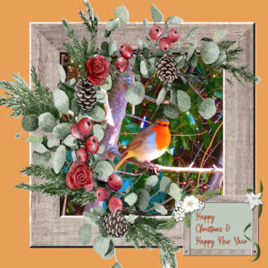
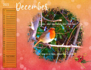
Thank you for your ideas throughout the year everyone and the tutorials & useful resources Carole. Sending my Christmas card to you all. The robin was in my garden when I was working outside.
Fiona
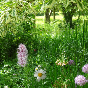
I was inspired to practice the blending techniques that Carole demonstrated in the webinar this weekend and eventually managed to combine three of my photos onto one. I did make a mess to start with and thought I’d mention in case it happens to anyone else but I had the ‘Colour’ Match Mode selected for my Fill Tool instead of ‘None’. Hopefully Carole has taught me the lesson now and pointed me to her blog about the Fill Tool that helped a lot in understanding what I had done wrong:
Finally completed but not sure I am happy with the final cover as it’s very busy. Have learned a lot in the process though and I could always go back and remove items.
Thank you all for the tip and the designs you have shared. Recently useful has been Ann’s use of Blur/Gaussian Blur for the enlarged background. It is effective and keeps the theme of the image relevant. I also thought Gerry’s use of Carole’s Script ‘Bleed JPG’ looks useful.
Get well soon Corrie. Wonderful that you felt like dropping in to the forum to see what’s going on.
I didn’t use a PSD cluster file but did not know how to use them until I watched the video so useful for future. Like Lynda, I thought a busy embellishment may be too much so I just added a little bit for December.
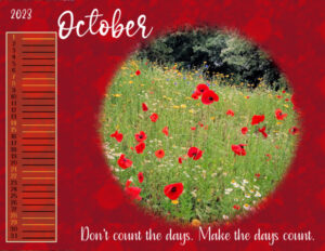
Carole’s design with the coloured background to the dates and lines certainly does enhance the calendar on all our pages. Have to say that Ann’s dome image for her October page gives me a sense of vertigo. a lot of depth.
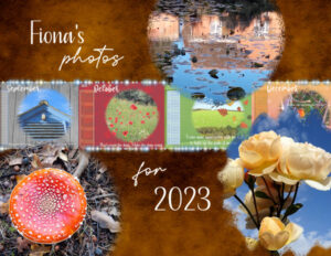
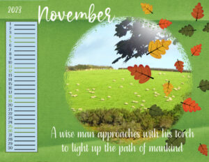
Here’s my Nov and Dec 2023
The tips we have learned in this tutorial must be worth remembering and like Cristina I found the tip to hold the ctrl key to toggle between the dropper and the floodfill tool, is a good one.
I was also interested by Carole prompting PSP by using the swatch toggle arrows in order for the colour swatch to register. I had found this by accident (probably frustrated) but now I know that I don’t have a bug!
I changed the dates’ font to ‘Tasteful Sandwich’ and used for my quotes also. The letter spacing in the new font was a bit close for some figures so I used kerning to space them out a bit so they appear to align better.
Thank you Susan and Lynda for liking my layouts. I think the circular framework for the photos is more impactful sometimes than the original rectangular format. Credit there due to Carole’s design. I like the way Lynda has used a photo background that draws you in to the main circular photo. Susan’s fresh colours and symmetrical, geometric feel to the images just look so good in a circle. Well worth considering these ideas for future projects.
All the best to Corrie and Dawn.
I love the circular frames used for the templates Carole. It makes a change and surprisingly photos composed in a rectangular format seem to easily fit.
Lynda, how did you add the days to the dates? I agree, it makes it more concise.
I have created the first 6 pages but have been contemplating adding quotes to match my photos. The photos are mine but the quotes that I would match to them are other people’s. Not sure where to put the quotation text though.
I dragged the text layer for the month name across from one file to the new one. I was thinking I would save myself a bit of bother but when I drag it in, the text does not slip into the same position on the new page. I had to put guidelines on each new page.
Hi, I have registered but am thinking it may be difficult to keep up during one week but will have a go.
I usually create an annual calendar for personal gifting to friends and family using my own photographs. Each month I try to match a photo of mine to a mindful quote. If I see a quote I like or someone gives me one, I write them down and collect them. So my calendar pages have the dates, 1 large photo and a caption for the quote.
Looking forward to having a go. Thank you again Carole.
Well I persevered just before going to bed having thought I’d have one last try. Seeing the explicit clues you kind people gave me in the Forum, I couldn’t let you down. With 1 hour to go I eventually completed it. Thank you for the encouragement. My puzzle now duly sent to Carole. I’m off to bed now! Night night.
Thank you for the additional hints Carole and your comments Rene and Suzy. I had another look and found number 2 but numbers 5 & 9 have alluded me. I have found articles for PSD supplies but no balloon. Sorry. I can send my incomplete puzzle but I have failed. Now run out of time. Sorry.
I am running out of time now and not sure if I will have time on Sunday to comple. I have 3 still to find:
number 2: Where do I save all those files I downloaded for PaintShop Pro?
number 5: Can I use Photoshop brushes (.abr) in Paintshop Pro?
Number 9: How do I get the old Material Properties window in my new PaintShop Pro?
I have found places with the answers but don’t see a balloon icon for these last three. Have managed to put together the rest of the jigsaw puzzle which is quite fun. A lot of effort has been put into the quiz and in the process of finding the clues we do see a lot of the site.
June 23, 2022 at 4:29 am in reply to: Congratulations to the winners of the Corel Animal Photo Contest #78333Well done Sue and Lynda for your well deserved wins. I also particularly liked your photo Lynda of the close up of the horse ‘s face with the detail in the eye. Amazing photos.
Fiona
Hi Iona, I don’t have Scrapbooking as a hobby and like you make greetings cards for family and friends using PSP. My angle is via photography and wanted to be more creative. I have found that the techniques Carole teaches in the context of scrapbooking are applicable to any of the digital hobbies we each have. I started with the basic course and make copious notes. The key is practice and I am constantly amazed at the quality and ideas of many of the contributors in the group. You will enjoy it.
Thank you Carole for reminding us about the competition. As a result, when I started to look through some of my photos I thought they could be of interest and then used PSP to retouch or adjust.
I have now submitted:
1. Jakey my cat looking like he is having a laugh. I made a selection of him using the method Carole used in her Fantasy World 2 class utilising the Edit Command icon in the Layers Palette. I then put him with a Drop Shadow on a new background.
https://What A Laugh! – Corel Discovery Center
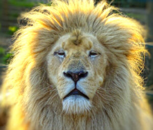
2. A White Kruger Lion, resident of Paradise Wildlife Park here in Hertfordshire in the UK. We could take photos from above the railings and his expression was so proud. I loved his mane so I brightened it up a bit in PSP with Adjust\hue & saturation\vibrancy and then used the Depth of Field feature to blur outside of the mane.
https://A good hairday – Corel Discovery Center
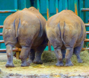
3. The amusing southern white rhinos were at Longleat Safari Park in Wiltshire, England. I used PSP to brighten them and their background and to remove a distracting rock with Object Remover.
The last photo I submitted for the contest is an amusing shot of Southern White Rhinos from Longleat Safari Park, Wiltshire, England. I used PSP to brighten up with Vibrancy and also removed a distracting rock with the Object Remover tool.
The second photo is one I took above the railings at Paradise Wildlife Park in Hertfordshire, England, of a resident White Kruger Lion. I loved his mane and his proud expression. I used PSP to brighten up the mane with Hue & Saturation\ Vibrancy. Then used the Depth of Field feature to blur outside of his mane.
I submitted three photos for the contest, following Carole’s reminder about it:
The first is of Jakey my cat who looked like he was having a laugh. I used the selection technique we learned about in the Campus ‘Fantasy World 2’ utilising the Edit Command icon in the Layers Palette. I added a drop shadow and then put him on a new background that contrasted with his fur colour.Hi Carole, I submitted info and photos to this Forum thread just now but it didn’t register so I am going to have another go.
So sad to hear. A character lost.
Happy birthday Carole. Thank you for the tuition, your creative inspiration and for the birthday discounts today and over the weekend.
Thank you Sue for the info on brushes and to Carole for the answer to my question about the texture layer.
Lesson 7: I tried making a mask for one of the circular paper elements layers (without changing the brightness setting in order to make it opaque). It resulted in a translucent image therefore the background layers showed through. I am now assuming that the template layers are presented as tonal greys sometimes in order to differentiate them from each other especially if overlapping in a design. From your previous answer Carole I guess ClipToIt always treats the tonal template layers as if they are opaque black ones and knows what to do?
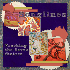
For the ribbons I went for plain colours as my overall images are so busy. Coincidentally I have chosen an Australian theme (having never been there though). I added a white border to a couple of the images to bring them out a bit and I used the Selection Expand technique from a previous lesson to do so.
I have found these lessons extremely useful and there is a wealth of creativity and techniques that is being shared. Need the time to read it all again. Thank you everyone especially to Carole.
Lesson 6
I notice Mary is up at 2am and I am trying to catch up having in the UK lost an hour due to the clocks going forward, just when we have loads to do.
I loved Ann’s cheetah and it reminded me of a visit to a cheetah rescue park we visited in Cape Town for a birthday treat I stroked a cheetah. So silky.
Sue, loved the delicate lacey border and wondered how you did it with a brush.
Lesson 6
I decided to keep the template daisy designs, selected sample colours from the photos and colourised by locking the transparency, floodfilling and Adjust-Add Noise. Then adding a reverse shadow helped.
A question: for the template Paper layer that had the texture, could you use it as a mask or clip to it at that stage?
Day 5
I have learnt from doing these templates the long way as a few of us seem to have done but I think I should get the ClipToIt script for the future. The mask of the circle didn’t work for me even after repeating the process a few times so it may be a case in point for the script. The solution as suggested was to add a flat element for that layer so I placed a doily. One of the ribbons is deliberately a gauze effect and the pink one is from cass-RibbonFactoryC-Spring.
Day 4 – Shadows on to group photo with a white border. The sense of having the Clip To It script is apparent with some of the problems I have been having with the intricacies of a mask template. I did however manage in the end to merge the group photo with its border by being able to merge down from the border to the photo group. Not sure why I wasn’t permitted on my PSP page to do that with my original attempts. Perseverance, the name of the game.
Lesson 4
On my Mask Brush layer (which appears white to show through the photo) I brushed out some of the distracting flare from the mask effect by using a white brush set at low hardness of 20.
Somehow I hadn’t noticed that my Photo borders were on top of each Group Photo so I had the wrong corresponding frame border when I merged down. Ha! (Should have gone to Spec Savers!). Having grouped the photos I then couldn’t merge down from the photo border layer. So I have decided to leave off the drop shadows on the photos.
Anyway, thank you for another interesting lesson Carole.
Day 2 – re-saved
Thank you Carole for the explanations and the tip about saving the text vector layer as a raster layer before resizing has got me out of a pickle. The article you linked to as well is very useful. Thank you.
Here is my Lesson 2 in its completed state. On to do Day 4 now.
I like your version for the Ukraine, Trish.
Day/Lesson 3
I didn’t have the Clip To It script but that is a good thing for me at this stage as I had to practice my masks long hand. I chose to keep the gauze effect mask layers and decided the drop shadows didn’t work with them so I omitted them. I thought the template had a natural gap in the stitching border to added a flower element.
Lesson 2
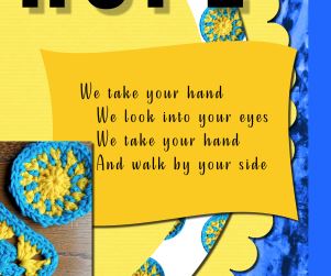
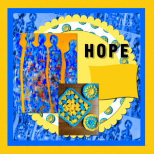
Recently my eye caught a post card which had been offered to share to open hearts to the people of the Ukraine. The painting ‘Hope’ is by Pamela Allsop and extracted words from the poem on the back of the card ‘We take your hand’ by Christine Allison. I created some crochet mats and combined for the picture for my lesson 2. I know the sentiment does very little but together sometimes people can make a difference.
On the technical side, does ‘locking the transparency’ confine the fill to the particular layer? Without doing so does the fill go across the whole page?
For some reason my poem text does not appear on the resized file that was saved as a jpg. What can I be doing wrong?
There have been some lovely images produced and the tips keep rolling in! Thank you.
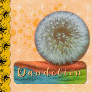
Hi, My first template is a bit abstract, using a photo I took of a dandelion seed head. I wanted the shadow to be quite soft so exaggerated it and applied the blend mode ‘Lighten’ which softened it some more.
All the patterns are from Digital Scrapbook. The cream pattern (Dandelion paper by Sheila Reid) I used for the background as well as for the bubbles and adjusted the contrast levels as in the lesson.
The rectangle is a close up of some wool.
Typeface is ‘The Madelin’
I have registered also. I especially liked the recent Masks Workshop which I am still going over. See you soon.
-
AuthorPosts


