Forum Replies Created
-
AuthorPosts
-
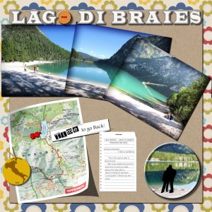
This is the page again with higher resolution… maybe be better to read the journaling
This is my contribution to this challenge. For the papers, I used eyeinspire-country roads freebie. Another freebie is the skipped cross stitch from Sheila Reid.
I used three different types of fonts: 2Pea Gone Postal, Andalus and Khmer UI. Also used cass-EdgeMagic free Script (photos) and cass-2016 Calendar Challenge Alphas-08
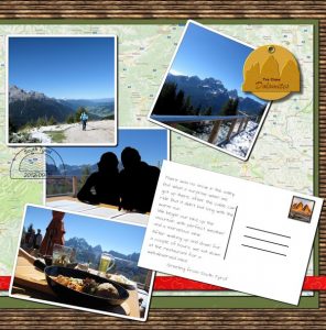
1- Something from the store blog (any freebie)———– cass-Notebook-LoosePage1
2- Something black ————- Silhouette
3- Something round ———— Button and Buttonized Photo
4- Something with a number ————- Part of the Journaling
5- Something attached to something else ———- Staple to the loose page
6- Something with a hole ————– Button and Leather Tag
7- Something that starts with letter T ———— word Time
8- Something lifted from the paper ————- Map (I used cass-Lifted Photo script)
9- Something made from scratch —————– (Button, Leather Tag, Staple – Cassel’s tutorials)
10- Something made of wood ———– Button
I had fun doing this page… having to think how to accommodate so many elements!
Marlene, like Dawn said, very nice and creative page! I am sure you had fun doing it. And I agree with both of you, this is a very interesting challenge,
Anja, Dawn, Marlene, lovely pages! It is so nice to come here and see all these lovely, colorful and meaningful pages. Great work.
Hi, Anita, welcome to the Campus! I am sure that you are going to meet friendly people here, great tutorials from Cassel and fun challenges.
Royanne, another lovely page!
Hi, Dawn, thanks for commenting on my page! To tell you the truth I am not 100% satisfied with the result… it doesn’t feel right and I will do many changes later. But for now, that’s what I have… 🙂
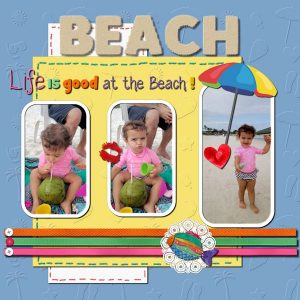
Here is my take on this challenge. I used cass-Embossed script for the blue and yellow paper, cass-LaserCutDoilies Round freebies, and cass-RibbonFactory script.
I added Corel SummerClipart freebie and PSP Buttons Picture Tubes.
I tried the Sand Effect for the title following the tutorial that was given in the Travel Tale Challenge. I was not sure with the settings, but I liked the effect.
For the colorized Word Art I used three fonts: Plump, GrilledCheese BTN, and Wednesday. The last one I got to know through the last LAB module 7-07.
I was tweaking and tweaking with no end in sight… so I decided to stop, post the page and move on to another challenge. 🙂
Royanne, your pages are great. I love the blue background (starry night), the idea of adding the skyline, the type of font for the title… the outer glow really made the photos to pop out. Lovely work!
Kay, you are a fighter! And you have nice stories to tell. 🙂
Royanne, beautiful page. The bright colors match perfectly with the photo and place.
Kay, I can only imagine the fun you have watching Twilla playing with her favorite toy.
Anja and Dawn, both beautiful pages!
Anja, I love the texture and color of the background and the elements you added. Dawn,
Dawn, I also love the texture and color of the background. The mask, elements, details…
Like I explained in another post, I have been away for a couple of days, so I am behind with the challenges, and will try to catch up asap.
Cassel, what a great challenge!
Dawn, another nice way to show word art. Like Marlene said, it is nice to learn little tips and tricks with each other.
Anja, what a beautiful and thoughtful page you created. We can feel all the sentiment involved. Great work.
I have been away for a couple of days, so I am behind with the challenges… I will try to catch up with them as soon as possible.
Sheila, very nice page. It is amazing the transformation of a photo with these techniques. Nice work!
Kay, what a lovely story of Bone and Ilsa! I am glad you shared with us.
Hi, Dawn, thank you so much for your comment. 🙂 This cute tire track is Cassel’s picture tube and the log background is from Filter Forge.
Eileen, thank you so much for your kind comment. I really appreciate.
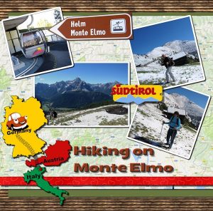
I also forgot to mention that the maps (route and paper) were also from Cassel’s short tutorials. I used the technique from the Masterclass Blend Through.
I forgot to mention that I based my layout on Marisa Lerin’s template marisaL-layout362
Casse, thanks again for this great challenge.
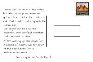
I am glad to say I finally finished my page… earlier than I expected. It was fun! I am planning to do another one but using a different Marisa Lerin’s template that Cassel gave us… From the short tutorials, I used the leather tag, stamp, and postcard… For the date stamp, I used the Date Stamp 5 script.
I am still working on my page… haven’t had much time to do it, but I will for sure post my project … hopefully this week.
Marlene, lovely pages! Love them all…I am sure you traveled again while doing the pages, and we traveled with you. Great memories for sure.
Dawn, beautiful pages! So many details and techniques… Great work!
Sheila, very nice page! I love the colors and the rings… I like to use them too since I’ve learned with this tutorial. The title came out pretty good. Great journaling! 😀
Marlene, your pages are lovely, and this was probably an unforgettable trip. The inclusion of the leather tags, date stamps, postcard etc added a nice touch to the page. These short tutorials that Cassel included in the emails are great, not only for this challenge but also for future projects.
Very nice work and techniques posted here. In the end, this is what is important when participating in a challenge, where we have the opportunity to share our work and learn from each other.
Eileen, the end result of the sand letters came up good. I like how you blended the light house and flowers.Nice colors!
Dawn, I love your pages, your photos, everything… Even without you being there, you took us on your dream trip. I am glad you decided to participate. Lovely work!
Marlene, with you I went to Québec and Montreal… I think I would love this cable ride! Nice work!
I haven’t done anything yet, but I am working on it, separating photos, choosing template etc. Like Cassel said, although officially over we can always post our work here.
Cassel, this was a great challenge, in which you gave us new ideas and great small tutorials. Thank you!
Sheila, very nice! Snowdog …. what a lovely story. I like very much the hexagons. Good work!
Hi, Dawn and Sheila 🙂 Thanks a lot for your lovely comments and encouragement. I have to say that if this had been a movie project, this page would have been take number 25 or so 😀
Have a nice day/evening!
Hi, Kay! I agree with all statements above… Before joining the Campus last year, I knew PSP but zero knowledge of scrapbooking… I started with the Start Here free videos and move on to the Basic Scrap Course. I can only talk for myself, but it was as opening a whole new world to me. So many tricks, techniques … And we also learn from each other participating in the challenges. Welcome to the Campus!
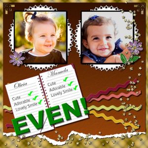
This is my take on this Word Challenge. Papers: I made the plaid paper (Cassel’s tutorial); the second paper >Basic Color > Effects > Texture > Parchment. I added cass-CornerPunchesA brush and ran cass-TornEdge script.
Mats: cass-EdgeFont2 Mat02 freebie //// Ribbons: cass-RibbonFactory-May freebie and ran RicRac Basic script /// Notebook: cass-Notebook freebie //// Flowers: cass-Precious-Flower freebie //// Confetti: cass-StarConfeti Gold freebie
-
AuthorPosts


