Forum Replies Created
-
AuthorPosts
-
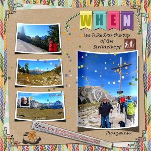
This is my contribution for this challenge. Papers and elements are from Kristin Aagard “Great Outdoors” kit.
For the word WHEN I used cass-2016 CalendarChallenge-07 Alpha and cass-StringTube … I tried an effect from Pinned Paper Tutorial.
I also used cass-Curved Photo and Lifted Photo Scripts and Corner Punched A Brushes.
Marlene, your friends must be very happy and thankful having you to create all these great memories for them.
Your layout is very nice! A situation that was scary at first turn out to leave good memories.
Anja and Daphne, very nice layouts. It is nice to see these different approaches to the same challenge.
This is what I have for now, but not sure about colors, and depending on the next tutorials I might change them.
Shirley, talking for myself, I am in no way a professional. Like you, I started with the Basic Course last year and now I am learning with the great tutorials of The Lab. I think the main goal here is for us to have fun working with PSP, learn and support each other. For me, I love to see all layouts, beginners or more advanced.
Your card is lovely and what a great idea to have the pull tabs! Your sister will love the card and the poem. Great job!
Cassel, the story behind the layout is even better! And you are right, most important is that he had fun and I guess the whole family did too. 🙂
Cassel, “when life gives you lemons, make lemonade”… in your case you created a creative and funny layout. I think by now you have your long-awaited shed. 🙂
Dawn, I love all your cards and this is no different. Everything is so beautiful: the beaded heart, the rose element, the overlay… I also love the golden font. Great work!
Sheila, your page is so nice and Georgia is a sweet little baby! <3
I like very much the colors of the plaid paper and the embellishments you added. The flower is great, and by your explanation, I can imagine how much work it was to make it… but in the end, this is what makes it fun to work with PSP.
Thanks, Sheila and Marlene for commenting on my page. I really appreciate. 🙂
Marlene, I took the idea (scraplifting) of using so many different papers from Cassel’s lovely Quick Page she made based on template #9 from the 2016 Calendar Challenge… and there are others great Templates/Quick Pages/Alphas that belong to this 2016Challenge.
Marlene, your layout is great and so is the journaling. I didn’t know anything about the Giant’s Causeway, and seeing your photos and reading about it I can only imagine how impressive it is. Lovely page!
Shirley, what a lovely way to keep the nice memories of Hershey. I am sure your daughter will love it. I like very much the different papers you used. Great page!
Rizzi, what a cute layout… Very good!
Dawn, thank you so much for taking the time to comment on my page. I do appreciate!
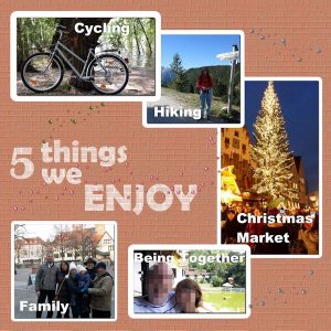
We are taking advantage of the good weather to be outside, enjoying the sun and nature… these nice days of temperature of about 20°C or 68°F are counted 🙂
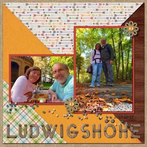
Cassel’s challenges always give me a boost to do something with my photos. 🙂 For this challenge, I used one of Cassel’s 2016 Calendar Challenge Templates (#9). They are so nice that we can use for any type of layout.
All the papers are from Kristin Aagard “Great Outdoors” kit. I added cass-SeedBeads1 freebie and cass-SeedBeads2 spray Picture Tube. Instead of using the alpha that came with the template, I chose cass-WoodenAlpha freebie… thought it fits more the theme.
I tried Filter Forge Vibrance filter to the photos.
Dawn, your layout is simply beautiful!! The embossed dot overlay, amazing photos of these birds, picture frames, the fonts…. I love everything. Really great work!!
Dawn, thank you so much for taking the time to comment on my layout. I do appreciate! 🙂
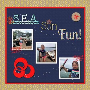
This is my contribution for this challenge. In fact, I tried to practice many techniques and the Word Art is just one of many.
From the LAB 7 module 10, I made the Custom Compass, Custom Lined Paper, and Smudged Paint.
From the Masterclasses, I tried a different technique from the Touch It webinar (elements and frame) and Word Art (title).
I used cass-SeedBeads2 spray Tube. Fonts: JLR Waves, Lobster two; Ice cream sandwich and KR Down by sea.
Dawn, your page is great! It is a piece of your personal story and this only you can tell. I love the whole layout and especially the title and cass-clothes preset shapes. Nice work!
It is so nice to come here and see these great layouts.
micfin, your work is lovely as always. Nice photos and I like the way you used cass-multi-photo-frame and the denim texture for the font… and I love the font too! Thank you for the explanation of how you did the seamless pattern!
Dawn, your card is also lovely, so delicate and with techniques, I’ve never heard about 🙂 I can only imagine how great it will look once printed.
Great work here, ladies!
Dawn, this card is really lovely and express the real important things in life. Everything matches so well together. Great work! I don’t have anything yet for this challenge but I will think of something.
Hi, Dawn, thank you so much for commenting on my page. I really appreciate! After I had posted, I made a few changes in this layout, changing positions, sizes of elements… 🙂
At first, I couldn’t think of anything specific… maybe the history of clothing… but couldn’t come up with a page until I remember I had this photo. I like to participate in the challenges because is a way for me to practice techniques and learn from others. Best wishes 🙂
micfin, I can imagine that was not easy to make this complex design to look seamless. This is something I have to learn more. But you really managed and the result is great. These daily layouts you create for sure keep you on your toes. Nice work!
Peggy, what a lovely card you made with the preset shape. I love the colors, the background, the elements and the font. Great work!
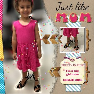
I thought that I would not participate in this challenge, but found a photo and this is my contribution.
It was made using as a base the Focal Point Template 2 from Scrapping with Liz. The background – koolkrafties6 – is a freebie from eyeinspire. I made the tag based on a tag freebie (ps_marisa-lerin_6346_chipboard-tag_cu ) from Marisa Lerin (Pixelscrapper)
From Cassel: Lined Paper and Confetti Tube (LAB tutorials 7 module 9); Polka dot and Button (tutorials); Rope and String Tubes; Cookie Alpha freebie. Cassel has so great tutorials and stuff that I want to incorporate as many as possible in my layouts! Am I going over the board? 😀
Fonts: Dancing Script, Californian FB, Claredon, Ellis.
So many creative and lovely layouts here.
Dawn, this is a beautiful card with so many techniques…I am sure your sister-in-law will be very happy.
Rizzi and Peggy, lovely and cute layouts. Hope to see more of your work. 🙂
micfin, nice work. I love the dotted background, and Cassel’s corner cutout brushes always make the layout stand out… like this font as well.
Thank you, Dawn, Marlene, and Cassel for the comments. 🙂
Hi, Cassel
I have just registered for this challenge. Looking forward to it. 🙂
Sue, great layout and cute birds!
Hi, Dawn and Marlene, both of yours layout are really lovely.
Dawn, I like the colors and the way you used the flash card script as a frame.
Marlene, I like the travel background with the vintage look. I also liked the way Cassel used the tags… a good idea that I may use one day.
I managed to come up with something for this challenge after all. I tried to practice the graffiti technique that Cassel showed last month in the Masterclass-Touch It. I used the Berlin Sans FB Demi and Arial Black fonts. The pearl scatter is an older freebie but the file doesn’t have the name of the designer.
Like the Mystery Challenge, I also don’t have anything yet for this challenge… let’s see if I can come up with something.
Marlene, over the years this coat became an important part of the family history and got a well deserve layout. 🙂 Another great story!
Sue, very nices pages. I didn’t know this fanned script and it gives a very interesting effect. Hope to see more of your layouts. 🙂
-
AuthorPosts


