Forum Replies Created
-
AuthorPosts
-
Lynda and Annie, thank you so much for the feedback; they are of great value to me. <3
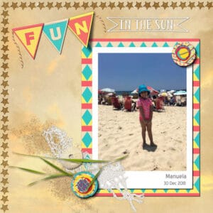
I forgot to mention that I’ve used a sunset photo (Unsplash_anton-darius) as an overlay and changed the blend mode to Screen. Also, I added Cassel’s Summer Punches-Starfish brush.
For the lifted shadow, I had changed the Blur and Opacity settings so many times that, in the end, I was not sure if it was giving the correct impression of being lifted… I really need to practice this more.
Thanks, ladies!
Sheila, you did a great job coloring with the mouse… I have an old Wacom tablet, and at first, I needed some time to feel comfortable with it. But, since I started working more with the laptop, I haven’t used the tablet/pen anymore… I have to find a way to get used to it again because, in the end, it is easier with certain techniques.
Last year, I created this layout for the Lab10-M9 but having a look at it again, I didn’t like the dark blue background paper anymore… I used another paper (DiHiller_PSJul2020 North Shore_paper4), added a photo overlay on top of it, and changed the blend mode… I also decided to practice the lifted shadow effect on the “N” Banner Alpha, but I am not sure about the result… After blurring the shadow a bit more, I lowered the opacity to about 80% … Any thoughts?
Sue, lovely layout… I love the canvas-like texture of the background and the beautiful frame.
Annie, outstanding Alpha. I love, love, love it!
Val, thank you so much for your kind words on my pages. I appreciate them very much. : )
Lynn, that is a beautiful paper; it was a good idea to use a gradient.
Sue, you are the master of frames! I love to enlarge the images and pay attention to all the details, textures… Both are just lovely work and so, so pleasing to the eyes.
Annie, I have noticed “all three mistakes,” but I didn’t want to hurt your feeling, so I decided not to point them out. LOL LOL … But I understand you; many times, I only see the issues to be corrected after posting here. Anyway, the page was perfect before, and now it is more perfect!
Beautiful work on the protea flower page. I love the background paper and the colors.
Michele, good to hear you are feeling better, although you needed an extraction., Two years ago, I also needed an extraction and implant, and here there were no restrictions on what I could eat… I was surprised but didn’t have any problem with that.
Annie, wow, I don’t know how you did, techniques used, but this is O-U-T-S-T-A-N-D-I-N-G!
Connie, beautiful layout, simple, and so effective. Great job.
Sue, your work is always delightful and a source of inspiration for me… I love, love what you did with the beads, what a great idea!… I didn’t know Carole had a script for it… I think I have to get this one. : )
You know that I’ve been working on this Out-of-Bounds layout for a while ; ) … I’ve changed it so many times, lol… Of course, I don’t mind your suggestions, I value your input, and I am more than happy when someone points me where I can improve. You can be sure I will go back and do what you suggested. Thanks a lot for your kind words of support, my friend! <3
Annie, I am blushing now!! : ) I am more than flattered with your compliment… Your Out-of-Bounds layout is beautiful! I love the background and the alpha. Wonderful job as always, my friend! <3
This is what I like here, everyone creates different things, uses different techniques, and this way, we learn a lot from each other… I am happy to say that I’ve made good friends over the years; some are still here, some are not… I still miss seeing Dawn’s beautiful cards.
Wow, Michele, this is amazingly beautiful! I love the idea of adding a bubble effect behind her and the subtle frames… Of course, I love the font and already downloaded it. : )
Headache and toothache are not a good combination. : ( … I hope you get well soon.
Everyone here is doing such great work! I love to come here and be inspired by all the layouts posted.
Marie-Claire, this is a great layout, and I love your photos!
Ann, both of your layouts are lovely!
Annie, what a creative and fun layout. I love it!
Lynda, I love the colors and the photos…Great layout!
Sue, beautiful layout as always… I am a big fan of your photos!
Betsy, beautiful work with the zipper script. Carole has so many amazing scripts that it is hard to choose what to get.
Annie, thank you so much for the words of encouragement; they do mean a lot.
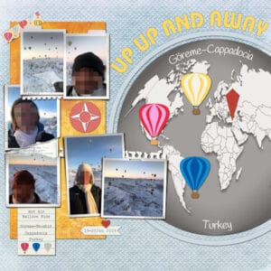
I, too, would love to go on a hot air balloon ride; my niece and nephew said they didn’t see the time pass…I will do this in my next life. : ) …The background paper (Tough Stuff paper5) I got from Linn Grieveson (The Lilypad). This site has pretty good offers almost weekly, and they vary from 20% to 50%. Here and there, I find something that I like very much.
You and Sue inspired me to create something different with the background papers, but I am just starting… still a lot to learn. Hugs and love, my friend. <3
Karon, you are always so kind and sweet. <3 Thank you so much for your words of encouragement; I value them a lot.
Lynda, maybe that more exploration is needed, but I like very much what you have done so far. Great work.
Michele, my friend, thank you very much… I had migraines for many years, and I know how debilitating they can be… I do hope you feel better so we can see your beautiful work again. Get well soon! Hugs and love. <3
Ann, another nice page for the Bootcamp Challenge… It is interesting to revisit those layouts and create something totally different, with more knowledge, than the first time. At least, this is what I think when I see mine.
Mary, seeing the original, you sure did a great job.
Corrie, the layout is so cute…. the background paper came out perfectly, subtle but there.
After a long time without posting or creating anything, I have something to post. It feels good to be working with PSP again.
One layout was created using the “Around the World template” by Scrapping with Liz – Elements from “Hot Air Balloon mini kit” by Marisa Lerin – Frames Pairs by Lynn Grieveson.
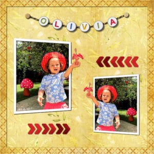
The other one I created to practice the Lab10-M10 tutorials (Cross pattern – Mushroom – Grossgrain arrows).
Papers: Shabby Princess-Promise paper sunshine – Creative Market Watercolor Forest Plants pattern2
Alpha-Beads-Baby freebie and Metallic-Rope12 picture tube by Cassel.
Annie, this is a beautiful layout. It has so many details, so much work behind it… I love the background paper and colors. Great work, my friend!
Ann S., wonderful layout and journaling. I am not good at that, but I think it makes the page special. I like how you used the diamond paper… I’ll remember this idea when using patterned paper.
Lynda, cute layout with the pastel colors. I love the background paper with the slats and the mask.
Val, you achieved a great result with the map. I think this was a clever idea from Carole to come up with this technique.
Annie, what a great layout about baobabs… I love this tree… I didn’t know, before watching an Australian series that took place in the Outback, that they are also grown in Western Australia besides Africa… I also love the font/alpha you used for the title “Avenue of Baobabs.”
Minka, the chicken’s layout is cute, and I love the colors. I like the clusters, and I am still not very comfortable creating them; maybe I should try it more often.
Karon, what a beautiful layout you created for Earth Angel… She has a lovely smile!
Annie, I was not aware that there is an Internation Day of the Frog, and you created a very nice layout to commemorate it. : )
When I said I purged kits that I’d never used, it didn’t mean I was going left and right, deleting a great number of them, but it probably sounded like. LOL…Like you, it is not easy for me to press the delete button… When I was in doubt, I said to myself, “I will check it again later,” whenever this will be! But I was glad that, at least, I started it. : ) Thanks for your friendship! Hugs and Love. <3
I love to see the diversity of creativity starting with the same sketch. Great work, everyone! … I like this type of sketch that showcases many pictures.
Annie, what a beautiful layout! I love the watercolor background, the alpha, and everything else… I really admire your work. <3
I got to know the Kookaburra birds here on the Campus from Marlene, who was also an Aussie and used to display them quite often… I find them very sympathetic. : ) … More and more, I am inclined to use artsy papers, although I don’t have many. Now, I am in a purge phase, getting rid of free kits I downloaded years ago when I started scrapping and never used… It’s liberating, lol.
Wow! : 0 What can I say?, Wonderful and creative work, Everyone!!
Everyone here is doing a great job with different types of work and techniques.
Karon, you are really inspiring me to go back to the Lab Tutorials! : ) Nice job.
Julia, cute and colorful page. Nice work.
Annie, you created a beautiful alpha.
Lynda, what wonderful work with the old map.
Lynda, I like very much how you added the shadows to the flag banner. They look great.
Sheila, another lovely layout of your daughter. Well done.
Minka, the photo, colors, the layout all convey peace. Nicely done.
Karon, this is really a lovely layout. I love to see your Lab pages showcasing what you created with the tutorials and the experiments. Great job.
Laurie, I love both of your pages…great color. To answer your question, I think you could go to Adjust>Hue and Saturation>Hue/Saturation/Lightness or Adjust>Hue, and Saturation>Colorize… Maybe Carole and others here have other options.
Annie, as you were not posting anything in the last few days, I was thinking to myself, “What’s she up to?” : D … I knew we were going to see another great work…Beautiful mandala, and I like the bright colors very much.
Bonnie, very nice layout. Did you also create the Word Art?
This is great work, Michele. The photo is astonishing, and the bokeh effect is beautiful. I have to practice this technique more… the last time I did was for the 2019 Love Story Challenge.
Ann, this mandala looks great, it has so many details. Good job.
Lynda, you’ve been busy with the Labs. I haven’t done anything lately concerning the Lab tutorials… Hopefully, I’ll find my mojo again as soon as some kind of “normal life” comes back. I love the flowers you created.
Michele, beautiful work and colors. I love all of them!
I haven’t been able to keep track of what all of you are creating, and just today, I noticed all the lovely work from this thread. Great work, Everyone!
Late, but I have finished something for this challenge.
Basically, I just had to add the photos… I used the template “Messy-Pockets-Captured-4” by Lynn Grieveson (Lilypad); The shadows were also included, and I didn’t change them.
The background is from her Newsletter “Welcome Kit,” and I just added a layer on top of it with one of the colors suggested… added some texture, and played with the Blend Mode.
Word Art fonts: Slashback Swashes – RioSquad – Romantic
Everyone had so much fun last month with the Lab, templates, freebies, pickleball, babies, mandalas, and so many more lovely and creative layouts; it is hard to keep pace with all of you! : ) I haven’t been creating much stuff, but it is always a joy to come here and be inspired by all of you.
Great work, Val, Annie, Ann, Karon, Minka, Mary, Bonnie, Michele, Lynda, and Anne!
Shirley, what a lovely layout and memory you are creating for your daughter. I am sure she will love to go through all the pages, once they are finished.
Everybody is doing such a lovely and creative job. I haven’t been very creative lately, but I love to see everyone’s take on all the different challenges.
-
AuthorPosts


