Forum Replies Created
-
AuthorPosts
-
Lynda: Still too busy for me. Sticking with that layout, though, I’d reduce the size of the WordArt and leave the truck in the center, maybe up a little higher and a bit smaller. Try Corrie’s idea. The beauty of digital is changes are easy peasy. 😉
Lynda: I prefer the one with the smaller truck. Alternatively, you could tighten up the word art going up and left and enlarge the truck a little bit in the center. See how that looks. The other one looks too crowded to me. Which do you prefer?
Susan Ewart: Wow, your cover is gorgeous! Your title makes me think of when I quit smoking (many moons ago) and I had to power through nicotine cravings. In fact, some of your crystal looks like an ashtray to me (probably not, just how my mind works!) 😉
Mary, that’s very nice! I think I’ll try my hand at this project next, now that my calendar is finished.
Lynda: If I wanted to add that truck to that layout, I think I’d “ghost” it behind the title. Maybe I’d even blow it up really large and use it as an overlay with the background. If you reduce the opacity, you’d still see the truck, but it wouldn’t be obtrusive. Just my thoughts.
Here’s my complete calendar-all 13 pages! I did a cover but didn’t use 2023 because I left the months as a perpetual without the days of the week and my daughters’ trip happened in 2022.
The cover uses the selfies they included in the photo batch. I tried the word art title and applied a little inner bevel or a shadow. The background is a gradient I edited from Corel’s White Sand and added the Plaster texture. I couldn’t do Inner Bevel on the masks as it left a line at the edge that looked out of place, so I skipped it this time.
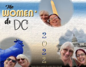 00-COVER-2023-CALENDAR
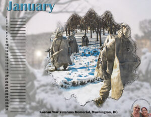 01-JANUARY-2023-CALENDAR__forum
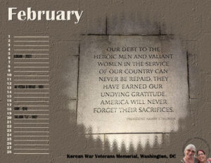 02-FEBRUARY-2023-CALENDAR_-forum
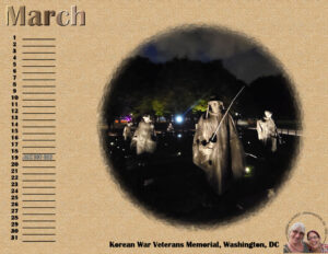 03-MARCH-2023-CALENDAR_forum
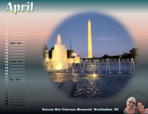 04-APRIL-2023-CALENDAR_forum
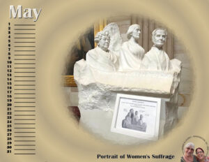 05-MAY-2023-CALENDAR_forum
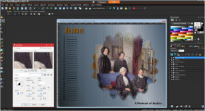
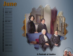 06-JUNE-2023-CALENDAR_forum
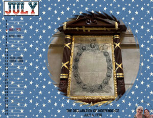 07-JULY-2023-CALENDAR_forum
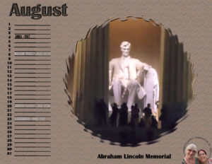 08-AUGUST-2023-CALENDAR_forum
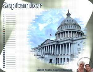
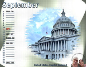 09-SEPTEMBER-2023-CALENDAR_forum
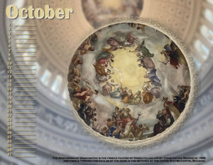
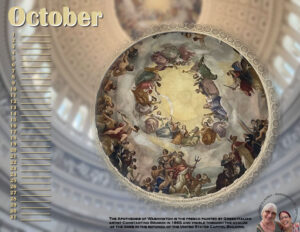 10-OCTOBER-2023-CALENDAR_forum
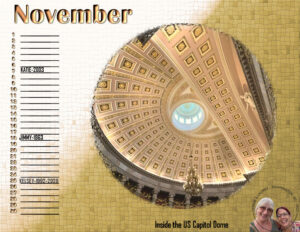 11-NOVEMBER-2023-CALENDAR_forum
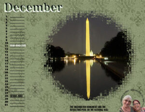
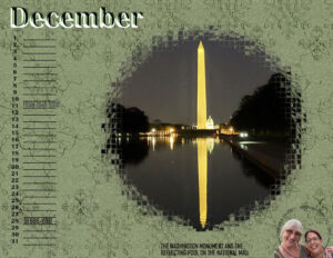 12-DECEMBER-2023-CALENDAR_forum
Chris: Those pages are very nice. You have the same ideas that I have; using a photo as a background. I discovered in my October and January calendar pages, that the center image in the group stands out better if I take the background and apply Blur/Gaussian Blur. Here are how mine look now that I did that.
Ha, ha, Michele! I too watch the same shows! So, we now have Money Laundering, Scams and Vig in our Money Alphabet Game. 😉
Linda Walker: I was adding family names on their birthdays to my calendars and when I resized the lines vanished! I think the templates have a Rectangular Selection to contain the lines which are a Vector. And I recalled they are prone to vanish on resizing and she advised us to duplicate that layer and to Rasterize it. I did that and the problem was solved. Hope this helps.
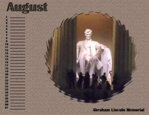
Carole: See #84373 where I posted a screenshot of my bevel problem. I was successful with adding an inner bevel to my merged group until I was working on June to correct that photo. Here’s August where you can see it worked quite well on Abraham Lincoln, so I was surprised when it threw what look like billiard balls into the center of my June group!
Finished November and December. Now I’m working backwards to catch up because I decided to add all the family birthdays! (Plus, the Fourth of July, for the USA) Those names in a pale color are those of the current generations who have passed away. Fran is my late husband.
December background uses a paper from my big Iceland kit. Still having trouble applying a bevel to the group.
S = Scam! (goes with Laundering 😉 )
-
This reply was modified 2 years, 3 months ago by
Ann Seeber.
Carole: You were right, the Perspective Tool did a Magical Job! I never used it before and actually had to hunt for it until I found it right there with the Straighten Tool. (DUH!)
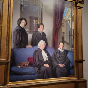
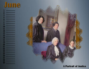
I’m appending a screenshot of my June calendar with the corrected photo of the Supreme Court Justices, but my inner bevel tool is acting strangely. I copied the group and merged it so I could play with the edges and be able to change my mind later. It scatters little balls all over the photo when I try to apply it, no matter which style I choose.
Help!
Corrie: Glad to hear things went well! The hospital/clinic is renowned for being the worst place to get sleep. My husband was such a disruptor with his call button that the night nurse wheeled him out to her desk in a big reclining chair, gave him earplugs and a sleep mask and walked away! 😉 Hoping your progress from now on is smooth going.
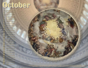
I revised October so the text at the bottom is readable (in the large format) and I finished September. Added my girls! 🙂
September was hard with the geometric mask. I ended up going all in on the tiles texture and then hit it with the Illumination/Lights effect. Does look different, I must admit!
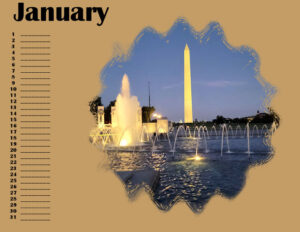
I did some editing on the January calendar and also finished October but September is taking longer. Who knows? Maybe later today.
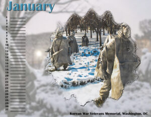
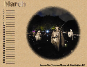
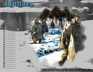
All these photos were taken by my daughters in DC last week except for January that I got from the memorial’s website as I felt I needed snow.
In case you can’t read the text in October in this reduced version, here it is:
The Apotheosis of Washington is the fresco painted by Greek-Italian artist Constantino Brumidi in 1865 and visible through the oculus of the dome in the rotunda of the United States Capitol Building.
Gerry: Using the birthday calendar as a visual for your mother is an inspired idea. I made ID sheets for my husband in his final year so he could tell which grandchild was on duty while I went out for errands, etc. The calendar templates this year don’t have the days of the week so I view them as Perpetual Calendars that can be used any year. Perhaps I’ll add the family birthdays. You’ve got my creative juices flowing! 😉
April/Dawn: I’m so glad to see you back and hope you are now feeling well. I keep a 1300 x 950 template with a black background which is the same as my monitor, for my ongoing projects here. I use a .jpg of it as my desktop background at all times. I do use my Big Cat Calendars as fill-ins when I don’t have a current project. Are those Lorikeets in your calendar? My granddaughter’s zoo has a flock that visitors can interact with and feed. They have gorgeous colors!
Mary Solaas: Beautiful layout and that title is perfect! My daughter, Debbie, whom I only see once or twice a year, just left to go home to California, after a great visit. We truly enjoyed our time together, also.
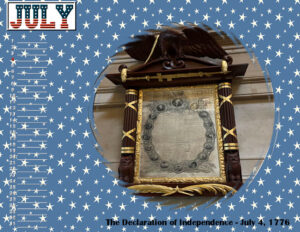
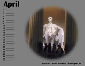
Here is July and August, finished. I got patriotic with July, since Laurey gave me a photo of the Declaration of Independence which was signed July 4, 1776. I used the USA split font so you can use 2 colors. I placed a mat behind it as the background is busy. I tried to add an Outer Bevel to the Photo/Mask Group, and it came out well, I think. August is Abraham Lincoln’s memorial, photo shot at night and from a distance so it was quite grainy. I tried to improve it and think it looks a lot better now. The background is a texture called Letters, which I found appropriate for Lincoln who was known as an effective orator. We had to memorize one of his speeches when I was in high school, “Fourscore and seven years ago …” 😉
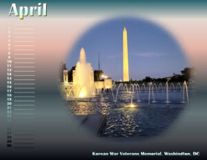
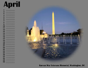
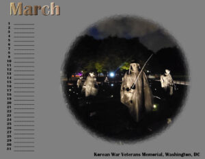
I think I’m finished with March & April, unless I add some more text. My March background is a double layer from the Textures tool. I made an interesting discovery, the Sculpture texture has tons of pattern choices and some are my own plaids, etc! I used the pale Elegant texture overlaid with the Cracked Plaster and then multiplied. My April background is a gradient called Calm Skies and Water. I used the gradient Cougar for all the text and applied an inner bevel to the month.
Carole said: “(#83317) Have you considered straightening the painting image? Based on the mirror in the back seems obviously angled.”
I’m showing you the original photo I had to work with. What you see in my calendar is the best I could do with the angles, never mind fitting it in the mask!
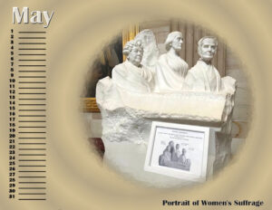
Here’s May & June, featuring the women who have made our country great. For May, featuring a sculpture of the original Suffragettes, I used a gradient on the background and then hit it with Kaleidoscope. For June, featuring an oil painting of four of our female Supreme Court justices, I also used a gradient and then used the Blinds texture.
Thanks for your kind words, Lynda. Both my husbands served in Korea after the conflict. My daughters were impressed with the memorial. There will be other sites from DC in coming calendar pages. I already changed April from Lincoln because I found another KWVM photo that I forgot about.
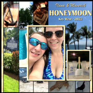
Oops, put my entry in the What are You Working On thread (#83166). Here’s my granddaughter’s honeymoon on Key West, FL.
-
This reply was modified 2 years, 3 months ago by
Ann Seeber.
Carole: You asked: “Ann (#83186), what will be the theme? Where do you bring up for a visit?”
The photos are from my daughters’ trip to Washington, DC, last week. (#83156)
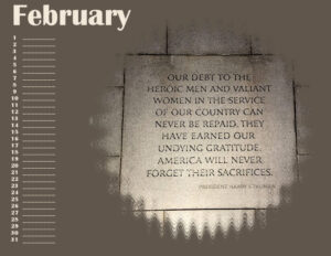
Well, I knew I’d be making changes as I go along. So here are Jan & Feb with backgrounds, pretty much finished except for maybe some journaling somewhere. And here also are March & April with photos and text but no backgrounds yet. All are works in progress. One thing I tried with February was to apply a texture to the background.
-
This reply was modified 2 years, 3 months ago by
Ann Seeber.
Pirkko: Carole says we can post as we go along, even unfinished. Here’s her suggestions –
“Since your pages won’t be completed until the end of the workshop, you have different options:
you can post one page you are working on, every day, as it is progressing
you can wait until the very end to post your pages
you can simply comment on what you are doing on that day, but keep the surprise until the end
The tutorials will cover something you can do, every day, on the same page, so don’t expect any page to be completed after one or two days (unless you skip the tutorials completely!)Whatever you choose, let’s make sure you don’t stay silent for 7 days!”
Personally, I’d love to see all 12 templates so I could do each lesson as I go along for 7 days. So far, I’ve placed photos in the first two and am waiting for ideas about the background, etc.
-
This reply was modified 2 years, 3 months ago by
Ann Seeber.
I used the September Sketch Challenge to document my granddaughter’s honeymoon on Key West. The sketch showed lots of vertical strips, but I used photos instead of papers.
Edit: after further consideration, I applied a Gaussian blur to the background photos.
More Edit: Does Honeymoon count in the Moon category? 😉
-
This reply was modified 2 years, 3 months ago by
Ann Seeber.
-
This reply was modified 2 years, 3 months ago by
Ann Seeber.
Sue Thomas: That snow scene works well with that mask! I’m still not sure what I’m doing for a background. So far, I’m using photos from my daughters’ recent trip to Washington, DC.
Susan, my technique may be wrong but, in your situation, I would just crop off the excess canvas. For me, it’s whatever works! Great moon layout!
Sorry, Cassel, I’ll only post my questions in general threads from now on. I was unaware of the change. I usually use the gold tab on the right side in case my question is a dumb one! 😉
-
This reply was modified 2 years, 3 months ago by
-
AuthorPosts


