Forum Replies Created
-
AuthorPosts
-
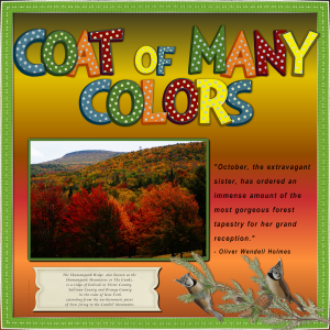
I’m not really familiar with much Country Music but Shania Twain is pretty classic. I looked up her list of songs and picked one that coordinated with one of my colorful fall foliage photos. The song is A Coat of Many Colors. which I think was a cover of Dolly Parton, and the photo is where I live in the Mid-Hudson region of New York State.
I enlarged the photo by 200% as I now have PSP 2021 Ultimate and it makes quite a big difference from the free trial. The journaling is a quote about the beauty of Fall and also about the area of the photo.
I used a simple gradient background with a border using ribbon from the Frootloop kit and Cass-mitered border script.
The alphas were from the eyeinspire kit but I doctored them with a lot of color, as you can see! The birds are from a kit featuring Iceland and I tried to identify them but had no luck.All in all, my Coat of Many Colors is quite colorful!
Edit: I see from enlarging the layout that it’s hard to read the journaling at the bottom, so here’s what it says:
The Shawangunk Ridge, also known as the Shawangunk Mountains or The Gunks, is a ridge of bedrock in Ulster County, Sullivan County and Orange County in the state of New York, extending from the northernmost point of New Jersey to the Catskill Mountains.
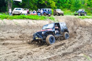
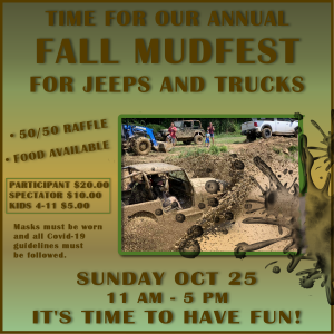
Bonnie: Yes, it’s at the drive-in. We have a special area where the local firetruck comes and dumps water to make the mud and then the jeeps and trucks drive through it and around behind one of the screens (we have 3 screens) and back into the mud again, hopefully not getting stuck! It’s lots of fun 🙂
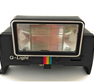
Q = Q-Light Flash for Polaroid SX-70
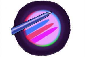
O = Optical Illusion – Ex: Colored Shadows
Working at actual WORK.. I do graphics for our business, the Warwick Drive-In Theater and this is an event coming up in October. The skills I’m learning here are helping me with my actual job. 🙂
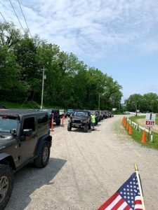
Oh, just to show you how popular this event is, here’s a photo of the lineup to get in last year..
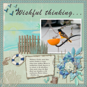
Karon, thank you for your kind words. That Oriole layout was begun in the summer when he could have been dreaming about his winter beach scene. I particularly like your Construction Work layout, I remember those rusty cogs. Were they from Cassel? Sunflower, AL: I need to work on the title on a curve, myself. Well done!
Thank you, Sue. As my journaling shows, the orioles are now at the beach! I’ll bring them back in the Spring. I am finished with that particular layout, for sure!
I may actually abandon this layout..(trying to avoid saying it’s DONE which seems to jinx me and I find more to do!) lol
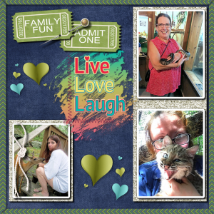
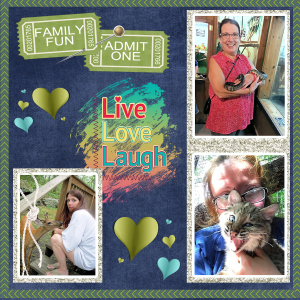
I know I’m late but here’s my Scavenger Hunt.. My daughter with the deer and the snake and her daughter with the bobcat kitten (she’s a zookeeper)
EDIT: Did some tweaking, including adding the shadows I totally forget in my rush last night. Here’s version 2:
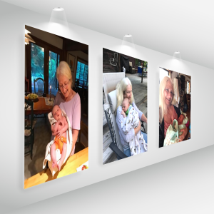
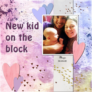
I tried the Gallery template with some photos of my daughter, Debbie, and her granddaughter, Magic.
I had to practically make the photos invisible while scaling them so I could see the outline behind but it worked out ok, I think. Let me know what you think.
Oh, and the closest photo was way smaller than the others but at least it was the correct shape. Luckily the AI engine in PSP2021 did a great job of the 200% enlargement.
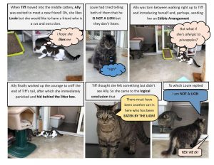
On the subject of Speech Bubbles I see these all the time on Facebook done by a local animal shelter’s talented volunteer and always wished I could make some myself. Here’s an example:
Interesting use of speech or thought bubbles accompanied by journaling. -from Real Cats of West Milford Animal Shelter’s Facebook page.
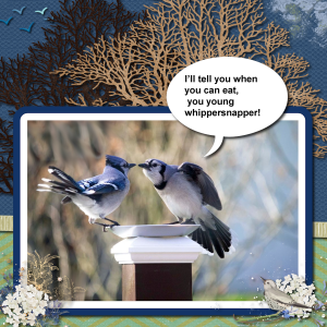
Speech Bubble Challenge: I started with the photo found on the internet and just let it flow from there. The photo frame is modified selections with flood fills and a little buttonize. I used elements from different kits: the trees-Vintage Memories; the flying birds-digidebdesigns; the clouds are a splatter from Choose to Shine; the clusters at the bottom are labeled Florju (?); and the ribbon-Somewhere in Time. The actual speech bubble is a shape from PSP 2021.
Oh, by the way, I’m trying out the 30 day trial of 2021 and it did a great job enlarging the photo 200%. It went from 960 x 640 to 1920 x 1280.
Now I’m ready for an October Challenge! 😉
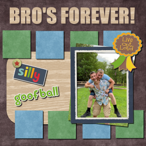
Here’s my final submission for this class. I was looking for an interesting photo to feature and these goofy guys filled the bill! This is my grandson in front horsing around with his soon-to-be brother-in-law who is also the soon-to-be Daddy from the gender reveal. We were at the engagement party for my oldest granddaughter and her fiancé.
I used papers from Somewhere in Time and the word art is from the Frootloop kit. The font is Impact which I played with by duplicating it and coloring the dupe with the darkest shade from the background and positioning it like a shadow behind the tan title. I wanted to make it look like the wood had some thickness. Flowers and bows didn’t seem to fit the theme so I gave them a ribbon award from the Exuberance kit instead.
Most interested to see the results of the contest on Monday! Good luck, everyone!!
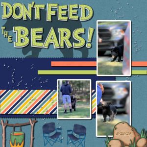
Day 9 Project #4 – But it’s not Bees, it’s Bears! This incident happened last Sunday at my grandkids gender reveal party. We were out in the woods and black bears are common in the area. Interacting with wild bears like this is definitely a no, no! The animal, more likely than not, becomes used to human contact; repeatedly ventures close to homes and ends up euthanized because the homeowners are frightened by this persistent bear. My daughter, in blue, reached out to the bear and he snapped at her arm but, luckily, just grabbed her shirt! My grandson, in shorts, really started the trouble by enticing the bear closer instead a chasing it away, as he should have. My other, older granddaughter, who is a wildlife biologist gave him “HECK!” She did call the wildlife people and they said, just shoo it away, so we did by banging pots together and using a long pole to push it away. It eventually left, meanwhile I was shooting a video, which is where these stills came from.
I started with a kit called Somewhere in Time but added to it from one called Adventure Time. I found the bear silhouette on CleanPNG.com but it was persistently insisting on having a green background, though it looked white or transparent in my files. I would select the bear and copy/paste as a new layer and the background would be there too! I finally selected the bear and CUT it from it’s background and pasted as a new image just to test it and that worked!
I used the Adjust/Depth of Field tool to isolate the bear a bit and blur the busy backgrounds in the photos. You won’t find that paper with that striped pattern anywhere because I took one from the kit and changed all the pink stripes to dark blue. And I used the Effects/3D Effects/Chisel on the date on the rock, with just a hint of a white shadow that made the text pop.
The title is an alpha from the kit that took some fiddling to get it to fit. The apostrophe in DON’T is the top half of the exclamation point reduced.
Enjoy, but remember, DON’T FEED THE BEARS! 😉
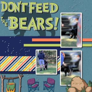
EDIT: I couldn’t take the color of the chairs any more so I pulled them back and filled with dark blue sueded texture.
Attended my granddaughter’s gender reveal party on Sunday and got some good photos and videos on my iPhone. The center photo is a still but the other two are clipped from the video. I wish I knew how to safely enlarge them. They led to this Bootcamp layout that illustrates their joy! A young black bear wandered into the celebration, looking to share the delicious BBQ! You can see him on the bottom left. 😉 I used the papers and alpha from the Somewhere in Time kit and the text is Bradley Hand which needed to be heavier so I added a stroke in the same black and that did the trick!
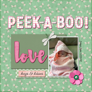
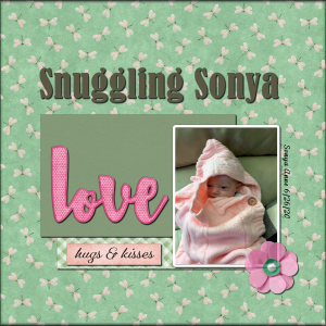
Here’s my Adventure project with a new photo of baby Sonya who is now almost 3 months old. She got a little buried in my daughter’s sweater, as you can see.. all snuggled up!
Carole: Here’s another version based on your comment! Good idea! I also faded the pink flower using the brightness/contrast based on a mention of it by Sue Thomas in the Facebook group. Much better than reducing the opacity.
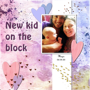
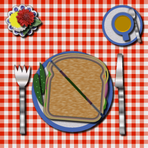
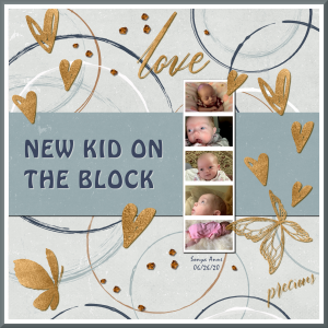
While waiting for the next assignment, of course I tweaked the table/sandwich and the New Kid on the Block. With the table I totally forgot to use shadows. It makes a big difference! Just a few little tweaks on New Kid (forgot a shadow on the lower heart). Here they are:
Euca Euca: I decided you must be in the Southern Hemisphere: Australia or South Africa to be experiencing Spring now. We have Fall coming in and the leaves are turning.
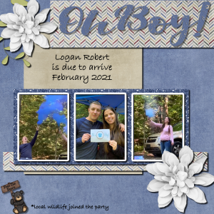
With 2 new great grands and another on the way I’m awash in babies! Sunday is the gender reveal for the one due early February. Here is the one born first, early June. In a previous layout utilizing the film strip I did a New Kid on the Block for Sonya, so now here is one for Magic. I think I’ll post both so you an see the different layouts. Sonya is gray and Magic is pink.
Learning to use the Change to Target brush:
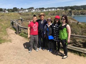
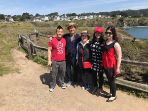
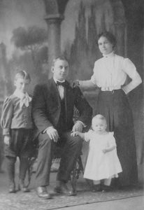
Here’s a family photo with my granddaughter, Anna on the right and her husband, Tj , on the far left, when his parents and sister visited from South Korea. I color changed Mama’s handbag from red to blue and I changed Anna’s dress from red to green.
I will post both photos so you can see the color change.
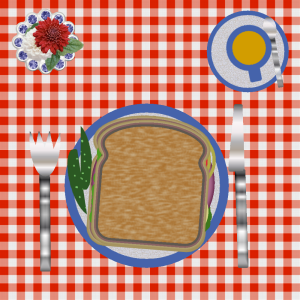
Lunch is ready. I used a gingham paper I made in The Lab for a tablecloth. I reduced the plate and duplicated it to make a saucer for the cup and then filled both with a texture called Cracked Paint which I reduced to 25% so it just resembled rough pottery. I filled the center of the cup with a coffee color and I filled the utensils with a silver gradient and reduced the size of the spoon to fit the saucer. Filled the bread with a textured color to resemble wheat bread and cut the pickles in half and put them on the side of the plate instead of on the sandwich. I then hunted down some flowers, leaves and a dish for the arrangement on the top left.
Peter Pan: I wanted to try an experiment so I borrowed your photo. I found a new tool to improve photographs under Adjust/Color/Fade Correction so I tried it on your photo. Here is the result.
Hi Everyone!
Here I am back for a second round of Bootcamp. I now have a Diamond membership but know that I work better with formal assignments and seeing other’s work inspires me! Not sure what photos I’ll be using; my daughter wants me to do an “album” on the newest great grand but I don’t have the photos yet. I may try to use some of the old photos I’ve been working on for Ancestry. This is an old photo of my aunt on my father’s side. She was born in the late 1800s.. my dad was born in 1892 and he was second youngest of seven.
-Annie =^..^=
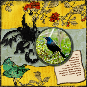
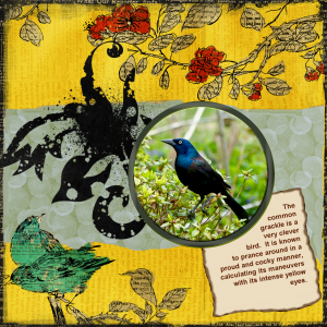
Trying my hand at a full bird layout. The Common Grackle is a good bird for Halloween.. his eyes are spooky!
EDIT: Oops! Forgot to do shadowing. This looks better. BTW, the flowers and lower left bird are part of the background paper.
Sue: The September Song was recorded by both Frank Sinatra and Willie Nelson, according to Google. Hope this helps.. beautiful layout.
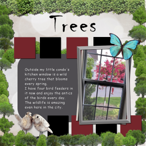
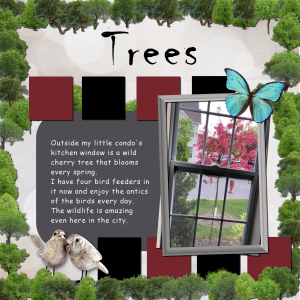
My Trees layout uses Cassel’s Picture Tube.. which is listed as “cass” ..not “trees” .. I think I went a little overboard!
Wonderful story, Ann and a beautiful layout. I love the colors!
Did a TREES layout for Sept based on #5 beginners. The trees are from Carole’s Picture Tube and I had a hard time finding them. They are listed as: cass-trees and not in the Nature folder.
I live in the city and am constantly amazed how much wildlife I see here! As you can see, I like dramatic color! I had to make my own picture frame.
O = Olive Tree
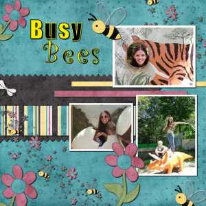
My latest lesson work: Quick Beginner Scrapbook Project #4 – Busy Bees. I’m not much of a photographer though I do have a huge trove of black and white snapshots from the 1940s which is not much help in these projects. I ended up raiding my granddaughter’s Facebook photo collection. These are where she was at a local zoo goofing around in the kiddie park. She was stunned when I sent her the layout! 😉 She’s 19 weeks pregnant now and all she was saying is “look how skinny I was!” 😀
I got a bit creative with the title; left on the stroke with the yellow and black motif. I like the effect. Added more elements than were called for because my photos were kinda small for the 3600 dimensions. Here’s a reduced version..
Beginners Scrapbook Project #4
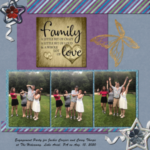
Cassel did Friendship..I did Family
These photos are from the recent engagement party for Jackie and Corey. These kids are Jackie, the bride-to-be, in white, with her TALL brother Tyler, pregnant sister Ilana and step-sister Katie (in red shirt). What they were doing? I have no idea (and I’m afraid to ask!) lol
The gold plaque in the center is from the internet when I was looking up a saying for Family and I liked the design so much I added it to my layout.
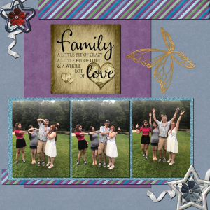
EDIT: The reduced version somehow lost the text at the bottom. Here’s the revised upload..
-
AuthorPosts
