Forum Replies Created
-
AuthorPosts
-
Sue: I did as you suggested and followed one of Carole’s tutorials on extractions and ..voila! Here is the same bird from before, extracted, duplicated and telling their story. 😉
Sue: That Christmas card is beautiful! Every element is so well coordinated. I particularly like the corner decorations. And of course, the blue jay could be here, right outside my window in the wild cherry tree, with the evergreen nearby. I long for a camera that would create the blurred effect behind the many birds I try to photograph with my iPhone. My neighborhood is far from serene. I lived in the country for years and am now recently back to city/suburban living which I enjoy as that is the atmosphere I grew up in.
Here’s an example of what I have to deal with when I photograph birds here from my kitchen window. I haven’t seen this mockingbird recently, hopefully in the spring:
MoniqueN. I see what you mean but unfortunately, there is no option any more to edit my post. I already did edit that one and I may not get another chance or maybe, too much time has passed. Thank you, anyway.
¯\_(–)_/¯
Sue: I think moose look so comical!
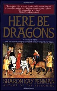
What I know of Wales I learned from reading Sharon Kay Penman’s Welsh Princes Trilogy: Here be Dragons, Falls the Shadow and The Reckoning.
I loved learning about Llewelyn, Prince of North Wales and his marriage to the English King John’s illegitimate daughter, Joanna, supposedly to secure a peace after years of conflict. Exciting stuff in the 13th Century!
MoniqueN. – Thank you for your advice. Unfortunately, I couldn’t find any small cross. I know Carole said she is the only one who can delete an image.
Lynda: Neat the way the wine glass shape became a cocktail glass – with a cherry!
Sue: In reading your post again, I focused on your city, Saskatoon. I looked it up and you are a little over 1700 miles from me here in New York, but just the name, Saskatoon, sounds more like some exotic location in the far reaches of the Canadian wilderness! I love the wild west so you’re probably living my childhood dream!
Karon, I just saw your Crow and Cackle but couldn’t read it off your layout, so I copied it off the internet:
“The Dear Hunter:
“Crow And Cackle”The Crow and Cackle of persistent innocence.
Elated in argument.
I’m empty and wondering
if you’re only saying what I wanted you to say.Cause you’re only saying
what I wanted to say.So I’ll just wait until our time
Slips through the cracks
fall to the ground
shattering. I’ll just keep
waiting for something to improve.
Something to move ahead.Cause I’m only saying
what you wanted me to say.The slow and steady sound of silence
hunts us down.
I’m empty and wondering
what you sent me, what you’re offering.”Your layout is really nice and the lyrics are also.
Lynda: Yes, I just read his book “And the Answer is… ” That photo is from the cover of the book. In it he confesses that he was happy to don a hairpiece when he did chemo because he was losing his hair anyway. He said..”wish I did this sooner!” <3
Still revising my Drinks layout..I took inspiration from Lynda and embellished my drinks shapes and added a can of my Folgers coffee to match the bottle of my 14 Hands wine. LOL.. these drinks are very personal for me.
I’m also sad as I just learned that Alex Trebek, the host of Jeopardy! has passed away today. My all time fav. :'(
Oh, sorry, I forgot to scale the picture of Alex Trebek.
Re-posting with changes.
I followed Carole’s directions for embellishing the wine glass and coffee cup shapes.
EDIT: Revised my layout inspired by Lynda and please give me a new assignment! With the two side by side you can see the little adjustments I made. I just can’t help fiddling….. lol
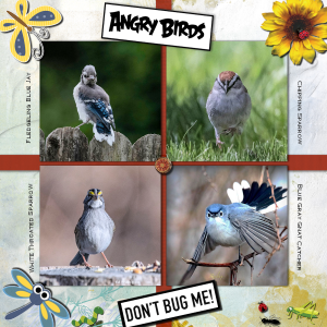
I was in the Lab yesterday, making grosgrain ribbon. Most ribbons in kits are not perfectly straight and do strange things as borders. I made some straight ones. I also played with some Angry Bird photos. Take a look.
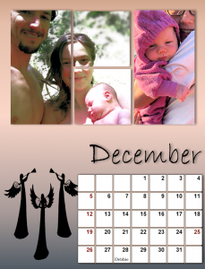
Bonnie: Your calendar is so enjoyable! The friendship and love just flow from your pages. I particularly liked the December color layout. Hadn’t seen a calendar page with white type and art before. Well done!
This past 2 weeks have been intense with 13 pages to create that I feel a distinct loss .. a letdown.. with nothing in the pipeline..yet. In hopeful anticipation for the webinar on Sunday and whatever November brings from Carole.. !
=^..^=
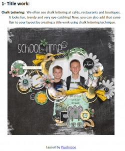
Carole/Cassel: I was interested in Lab 10 Module 3 – Experiment 1 – Title Work – Chalk Lettering
I don’t see any tutorial or directions to achieve the chalk effect on The Lab Campus page or the PDF.
What did I miss? Here’s the layout that is displayed but no info with it:
Jnet: That is the way I do it for one photo behind multiple masks. It works for me.
James: Thank you for taking the time to address my print problem. I may just punt the whole job to my daughter in CA. She’s a professional architect and also a professional in fine arts so I’m sure has access to better printing than I have, or at least knows more, in any case.
Sue: I just saw your post. I’ve had the dark effect before with photos of people. I rarely print anyway, just this calendar seems to call for it. As I said to James, I think I’ll let my daughter take on the chore..it’s for their family, anyway.
And I love your Orb Spider.. (I have a soft spot for spiders, myself). I haven’t seen one here in the city but used to get one every year just outside my back door at my previous abode in the country. I’d carefully open the door so as not to destroy it’s web.
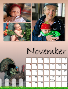
Here are my November and December. The turkeys and fence decorating November are Picture Tubes. The blonde holding Magic in her strawberry cap is my daughter, Debbie. Her birthday is slotted in on Dec. 28 and she’ll be turning 60 this year.. my now I feel old!
As I mentioned on the Facebook page, the technique I use to display one photo in several adjoining frames is to place the same photo into each of the masks and use the pick tool to carefully align them. If there’s as easier way I’d be delighted to hear it!
Also, moving forward, if anyone prints your own calendar, which I might do, what size and quality of paper do you use? I tried on some Epson Premium Presentation Paper MATTE 44 lb. which is 8″ x 10″ but the print always came up short, cutting off the bottom. I have an Epsom Workforce Pro printer and most of my printing comes out dark, especially people’s faces. Any suggestions?
Everyone’s pages are awesome! I’ve been basically trying to use up all the baby photos flowing from No. Cal. before the holidays hit and the next influx of photos begins. lol
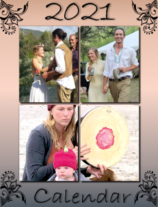
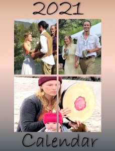
Just finished (hopefully) my cover. I hope everyone changes the date to 2021 😉
I knew I’d be tweaking and after consulting with the California crew, here’s the final cover..
Print it, they said! 😉
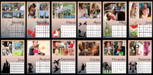
Here is my Lennox family calendar (my kids on the other coast) They will be small but hopefully you’ll get an idea of my theme. I have yet to do the cover. Probably not until tomorrow. Lynda and Sue your pages are so gorgeous! You inspire me!!
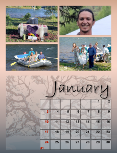
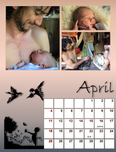
Been so busy tweaking all the months that I never even started Nov/Dec yet. But at least now I have a format I like and I’ll post the first four months to start.. Jan/Feb/Mar=grandson Will’s wedding and Apr/his new baby Magic for the rest of the year..
Thank you to whoever mentioned Pixabay.. that’s where I’m finding my illustrations for each month. I have added shadows but doubt the photos can be done as they are large under the masks.
Lynda, I’m enjoying your beautiful calendar progression.
I particularly like the emphasis on Feb 18, because that’s MY birthday, too! 😉
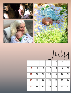
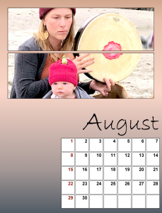
I was not happy with the photo quality on one from May so I changed that. Also here are July and August.
I’ve been longing to use the drumming photo as I think it’s classic of their lifestyle in No. Cal.
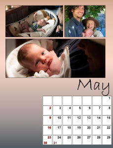
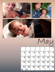
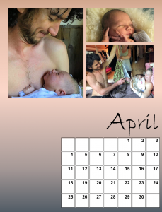
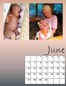
Hi everyone. Here are April, May and June. Now we’re into Baby Magic, three years after the wedding. The other person in these photos is Nana Deb. She is Magic’s grandmother, Will’s mom and my daughter! Now the setting is Comptche, Northern California, just in from the Mendocino coast, about 3+ hours north of San Francisco. So far the fires haven’t touched them. It’s really damp there from the ocean though the air quality has suffered.
So far I’m sticking with the same gradient background and keeping the Bradley Hand font, though I did increase the size of the first letter of each of the months.
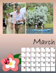
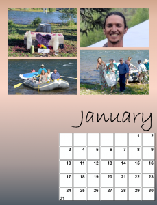
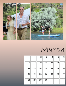
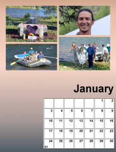
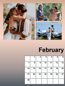
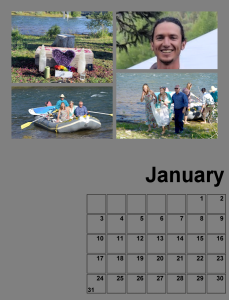
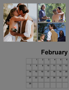
Ok, here’s what I have so far for Jan, Feb and March. April onward will be baby Magic. These wedding photos are for the ages with all the chanting and rafting back upriver after the ceremony. The reception was held out in the woods in Colorado with lots of tents and mosquitoes. That tall handsome groom is my grandson. 😉
I changed the font on the month name to Bradley Hand. The gradient background is Rising rotated 180 degrees. I think that split screen effect came out pretty good, a first time for me.
Did the background for Jan and Feb with a gradient called Rising. And I selected the area of the calendar and filled it with white. I changed one of my photos; in Feb I added a photo of the happy couple boarding their raft to leave for the reception.
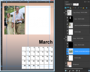
I did fill the background on March and April but I got confused with the photos for March. The layers had lots of PHOTO HERE directions so I thought I’d wait for Carole/Cassel to explain.
Carole/Cassel: I did try adding photos to March and something isn’t working right. I used 2 photos: one for the right area and one that I placed twice for the 2 left areas. The left areas worked out fine but the photo for the right will NOT show up, for some reason. I’m attaching a screenshot to show what I’m dealing with. Help!
After a lot of fiddling with photos I am satisfied so far with these from my grandson’s wedding. I traveled from NY to Colorado to be with them. It was awesome! As you can see, the bride arrived by raft.
Hi everyone. I’ve never done a calendar before so this will be something new and different for me. I have a ton of photos of my now 4+ month-old great-grand in California that I didn’t know what to do with so I think this will use up quite a few.
Carole/Cassel: Will we be posting our work in here as we go along?
=^..^=
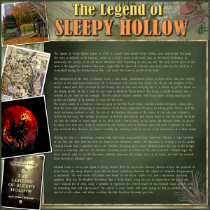
Finished my October Color Challenge, and it was a challenge to use those colors! My theme is The Legend of Sleepy Hollow which was a story written by Washington Irving, of Rip Van Winkle fame. Sleepy Hollow is an actual village not far from me, south of me, near Tarrytown, NY. This entails a lot of journaling which I will post separately also. It may be hard to read in the reduced version for The Campus.
Here’s the text:
The Legend of Sleepy Hollow
The Legend of Sleepy Hollow begins in 1790 in a small town named Sleepy Hollow, near modern-day Tarrytown. The town is believed to be haunted, owing to a witch’s curse in the early days of the Dutch Settlement, or potentially the sorcery of an old Native American chief, depending on who you ask. The most feared spirit in the town is the legendary Headless Horseman, supposedly the ghost of a Hessian mercenary who lost his head to a cannonball during the Revolutionary War, and roams the town in search of his head.
The protagonist of the story is Ichabod Crane, a tall, lanky, schoolmaster prone to superstition, who has recently arrived in the town from Connecticut. He is infatuated with Katrina Van Tassel, the 18-year-old daughter of the town’s richest man. He’s attracted by her beauty, but he also sees marrying her as a chance to get his hands on the family wealth. He has a rival for her hand in Abraham “Brom Bones” Van Brunt, a rowdy drunkard who is beloved by the town for his strength. The two quickly become enemies, with Brom Bones pulling mean-spirited pranks on Ichabod in an attempt to scare off his rival.
The rivalry comes to a head at a harvest party at the Van Tassel home. Ichabod attends the party, eating more than his share and attempting to woo Katrina. Brom Bones captivates the party by telling ghost stories, with the locals becoming involved as well. The tale of the Headless Horseman is the center of the tale, and Ichabod is rattled by the story. His attempt to propose to Katrina goes poorly, and having failed to win her hand, he heads out into the woods to return home on his horse with a heavy heart. As he travels the distance home, he passes by many sites that were listed as haunted by the revelers, and he becomes more and more frightened of what may surround him. However, he doesn’t actually see anything, until he arrives at an intersection in a dark swamp.Waiting for him is a mysterious, cloaked rider who seems unnaturally large. Unnerved, Ichabod is then horrified to see that the rider does not have his head on his shoulders. Rather, the Horseman is carrying it on his saddle. Ichabod breaks into a panicked run as the Headless Horseman gives chase. Ichabod makes his way to the bridge next to a cemetery, and sees the Headless Horseman vanish in a flash of fire and brimstone. Ichabod urges his horse onward, only to see the Horseman suddenly leap over the bridge, rear up his horse, and hurl his severed head directly at Ichabod Crane.
Ichabod Crane is never seen again in Sleepy Hollow. With his mysterious absence, Katrina accepts the proposal of Brom Bones, who many observe seems like he knows something whenever the subject of Ichabod’s disappearance is mentioned. The only traces of Ichabod ever found are his horse, saddle, hat, and a mysterious shattered pumpkin. Who was the Headless Horseman? Was it Brom Bones, using his size to impersonate the ghoul and scare Ichabod out of town, using a pumpkin to represent the severed head? Or was Ichabod Crane spirited away by something dark and supernatural? The answer is never found, with some saying he fled to another town and married a rich widow, and others insisting that the Headless Horseman got him.
Thanks, Carole Cassel! I was looking forward to another color challenge. I enjoyed the Sherwin Williams Perle Noir. Yes, the color was challenging; that’s the idea, right? I already did one with a Fall theme with Coat of Many Colors for the Shania Twain Song Theme. I’m going to try to use these colors in something other than “boring” Fall.. 😉 (off to sort photos >>>>>>>>>>>> )
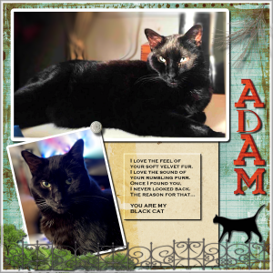
Here is Adam, the companion piece to Eve. He’s her big brother and we adopted him first. He had languished in a shelter for two years from early kittenhood. Black cats are usually the last to be adopted. 🙁
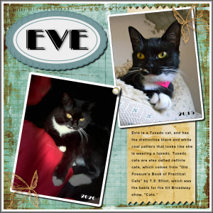
I decided to look up Jellicle Cats. Here’s the definition: The name “Jellicle” comes from an unpublished poem by Eliot entitled “Pollicle Dogs and Jellicle Cats”, where “Pollicle dogs” is a corruption of “poor little dogs” and “Jellicle cats” of “dear little cats”.
=^..^=
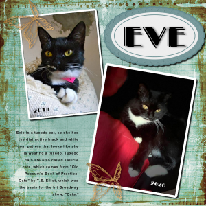
I did a complete revision of my EVE layout and am now happy.. swapped the photos so they face inward, added a paper strip behind the journaling but had trouble with the jagged border. Added a brad to tie down the photos and a white border that I buttonized.
Carole Cassel? I seem to recall using the eraser tool set to 45 degrees to create the jagged border. Clicking on one corner and holding down the shift key when touching the opposite corner. It didn’t work for me in PSP2021! In fact, it erased the entire edge of the paper without any cutouts. I ended up clicking for each diamond all along the edge of the paper. What did I do wrong?
It’s the 5 year anniversary of Eve’s adoption, aka Gotcha Day! I did a pretty little layout showing her then and now. Nothing really fancy, just showcasing her photos. The photo on the right where she’s on my shoulder was more or less a kittie selfie! My iPhone XS has a Portrait mode and you can choose the light level so this is Stage Light.
-
AuthorPosts


