Forum Replies Created
-
AuthorPosts
-
Masks? Oh, good! I need more practice with them and I’ve seen examples of how awesome they can make a layout.
Speaking of snow: we got about 32″ which is a record for us going back to the 1960s!
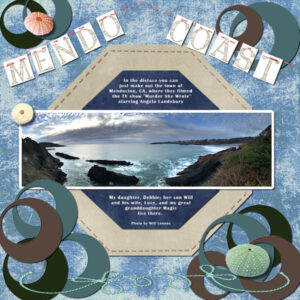
Basic Scrap Course: Module 5 – My grandson sent me a photo he took of the Pacific Ocean and his coast in Mendocino. Enjoy..
C = Christmas Card
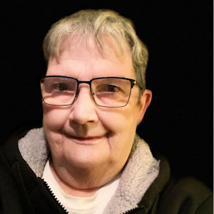
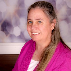
Hi Carole: I just spotted this link in the Forum this morning.. here’s me 😉
Karon: Thanks for your kind comments but make that GREAT Grandmother.. I’m the elder in the family. 🙂
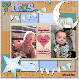
Basic Scrap: Module 4 – My great-granddaughters are now 7 months old (hard to believe!) I need to practice for the next new baby’s arrival; we’re expecting a boy in early February! Here are Magic and Sonya.
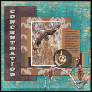
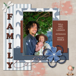
Module 3 of the Basic Scrap Course, 2nd time around. This is titled Concentration and features the Short Eared Owl, common here in Orange County, NY. The background paper from a kit: Life Montage, the frosted branches lower right is the new Corel freebie: overlay. The title font is Wide Latin, doubled and shadowed. The owls were photographed by Joseph Licari for The Hudson Valley in Pictures. I’m also posting the same exercise from June 2020 so you can see the difference. Its title is Family and is the first photo of my grandson, his wife and my first great granddaughter, Magic, who was born June 4.
Not sure if you’ll be able to read the small text in the owl layout to I’ve posted it here, also:
The short-eared owl is an open-country hunter and is one of the world’s most widely distributed owls. They course silently over grasslands on broad, rounded wings, especially at dawn and dusk. They use acute hearing to hunt small mammals and birds.
-
This reply was modified 3 years, 11 months ago by
Ann Seeber.
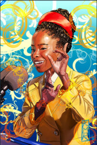
Lynda: The artist Kevin Michael Roberts has created a portrait of Amanda Gorman that he has for sale. Here’s a peek … prints are available at gumroad.com
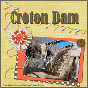
Here’s Module 2 of the Scrap Course, featuring Croton Dam (photo from The Hudson Valley in Pictures). Used the kit: Let’s Shop + bits and pieces needed. No real special techniques, just playing with papers and colors, etc.
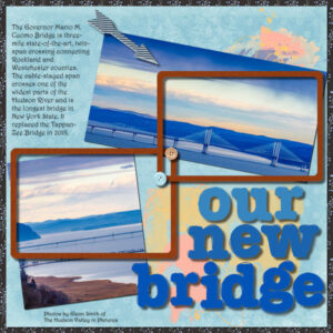
Trying the Basic Scrap Course again, just for layout ideas. This is Project #1 which I titled: Our New Bridge. It’s about 45 minutes from me towards New York City and I think it’s very handsome! I used the suggested kit: HeatherT-Love Spoken Here. I changed a lot of the colors (as usual) and filled the frames with a wood tile pattern. Didn’t like the arrow so found a different one in my “stash.” The photos are by Glenn Smith from the Hudson Valley in Pictures group. The alphas are from the kit but I changed their colors. The font is Harrington. Dunno what happened to my text but when I scaled down the vector text blew up full size of the page! LOL I backed out and reset the text to raster and hid the vector. Then it worked ok. 😉
Cassel: Interested to see if you get this post. I posted a question to you and when I hit SUBMIT it dropped me back on the blank page again……. I tried in Edge and Firefox with the same result each time… ???
Edit: I see it showed up when I posted this and now it shows previous page numbers, which it didn’t before.. *shrug*
-
This reply was modified 3 years, 11 months ago by
Ann Seeber.
Cassel: I got the email that you had released Annie’s post but when I clicked on the link in the email it dropped me on What are You Working on (January) page that was blank, with no posts… ?? I finally had to use a bookmark I had for the previous page to see any posts at all…..
Annie T / Carole Cassel: I’m looking for your posting about that Transparency plugin (#52123) but it’s not here?? Should be on this page looking at the numbers but they skip from 107 to 144 ??
Michele: I love your work! The POW! aspect speaks to me! 🙂
Cindy: Your work is AWESOME! So glad you got it done for the draw. I see one little tweak I hope you can make: the word Disguises needs a G between the S and the U, other than that, everything looks perfect to me. I have a big black cat named Adam who thinks he’s a black panther so I know how you feel about Bruce Lee. Take a peek 😉
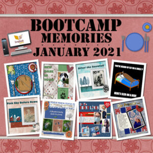
Playing with Carole’s yearly roundup template; I made a memory-lane for the Bootcamp class.
I’ve been playing with Carole’s template for last year’s memories and turned it into a Bootcamp Memory of my own work. I think it came out pretty nice. First time I tried a layered paper from one of my kits. Enjoy!
Lynda: That’s beautiful. She was wonderful, wasn’t she!
Clarine: the action is to HOLD DOWN the CONTROL key and tap the “C” while the Control is held down. Same with pasting: Hold down Control and hit “L” to paste to a new layer. Hope this helps..
-
This reply was modified 3 years, 11 months ago by
Ann Seeber.
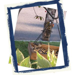
Reading through the comments, I had a thought so I tried an experiment. I opened a small canvas 900×900 and added a photo as a layer. Then I went to Image/Picture Frame and following the directions there, chose a frame for my photo, making sure it was just on the photo layer. I was pleased to see the frame came in on it’s own layer, which I could manipulate with the pick tool, just like the last design of this Bootcamp. If you ever can’t find a frame in a kit, look in PSP. There are quite a few available! Here’s a graphic of it.
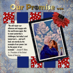
My final design for January Bootcamp. I just had to do something to celebrate our new president. I call it Our Promise..
My final design for January Bootcamp. I just had to do something to celebrate our new president. I call it Our Promise..
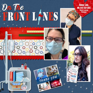
Finished my latest Bootcamp assignment; a tribute to my granddaughter, Anna Lee, for her steadfast work at her hospital fighting Covid-19. She works there as a Speech Language Pathologist ordinarily but has been recruited to care for Covid patients due to the facility being overwhelmed there in California. Anna gets snarky about following the “rules” to defeat the pandemic as she sees the results of the virus firsthand.
I found this kit: DC-Emergency Hospital which is not up to the standards of the usual kits we use but I needed specialized elements. The papers in the kit are only 800×800 but I did use the red one on my design. The Thank You art is from a Google search and is from the White Ribbon initiative to thank healthcare workers. The bottom photo of Anna has her holding a list of protocols but it was actually a drink cup with a straw that I operated on and added a big tag from my stash.
I’ve had this in the back of my mind to do for awhile: a tribute to my granddaughter Anna Lee who is On the Front Lines in the fight against Covid-19. Though she’s a Speech Language Pathologist, she’s also doing double duty in the Intensive Care division because her hospital in California is overwhelmed. Anna is married to a software engineer who works for Google.
I got a kit called BC-Emergency Hospital and though a lot of the pieces were pretty lame (the papers are only 800px) I don’t think I would have been able to do this without it. I got the White Ribbon Thank You graphic from Google. The main title font is Stencil.
Annie: What beautiful colors! What interesting plants! What a terrific layout! It may be I need new glasses but I can’t read the text on the right in the tan circular tag. If that’s the Harriman system font, I had trouble with it when reduced so I had to go in and add a raster layer version and then I could read it when scaled down to 600.
Minka: What a charming fox! He looks happy and healthy there with a flourishing coat.
I have a friend in our State of Virginia who puts out dog kibble near their dens in the winter and occasionally a chicken with de-wormer injected to keep her foxes healthy. And she’ll trap them with a humane trap to give them rabies shots every 3 years or so.
Love the layout you made for Henri!
Christina: That travel layout is FAB! How did you get that background specifically for Turkey? With the photos arranged around the globe like that the whole thing is very effective. I see you’re a Super Fan so you’re more experienced in PSP than I am. I just started doing layouts in June of 2020. At that time, Carole was hosting a Travel challenge and I started out doing double pages; 7200 x 3600, and then in order to post my work here I had to figure out how to cut each page in half! *awk! 🙂
Michele: As I said on Facebook, I look forward to your creations. I’m a fan of illustration and, especially your Sunday Stripes is “POW!” 🙂
I’m with Annie … I couldn’t find your “boo-boo” either! 😉
(wondering how I’d look with blue hair…. )
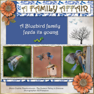
My submission for the Jan. Bootcamp assignment “Friends.” I chose to do a “A Family Affair” of a Bluebird family feeding their kids. It was lots of fun. My photog friend, Ed Frampton, initially dubbed the center photo: “Bluebirds Discussing the Housing Crisis”
Edit: I changed the swirl under to the top left flower to the leaves from the same kit.
-
This reply was modified 3 years, 11 months ago by
Ann Seeber.
Hi Everyone! Here’s my take on Carole’s Friendship page. I turned it into A Family Affair for some Bluebird photos I got from a friend. I admire his photo skills. So, this layout includes:
- Three bluebird photos from the Facebook group: The Hudson Valley in Pictures, photos by Ed Frampton of Poughkeepsie
- The font for all text is Harrington
- The flower is from the kit: All That’s Fall
- The swirl is from the kit: Somewhere in Time
- The pale background paper is from the kit: ALA-Hygge
- I made the blue paper by choosing a color from one of the bluebirds
- I have a folder with many glitter files; this one was the palest and then I used the color changer to replace any dark gray flecks with the blue of the paper.
- The flying birds are from a kit: It’s Beachy
- The tree is from Corel’s Winter Clip-art collection
- The blue and white paper was in my folder with no label. When I went to use it, it turned out to be on a transparent background, like an overlay, so I added a layer underneath and flood-filled it with white.
Thanks for any feedback!
(Ed said he tagged the center photo: “Bluebirds discussing the housing shortage”) 🙂
Edit: I discovered that scaling down to 600 px from 3600 tends to make the small vector text break up so I went back and duplicated the vector layer and chose “convert to raster” on that layer in my .pspimage file. I made a new 600 px version for here. You can now read the text at the bottom.
Edit2: I found I disliked the golden swirl under the top left flower so I found the matching leaves from the same kit and now feel much better about it.
-
This reply was modified 3 years, 11 months ago by
Ann Seeber.
-
This reply was modified 3 years, 11 months ago by
Ann Seeber.
-
This reply was modified 3 years, 11 months ago by
Ann Seeber.
-
This reply was modified 3 years, 11 months ago by
-
AuthorPosts
