Forum Replies Created
-
AuthorPosts
-
What a beautiful dog, Marie-Claire! I take it your design uses a photo from when he was a puppy. That color works very well.
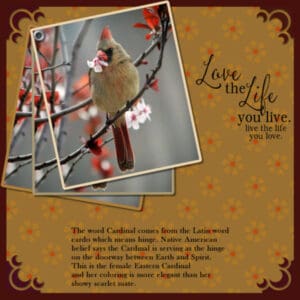
Here’s my take on Tarnished Trumpet colors. I made the background by using the brush in a flower shape and then filling the center of the flower with a color from the flowers in the photo. I then applied soft light. The corners are also brushes which did not want to cooperate. They would not stay the same size, so I ended up with each corner on a separate layer so I could use the pick tool on them. I then added an under-layer in the same color as the corners and pulled in the original background to leave a border. The photo is from the Hudson Valley in Pictures. The word art was in my stash and the little mythology about the Cardinal I found using Google.
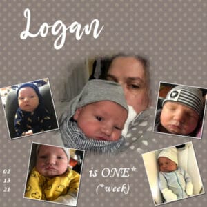
Carole/Cassel had us making polka dot backgrounds with our final mask assignment for the Love Story Challenge. Here is my latest great-grand.
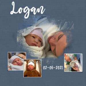
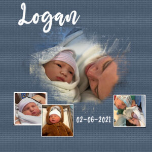
And here is my final. My granddaughter, Ilana, gifted me with 5 photos of Logan for his one week anniversary so of course I had to use them all. Ilana was hugging a gray polka dot blanket so I sort of copied that for the background.
-
This reply was modified 3 years, 11 months ago by
Ann Seeber.
Carole/Cassel: My linoleum background color came from the foam on the waves x 12 repeats! 🙂
Wonderful work everyone. Amazing what I can learn looking at your work. I think all our designs have taken a giant leap upward in quality with this intense week of masks!
Happy Valentine’s Day!
Here’s my Lesson #6 in the Love Story Challenge. We’d hit Acapulco every January for a week; our break from the cold and snow. These classes with masks are really good and I love the minimal designs you can create.
I did a large travel challenge last year featuring Acapulco, Mex. but this is another photo from the original trip in 2008. I just love that beach; we’d hang out there all day with beach boys waiting on us hand and foot. I added the pelican photo-bomb! The frame reminds me of a camera lens. The “linoleum” background can be the foam on the waves or the snow at home here now! The font is Mama plus two beachy embellishments.
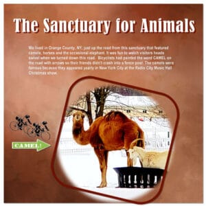
Here’s my Lesson #5 in the Love Story Challenge which features an animal sanctuary that was near where I lived back in 2004-2008. No matter what I tried using various brushes to add to the mask just didn’t look right so I went with a frame, instead. The background is a paper I had in a Fall kit and, this time, pasting in text to a selection rectangle finally worked for me! It’s hard to see on the Forum but there’s a white border all around that I make with an extra layer under the paper and then “pick” the paper layer in on each corner. I’ve learned it’s best to use guides so things come out even.
Really enjoying seeing everyone’s work. It’s all quite inspiring! Here’s my Lesson #5 which features an animal sanctuary that was near where I lived back in 2004-2008. No matter what I tried using various brushes to add to the mask just didn’t look right so I went with a frame, instead. The background is a paper I had in a Fall kit and, this time, pasting in text to a selection rectangle finally worked for me! It’s hard to see on the Forum but there’s a white border all around that I make with an extra layer under the paper and then “pick” the paper layer in on each corner. I’ve learned it’s best to use guides so things come out even.
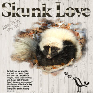
Wanted to share some Skunk Love here; an extra I crafted between lessons on the Love Story Challenge.
“Although New York’s striped skunks retreat to winter dens and remain inactive for extended periods, they do not hibernate. Males are particularly likely to be active aboveground, even during cold weather, especially during the breeding season. So, if you have been seeing more skunks out and about lately, that could be why.”
Info and photo from the NY State Department of Environmental Conservation.
I found this picture and write-up about who else celebrates LOVE on Valentine’s Day and I couldn’t resist doing a design. This guy looks just like the family that came visiting last year. They all had a great deal of white on their back, not just a stripe. The amazingly appropriate alpha is from my Rustic Reflections kit; the paper and embellishments are from the PBS Valentine kits for this class. Love certainly is “in the air!” 🙂
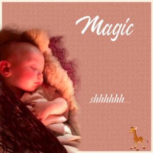
Babies again.. Magic was sleeping in a hammock.. shhh..! 🙂
I took a color from the photo and created the background paper with texture and a little noise. Used one of the watercolor brushes to make my own mask. Doubled up on the background to add the white border. The font is Wakanda.
Picked up some fun Valentine’s Coloring Pages from the Corel Freebies. It is a bit psychedelic! I don’t believe how fussy I was with this! 😉
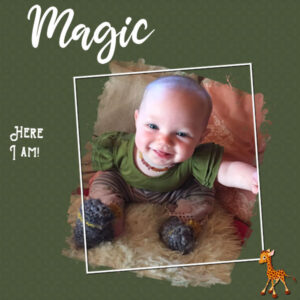
Here we go, great grand Magic said it was her turn for a mask! lol
Made the background paper using the Kaleidoscope tool; the fonts are Mama and Pirate Bay. I hear tell Magic’s totem is the giraffe, so here we are! I even remembered to give the frame a shadow… 😉
Sue, I did it! Created the frame I wanted. Soon I’ll post the new design. Thanks for your help!
Thanks, Sue. I’m not sure where to place it in relation to the mask layers??
Just wanted to share that I just got an email from Marisa Lerin from Pixel Scrappers that they are trying out offering individual kits for sale without a subscription! This is good news for me. Hooray! 🙂
Hi guys.. HELP! I sent a message to Carole but she may be working. I’m doing Day 3 with one large photo with the mask but there doesn’t seem to be the white frame that shows on Carole’s and Jnet’s design. How do I do a white frame with the mask? Thanks for any advice!
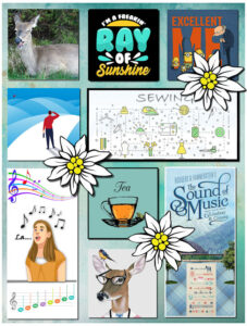
Do-Re-Mi-Fa-So-La-Ti-Do!
-
This reply was modified 3 years, 11 months ago by
Ann Seeber.
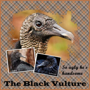
Working with masks in Lesson 2 of the February Love Story Challenge. Here’s an interesting bird. We also learned how to make a plaid paper to match the layout. Photos by Ed Frampton of Poughkeepsie, NY
Here is my day 2 with the template Carole gave us the link to. The photos are from Ed Frampton of The Hudson Valley in Pictures.. he’s a wizard! The main font is Wide Latin and I made the matching plaid background following Carole’s directions. Three black vultures at different stages of life.. the young fledgling is quite striking!
Carole/Cassel: You were right! It is now all ok.. thank you!
Annie: I like how the black and white photo works with the subtle colors of your design. Very nice! (Why does French make it more Romantic? 😉 )
Annie and Susan: Wow, your designs are delightful! Love seems to bring out the best in us! 😉
Gerry: Outstanding layout and sweet baby! Plenty of babies to go around in this class! 😉
Cassel said: Ann, if your background paper appeared on top of the photo, it might just be a layering issue in the Layers palette. Did you see where that paper ended up? Was it “stuck” inside the mask group? If so, you can just click it, and drag the layer below. But you will have other pages to practice!
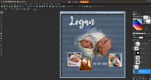
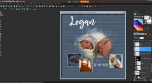
Carole/Cassel: Here are screenshots of my design. One with the background paper over the photo and one showing where the background paper was located on my layers palette; at the very bottom! *scratching my head over this* And I also don’t understand how my work-around with the photo shows up as a “promoted selection” ??
I struggled with the masks on the small photos. And when I added a background paper, it ended up on top of the lower left photo?? I ended up copying and pasting the photo over the top.. As you can see I copied Carole’s layout for our new great grandson.
Thank you, everyone, for your kind wishes. We are “over the moon” with the new baby 🙂
-
This reply was modified 3 years, 11 months ago by
Ann Seeber.
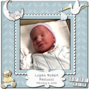
Guess what! Here’s a revised design I did for my granddaughter’s gender reveal. She’s in labor and Logan Robert will be here any hour now!
UPDATE: Logan arrived at 6am Sat 2/6 weighing in at 8lbs 3oz. Everyone doing fine!
-
This reply was modified 3 years, 11 months ago by
Ann Seeber.
Lynda: Staring Monday and in fits and starts that never really stopped until today (Wed morning). It’s pretty spectacular here!
-
This reply was modified 3 years, 11 months ago by
-
AuthorPosts


