Forum Replies Created
-
AuthorPosts
-
Susan, thank you! I uploaded the .png file to the Scrapbooking with PaintShop Pro Facebook page. It’s in the Files, at the top.
Michele: I love your Fab Divas! They always brighten my day!!
Just got August up to speed and I have a tip for anyone who wants to put the names of the days of the week over their calendar boxes. On a separate layer I used the text tool 7 times to write the days (MON TUE etc) and then I merged all the vector layers down to the raster layer and used my mouse to pull that layer out as a separate image. I saved it as a .png and have been inserting it into each calendar page instead of having to type them all over again! Neat!
EDIT: I will upload the file to our Facebook page so all can use it. It’s in black Arial all caps font.
-
This reply was modified 3 years, 2 months ago by
Ann Seeber. Reason: Announcement
Well, I did part of my homework. I did up July totally, so far, but now have to go back and revise the earlier pages.
As a side note, if you were wondering how I get color under the mask. I use the PHOTO HERE layer and apply a color while also reducing the size of the photo a bit with the pick tool.
-
This reply was modified 3 years, 2 months ago by
Ann Seeber.
Wow, thank you for that detailed explanation, Sue. Meanwhile, I’ve been adding to my “fish-lore” with a new Betta named Blue Demon and his companion Nerite snail, Roomba. 😉
-
This reply was modified 3 years, 2 months ago by
Ann Seeber.
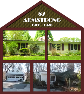
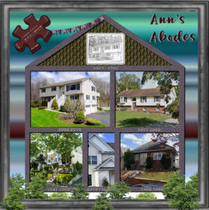
I almost totally re-did my house project since my daughter sent me photos of the one place I was missing. Here’s the new design and addendum.
Sue: What a charming bug! What is the difference between a bug and an insect?
Foxy Lady Trish: Wow, you were hiding a lot of talent back there in the shadows! 😉 I like the one with the misted figure, too.
ANNIE!!: I’ve missed you around these “rooms,” my friend! Hope all is well in Aussie-land and I hear you about math. It was my nemesis in school also UNTIL I got to Algebra, the only math that I could truly understand! LOL I’ve been using it lately to size photos for our calendar challenge. In many cases I have to turn a portrait into a landscape. Aarrgghh!!
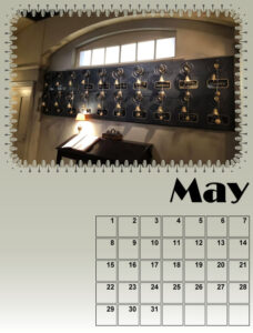
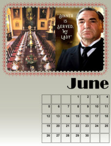
Here is my May and June using a new font called Broadway for the title of the month.
-
This reply was modified 3 years, 2 months ago by
Ann Seeber.
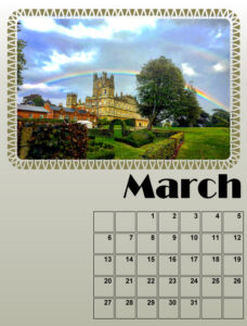
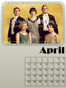
Here are my March and April. It is difficult to come up with photos with the right size and perspective!
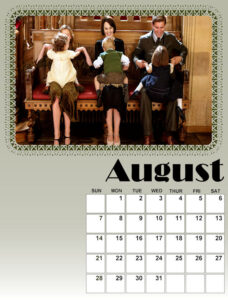
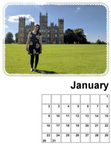
In case you were wondering, my granddaughter is BIG fan of Downton Abbey (as am I 😉 ) And this is her Christmas gift.
-
This reply was modified 3 years, 2 months ago by
Ann Seeber.
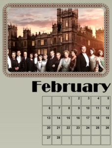
So here’s January and February with photos. I edited January’s background.
-
This reply was modified 3 years, 2 months ago by
Ann Seeber.
Monique: The new March and April each have 3 photos!
Monique: England, not Scotland. Close but not quite.. 😉
I did the first lesson and here’s my January with a photo of my granddaughter Anna. This will be her Christmas gift. Last year I did one for her brother and his wife and new baby, Magic, so this year it’s Anna’s turn. Can anyone guess the theme?
Still to come, background and something to the left of the date box.Edit: I flood filled the background with white and then I also edited the mask.
-
This reply was modified 3 years, 2 months ago by
Ann Seeber.
-
This reply was modified 3 years, 2 months ago by
Ann Seeber.
Pirkko: Very nice design; excellent execution! Well done!!
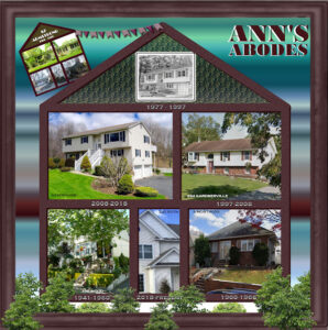
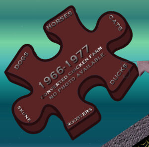
Using Carole’s House Theme Template I created Ann’s Abodes. I had photos of all but one of my homes throughout the years, so I attached a floating puzzle balloon for the missing piece. I will also post it separately so you can read the copy. The gradient I created from the colors of my new Galaxy Koi Betta are used for the background, named Blue Demon for my new, colorful guy. The title font is Berlin Kitchen and all the rest is Copperplate Gothic. I really didn’t have a photo for the house I was in from 1977-1997 so I used a generic sketch of a raised ranch. I applied various textures to the house outline and filled the “attic” with a pattern.
I downloaded the Corel Freebie of the Week and tweaked the colors for the Palette Challenge.
MoniqueN: My mother’s mother was a Swede and my father’s mother was Dutch so I got Swedish Sticky Chocolate Cake in Dutch! 🙂
Z = Zweedse Klevende Chocoladetaart
Had to show off my Palette Challenge entry. I took the palette and created a gradient from it and this is the result!
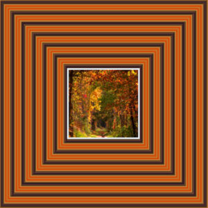
I’ve been playing with the October Palette and with the new Gradient Script. After getting schooled by Carole about vector lines I finally got the script to behave and used the palette itself as my source. Which gave me a gradient that looked just like the palette with bars going across! So I poked in the gradient tool and came up with this, which I’m pleased with after adding a fall photo as the focal point. There’s a background layer of the palette orange at 75 % opacity and then the gradient where I applied the multiply blend mode. I selected each of the dark squares and applied an inner bevel. All I added after that was a Select Selection border to the photo. You might need sunglasses! 😉
-
This reply was modified 3 years, 2 months ago by
Ann Seeber.
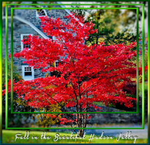
Carole/Cassel suggested we showcase our autumn colors if we live where they become vivid in the fall. Here’s my contribution to the fall beauty of my Hudson Valley here in NY. I used some of the cass-nested frames filled with various green gradients she gave us last March then I applied inner bevels. The font is Heavy Boxing.
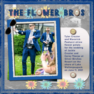
I am in, too! I did this challenge last year and sent it to my family in Mendocino, Northern California. I heard my granddaughter-in-law’s mother has it on her wall in Colorado! Boy, that calendar travelled! I haven’t settled on a topic yet, though it looks like my granddaughter’s wedding this past June generated a lot of photos, so that’s probably my best bet. The wedding colors were navy blue and silver. The famous wedding Flower Bros have already been featured in one of my layouts but there’s lots more where that came from. Here are Tyler and Maverick dancing down the aisle.. 😉
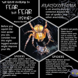
Following through on Sue’s bug challenge; here’s my spider design. I thought it was appropriate for Halloween time. I even used some Halloween clipart with the cartoon spider and the webs.
Edit: Forgot some details. The design is a template: Corel’s Freebie Honeycomb. The fonts used are: Clockwise from top left: Birdy, Bodoni, Curlz and Eras. [Thanks for the suggestion, Michele, I used the Image Information to record my fonts.]
-
This reply was modified 3 years, 3 months ago by
Ann Seeber.
-
This reply was modified 3 years, 3 months ago by
Ann Seeber.
Michele: Stunning layout! Those pictures bring back memories! I visited Lake Winnipesaukee in New Hampshire when with my folks on one of our annual pilgrimages to New England from New Jersey when I was young.
Vinyl Record Cake
Oops.. sorry! Forgot you said no two in a row..
-
This reply was modified 3 years, 3 months ago by
Ann Seeber.
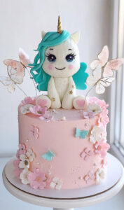
Unicorn cake
Sue: You are giving me many ideas! I truly admire your work; so detailed and attractive. I’m fond of insects myself, though usually spiders are my focus. Let’s see what I can come up with! 😉
Michele: Wow, thank you so much for your mini tutorial. I never heard of the Text Cutter option before and I’m sure I’ll use it regularly now. You rock! 😀
A – Alphabet Cake
Michele: Wow! I always love your designs; they usually have lots of WOW factor. 😉
Tell me, what is a “text cutter” that you mentioned? Does it give the text that raised, 3-D look you achieved?
-
This reply was modified 3 years, 2 months ago by
-
AuthorPosts
