Forum Replies Created
-
AuthorPosts
-
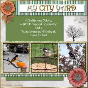
Basic Scrap Course – Module One. The photos are mine taken Tues 4/26 with my iPhone camera. The title font is Impact, the text is Lucinda. I’m following along after Pirkko … and I just whipped up to Amazon and ordered a real Oriole feeder. LOL
Michele, that is so funny! 😀 Tell me, how did that monster acquire a retainer? 😉
Pirkko, you’re right about repetition! It’s why I keep taking the basic courses over and over. Your cat layout, Noel with his Mom, came out exceptionally well. I’m off to do one, also, as I have two new photos to showcase.
Corrie: That’s great that you’re “Coming to America!” Enjoy your family and I wish you four weeks of wonderful weather. I will miss you. Have a safe journey!
Veilige reizen! 😉
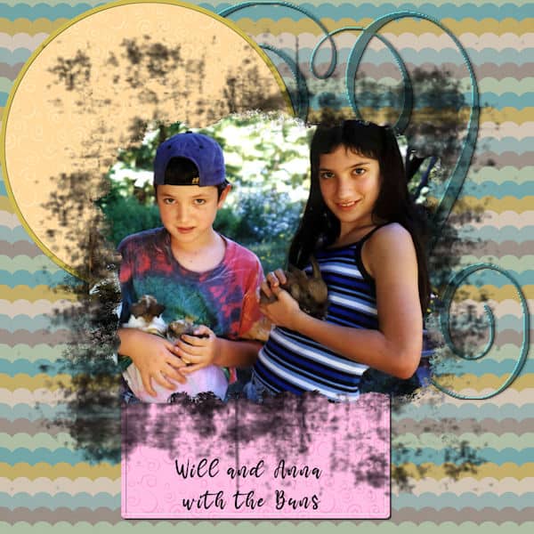
Oh, this came out a bit different for me. The photo is my grandchildren in California when they were young and had hutches full of soft bunnies. (Mostly Lops) Interesting exercise!
-
This reply was modified 2 years, 8 months ago by
Cassel.
My 2nd Siblings entry. This is my California contingent – My daughter Deb is mother to Will and Anna. Anna is married to TJ. Will is married to Lucy and they have my great-grandbaby Magic. The font is Bodoni MT Black; the background photo is by Will Lennox; the layout is based on a template from Lab 10-12. I used Carole’s split photo script on the photo of Will & Anna.
Using the Split Photo Script I got in Carole’s sale yesterday, here’s a do-over of my design for Siblings. (See the original above.)
Pirkko – very interesting. Can you explain your technique and what tools you used?
Thanks, Susan! I did get it, just in time for the 50% sale!
Susanne Greth: My maternal grandmother (Selma Hammär) was from Sweden and my grandfather (Emil Haggquist) from Finland (though his birth certificate says Russia, but it was actually Finland under occupation.) Where are you located?
Carole, you said “Ann (#75625) you did a great job with that shape of photo! What is the font of the journaling? It does not look like the Mama font.”
You are right. That is not Mama, it is Birdy.
Happy Birthday, Carole!
Finished my shopping and have a question. I bought the Smoothener Script and the ReadMe mentions using the Stray Pixel Catcher. Is that a script or part of PSP?
Have a great day! 😀

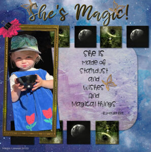
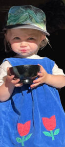
PROJECT #5-She’s Magic! My great-granddaughter, Magic, will be two in June. I love this photo but it was difficult because it is so tall and skinny! I used a kit called SI-StarGazer and the font is Mama.
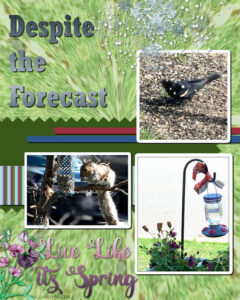
Here’s my Project 4 – Despite the Forecast – Live Like It’s Spring! I used the hummingbird feeder photo treated to a Kaleidoscope Reflection Effect and blurred with lowered opacity as my background and put darker green layer under it. The photos are mine from my yard this week. I had to bring in the Hummingbird Feeder as the temp dropped below freezing. It’s been sunny, cold and windy! I used the Color Replacer Tool to change the colors of the striped paper.
Carole wrote: “Ann (#75504), I am a bit puzzled. Looking at the shadows, the striped paper LOOKS like it has also a striped shadow. Is that just an optical illusion or something related to the resizing, or do you see the same thing?”
Carole: I made that layout using a previous design as a template. Those mats were added using “clip-to-it script.” I added new shadows. Perhaps the masks already had shadows, so they doubled when I added mine now?
From now on all my shadows are going on a separate layer and I’ll hopefully avoid that problem!
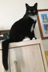
Eve likes to sit up high on top of the hutch part of my computer desk. That way she can keep an eye on me, on her brother, Adam, and the birds and squirrels out the window!
Running behind. I took time out to have my cataracts removed. Now I can see! Here’s my Project #3. Photos I took in my yard last year. I used the Paint-to-Target tool to change the color on the bottom flower. I like how it preserves the texture from underneath, so it looks very realistic.
Carole, that Refine Brush option is great with the Smart Selection Brush! Thanks for the tip!
Susanne Greth: Nice job! Your color scheme is dear to my heart. It must be my Scandinavian genes! 😉
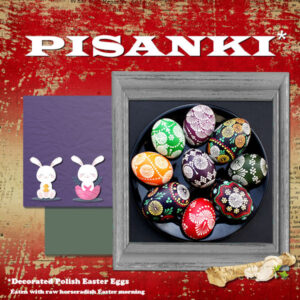
Here is my Project 2 – My husband and I would go to Pine Island, which is part of Warwick, NY, where we lived for 40 years, to visit Polish friends on Easter morning. Sophie was a village elder and would make us chew raw horseradish with our hard-boiled egg. (blech!) The eggs were beautiful, though.
I got these eggs from the Lamus Dworski Blog
They are very similar to what Sophie had on her Easter table.
The frame is from my .pspframe stash and I changed the color using the Paint to Target tool. My headline font is Wide Latin and the rest is Cooper Black. The horseradish is from pngegg.com and the bunnies are Corel Easter clipart 2021. The background paper is from a kit called AFT-Life-Montage.
-
This reply was modified 2 years, 8 months ago by
Ann Seeber.
Carole, you said: “Ann (#75336) although those multicolored elements are “supposed” to be tiny beads, on your layout, they look like Fruit Loops (maybe you can add some noise to them to give them that cereal texture?).”
Actually, they are Fruit Loops, according to the file name in my stash. 😀 It says: “eyeinspire_fruitloop_scatter”
I did add the noise you suggested.
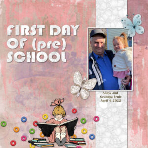
Finally got to do Project #1 – this is First Day of (Pre) School featuring my son-in-law, Ernie and my great-grand, Sonya. This just happened last week. Sonya will be two at the end of June. The title font is Bauhaus and the rest is from various unlabeled kits. I know the girl reading the books is from a kit called 1-2-Buckle-My-Shoe. The background paper is from Marisa Lerin Good Life May 21.
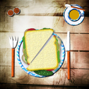
Here’s my effort at a table and sandwich. I love playing with the dishes and cutlery. 🙂
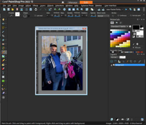
My workspace = Dark gray / background = medium gray / Palettes = Materials, Layers and Scripts
-
This reply was modified 2 years, 8 months ago by
Ann Seeber.
Here I am again, also. This workshop is a habit with me. I love the designs Carole Cassel uses in this class but somehow, each time I do the assignment it looks totally different than last time. (I think this is my 5th go-round! 😉 ) Here’s a new shot of my great-grand Magic that I may use. She’ll be turning 2 in June. We’ll see …
Corrie: Happy Belated Birthday! Admiring your layout; those flowers resemble the pot I have on my coffee table right now. We call them Grape Hyacinths and they are a sure sign of Spring here.
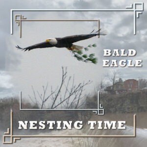
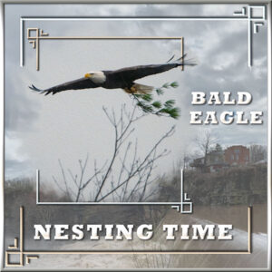
BALD EAGLE – NESTING TIME: I’m experimenting with cass-ArtsyTemplate2 and Dynamic Frames. The background photo is by Kathy Henninger and the eagle photo is by Ed Frampton, both from The Hudson Valley in Pictures site. It’s a bit subtle but I promoted the eagle’s right wingtip and put it on top of the mask frame. I also duplicated the frame and expanded it to full layout size. All the fills are gradients. The title font is Rockwell. I love seeing these huge birds gathering big branches for their nests!
EDIT: Following suggestions from Carole Cassel and Sue Thomas – I re-did the larger frame as the shadows were wrong and I cloned out some of the branches that stuck up in the photo. I also decided to remove the outside border.
-
This reply was modified 2 years, 8 months ago by
Ann Seeber.
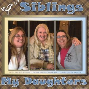
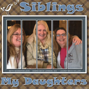
SPLIT PHOTO2 TEMPLATE – Using the April Siblings Theme, these are my daughters. Font is Snap. I made the plaid. Someone in the family took this photo.
APRIL THEME -SIBLINGS: Still playing with templates, here’s the SplitPhoto2 featuring my daughters, since I have no siblings of my own. The font is Snap and I made the plaid from Deb’s shirt. It was a bit of a trick getting it onto a larger canvas while still in layered format. Any tips on that would be appreciated!
H = Happy
-
This reply was modified 2 years, 8 months ago by
-
AuthorPosts
