Home of the Scrapbook Campus › Forums › Showroom › Wise Words Challenge 2020
- This topic has 326 replies, 36 voices, and was last updated 4 years, 7 months ago by
Cassel.
-
AuthorPosts
-
April 23, 2020 at 11:54 pm #41941
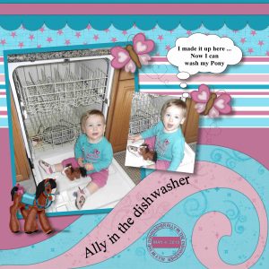
I so enjoy looking at all the work. Gerry the tornado is really good, I was looking at it and then “it’s a tornado!!!”. Ally loved to climb on the dishwasher, I think she thought she was helping. Had to always make sure the door was shut. Had a bit of trouble with the curve, but after watching the video at least 5 times it turned out okay. A basic page with lots of papers that I made. Used Cass quick scallops, I made a few templates with the script, stripe template and doodle template for the other papers. Added the butterfly and horse, they are element scripts I purchased. I can then colour them to match my project. Added Cass Date Stamp and shadows.
April 24, 2020 at 12:07 am #41943Hello Scrapbook Campus. Again my congratulations for all of your beautiful creations, such a joy to view them.
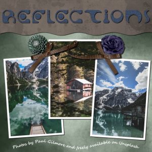
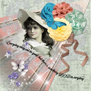
This is my Day 4. I used a beautiful scrapkit by bld from Digi Scrapbooking Boutique … no idea which designer goes by those initials but that is all I have to go by! I can’t even find DSB on a Google search so perhaps it no longer exists. The font I used for the title is Solange and the texture is from the Texture plugin and is Craquelure at default settings. I used Cassel’s layout template as it is simple and so very effective … thanks Cassel, I love it. Thanks for takin a peek!
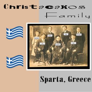
April 24, 2020 at 12:22 am #41947I’m a little behind but catching up. This is an actual family photo of my grandfather and brothers/sisters who were born in Greece. My grandfather is top left second. It was challenging fitting our family name in the project. Tomorrow will be off to Day 3.
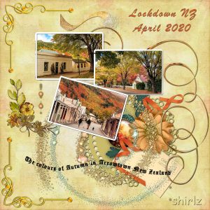
April 24, 2020 at 4:14 am #41949Wise Words Day 4 and quite far from the beach I would say. In Central Otago NZ we have beautiful Autumn colours. Arrowtown is a historical village with Queenstown close by. It is an hours drive from where I live ad I can say there is a picture around every corner in all seasons, but Autumn has the most vivid colours. It is so unusual to see sucn quiet streets with no tourists.
April 24, 2020 at 4:40 am #41951Day 4 , vector and paths, are my worst subject, congatulations to all of you , you have all done so well. Mine hardly curves x
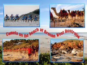
April 24, 2020 at 6:30 am #41954Day 4 Beach – These are all photos I took on holiday at Broome last year.
April 24, 2020 at 10:03 am #41957Dorothy, nice photo of that castle. Is that a place you have visited?
Shirley, what do you mean when you mention that you didn’t have it on a template? You could use any selection made with any of the Selection tools, even a simple rectangle. Was that the issue with the Text Wrapping? On your Day 4 layout, there is one little detail that I noticed: the corner on the top left is repeated on the bottom left. That is ok, but it seems like the shadow was added BEFORE you duplicated it, which makes the shadow for the bottom corner inconsistent with the rest of your work. It is always important to either NOT rotate, flip or mirror something that already has a shadow or an obvious bevel OR to do so before adding those effects. I am just very picky about those details 😉
Annie, fun use of the multi-font title in addition to the Text Wrapping of the Day 3. That Solange font is really cool. I’ll have to search for it. Glad you like the templates.
Euka, you did quite well for not being familiar with templates. Did you follow the tutorial HERE to help? You might want to add a little shadow to the photo (or white frame around it) to make it stand out from that light background. On your Day 4, I love how you used a photo as a background. Sometimes, we forget how those photos CAN be used even if they might not have anything “special” on them to showcase.
Lydia, isn’t it amazing that a photo that is so “simple” can be enhanced by the story like those boots? That is the beauty of scrapbooking and story-telling! What did you use for the papers? I love that texture. I think you might give even more effect to your page with some (more) shadows.
Lynda, yes, I DO read every post in those challenges threads and respond to any request or question 🙂 Although I READ every other thread (like What are you working on?) I might not always comment, other than if there is a specific question or issue. Your layout about scripts made me smile! The favorite of mine, on that layout, is the jigsaw puzzle one! What is yours?
Leslie, that is a lot of sewing! How many masks have you done so far? I would be curious to know what pattern you use. A few of us in here are able to sew some and I have heard of various types of patterns. For the bread box layout, I would suggest that if you are to use multi-font titles, try to make the variations a little bit more obvious. If it is obvious, then we see that you did it on purpose; if the variation is slight, the viewer would wonder if it is a fluke or an error. Do you see what I mean? You are creating some fun pages for your woodworking. I think you deserve to end up with a full album of those projects!
Jeanny, that is quite a photo for quite a job!!! I don’t think I would want to do that kind of job!
Sue, beautiful photos and a beautiful display. For someone who says she is not a scrapbooker, I think many scrapbookers would disagree with you!
Bonnie, Levels is under Effects > Brightness and Contrast > Levels. It allows you to “emphasize” the darker colors or the lighter colors and something in-between to give more contrast to a photo. Those deer layouts are great. Do you need a zoom lens to get such great photos?
Gerry, I don’t think you overdid anything with the shadows. In fact, I think it is a good use of large shadows to give that impression of floating. That is something we don’t want on a “paper” but with things flying all over, it does become meaningful.
Jnet, belle photo à mettre en valeur!
Minka, I hope it is ok for you to have that text in a circle go upside down. I think it looks great. I didn’t want to address that specific situation of the “upside-down text” in a circle as there is already a tutorial, so *IF* you need it differently (which does not seem to be needed here, but for future projects), HERE is the tutorial.
Cyndi, looking forward to seeing those titles on projects.
Corrie, I hope you enjoy the book. For your layout, may I suggest that you lower the opacity of the shadow on the droopy bow? Since it is showing “off the paper”, the shadow should definitely be fainter.
Mary, a lot of “scrapbooking” is a matter of personal taste. I might like a combination of colors/papers and someone would cringe at it, and vice versa. With practice, you will find YOUR style. If you look through the layouts posted, some of them have a similar style and we can almost identify who did it without looking at the time. Many others have varied styles, or are still looking for theirs. And furthermore, that can change over time. If you like something, try to copy it and see if it suits you. If not, change things around. That is the beauty of “scraplifting” (copying another scrap page).
Alicia, creating an edge with the Pen tool to then add a text on path is probably the only way to do it, and your result is great!
Royanne, it is fun to have the path to follow that “swirl” in your layout. It makes perfect sense!
Rita, that is a great family photo. You might want to add the year also, somewhere, on the photo or elsewhere on the page. Have you tried adding some shadows to the photo, frame, and the flags? It might add a bit more of a 3D effect.
Trish, if text on path is difficult for you, your project does not show any struggle!
April 24, 2020 at 11:34 am #41963Day 5. Thank you Carole for you comment. I’ve created a scrapbook page, and will now label myself as a scrapbooker! 🙂
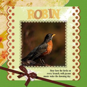
An edge punch used on the photo, eyelets and scalloped edges on the overlayed paper. Element found online.
Well done all, on creating such beautiful pages.
April 24, 2020 at 11:40 am #41965I’m just starting–I know I’m late but I love Carole’s challenges! I see everyone has been quite productive already!
Jackie
April 24, 2020 at 11:51 am #41969Bravo pour les nouvelles mises en page ajoutées, c’est tout joli et intéressant de lire comment vous vous y êtes pris pour obtenir le résultat souhaité
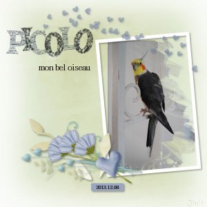
Voici mon jour 5 – Picolo avec un Mask Palvinka appliqué sur la photo et Family Kit by Palvinka Designs. La photo est perso
Mon papier étant pâle, mes lettres ne ressortaient pas assez
J’ai refait jusqu’à ce qu’on y voit quelque chose. Merci Carole pour ce nouveau modèle de texte. Je joins une autre page faite ce matin avec ce que j’ai appris dans les premières leçons avec Sweet Cooking by Thaliris, un Overlay by The Urban Fairy et la photo est perso
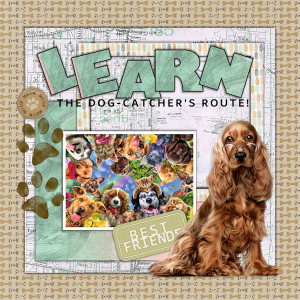
April 24, 2020 at 11:57 am #41970Fun again … when I first put in the letters, it used the same variegated bg I used for under all the dogs – greens and pink –
but when they converted to all on their own layers all I got was a tiny little stripe on the first two letters. I played and played with it trying it over but with the same result. So what you see if what you get. Thank you, Carole, for the text on a path info. I could have used it earlier, for sure, as I watched about five hours of old YouTube webinars. A great resource – especially with not a whole lot else to do while in the house. Saw a few of yours, too! :o)April 24, 2020 at 2:16 pm #41975Overlapping text, Day 5
I have had so much fun with this, I don’t want it to end!
April 24, 2020 at 2:21 pm #41977Carole, I used for the paper of day 3 a free silver background FPTFY (?) that I found on the internet, than changed the colors into the colors of the boots.
For today … this is a PSP image that I made earlier and now just added the text. Because i’m making lots of mask there is no time for spending hours behind the computer.
April 24, 2020 at 3:19 pm #41979Day 4 Challenge. I had problems with the curve text. I finally got it and am going to work on Day 5 challenge in a while. I forgot to put a shadow on the letters. This is new for me, I have never worked on scrap booking. But I am learning a lot. Thank you so much Carole. I love all the creations you all are creating, I don’t know my way around the forum, so congratulations to yo all.
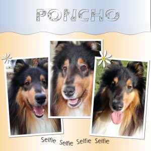
April 24, 2020 at 4:16 pm #41981Hello everybody ! this is my result of Day 4
@ Carole, yes this is my dog. I have 1 dog, his name is Poncho, the other dogs on the picture of day 2 are of my friends.
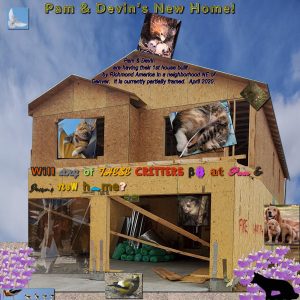
April 24, 2020 at 4:54 pm #41983I kind of combined the first three days into one page. I used a couple photos with decreased transparency, used some text with different fonts and colors a journal entry fit to a shape and a title with different edge and fill effects. My daughter is building a new house and I sort of had fun with it. I thought about putting another dove over top of the entire page at low opacity but I was having some problems with the gravel – when I added it as I new layer I could select the layer in the palette and then press ‘m’ and move it but I could not press ‘k’ and then select it within the project to scale it or anything – so I was wondering if there was a layer limit and decided not to try adding another layer.
April 24, 2020 at 5:17 pm #41985GREAT inspiration, I really enjoy looking at everyone’s projects. Thanks for sharing.
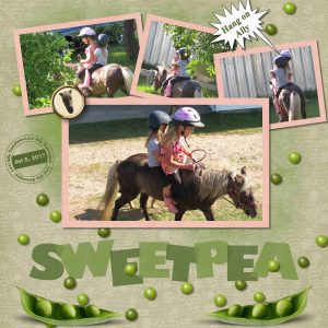
Day 5, once again I learned a lot. Did not know how to separate the text by such a simple click. Sweetpea was our minature pony, she died last year. But the girls had lots of fun riding her. They were riding around the yard and Ally was slowly loosing her balance as they went. Green paper and peas from a purchased kit. When I was done it did not appeal to me. So added a layer and applied the airbrush with a bit darker green. The picture with Ally leaning was to the right and did not work with frame position I wanted. So I duplicated the picture and moved the wall to the left, it worked out good. I have a brad template and added Sweetpea’s head to it, that did not turn out to good, it is ok. I tried putting designed paper behind the text to pull in the colours but it did not look good. I ended up leaving the text on the main paper and I really like the effect. Thanks Carole a great way to show off our work in the TITLE.
April 24, 2020 at 6:07 pm #41987Bonnie, Levels is under Effects > Brightness and Contrast > Levels. It allows you to “emphasize” the darker colors or the lighter colors and something in-between to give more contrast to a photo. Those deer layouts are great. Do you need a zoom lens to get such great photos?
Thank you, Carole! I will play with Levels and see what I can come up with.
I have a small point and shoot camera with a pretty good zoom, 24-720mm . I also have a larger camera but seldom use it any more…it is heavy to carry for too long. The deer pics were taken with a zoom but not too much of one. The photo of the buck used a longer zoom than usual. The deer are pretty comfortable with me being there…of course, I move very slowly, if at all. I was 15 to 20 feet away for some of the photos. They don’t seem to mind the small camera…the larger SLR spooks them.
April 24, 2020 at 6:09 pm #41988I’m enjoying seeing everyone’s work almost as much as I am creating my own pages.
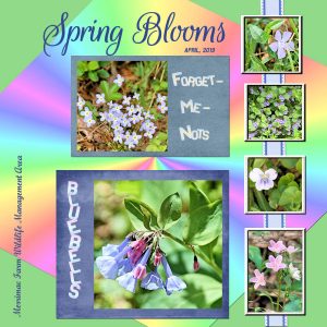
For Day 5, I created gradients from the featured flowers to color the overlapping letters of their names. The photos are all my own. If anyone can name the second wildflower down along the ribbon, please let me know – a Google image search just kept turning up violets, and I know they’re not violets.
The colored starburst paper was a freebie that Carole offered on her blog last year, made with her Sunburst2 script. I played with the “shear” pick mode to stretch it a bit.
April 24, 2020 at 6:33 pm #41990I know the pen is mightier than the sword but I admit it really nearly beat me this time. I figured it out though ,
Do not put a new paragraph in the text when the wave you are riding is just so big.
April 24, 2020 at 7:42 pm #41992Just beautiful Shirlz, and your colour scheme is gorgeous … well done! <3
April 24, 2020 at 7:46 pm #41993Minka, this is a really delightful page, you have done well my friend. <3
April 24, 2020 at 7:52 pm #41995Day 5. I enjoyed this lesson as well as the other one’s. Every day I have been learning something new. Thanks Carole.
April 24, 2020 at 7:58 pm #41996Euka Euka, I love those photos and the text on a curve is brilliant! Well done my friend … Are you a fellow Aussie?
April 24, 2020 at 7:59 pm #41997Trish, it curves my friend … beautiful result! <3
April 24, 2020 at 8:02 pm #41998Jnet, I always love your work … it is beautiful, congratulations. <3
April 24, 2020 at 8:05 pm #41999Sue, a lovely job my friend. You always showcase your delightful photos to a simplified perfection … a delight to view. Well done Hon. <3
April 24, 2020 at 8:08 pm #42000Bonnie, simple and delightful! You put a smile in my day my friend … thank you! <3
April 24, 2020 at 8:12 pm #42001Okay dear Scrapbook Campers, I started out determined to comment on each page individually but I got overwhelmed! I will now say for all those whom I have missed … and there are many … beautiful work my friends. It is indeed a great pleasure to get on here everyday and feast on the delightful pages … Thank You! <3
April 24, 2020 at 8:36 pm #42003 -
AuthorPosts
- The forum ‘Showroom’ is closed to new topics and replies.


