Home of the Scrapbook Campus › Forums › Showroom › Wise Words Challenge 2020
- This topic has 326 replies, 36 voices, and was last updated 4 years, 7 months ago by
Cassel.
-
AuthorPosts
-
April 20, 2020 at 1:11 pm #41626
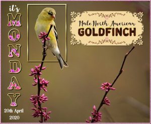
Here is my Day 1 of the wise word challenge. I used the rectangle tool for the frame around the bird, with the out of bounds effect. The tag is created using Cassel’s corner punch brushes. I hadn’t had the chance until now to use the glitter tutorial from the blog. The swashes in the tag is a font.
April 20, 2020 at 2:38 pm #41632I am using mine for a webpage slider.
have to keep res low for quick loading.
Glad to be in another of Carole’s classes.
Jackie
April 20, 2020 at 2:39 pm #41633It’s beautiful, great job. I’m barely going to work on mine.
April 20, 2020 at 3:51 pm #41635Keeping mine simple today, too … only because I have a ton of work to do. I’m sure she will dream up something hard later on this week. LOL
April 20, 2020 at 4:11 pm #41637I hope I did it right. First time here and I am trying to upload the image. I enjoyed the class, it’s interesting and I learned something new. That you so much Carole. I will try and work on something else later today. I am working on the backyard at 6:00 P.M.
April 20, 2020 at 4:37 pm #41639Day 1
Picture taken last week on my terrace.
I found it a very nice lesson. I am glad I learned how to process tubes in text. Thanks Carole.April 20, 2020 at 4:44 pm #41641I love it! Great job. I need to work on another one. What size do you make them?
April 20, 2020 at 5:06 pm #41643Hello Isabel, I make them 3600 pix x 3600 pix. To upload them here in the forum I rezise to 600 pix.
April 20, 2020 at 5:56 pm #41644I am in too. I was sure I had signed up for this but couldn’t have done, must have got side tracked . Anyway here now and looking forward to the challenges. Hope they come through soon..
Sheila.x
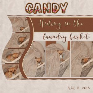
April 20, 2020 at 10:04 pm #41647Wow!!!! What great work. Enjoyed each one. I took a basic template and the clip to it script. The background is the pattern from the blanket, added texture to the brown rectangles. Added some lines to give it a bit more colour, against the brown rectangle and curve, and added a small bevel. Dogs eyes do not photograph well, so had to add a layer and with the paint brush added brown circles to hide the light. As our dog’s name is Candy I filled the text with candy. Thanks Carole another interesting lesson.
April 20, 2020 at 11:42 pm #41653My computer and PSP have been acting up all day. I can’t get my pick tool to work on the titles I create. Seems to work on other things. I finally got something done. I really don’t like the scrapbook page. Next time I’ll give more thought to the fill color…it just doesn’t show well on most background layers.
April 20, 2020 at 11:54 pm #41655It’s beautiful, I love it. Great job.
April 21, 2020 at 12:09 am #41658I’m new to all this. Not sure what I am doing wrong. The outline and fill don’t look right. I’m sure it’s just a setting. Any suggestions? You can see that the stroke and fill don’t look right. I’ve done this several times and I must be missing a setting change.
April 21, 2020 at 12:19 am #41659I’m playing around with possibilities for the cover of an album for my New Zealand trip, so I came up with this. Not very exciting, but for a cover page, I think I like it.
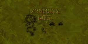
April 21, 2020 at 12:59 am #41661Hello Scrapbook Campus Friends. Well, I managed to create a page for this Wise Words Challenge 2020. I wanted to create a cover for my DeviantArt profile so decided this would be a good opportunity. The dragon was a freebie from PNGTree. I use a dragon in a lot of my profiles as I was born in the year of the dragon. Background is my play on Cassel’s marble paper tutorial, eyes are a tube I misted myself and the signature is one I created many, many years ago. Thanks for takin a peek!
P.S. Love all the work coming through, a great effort by all concerned.
April 21, 2020 at 1:12 am #41663Hi Carole,
Well it’s been hours, I will admit I do not know how to use a template but I did d/l it, and open it in my work window looks great but I don’t know how to use it. Been trying to figure out what size to open for the other numbers I know the first is 3600 for the top title. Did that a dozen times, Tried a dozen times to get my work to instead of a color to use my tacos to fill instead of the blue, no go. In the past I got it to recconize a picture I wanted to use as a fill but not now. Long story short. I failed. Hours didn’t even watch tv tonight no biggie there I have hulu, just so frustrating when you can get past go at all. So today’s a fail, my eyes are to tired now its over 6 hrs have to stop. Maybe tomorrow I an produce something. so Frustrated. Maybe it’s to advanced for me heck maybe ha I don’t even know how to use a template I copied it an pasted it into a 3600 3600 work frame and it just turned it black. I really want to do this maybe i can after i sleep. Everyone’s works great 🙂 Guess my psp ultimate hates me today 🙁 ok pouting maybe tomorrow I can do it.
April 21, 2020 at 3:08 am #41665Day 1 in Wise words challenge. This little guy popped up on my fb page and gave me the inspiration for my page. I scrounged the elements from png guru and UIHere free elements except for the butterfly and the paper came from my stash . I used the same text as Carole and boy what a job I had doing this.
April 21, 2020 at 6:27 am #41669Jnet, very simple yet effective!
Lydia, interesting facts that we learn. You might want to add more shadows on your title considering how much you added to the photos themselves.
Sue, great match with the flowers you chose.
Jackie, to get a smoother look, you could have a bevel only on the outline and none on the inside.
Minka, because your background is a bit dark, you could consider adding more shadows to the title, so it would be more visible.
Isabel, did you fill the center with something else? Maybe you did, but it is so much similar to the background that it does not really stand out.
Marie-Claire, a bit more shadows on the title would make the whole montage a bit more consistent since you do have shadows on the other elements.
Royanne, fun layout. Great job!
Bonnie, the text at the bottom is a bit hard to read. Is that only due to the resizing?
Rita, it is strange that the two layers don’t match. Did you use the exact same font with the same attributes? Maybe you changed one attribute along the way? I looked at your pspimage file you sent me and that is what I see too. Not sure how you arrived to that result.
Alicia, using a gradient is also a great idea.
Annie, the background is a bit dark to show something delicate but it still works.
Cindy, HERE is a tutorial on how to use templates.
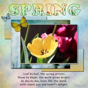
Shirley, nice spring time project.
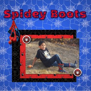
April 21, 2020 at 8:49 am #41673After much experimenting, I ended up using Flood Fill to get the web highlights in the title.
Your Big Boots project reminded me of the first Thanksgiving I spent with my great-nephews and nieces. Brelan was quite excited about his new boots.
April 21, 2020 at 9:04 am #41674Hi, Carole,
I’m not sure about the bottom text…since I wrote it, I know what it says…it’s hard to tell if it is hard to read. It is a very thin font. Maybe I should try a different font to see if that would help. I have a friend who is very critical about fonts and her first critique is, is it easy to read. The resize could have effected it too.
Everyone, beautiful work.
April 21, 2020 at 9:09 am #41676Dag 1
Het was moeilijk maar ik heb wel veel bij geleerd van deze les.
Ik heb gezien dat ik niet dezelfde patronen ter beschikking heb in de lijst patronen van effecten; textuureffecten; sculptuur…bronze is daar niet bij.
ik heb psp pro 2020 ultimate
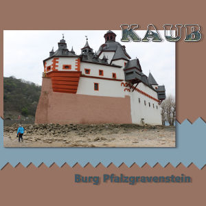
Dit is mijn resultaat , een uitstap langs de Duitse Rijn!
April 21, 2020 at 9:19 am #41678Day 1 , this iste is in tiny font, the pictures are postage stamps, making them a job to read, this is my contribution to day I , I chose to go simple and use glitter on this card. where we supposed to use the template carole and I know I have asked once, but do you know how to get this text back to normal please. this is the only site it is happening to. Thank you
April 21, 2020 at 9:58 am #41680I love seeing the creativity in everyone’s projects!!
I had an issue with mine that I hope someone can help me with. I thought I was following Cassell’s instructions. I created my text, applied a bevel, duplicated the outline layer, then on the new layer, filled it with a color and made the out line transparent. The fill color was always offset a little and left transparent gaps inside the text. You can see it on the G and O. Any ideas what I need to do differently.
I’m going to post only my text projects. I have a different project I need to finish. But obviously, I’m not playing golf!
April 21, 2020 at 11:28 am #41681Love all the Wise words! My pc is updating so will post my effort when it decides to let me.
i am on my iPad atm and am unable to open the story link. Is anyone else having that problem? The boots opened just fine.
April 21, 2020 at 11:43 am #41682Ik heb inderdaad een probleem met de les STORY , krijg ook niet geopend met het wachtwoord.
April 21, 2020 at 11:46 am #41683Hey, Mary…Love your GOLF. Yesterday, my project was doing what yours is doing. Drove me crazy. I thought it was the font…no.
Finally, I restarted my computer…turns out it was waiting for a restart to finish updates. After that everything worked. I also realized I had forgotten the step convert to raster…that was probably the problem. I went to bed exhausted but I finally got it to work…after convert to raster.
April 21, 2020 at 12:12 pm #41684Indeed, the story link is not working, however we are patient … thanks!
April 21, 2020 at 1:21 pm #41685can anyone please tell me if there is a problem with day 2, as I cant get into it. thank you xx
April 21, 2020 at 1:22 pm #41686Thank you for your suggestions. Did you convert to raster before or after you duplicated the layer?
April 21, 2020 at 1:32 pm #41687After. Create text with black outline. Duplicate. Change copy to white outline. Convert to raster. Back to original. Fill and take away the stroke. Convert to raster. Lower transparency. …as best I can remember. From this point move on to texture effects on the copy, etc.
-
AuthorPosts
- The forum ‘Showroom’ is closed to new topics and replies.


