Home of the Scrapbook Campus › Forums › Showroom › What did you do (in August)?
Tagged: our summer
- This topic has 32 replies, 8 voices, and was last updated 7 years, 4 months ago by
Michele.
-
AuthorPosts
-
August 7, 2017 at 6:48 am #14354
Show off what you are working on in August, be it a scrapbook page, a tutorial, or anything else you want!
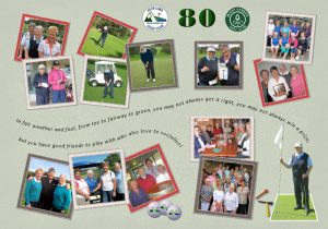
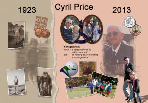
We are curious and want to see.August 8, 2017 at 12:36 am #14376A number of years ago a friend invited me to celebrate her 60th birthday and I decided to do a collage for her of photos taken at the Australian Ladies Open Golf. This was so well received it has become a tradition now that golfing ladies’ “zero” birthdays are marked with a collage. In 2017 I have done a 70th and have a 90th for later in the year. I have just finished an 80th which I have uploaded here. I have also included one I did for her husband’s 90th in 2013 – Cyril is still playing golf at least twice a week!
August 8, 2017 at 1:44 am #14377Hello Marlene. …. you make terrific collage pages… the one for Cyril really touches the heart just by viewing it and I think it is wonderful he is still able to play golf.. Great work Marlene! This would be a good idea for what I would like to do for my mother’s room at the nursing home. so I hope you won’t mind if I ask what size page did you start with and what did you resize it to for uploading here in the forum. I have always thought our size of A4 and A3 photo paper would make a great collage for hanging on a wall. This size would make for a great album book as well. Thank you for showing us your projects.
Dawn.
August 8, 2017 at 4:03 am #14379Great work Marlene. These layouts must keep you busy. Do you take the photos or do your fellow players supply them? Never played golf but did a lot of Badminton until my Achilles was nearly snapping and then had to give up 🙁 Think a bit of walking is all I’m fit for these days.
Sheila x
August 8, 2017 at 10:50 am #14385Marlene, what nice memories you created… No wonder it was well received. I particularly love Cyril’s page with his old photos and knowing that he is still playing golf.
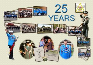
August 9, 2017 at 2:50 am #14393Thank you ladies for your nice comments. To answer the questions: I use the A4 size paper with 300 dpi resolution, usually in landscape but have done portrait. This size is good because I can use simple Document Frames which are just a plain black and don’t detract from the collage. I resized these two to 30% – any smaller and they look horrible. The photos are a bit of a mixture, we have a lady golfer who takes photos for the local paper and of special events, plus I take some and other ladies pass on some they have taken. The ones for Cyril’s page were given to me by Fay and I have done some special pages with photos supplied – one of our ladies was the Drum Major for the Mount Gambier City Band for 25 years and when she retired I did a page for her (attached). Now I have retired from work and Committee commitments I have more time to “play” with PSP.
August 9, 2017 at 6:12 am #14394Absolutely love your work, Marlene.
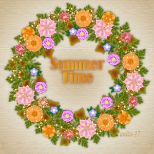
August 9, 2017 at 2:53 pm #14399So far Summer has made a brief appearance so I decided to create a summer wreath. All the elements are my own creations. Thank you so much for the chance to share. Anita
August 9, 2017 at 6:02 pm #14404Hi Marlene…. thanks so much for sharing the size of the page and the resize amount for uploading here in the forum for the A4. I am going to try doing some projects in this page size for here and also for my Mum’s room at the nursing home. Sometimes it is nice to do something different than a 12×12. The page for the Mt Gambia band is great, love the way you have displayed the photos. really lovely work Marlene. Thanks for showing us.
Hello Anita…. a really lovely wreath page and the colours are beautiful… .your element creations are very nice. Do you do card making for your designs? I am sure they would be well received if you do.. thanks for sharing with us your projects.
best wishes to you both,
Dawn.
August 10, 2017 at 8:32 am #14405Marlene, what a beautiful page! I like very much the way you arrange the photos on top of a ribbon and across the canvas. Great work.
Anita. lovely wreath you’ve made. The elements are very nice and great choice of colors.
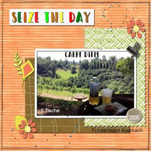
August 10, 2017 at 3:48 pm #14409This is my take inspired on The Lab 07-Module 07. <span style=”color: #333333; font-style: normal; font-weight: normal;”>From the ideas given, I made the colored Wood Texture B</span>ackground Paper, the Negative Chevron and the Lined Overlay Papers (Cassel’s tutorials).
I added the clip and the multi color title. The suggestion was multi color words, but I used a different color for each letter, using a technique taught on Masterclass “No Kit Scrap 2”.
The clip is a freebie from Blue Flower Art (On This Day); the elements are freebies from www.freebies.bubururesources.info; the date element is from Sheila Reid (Unwind). The stitching is KAagard-ByAir_BorderStitches_Black freebie.
I added cass-Beads-SeedBeads2 Picture Tube.
It was fun to follow my first lesson of The Lab… I am liking it very much.
August 11, 2017 at 6:06 am #14418This is the page I made inspired on the Lab 07-Module 07. From the ideas given, I used the color wood texture for the background paper and created the negative chevron and lined overlay papers (cass-tutorials).
I added the clip (Blue Flower Art freebie) and Multiple color title. Instead of each word of a different color as suggested, I made each letter with another color using the technique shown on cass-Masterclass-NO KIT SCRAP 2. The font is Happy Camper, also mentioned in the lesson.
I included BuburuResources freebies elements; Date element from Sheila Reid-MAR 2016 Unwind Blog Train and KAagard-ByAir-BorderStitches-Black.
I had fun making this page based on my first lesson of The Lab.
August 12, 2017 at 12:42 am #14444Hi Cristina!… a nice page and elements that work well to create your layout , really like the colours of your textured background paper. Cristina you gave me inspiration to go and do a couple of lessons that are in the Lab 7 modules 6 and 8 that I had not done yet and incorporate them in a card project.. Module 6 had a lesson for Patterned Fill shape and I used it on the greeting on my card. Module 8 has a lesson for Triangle Pattern and I have made a background paper with the pattern that was created.. I used Cassel-Leaves1 freebie element and also a Hibiscus flower that was created with a purchased script from Joannes Digital Design. I often send email greetings to family so this one will be an addition to my collection for printing as well. . Sometimes we can forget the Lab modules contain many ideas . Thank you for reminding me. There is still more lessons to try so will enjoy doing them also……… Dawn.
August 12, 2017 at 9:17 am #14446Hi, Dawn! Thank you for your kind comments on my page. I wanted a different color for the background than the green one of the example. So, I used one that worked well with the blend mode. I’ve just joined The Lab and I am liking very much the lessons. Cassel has great tutorials
Your card is beautiful! The triangle background, the hibiscus flower, the leaves … everything works so well together. I am sure whoever gets this card will be very happy.
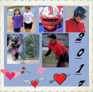
August 12, 2017 at 2:31 pm #14449Our two younger grandsons love playing sports. This summer we have been to football games and baseball games, loads of fun. We visited OakLawn Farm Zoo in the Annapolis Valley, the two little people were there with us approximately 20 years ago, the place hasn’t changed, the same little mound is right there, happy memories 🙂
August 12, 2017 at 7:27 pm #14462Hi Anne, you have created a nice memory page for the family album. Time goes by so quickly …… it is great to have photos to remember those happy occasions.
Dawn.
August 12, 2017 at 7:36 pm #14463Hello Cristina, Thank you for your comment on my card…. I also enjoy doing Cassel’s tutorials.
best wishes,
Dawn.
August 13, 2017 at 6:29 am #14474Anne, creating this kind of page is liking going back in time and reliving these happy moments. It begins with choosing the photos, the papers, elements… It is fun all the way. Nice work!
August 13, 2017 at 1:25 pm #14506Thank you April and Cristina! It was a fun little project, always nice looking back at photos of the young ones 🙂 Great work from you two and others on this site.
August 18, 2017 at 1:47 am #14594I have been frustrated by those fonts with Alternate Characters as I hadn’t got a program that could use them – then I read Cassel’s Blog on the subject and now I am really happy! This is a page I have done just to try these fonts out. It is of my cousin and her daughter, I used the Maphylla Font with special characters for the M and B, the swatch was a font called Bellwethers which has 6 different fonts – the normal one and 5 swashes etc.
August 18, 2017 at 11:35 am #14597Marlene, what a beautiful page! The background, elements. and lovely photo, I love everything. Very good work with the alternate characters. I have to try it one day.
August 18, 2017 at 8:00 pm #14609Marlene.. I agree with Cristina, your page is beautiful.. The fonts you have used are really nice and I love the texture in the frame. I like to use these types of fonts and now that we know how to use them in PSP I will be using them more often I think.
Dawn.
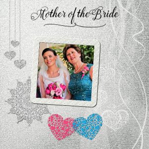
August 19, 2017 at 4:27 am #14610Wow, Marlene. Your Mother of the Bride page is really beautiful. That background pic is gorgeous. If you have time, could you tell us how you created it?
August 19, 2017 at 6:27 pm #14617micfin the page was made using a kit called “Wedding” which I got as a freebie many years ago and I can’t remember where from. I tried to find it on-line but you can imagine the number of hits I got looking for Wedding! The frame I made from another background in the kit, the two coloured hearts were made by using a white heart, selecting everything then on a new layer flood-filling with the colour, then using the Hard Light layer style to get the texture.
August 19, 2017 at 9:14 pm #14619“Thank You Cassel” for your Crochet Lace Frame Freebie….it was just what I needed to finish my project as I needed a frame for the Wedding Photo…… Also a “Thank You” to Marlene for the inspiration I received from her A4 Collage Projects.
I decided to try doing some Memory Pages up for our Family. Here is one I have created in memory of my Husband’s Mother “Classie” who passed away when he was a very young boy. I tried to create a Vintage feel to the project (I hope I have succeeded). I also used Cassel’s Edge Font 2 to create a frame for the Portrait photo. The font is Klymissky on all the text except for the swirly divider under her name. The Roses I painted some years ago on a card for my Mum – she kept it- so I scanned it into my computer so I could keep using it.
Dawn.
August 20, 2017 at 8:32 am #14620Dawn, what a beautiful memory page! I like everything: the photos, the edge font, the crochet lace frame… Great page. Looking forward to seeing more of your memory pages.
August 20, 2017 at 5:59 pm #14623Dawn that page is absolutely beautiful, you certainly have achieved the vintage look, the colours are perfect. I love the contrast with the bright roses. Classie was a lovely young woman, what a shame she died so young. I’m glad you have been inspired by my collages, I do enjoy doing them and they make fantastic gifts.
August 21, 2017 at 7:22 pm #14634Cristina and Marlene….Thank You! to you both, for your kind comments on my project. I appreciate it very much. I have found some more photos of my Dad so I am going to try and do a page for him over the coming days…….Best wishes to you both
Dawn.
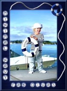
August 23, 2017 at 7:07 am #14639This is yesterday’s project for my FB gaming group. I started with a blue wood-grain background. That beautiful little sailor is something I found on Google. The 3D Chisel Effect outlined her pic nicely and gave it some depth. Then I used the NavyBlues font (free on FontSpace). I duplicated and changed the font layer to raster and repeated the chisel effect. I added the life ring and gave it an Inner Bevel. The Rope picture tube came in handy to balance out the total look, but it comes out in a sort of gold color. In keeping with the blue and white theme I had going I used Colorize and changed the saturation to zero. In order to brighten the rope up, I used the Replace Color Tool with white as my foreground color. Lastly I Buttonized the background in order to frame the entire project.
I would have been unable to do something like this a year ago. I’ve learned so much about PSP from Cassel and the rest of the Campus members that my artistic side is really coming out now. Thanks to all of you. <3
August 23, 2017 at 1:52 pm #14640micfin, wow your project is really beautiful! The whole composition matches so well… Great work! Thanks for sharing the details of how you did it. 🙂
-
AuthorPosts
- The forum ‘Showroom’ is closed to new topics and replies.


