Home of the Scrapbook Campus › Forums › Showroom › What are you working on (in September 2020)?
Tagged: September
- This topic has 145 replies, 19 voices, and was last updated 4 years, 2 months ago by
Sue Thomas.
-
AuthorPosts
-
September 10, 2020 at 3:35 pm #47036
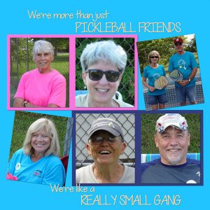
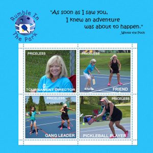
I saw this quote on a T-Shirt and knew I needed to create a page…especially since we refer to ourselves as a gang.
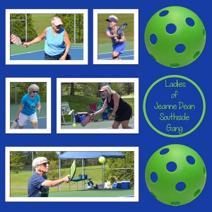
September 10, 2020 at 3:37 pm #47038This is something of a scraplift. The original had 3 baseballs on the right. The frames were easy to reproduce.
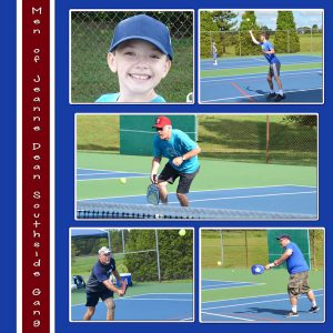
I guess the guys will be expecting their own page also.
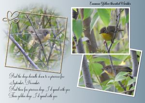
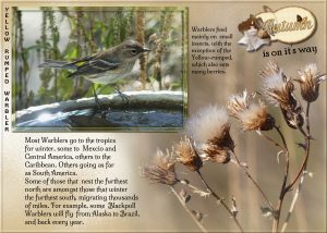
September 10, 2020 at 10:06 pm #47047Two images, same bird. Instead of using a mask to blend the two photos vertically, I matched the 2 pics the best I could and used the clone, and push tools. Used one of my masks on the other bird and placed a tilted frame around it. I also used a font heart, removed part of the frame, merged down, sculpture, drop shadow. At this time of year, as birds are leaving others are arriving, stopping off for a week or so, before continuing on their long journey south to warmer climes. I’m doing a series of these bird and insect post cards. 5×7 photo paper. When working on a page I double the size of the page. I love seeing them, and make the most of their short but sweet visit. I won’t see them again now until next Spring, when they make their way north, to their breeding grounds. I chose this song, as it’s fitting for this post card. Do you know who sings this song? I’ll add the singer’s name tomorrow.
September 10, 2020 at 11:43 pm #47049This page and “Really Small Gang” above were created using free templates at https://chantahliadesign.com/ . There is a link to “free digital scrapbooking templates”. There are close to 100 templates.
September 10, 2020 at 11:44 pm #47051This one also uses Carole’s stamp template, Stamps 3 Summer Template.
September 11, 2020 at 3:48 am #47053Sue: The September Song was recorded by both Frank Sinatra and Willie Nelson, according to Google. Hope this helps.. beautiful layout.
September 11, 2020 at 4:19 am #47054Goodness, everybody has been so busy. I’m loving looking at all that you’re doing.
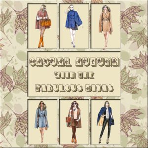
September 11, 2020 at 4:24 am #47059With this pesky pinched nerve of mine, I haven’t been able to do anything except for the daily pics for my gaming group. Just thought I’d share some recent ones I did. If anyone is curious about how I did something, I’m happy to share. Hope you enjoy looking.
Hey, I just discovered that you can drag and drop the pics to the Upload Images icon. That just made it a lot easier to share.
September 11, 2020 at 8:26 am #47062Love all the pages posted, beautiful done, Michele, you’ve done well considering you are still under the weather, hope you get well soon.
Ann, Bryan Ferry also recorded the song September Song.
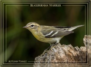
September 11, 2020 at 2:13 pm #47069An early morning project. For the frame I used the chisel tool, I like the effect that clicking transparent creates, repeating it twice. A soft subtle frame. Carole has several word frame scripts. I created my own.
September 11, 2020 at 11:39 pm #47071Another bird! Prairie thistle gone to seed photo, extraction. Chisel frame around the Warbler. Background paper is 3 papers, one of which is a gradient with a texture.
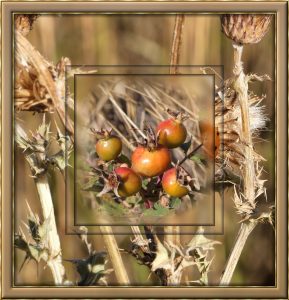
September 12, 2020 at 1:29 pm #47079Thistles and rosehips Autumnal colours. Took some photos yesterday. I haven’t done frames for a while. I do my own simple frames. Buttonize tool for the inner frames, where I paste into selection a rosehip photo I masked.
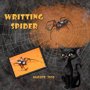
September 12, 2020 at 4:45 pm #47091This is a picture of a Writing Spider that we found in our garden last month. It was very big.
I took a mask made by Melo at Pixel Scrapper and used it and it landed perfectly on a bg paper from a kit called ” Faboolous Halloween” by La Galerie De Jackie and I used the embellishments in a kit called “A Bootiful Night” by Designs by Stina.
The spider web was perfect with the spider picture and mask I used.
September 13, 2020 at 8:40 am #47112I was a few days away, and so many amazing layouts posted here. Great work, Sandra, Jan, Karon, Bonnie, Sue, and Michele!
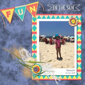
September 13, 2020 at 8:58 am #47114Here is the layout I created to practice the Lab10-M09 tutorials (Diamond2 – Banner Alpha – Interlocking pattern).
I am not a fast scrapper, but I like the long process of creation; even when I am not 100% satisfied with the result, I always learn something. I created a cluster to see if, with time, I get more comfortable with it.
Credits: Cassel> Layered Flowers Script – String White-Orange Tube – Pinned paper technique; Palvinka>”Fun in the Sun” WordArt banner – “We Love Summer” elements – JanClark-PSJuly20-Paper11 Background paper
Fonts: Blue Highway – Berlin Sans FB Demi
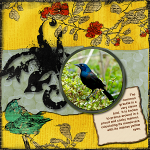
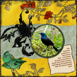
September 13, 2020 at 9:07 am #47116Trying my hand at a full bird layout. The Common Grackle is a good bird for Halloween.. his eyes are spooky!
EDIT: Oops! Forgot to do shadowing. This looks better. BTW, the flowers and lower left bird are part of the background paper.
September 14, 2020 at 4:04 am #47194Beautiful layout, Ann!
September 14, 2020 at 5:13 am #47198This was an “off shoot” of Cassels Tree challenge.
September 14, 2020 at 7:04 am #47203You guys are all so inspirational! Good way to pass time during the pandemic.
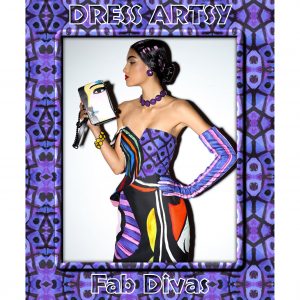
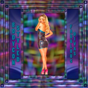
September 14, 2020 at 7:07 am #47205I loved the girl I found for my gaming group’s theme today, Bodycon Styled, but I really wanted to glam the page up. I took a small piece of her dress, resized it and used Effects: Reflection Effects: Pattern to get a background I liked. I duplicated the background, rotated the copy by 90%, then reduced the opacity and merged. I followed some of the following tut, but did not have time for the plugins. https://www.artistrypsp.com/Jemima/Tutorials/2016Frames/SunsetFrame/sunsetframe.htm
September 14, 2020 at 9:29 am #47207Fabulous page Michele, From a small sample one can get awesome background papers from the effects tool bar, reflection, kaleidoscope, and many more, no two layouts are ever the same. I don’t do tutorials, but I’m going to check out the site you used.
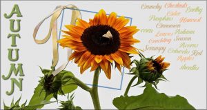
Autumn tag page. Not many techniques used in this one, out of bounds, extraction ( I replaced the background with a plain one, simple word art, and the bow I love best of all, Cassel’s floppy bow 15. The fots are Warrior Script, and Cheddar Cake factory.
September 14, 2020 at 9:31 am #47208I haven’t been on here for 2 days, and in that time, Wow! some beautiful, creative pages have been submitted.
September 14, 2020 at 11:17 am #47213I keep buying these paint spatters usually the watercolor ones and after watching the Master Class Video called “Brush Work in PSP”, I decided to try making my own. I used the colors light orange and dark red. In my brush variance pallet, I changed the hue, increased the size, and I changed my rotation. For a first attempt it did not turn out to bad. I played around with the opacity on the layers panel. I used Cassels newspapers bits for the lettering and blended it in.
If any one has any ideas on how I could have made this better please let me know. I really appreciate all the tips and ideas that have been given to me over the time I have been here.
Beautiful work every one. I am really inspired by the variety that every one does.
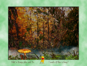
September 14, 2020 at 12:56 pm #47214Bonnie… Great layout for your basketball page. I have several books done in this style and you captured it perfectly. Sometimes you just need to take a left when the directions say right, and your mushroom layout is the better for it.
September 14, 2020 at 1:18 pm #47215Somehow or another I missed a whole page of layouts. 🙁
Bonnie… Love the quote you used on Really Small Gang. It fits perfectly. Yes, the guys are going to want one of their own “Bonnie” pages. Well done. Ahhh, I see you did one for the boys; great job incorporating “gang” into it. Wonderful stamp layout. And more “gang” incorporation, love it.
Sue… You make the most exquisite postcards. Anyone would be honored to receive one. Wow, Sue, terrific job on creating your own word frames, the Autumn Female is great. Yellow Rumped Warbler is another stunning card. You are taking making frames to a whole other level. Lovely Sunflower card with the extraction.
Michele… Totally awesome daily pics, it is so hard to decide which one I like the best. Guess I will have to pick them all. Nice Body Con theme for your gaming group. Thanks for sharing what you did.
Sandra… Knocked out by your spider layout. Great choice of kits to use. Your spider looks like the ones we have around here and call banana spiders. Nice work on the paint splatter. Wonderful color choice and I really like the inclusion of the newspaper bits.
Cristina… a darling layout. The colors work so well with the photo and your cluster is spot on. (Did you make the banner too?)
Ann… Great layout, with or without the shadows. Love how you extracted part of the background layer to overlay the layer above it.
Nemisis… A wonder layout, beautiful colors and the perfect quote.September 14, 2020 at 6:30 pm #47234Karon, thank you for your words of praise. They mean the world to me. I do enjoy working with templates but always go off on my own. Thanks again!
September 15, 2020 at 6:27 am #47241Sue & Karon, thanks so much for your kind words.
September 15, 2020 at 6:43 am #47242Hi Nemisis, Michele, Sue, and Sandra, all of your projects looks great!
Michele, another tool I’ve never used — Reflection Effect>Pattern — I tried and I liked the effect it creates. I am noticing that there are so many tools that I never touched. And thanks for the link!
Sue, I also loves this bow… in fact I am a big fan of Cassel’s bow scripts…I love to see them at work!
September 15, 2020 at 6:55 am #47243Karon, thank you very much for your kind comment! And, no, I didn’t make the banner. It was a freebie, Fun in the Sun Add-On “WA Banners” from Palvinka, as I credited her on my comment. I tweaked a bit because it said “Fun in the Sun,” and as I had the word Fun for the title, I deleted this word from the banner. 🙂
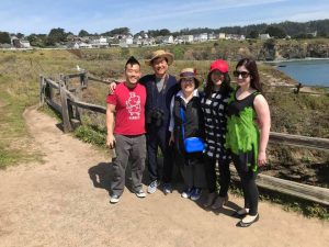
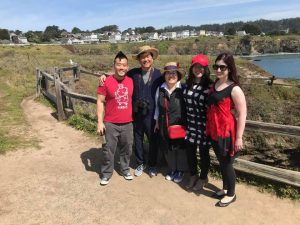
September 16, 2020 at 6:57 am #47266Learning to use the Change to Target brush:
Here’s a family photo with my granddaughter, Anna on the right and her husband, Tj , on the far left, when his parents and sister visited from South Korea. I color changed Mama’s handbag from red to blue and I changed Anna’s dress from red to green.
I will post both photos so you can see the color change.
-
AuthorPosts
- The forum ‘Showroom’ is closed to new topics and replies.


