Home of the Scrapbook Campus › Forums › Showroom › What are you working on (in October 2021)?
- This topic has 132 replies, 19 voices, and was last updated 3 years, 1 month ago by
Ann Seeber.
-
AuthorPosts
-
September 30, 2021 at 9:29 pm #65317

It is a new month and new projects.
Show off what you are working on in October, be it a scrapbook page, a collage, a tutorial, or anything else you want.
We are curious and want to see, learn, and get inspired.
These threads are quickly becoming a fantastic source of inspiration, support, and friendship. Keep them coming!
Remember to size down your image to about 600×600 pixels before posting it.
Here are a few guidelines for everyone:
- when you post a project, give as much information on your sources or techniques used. It will help others who are curious and would like to do the same.
- if someone uses something that you like on their page, ask where they got it. Sometimes, you can go get it too and it will be better quality than trying to extract it (as it would have been resized to post in the forum anyways).
- if it is something that they did from scratch, ask how they did it. It would be so helpful to everyone!
- if you like a photo and would like to “play with it”, ALWAYS ask permission. Sometimes, there are some limitations and the person is not allowed to let others use it. Don’t get them in trouble. Usually, people are happy to say yes (if they can) when you ask politely. And if you get permission, you might get better quality than on a resized image anyways.
October 1, 2021 at 3:40 pm #65355Unfortunately, I am working on boot camp still project 3. I can make all kind of excuses like my dog ate it but that would be hard to swallow! So here is the truth, I had to get a new laptop and it’s taken me a little bit to get use to it. I am going to continue with all of the boot camp projects because I really want to learn.
October 1, 2021 at 6:40 pm #65358I admire your perseverance, Brenda. The Bootcamp tutorials are fun! Love your layout…keep up the good work.
October 2, 2021 at 8:18 am #65362Brenda I know how you feel; it happened to me too. But you are doing great and remember there is no time pressure!!!
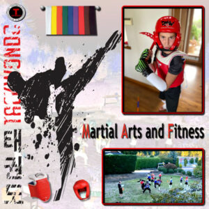
October 2, 2021 at 8:33 am #65364My youngest granddaughter is a huge fan of soccer! When the family moved to the States she was promised that she could join a soccerteam. Then Covid came and everything was cancelled, but this summer she could go to a soccer week and now has joined the local team. In one of the Labs (10-11) I found a layout about soccer as an inspiration and a template. Of course I used that template as a starting point for my layout and my daughter send me the photos I used. On the photo of the team I blurred all the faces for posting here and on facebook. The colors I took from her outfit and the soccer related items I found on Chantahlia Design and with the ball I made the background paper. I hope she likes it. Now I’m working on a Taekwondo page for her sister. When finished I’ll show that here too.
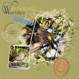
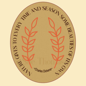
October 2, 2021 at 1:28 pm #65369These delightful little birds come to visit during the Spring and Autumn, when they are passing through. Hyper active, in search of insects in the undergrowth. They have a distinctive song, to keep tabs on each other. Here is a male and female. I used 2 quotes in this project. The tag will be used in another project. Paper clip, 2 masks. The list of techniques is long. If there is anything in particular you’d like to know how I did it, please ask.
October 2, 2021 at 2:26 pm #65372Anonymous
- 335

- Enthusiast
Sue, just gorgeous … oh, I love it… all of it 🙂
October 2, 2021 at 2:47 pm #65373Pirkko, thank you ever so very much for your kind words. I hope it will inspire you. How are you coming along with your projects? Is there anything we can help you with? I was pleased to that Corrie corrected the web site I gave you. I rarely use scrapbooking sites.
October 2, 2021 at 3:10 pm #65374Brenda– Nice layout, it is great that you are continuing to do the Bootcamp. There is a lot to learn from each page.
Corrie-This is so well thought out and put together. I bet your Grand Daughter will love it. Like you, when I use children on my projects, I try to blur the faces, especially if they are going on facebook . Sometimes I do not remember to do that for here. I know I should though.
Sue-Beautiful page as always. You use so many different techniques, and still manage to come up with an uncluttered layout. With as many irons you have in the fire, I don’t know where you find the time to create them.
October 2, 2021 at 7:13 pm #65375Anne, Thank you so much for your kind words. You will be surprised how many techniques we all use in creating a page, if we were all to count how many we use, you will be quite surprised, even in a simple page. Early morning, and late evening is when I get creative, I’m not a telly person, which means I can fill my evenings going through photos, to showcase them. In a few weeks I’ll have more time, shorter days, also it’s only a matter of weeks now, before the snow starts to fly. I hope my pages gives you ideas for your own pages. Again, thank you!
October 2, 2021 at 9:43 pm #65376Anonymous
- 335

- Enthusiast
Sue, I go through lessons, so much learning – wonderful. Exciting. I’m a bit slow to learn but the will is strong 🙂
October 3, 2021 at 1:58 am #65389I see we’ve started October with a bang! Sue, Corrie and Brenda: really nice layouts. Y’all are champs!
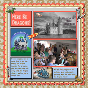
I did do a layout for Lab 6 Mod 6 (not sure what I’m going to do for that Mod 5 yet). Used the sketch/psd template as experiment 4. Created the scallop papers as experiment 3. The bottom dragon paper is from Marisa Lerin. The other papers are my stash; the frames around the photos were made with the magic wand. The dragon slayers peeking out are from the web, but I’m not sure what clip art place I got them from as it was about 6 years ago. The invite was provided by the company we bought the material from to put on the play. The dragons are figurines we had and I extracted them from the photo. The arrows are also mine. The cake instructions were provided with the material we bought for the play and was a lot of fun to make (& to eat). Although the grown ups were the actors, the kids had a ball watching and playing “clue” to find out who did away with the dragon slayer! Oh- fonts: title is AR DELANEY and the narrative font is AR ESSENCE both PSP fonts. The castle and title of the play is a picture of an English or Scottish castle which I made black & white & put the red dragon at the top left. It was the opening of a video I made for my daughter-in-law’s 50th birthday party – when we did the play.
-
This reply was modified 3 years, 2 months ago by
Mary Solaas.
October 3, 2021 at 4:45 am #65392I used one of Corel’s shatter collages and found the wonderful pics on Google. Combined a couple of backgrounds from PixelScrapper. The string element with the beads was also from PixelScrapper. I wanted to create some tags or labels with the locations for each pic, but I ran out of time so I went with plain text. The font is Brush Script MT which is a system font, I think.
October 3, 2021 at 10:08 am #65399Mary, a wonderful page you created, so many details beautifully added to tell your story.
Michele, as always you have created an eye catching vibrant page portraying the colours of Autumn. The whole page is aglow!
October 3, 2021 at 11:21 am #65402Michele fabulous autumn colors and so well displayed!
Mary what a lovely memory!
My other granddaughter’s sport is Taekwondo and she is rather good at it. As I made a layout for her sister, I of course had to do the same for her. There are not so many elements to be found on the different scrapbook sites so I had to turn to Google. Then comes the AI from Paintshop into play because everything I could download was very small and it is great that it’s possible to enlarge! The background is made from the bottom photo before I cropped it; I used a blend mode and low opacity. Font is Trebuchet MS which comes with Windows.
October 3, 2021 at 1:42 pm #65412Anonymous
- 335

- Enthusiast
in another group I made a layout for the challenge image
I practiced making a natural shadow… well… the background paper I made from the san of beach 🙂
the original image is from here: https://www.cossyimages.com/copy-of-cossy-baby?pgid=jgs76d02-2a30d736-6cc7-42a8-abb1-48cfdc55bccb
October 4, 2021 at 12:33 pm #65441Michele: Stunning layout! Those pictures bring back memories! I visited Lake Winnipesaukee in New Hampshire when with my folks on one of our annual pilgrimages to New England from New Jersey when I was young.
October 5, 2021 at 5:26 am #65501Thanks for the kind words, ladies.
I wish I had been on those trips with you, Ann. It must be breathtaking to see it in person.
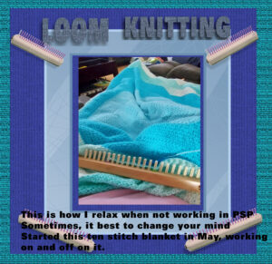
October 5, 2021 at 9:27 am #65505Playing with Filter Forge in this page, it is fun to see what you can create. I am loom knitting a blanket, thought I would show it off with a bit of creation in paintshop pro. I made tubes out of the loom that I am using for my blanket. I did use notepad++ to make myself notes on how I created the text with drop shadows and filter forge. So much stuff to play with. LOVE IT !!!!
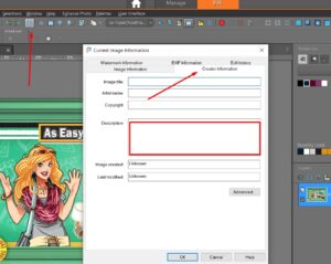
October 5, 2021 at 9:59 am #65508Helen, that blanket is gorgeous! FYI, you can click on Image Information and make your notes there. That way you always have your notes in the actual file. (You can click on Image: Image Information or Shift I)
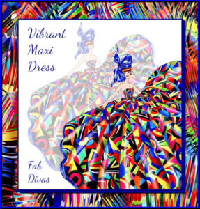
October 5, 2021 at 10:06 am #65510I played around with Filter Forge last night, too. I copied a piece of the dress to a separate image. Then I used Filter Forge: Distortion: Frosty. Can’t remember how many different settings and PSP effects I used until I got the one I wanted to use for the background. I always wish I had more time.
The original fashion illustration is from Sunny Gu and the font is Dancing Script.
October 5, 2021 at 10:12 am #65511It is beautiful. Love it, Michele, great job. Thanks for the tip. But I write really long notes to remember stufff.. LOLOLOL
-
This reply was modified 3 years, 2 months ago by
Helen.
October 6, 2021 at 6:37 am #65589There’s much more space than indicated by the rectangle. Check it out to see if it will meet your needs. The longer you use PSP, the fewer notes you will need. 🙂
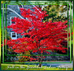
October 8, 2021 at 11:04 am #65700Carole/Cassel suggested we showcase our autumn colors if we live where they become vivid in the fall. Here’s my contribution to the fall beauty of my Hudson Valley here in NY. I used some of the cass-nested frames filled with various green gradients she gave us last March then I applied inner bevels. The font is Heavy Boxing.
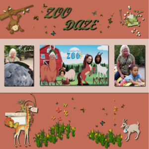
October 8, 2021 at 7:09 pm #65740This is a LO of a zoo trip made when my children were young and the grandkids were small! All the papers and elements are mine except the journal card which is from Digital Scrapbooking (DS) Marisa Lerin.
Sue – the state of New York I fell in love with on one of my travels – it is beautiful in any season of the year. That tree is gorgeous.
Michele – I always look forward to your posting of the Fabulous Divas and the above is no exception.
Pirkko – a beautiful illustration for that lovely quote from 1 Corinthians.
Corrie – those are neat layouts for your granddaughters.
Brenda – love your “zoo” layout. Keep up the good work.
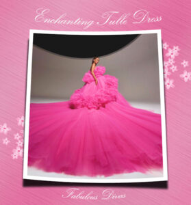
October 10, 2021 at 4:56 am #65774Found this amazing tulle dress designed by Giambattista Valli and used Cassel’s Curved Photo script on it. Filter Forge helped me create the background paper using Textures: Techno: Brushed Metal. Not wanting to go back into FF, I sharpened the background using Adjust: Unsharp Mask to make the effect more pronounced. I also used Cassel’s Smooth Overlay script to make the paper a little more interesting. (You’ll probably have to view it full size to see the details.) The flowers are a scatter from AnnieCDigitals and the font is Kunstler Script.
October 10, 2021 at 4:48 pm #65804Here is my palette challenge page. The background was one from Autumn Watercolor Glitter Frame8 that I adjusted the colors to go with the palette. The photo is mine. The frame is from digitalscrapbook.com
-
This reply was modified 3 years, 2 months ago by
Anne Lamp.
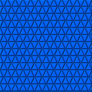
October 10, 2021 at 11:10 pm #65819Helen, Michele, Ann, Anne..WOW. Beautiful work. I totally missed our fall colors, they were also spectacular this year. I’m trying to carve out some PSP time and had 1/2 hour so I did a Triangle Paper tutorial from the Creative Scrap (also in Lab 7 Mod 8). My triangle spacing isn’t great but I went with it and played around with colors, opacity, inner bevel and shadows. It was fun to do and I can see how I could spend hours playing with this. I like the darker blue one that has more muted triangles.
October 11, 2021 at 2:55 pm #65826Michele your tulle dress is just fabulous!
Ann that tree has great colors. Over here the autumn colors are not so vibrant and it is only just beginning to color. Of course there are a lot of little acers planted in peoples gardens and they are starting to color, but mostly our trees get brownish leaves; some are yellow. I was hoping to be able visit my daughter/grands this fall and see those colors for myself, but it won’t happen this year .
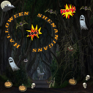
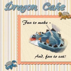
October 11, 2021 at 3:06 pm #65829I’ve just been having fun. Made a separate layout for the dragon cake and will post it in the October theme as well as here. Also, played with possibilities of Lab 6 Mod 5 which I just couldn’t seem to get into before, but I think I will post my meanderings with Halloween Shenanigans. Dragon Cake: papers and elements are mine. Had fun extracting the cake from the counter with the other stuff on it. The font is (of course) Cass-icing – the freebie which I recolored to match the cake. The narrative font is Brush455 BT.
The Halloween Shenanigans: the spooky elements are all from the 3 Halloween picture tubes in PSP, except the web and spider which are from PS – Brooke Gazarek for the web and Gina Jones for the spider; the font is Decorated035 BT (PSP font). The background is a picture from Microsoft of a road in Ireland – reduced opacity with a black layer underneath. I experimented with shadows on this one – different #’s for horizontal & vertical and different shadow colors. A lot of fun.
-
AuthorPosts
- The forum ‘Showroom’ is closed to new topics and replies.


