Home of the Scrapbook Campus › Forums › Showroom › What are you working on (in Oct 2022)?
- This topic has 145 replies, 24 voices, and was last updated 2 years, 1 month ago by
Ann Seeber.
-
AuthorPosts
-
October 18, 2022 at 7:00 pm #84759
Like Janette, I hadn’t heard of ‘gotcha day’ either, and had to look it up. Gotcha is a North American slang word. A word I’ve heard used on occassion in Canada. It’s a word I’ve never heard in any context outside of Canada. I’ve never used it.
October 18, 2022 at 8:55 pm #84761Anonymous
- 335

- Enthusiast
I miss spring so much
October 18, 2022 at 10:56 pm #84762Hi i saw Pirkko say what shes working on and came to say glad your back missed you around here plus congrats on your new place. Glad your back like they said 🙂
October 19, 2022 at 12:11 am #84765Anonymous
- 335

- Enthusiast
Thanks Cindy
October 19, 2022 at 5:41 pm #84784Lovely page Pirkko, simplicity at its best!
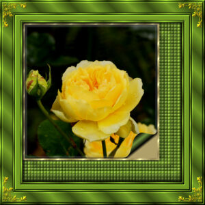
I do enjoy creating frames, to showcase my photos. I find creating them quite relaxing.
October 20, 2022 at 7:17 am #84799Anonymous
- 335

- Enthusiast
Thanks Sue
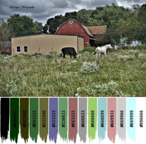
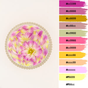
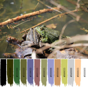
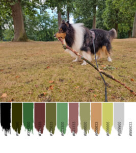
October 20, 2022 at 12:23 pm #84806I purchased Carole’s Palette Maker 2 and it is really nice. Here is a sample.
October 20, 2022 at 2:10 pm #84808Wow Lynda, that is so cool. I also purchased it and hope to try it out today. Love the colors that it picked.
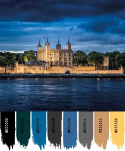
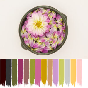
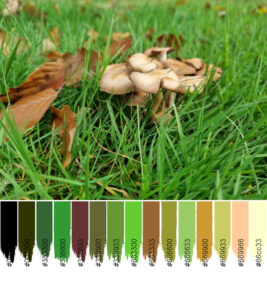
October 20, 2022 at 2:27 pm #84813You are inspiring me, Lynda. Now I had to try it out, also. Here’s a photo I planned on working with for a Ghosts layout.
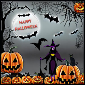
October 20, 2022 at 2:57 pm #84816Took an idea from Anita. CF Spark is a nice program from Creative Fabrica.
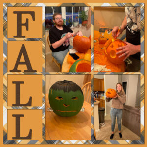
I also made a Halloween layout using CF Spark and Carole’s web frame. Fun
October 20, 2022 at 4:17 pm #84820Susan and Ann, there was a sight glitch in the script which Carole fixed. I’m sure she will be getting to all but you might want to ask her in the meantime. It’s just the HTML codes (#ffffff) are not correct.
October 20, 2022 at 5:23 pm #84824Lynda and Carole: I tried several times with various amounts of colors and kept getting little stubby bits of color with the Hex codes way down below it. The one I posted finally worked. I guess the image can’t be too large. I had to reduce it to 600 pixels to get the correct color displays.
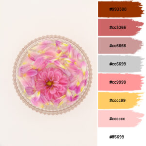
October 21, 2022 at 1:41 am #84861Oh, this new Palette Maker 2 Script is FUN! And addicting. The results are art in itself. I wasn’t expecting it to be so easy and fast. Here’s my tests. I did the default choice 8 colors and choose with the Hex. Love that it’s on a different layer so I can choose to use the photo/palette with or without the Hex. Then, I tried 12 and 15, I love the look of more strokes. BTW I really like the brush strokes. Another cool thing is it makes a copy of the original photo then makes the palette/photo combo. But the cool thing is the copied photo is really neat looking. It could also be something to use in a layout. I didn’t edit my photo’s so they might look a little off colored, my monitor seems a bit on the warm side. Hoping new monitors come into my life soon.
Thanks for the heads up Lynda. I don’t use Hex codes, I’d probably leave them off and use the dropper to pick the RGB anyway. but I will get the un-glitched version because I might one day want to use them (Hex).
-
This reply was modified 2 years, 2 months ago by
Susan Ewart.
October 21, 2022 at 8:22 am #84871My milk mug was getting ugly so I decided to design another one. The old one had Gilmore girls things on it, but now I’ve been adjusting one image (also Gilmore girls,but the aligning is far better) but on the other side Outlander. This is the result. 🙂
October 21, 2022 at 3:08 pm #84888WOW – everyone has been busy. I, too, bought that palette maker script even though I had the 1st one also. Haven’t tried it yet. Like what you did Susan, Lynda, Pirkko, Jannette, Monique, Ann.
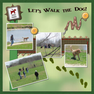
I’ve been messing around creating elements (not papers this time). This is Lab 10, Mod 3: Bracket Frame and label (used the label and gave it a wood pattern and inner bevelled it), Boot print and custom sign (actually made 2, but decided to use the dog park sign – may use the hiking trail sign later as I have some pics from Harpers Ferry, WV where the conservancy is for the Appalachian Trail); the leash is from Nice Png and the font is AR JULIAN. All the rest is mine.October 22, 2022 at 12:00 pm #84913I recently saw something like this on Pinterest, and I wanted to try if I could make it myself, here’s the result.
The font is a free font I think from creative fabrica, Bomshel Script Slant. I made 3 masks using Carole’s Raster to Mask script, which is very easy and fast with the script. That way I could also place a photo above the letters and below the letters instead of a color or paper or pattern.
I used a tube for the leaves, but I don’t remember where it comes from.
 October 22, 2022 at 12:07 pm #84914
Marie Claire, STUNNING! I too saw something like this and did a screen shot of the layouts as inspiration. I had no idea how to even make it. This is really beautiful.
Mary, I love that layout and the colors are so perfect.
Lynda, what a great graphic, I did try the CF spark. it’s pretty cool.
Monique, after you create your image for your cup/mugs, what do you use to get them onto the mug. Or do you send them to a photo store. They would make great gifts.
October 22, 2022 at 12:47 pm #84919Carole, I have a problem, I think something is wrong with my settings.
I got this result with the palette maker 2 script.
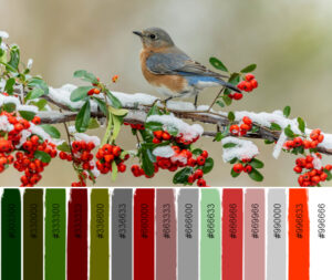
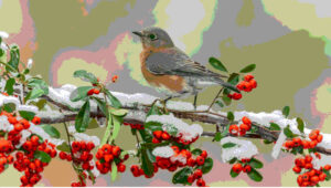
photos from my DSLR (photo 1) are the dimensions 5184 x 3456 and there the result is ok.the dimensions of the photos from my mobile (photo 2-3) are 4032 x 3024 and as a result I always get the following ?
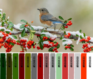
The dimensions of the photo with the bird (3) are 3840 x2160 and the result is also not ok there.
Is there something in my settings that isn’t right?
October 22, 2022 at 1:45 pm #84922Susan, thank you, I’m going to have to do it again, because I’ve done so much and of course not noted down, what I do remember is that I first made a raster with the edge and filled it in a shade of gray.
A second raster with the top text in a shade of gray
a third raster with the bottom text.
Then came the thinking of how to make the selections, I have to do that again to be able to explain it, because I don’t remember how I did it myself ?-
This reply was modified 2 years, 2 months ago by
Marie-Claire.
October 22, 2022 at 1:54 pm #84926Marie-Claire / Cassel: I “borrowed” your bird photo as I was curious why a bluebird would have no blue in the palette. Here’s the result: the extracted photo the script creates and the final product, that was the same as yours, Marie-Claire. Note the blue is gone from the extracted photo!
October 22, 2022 at 1:56 pm #84927Marie-Claire: Your Autumn Memories is stunning!
October 22, 2022 at 3:01 pm #84928Ann, thank you ! and I was so busy wondering why I had this sizing problem so that the bruches don’t line up, that I didn’t even notice that no blue was selected, indeed now that you mention it
October 22, 2022 at 3:17 pm #84929I tried to make a template of the wordart Autumn, and uploaded it in the facebook group,
October 22, 2022 at 3:49 pm #84931Marie Claire,
I agree with Ann, your Autumn Memories is stunning.
Lynda
October 22, 2022 at 4:34 pm #84932Marie-Claire: Thanks so much for the template. (I LOVE templates! 😉 ) Here is my version. Using Marie-Claire’s template, here is Autumn Memories in the Hudson Valley. I used the same photo 3 times. The lettering and the border are a St. Patrick’s Day paper. I added flying bird silhouettes, and the Mallard ducks are tubes.

-
This reply was modified 2 years, 2 months ago by
Ann Seeber.
October 22, 2022 at 10:21 pm #84949Marie-Claire, I downloaded your template. I will be trying it as soon as I get my computer on the straight and narrow again. Thank you!
Becky Bee at Digital Scrapbooking posted a layout with this template that I liked so I downloaded the template. I had to search a bit but it is there. I am not sure I am happy with my layout but it will have to do until later. I did modify the template a bit. Original used only 2 photos.
https://internationalwordart.com/ monthly template challenge october 2022
October 23, 2022 at 8:08 am #84964Susan, I put this one on a mug 🙂
October 23, 2022 at 8:09 am #84965Wonderful colours, Ann! Like the colour of the font too 🙂
October 23, 2022 at 8:29 am #84966MoniqueN: How do you put a design on a mug?
October 23, 2022 at 10:16 am #84967Ann, you have companies who do that. Over here (I think it’s a from origin an American company) does that. http://www.vistaprint.nl
-
AuthorPosts
- The forum ‘Showroom’ is closed to new topics and replies.


