Home of the Scrapbook Campus › Forums › Showroom › What are you working on (in Nov 2022)?
- This topic has 109 replies, 21 voices, and was last updated 2 years ago by
Michele.
-
AuthorPosts
-
November 6, 2022 at 7:39 pm #85837
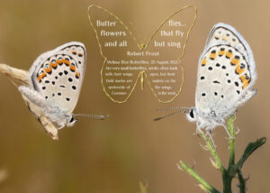
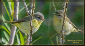
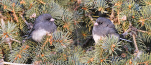
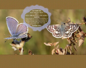
After watching today’s masterclass on blending. I thought I’d I show you some examples of the pages I have created using the same techniques demonstrated today. I have always used masks, and adjustment layers, as Carole said, they can be reopened at any time to be edited. I suppose I do have some advantage. I always use my own photos, which more often than not means that the backgrounds are almost identical or at least very similar. Especially when the shots are taken in the same area on the same day. Correct lighting should always be taken into account when blending, for the best realistic blend result.
November 6, 2022 at 7:44 pm #85838Sue, I definitely thought of you when I was working on those birds! 🙂
November 6, 2022 at 8:07 pm #85842Carole, as was I, thinking of you thinking of me, and my birds. ?❤️
November 7, 2022 at 2:01 am #85845Those are great Sue, thanks for showing them. It’s unreal how it looks like it was shot that way. The master class was outstanding. More ways to blend that I expected.
November 7, 2022 at 2:06 am #85846Mary that is wonderful. I love the honeycomb background on the 3 picts. Your colors are perfect for capturing the feeling of the world of Pooh.
November 7, 2022 at 4:27 am #85850I guess the format here in the Forum has changed because the images don’t open nicely in a larger version when I click on them. Of course, posting the link from the Gallery gives a much larger version but I’m still struggling to get those aligned with my text here in the Forum.
And Carole Cassel: as I mentioned, the Selection tool set to Fixed size is giving me headaches as it won’t acknowledge the new, larger image I want to work with. Many times I have more than one open in my PSP and it seems to get stuck on a previous, smaller size and won’t adjust to the image I have newly activated. Sometimes, in frustration, I end up closing my PSP2022 down altogether and re-opening with just the image I was attempting to use the selection on. Hoping for a tip or trick to fix this. Thanks.
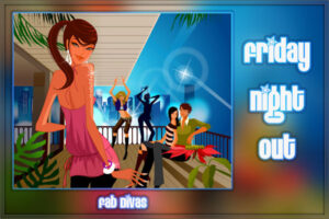
November 7, 2022 at 6:22 am #85855We tend to focus on inner bevels so I thought I would show any newbies what can be done with the 3D Outer Bevel effect. I don’t know how visible the effect is in this 600 pixel pic, but I used it around the party pic and the text. The background is simply an enlarged version of the party pic blurred (gaussian) with a 75 radius. The font is EightTrack, free from fontspace.
November 7, 2022 at 6:50 am #85857Nice, Michele. Always glad to view your Fab Divas! I’ve tried Outer Bevels but have no luck with black or very dark borders. Do you have any tips?
November 7, 2022 at 8:57 am #85861I do admire your work Michelle. You page is great, as always. I agree, myself included, tend to use the inner bevel more. Although I do use the outer bevel in many of my frames and framing. It looks great on the text. I use the dimension script a lot, for 3D effects, especially on text and shapes.
November 7, 2022 at 9:02 am #85862Thank you Susan. Hopefully, they will help inspire others to have a go at creating that effect. As I said using my own photos gives me an advantage, and correcting lighting is paramount.
November 7, 2022 at 9:04 am #85863I’ve noticed the small pictures that are produced when you click on a LO. But, I have discovered that if you right click on the pic and choose “open in a new tab” it comes up about the size we had become accustomed to before.
November 7, 2022 at 10:56 am #85878Sue, what I love the most in your projects, is how you often let something of your subject come across a frame, I can’t quite translate what I mean, it’s like in your project of the house sparrow female. the tail comes over the frame, it’s always so beautifully extracted. What tool/technique do you use if I may ask?
November 7, 2022 at 11:02 am #85881Mary (#85863) I have also small pictures now ?, I tried the right click “image open in a new tab”, it is indeed much better !
November 7, 2022 at 11:06 am #85882AprilDawn (#85493) You’re welcome!
November 7, 2022 at 11:43 am #85883Marie-Claire, thank you for the kind words on my work. I’m pleased that you and many others notice, as they are meant to be small subtle details, that give that special touch to a page.
Carole refers to that technique as out of bounds. There is a masterclass on it.
Extract the area using the eraser tool. Very very carefully, I might add. Leaving one pixel behind will destroy the effect. Move above the frame. It’s imperative that everything retains its original sizes and position. These are the basic steps. I will use other tools and techniques depending on the project. I u always use a mask when I do extracting. Check out the masterclass called Out of this world.
November 7, 2022 at 11:47 am #85884Mary, thank you! That does open a larger view.
November 7, 2022 at 11:51 am #85885I also noticed that the images were no longer showing as large as before. At first, I thought maybe someone just saved as a smaller size, but maybe it is due to an update 🙁
November 7, 2022 at 11:53 am #85886Riffing on Carole’s class on Blending Photos I just put these two together. My granddaughter and her new husband from the wedding ceremony on Sept 9 and later on honeymoon in Key West, FL. The word art is from Marisa Lerin.
 November 7, 2022 at 3:22 pm #85906
Thanks Sue, I’m going to take a closer look at those masterclasses.
November 7, 2022 at 3:28 pm #85907Ann, very well done ?
November 7, 2022 at 3:49 pm #85908I made this with the template from Lab 12-09.
Used the same photo 3 times.
The background with the words ‘life’ is from Marisa Lerin.
The font is Cooper Black
Effects – Distortion effects- Rippling used on the word DAY November 7, 2022 at 6:49 pm #85914
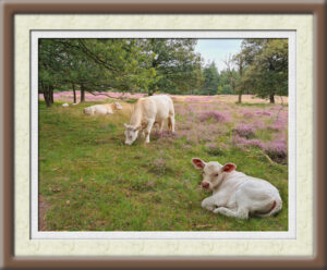
I have a couple of photos from a day out (last year) and the calf was laying to far away to get them all in the same picture, but using the first technique from yesterday’s masterclass I have them all together now. The frame is made with the simple frame script that I won last week. It’s a nice script and gives lots of options to make something complimenting the photo. I could have made a little label with a date or place but it’s bedtime for me now.
November 7, 2022 at 7:10 pm #85923I was inspired to practice the blending techniques that Carole demonstrated in the webinar this weekend and eventually managed to combine three of my photos onto one. I did make a mess to start with and thought I’d mention in case it happens to anyone else but I had the ‘Colour’ Match Mode selected for my Fill Tool instead of ‘None’. Hopefully Carole has taught me the lesson now and pointed me to her blog about the Fill Tool that helped a lot in understanding what I had done wrong:
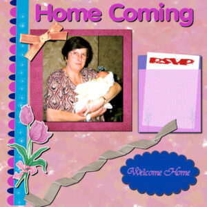
November 8, 2022 at 1:22 am #85950Hi, Still plugging away this is my attempt at lab 6 03. The multi coloured ribbon along the left edge, the semi transparent envelope to the right and the scalloped shape in the bottom right
November 8, 2022 at 5:42 am #85953Playing with Blending techniques and my granddaughter’s wedding photos. This is two photos, one of the couple and the other of the flowers on the head table. The word art is stamps from Pixelscrapper. The frame started out as a white mat but playing with inner bevels I decided to leave it like this.
 November 8, 2022 at 5:53 am #85954
Thanks so much, Ann and Sue.
Ann. I play with different colors and settings to get the outer bevels to my satisfaction. It really depends on the background. The one I used for Friday Night Out started as a randomized pick that I then tweaked.
I use the dimension scripts sometimes, too, Sue, when I have ample time to play with them. As you know having a deadline every day, I’m often rushed.
November 8, 2022 at 5:54 am #85955By the way, I just love what everyone is doing this month. I get inspiration from all of you. <3
November 8, 2022 at 3:13 pm #85963November 8, 2022 at 3:41 pm #85966Fiona, thanks to point to the blog about the flood fill tool ?
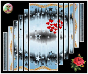
November 10, 2022 at 10:46 am #86067Kiss from PSP created with PSP;) You know, Carole’s template (btw, I like it and going to use it often this time because, IMHO, the template gets a little 3D to the image:), free paper and PSP’s effect here, Carole’s golden chain, my hearts from tube. That’s all:)
-
AuthorPosts
- The forum ‘Showroom’ is closed to new topics and replies.


