Home of the Scrapbook Campus › Forums › Showroom › What are you working on (in March 2021)?
Tagged: March 2021
- This topic has 348 replies, 21 voices, and was last updated 3 years, 8 months ago by
Karon Dey.
-
AuthorPosts
-
March 24, 2021 at 9:27 pm #55376
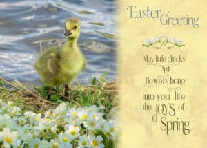
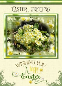
An Easter e -card. I used two photos, I used the Primroses as an overlay, used the eraser tool to remove what wasn’t needed. I also used an overlay on a yellow paper, used a mask to merge the two together. The element is a font, which I coloured in to match the primroses. The primroses, are out in flower at home in Wales, as for here we still have snow down, and the ground is frozen solid. My usual word art type of greeting.
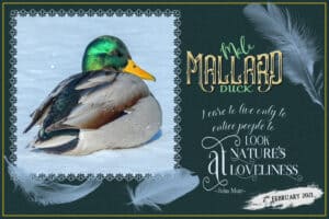
March 24, 2021 at 9:32 pm #55378I’ve done a lot of pages, some of them I posted on facebook. I used one of Carole’s edge punch brushes to create the frame. Various fonts to create the word art. The feathers are brushes.
March 24, 2021 at 9:47 pm #55382Cristina, wonderful to see your pages, it has been a while, and you have been missed. I love the out of bounds page, you did a great job. If I may make a suggestion, and I’m not being critical by any means, as I know you will appreciate my suggestion. The Olivia beads threaded on string, after you have angled them correctly on the curve using the pick tool, aligning the centre pivots with the string, select the eraser tool, and delete a notch on either side slightly larger than the width of the string, and not to deep, once done add a drop shadow. This is a project I did the other day using one of Carole’s bead scripts.
March 25, 2021 at 4:12 am #55385Sue beautiful work on all four of the pages I have just viewed. You continue to entertain me with your love of nature, your delightful photography and your artistic bent which knits it altogether. I am inspired, thank you my friend. ;D
March 25, 2021 at 4:22 am #55387This page has been inspired by Cristina’s layout of Olivia. A direct steal or plagiarism whatever you may want to call it … for me, it is a true admiration of the beautiful work that inspired me … thanks so much Cristina, I do hope I have not offended you. Thanks for takin a peek my friends. 😉
March 25, 2021 at 6:21 am #55389Connie, beautiful layout, simple, and so effective. Great job.
Sue, your work is always delightful and a source of inspiration for me… I love, love what you did with the beads, what a great idea!… I didn’t know Carole had a script for it… I think I have to get this one. : )
You know that I’ve been working on this Out-of-Bounds layout for a while ; ) … I’ve changed it so many times, lol… Of course, I don’t mind your suggestions, I value your input, and I am more than happy when someone points me where I can improve. You can be sure I will go back and do what you suggested. Thanks a lot for your kind words of support, my friend! <3
Annie, I am blushing now!! : ) I am more than flattered with your compliment… Your Out-of-Bounds layout is beautiful! I love the background and the alpha. Wonderful job as always, my friend! <3
This is what I like here, everyone creates different things, uses different techniques, and this way, we learn a lot from each other… I am happy to say that I’ve made good friends over the years; some are still here, some are not… I still miss seeing Dawn’s beautiful cards.
March 25, 2021 at 10:31 am #55392Annie, like Christina, I’m very flattered at your comments on my work. It’s a good way to start any day, with a morning cuppa while scrolling through the pages of countless creativity in the forum. Your out of bounds page is fantastic.
Christina. I have several of Carole’s bead scripts. They save a great deal of time. I can and do make my own, using a tutorial in the creative scrap. But I have to do each one individually, whereas the scripts will do a whole short sentence if need be. Likewise, I am a great fan of your work, and you inspire me too.
March 25, 2021 at 9:16 pm #55418Cristina and Sue, thank you very much for your lovely comments on my work. I really do appreciate it and like yourselves I love how this group grows in knowledge from each other as well as from Carole’s wonderful tutorials. How lucky can we be. ;D
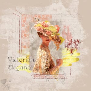
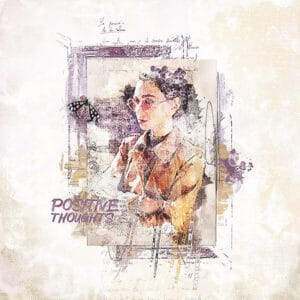
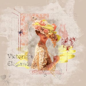
March 26, 2021 at 4:28 am #55430Hello Fellow Campers. This is a copy-cat of a layout that I very much admired. I came across it via this campus but now I cannot find it to give credit … a beautiful piece of art that I very much wanted to replicate. I will display the original as well as the page I created. It was not easy to copy and I made good use of the eraser tool to achieve the desired effects. The artwork is by Sue Halstenberg and it is a tube that I have had for a very long time. I hope I have done it justice because I really love this victorian lady. The font used for the title is Perry Gothic. Thanks for takin a peek my friends. ;D
March 26, 2021 at 1:20 pm #55444Annie, wow, I don’t know how you did, techniques used, but this is O-U-T-S-T-A-N-D-I-N-G!
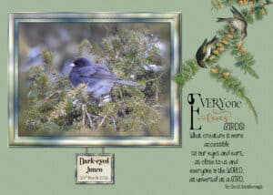
March 26, 2021 at 2:46 pm #55451I haven’t done an elaborate simple frame for a while, I’m back in that frame of mind, so to speak. I seem to go through phases. Anyway this was a project I did last night. The Juno was rather high up in the tree, a bit far away for the camera, so the photo isn’t that good, yet I still love the colours and textures of the photo. He’s all fluffed up, as it was cold. For the frame I used brush strokes, paste into selection, cut out, and a few more tools. I duplicated the photo, masked the photo, placed it on top of the duplicate image, used a blur and brush strokes on the duplicate layer to get the nice edge. Clip art I found on the net. Created word art, for an appropriate quote by a man I have respected and admired since I was a child. I must say I never use tutorials, other than Carole’s, It’s all trial and error until I’m happy with the result.
March 26, 2021 at 2:51 pm #55452Annie, I’m lost of words, your latest pages are stunning! I assume that you use masks, and double masks, and play around with overlays and the blend modes. Creating pages like those, one needs a very keen eye for colour and detail. Superb creations!
March 26, 2021 at 3:57 pm #55453Annie a fantastic layout and I love those colors. When I see something like this, I realize how much I still have to learn!
Sue again a very lovely page with again an other bird. I get to know a lot, for me, exotic birds or species we don’t have over here in Europe. I like your frame too.
March 26, 2021 at 8:26 pm #55459Thank you so much Cristina. Now that you have given me that wonderful compliment I must add that on reviewing my page I discovered three mistakes … no butterfly, the scribble on the right is overlapping the ladies hat and the funky squares are also overlapping the lady … duh! Well I can tell you that it did take a little while to complete and it was all done with brushes, overlays, blending, pen tool and most importantly, the eraser tool. Honestly, that is one of my ever favourite tutorials by Cassel … such a simple tut but the effects can be amazing. When I first started on creating the page it just looked ugly but as each layer was applied and blended it started to come together. I was pleased with the result and may, or may not, add a butterfly and pull the scribble and square under the Victorian lady’s image. All in a creative day’s work, lol! Always appreciate your comments dear friend, thank you. ;D
March 26, 2021 at 8:57 pm #55461Sue this is really a delightfully lovely page. To me, you are the queen of simplicity, masks and wordart. The frame is simply gorgeous and the whole effect is perfect. Like yourself I am a huge fan of Sir David Attenborough … he has made his mark on the world and opened our eyes to the glory of nature. I never tire of perusing your work my friend and , to me, your photography is truly amazing.
As for my work no masks were used (as I said you are the queen of masks). It was all overlays, blend modes, opacity, colour change ups and that delightful eraser tool. You have inspired me to give wordart another go as I do so admire it but somehow I always manage to make a booboo and it just looks ugly plonked on my work, lol! I’ll keep trying my friend. ;DMarch 26, 2021 at 9:09 pm #55463Dear Corrie, thank you so much for your kind and lovely compliment. The style I have created with Victorian Elegance is one I have been aiming towards for many, many years. I would not have gotten there without Cassel’s wonderful tutorials and a bit of plagiarism. I don’t think I am really there yet but perhaps I’m on my way. There are many styles that I admire and I wouldn’t want to get stuck in a groove … Cassel wouldn’t approve of that … ‘dare to move out of your comfort zone’ I can hear her say, lol! Your work is always lovely Corrie and I get as much enjoyment perusing it as I do all the others … you, my friend, are well on your way! ;D
Here is the amended version of Victorian Elegance. Thanks for takin a peek my friends. 😉March 26, 2021 at 11:10 pm #55468One of this year’s Easter ecards. Lots of techniques used in creating the framed photo. Masked the photo, seamless tiled a section of the flowers, flood filled, place the layer underneath the masked layer, played with some effects. Brush strokes used in the frame.
Thank you so much Annie for the kind words on my page. Whereas you would use the eraser tool, I would use a mask, you should try it. I find I have more control of removing parts of an image, what’s more I can always go back at a later date and change what ‘ve done. Which you can’t do with the eraser tool. Either way, you did a superb job, and it’s down to personal tool preference. Beautifully executed my friend. Soon you will be getting out your winter clothes, while I will be getting out short and T shirts. The horses are shedding their winter coats too.
March 26, 2021 at 11:58 pm #55472You are most welcome Sue. This is a lovely Easter greeting card, such pretty flowers and frame … and, again your wordart is to die for. Yep, will be stepping into some winter clothes soon … for all of about 8 to 12 weeks. It starts and ends abruptly here in Australia, almost as if nature has set a clock, 🙂 I will be playing around with wordart and masks … just because you have inspired me … thank you my friend. ;D
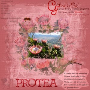
March 27, 2021 at 4:54 am #55475Hello Campus Friends. I have been playing with masks. Each protea flower surrounding the main image has been extracted via a mask. Adjusting the blend mode and opacity of these layers has resulted in a loss of the mask but that is the result I wanted. The main image was masked and I allowed a slight drop shadow as the usual paper shadow was too ‘obvious’. Wordart top right is my own although the poem is not as with the one on the left. Many layer overlays, blend modes and opacity changes to achieve the background paper. Alpha is from Designer Digitals by CZ and called Messy Slabs. Thanks for takin a peek my friends. ;D
March 27, 2021 at 5:25 am #55476Thank you, Cristina. I ended up needing an extraction and implant. Today is the first time I’ve been able to eat anything besides yogurt or apple sauce. My appetite is back and I can eat semi-solid food. Woo-hoo!
Thanks so much, Annie. And I love the macaws! The colors you used are perfect. Your Victorian elegance is wonderful and I don’t consider those things as mistakes. When you use something as inspiration, you put your own take on it which you did. The mask you made for Protea is absolutely stunning.
Connie, I don’t know how many times I’ve done the same thing. LOL
I already “loved” your cards on the FB group, Sue. They’re wonderful.
March 27, 2021 at 6:12 am #55477Sue, you are the master of frames! I love to enlarge the images and pay attention to all the details, textures… Both are just lovely work and so, so pleasing to the eyes.
Annie, I have noticed “all three mistakes,” but I didn’t want to hurt your feeling, so I decided not to point them out. LOL LOL … But I understand you; many times, I only see the issues to be corrected after posting here. Anyway, the page was perfect before, and now it is more perfect!
Beautiful work on the protea flower page. I love the background paper and the colors.
Michele, good to hear you are feeling better, although you needed an extraction., Two years ago, I also needed an extraction and implant, and here there were no restrictions on what I could eat… I was surprised but didn’t have any problem with that.
March 27, 2021 at 9:24 am #55483Annie, another beautiful page, you have an understanding of the use of blend modes. I noticed what you called mistakes, but are they really mistakes, I wouldn’t say so, as you haven’t used any drop shadows. Your mask is great, and so is your word art. well done. Thank you ever so much for you kind comments on my Easter card, I away appreciate them, coming from experienced pspsers they mean a great deal to me.
Cristina, thank you for your kind comments on the framing. I use my full sized photos, which means I have to resize them down greatly to post them. Which means a lot of the details are lost, unless you really zoom in.
Michele, I didn’t realize you were under the weather. I can only imagine how painful it must have been, as I have never had toothache. I’m pleased to hear that you are much now, even though you had to have an extraction.
March 27, 2021 at 2:28 pm #55495Annie, thank you for your encouraging words! Coming from you it means a lot to me. The protea flower I only have seen on photos or tv-programmes and looks delightful.
Michelle, good to hear you feel better! I know from experience that those extractions are horrific and what is most annoying my husband has no problems with them if he has to have one!!!
March 27, 2021 at 3:44 pm #55510March 27, 2021 at 6:02 pm #55516Michele, Cristina, Sue and Corrie … you truly are sweeties. Your comments are always inspiring. I guess when we make ‘mistakes’ we are really learning. Thank you my friends, very much appreciated. ;D
P.S. Very glad your nasty tooth is out and you are on the road to recovery Michele … toothache is a most unpleasant ailment. 🙁
March 27, 2021 at 6:11 pm #55517Lynn, a lovely and colourful background paper you have created. The gradient is lovely as the colours merge beautifully. Well done. 😉
March 28, 2021 at 5:09 am #55526That’s a great paper, Lynn.
March 28, 2021 at 5:38 am #55527Lynn, that is a beautiful paper; it was a good idea to use a gradient.
March 28, 2021 at 9:46 am #55535Ok, breaking this into two since there is so much I want to say… in the order I saw the layouts…
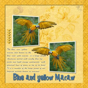
Annie T – The Curragurrong falls is beautiful and the colors you use in your layout really bring it out. Your Blue and Yellow Macaw page with them flying out of the photo is delightful. I like how you did the flowers / leaves in the background like stamped images. Your Positive Thoughts is splendid. You did a great job in coming up with the same effect. Thank you for the idea on how to use masks like you did in your Protea layout. That is beautiful and I love the extra touch with the bea and the dragonfly.
Christina – Your balloon one looks like yuo had fun. And the one of olivaia and how you had her coming out of the photo is unique and really makes me smile.
Ann S – Your Rockin’ Robin page – ROCKS! Grin. I like your writeup and the burst of colors that go with the Robins.
Mary S – Wow. You did a fantastic job on getting rid of the hand and glass as well as the whole finished look. I like how you added the corner punches.
Corrie – Your easter card is beautiful. What a great use of the mask.March 28, 2021 at 9:47 am #55536Sue T – Thanks for posting that mask on Facebook. I haven’t used it yet but wanted to say thank you know before I forget. Your Quote Robin layout is lovely. Your Easter Greeting with the chick in it is so much fun. You did a knockout job on bringing it all together. The Male Mallard is unique. I love the quote and the feathers you added. I appreciate what you told Christina about the beads on threads… I would never have thought of that and what a difference it makes. I learn so much on this forum looking at layouts and reading comments. Your Dark-eye Junco is exquisite. The frame you did fits so well and I would love to buy one in the store. I like the whole layout and the fact you did it again just as beautiful in your Easter Greeting layout.
Betsy – Looks very Victorian. Beautiful.
Lynda – Your balls and bubbles look great.
Michele – I like how you u sed the bubble with your Prom Fashion. Just gorgeous. Hope you feel better now.
Connie – Beautiful wintershed layout. The colors bring out that winter feeling.
Lynn – Great job on your dot template! -
AuthorPosts
- The forum ‘Showroom’ is closed to new topics and replies.


