Home of the Scrapbook Campus › Forums › Showroom › What are you working on (in June)?
- This topic has 130 replies, 7 voices, and was last updated 6 years, 5 months ago by
Annie Tobin.
-
AuthorPosts
-
June 21, 2018 at 5:13 am #19503
Lovely use of texture Michele, job well done my friend. 🙂
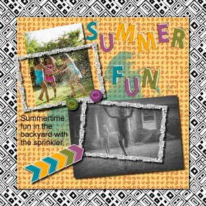
June 21, 2018 at 5:17 am #19505I had to have a go at this. Such simplicity and very effective. Wanted a grungy/messy alpha and couldn’t find one so decided to create my own … turned out ok! I’m finding more and more that creating your own elements etc., with psp is very self satisfying. Thanks for takin a peek!
June 21, 2018 at 5:51 am #19509Thanks so much, Annie.
Love the way you did your fun alpha. And all the colors contrasting against the the b&w looks wonderful.
~ Michele
June 21, 2018 at 6:38 am #19511Thanks again Michele, you rock my friend! :)))
June 21, 2018 at 10:16 pm #19526Annie…. your Lab 6-3,4 and 5 projects are very nice. the Lab tutorials are a great way to learn PSP… I must do a few more myself.
Michele… you birthday card looks nice and I am sure you friend will be happy to receive it.
Dawn.
June 21, 2018 at 10:26 pm #19527Thank you Dawn, very much appreciated. 🙂
June 22, 2018 at 5:37 am #19538Hey, you can post again, Dawn! We missed you on the campus.
~ Michele
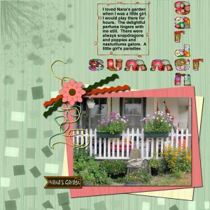
June 22, 2018 at 9:23 am #19549Hello Scrapbook Campus Friends. I was perusing Cassel’s earlier tutorials and liked the look of the Basic Scrap Course Module 2 layout so decided to give it a go. I am totally enamoured of the Open as One Layer script … bonus, and I am becoming addicted to creating alpha. Also can use this one for the June word challenge. Thanks for takin a peek.
June 22, 2018 at 8:15 pm #19592Annie a very sweet page and a beautiful memory for you to hold on to.
best wishes,
Dawn.
June 23, 2018 at 5:50 am #19594Thanks so much Dawn … yes, I do treasure those memories. 🙂
June 23, 2018 at 8:16 pm #19608hello Everyone… a little update on the problem I was having trying to upload etc in the forum area. my computer friend came home from his holiday and after much testings he determined it was internet explorer 11 that had a hiccup in it somewhere… so he reset it and what a surprise…. he was right… so now problem solved.. ( I hope).
I started this project with the Lab 8-06 template modified but ended up with a double page layout. I hadn’t really tried the double page effect but I am pleased with how it turned out. The photos were taken by my in-laws on their vacation travelling through the Bunyeroo Valley…. The gold tone paper is a freebie from the coffeeshop blog and I used Cassel’s Torn edge script on it… I made the plaid paper and the floral rings brush….I chose the Chrome tutorial from Lab 8 to create the Australia word but changed the colour to blend better with my colour theme.
Dawn.
June 23, 2018 at 8:29 pm #19609Love it to bits Dawn, simple and very effective, my kinda project, 🙂
June 23, 2018 at 10:25 pm #19611Annie thanks so much for your kind comments I appreciate it very much… I enjoyed doing this double layout so I will probably do some more in this format .
best wishes,
Dawn.
June 24, 2018 at 1:21 am #19618Happy to see you back, Dawn. Your layout is beautiful. I love how you faded the colors on the background pic to further highlight the three in the middle. I haven’t gotten to the Chrome tutorial yet, but I love the effect.
Annie, you made a lovely tribute to your grandmother’s garden. Amazing how smell can trigger our memories. I really like how the title looks. Do you mind sharing how you made it?
~ Michele
June 24, 2018 at 7:43 am #19619Annie, lovely layout and journaling. Smells really bring back memories… I remember going into a shop years ago and smelling a perfume that immediately reminded me of my mother using it when she was going out. It brought back good memories from more than 40 years ago… and in the end, I had to buy it. 🙂
Like Michele, I like the title very much and was wondering how you made it. Great work!
Dawn, I am so happy you are back! I do hope that the problem is solved but just in case, what about downloading another browser, like Chrome for example? So, if in one doesn’t work you will always have another. 🙂
Your double page is beautiful… the colors and tones… I love the title with the chrome effect and the way you arranged it. Great layout!
June 24, 2018 at 9:29 am #19620Michele, I appreciate very much your comments on my project and I am also happy that I can once again participate in the forum.
Cristina, my friend did install Firefox to do testing with and it did work so we will leave it on my computer in case the problem returns. Thank you so much for your comments, they are always appreciated….. I did miss not being able to participate.
best wishes to you both,
Dawn.
June 25, 2018 at 2:54 am #19648I had some fun making a birthday card yesterday for one of the members of my gaming group. First I rotated the main yellow flowered paper on image 1 by 90 degrees. On image 2, I used a copy of the original paper and first applied a kaleidoscope effect, then a seamless tiling effect. I copied it to image 1 and moved the layer down. Going back to image 2, I selected and resized it so I could use Cassel’s Bow9 script on it. I just loved the way the bow came out. The font is a cute one called StitchCross that I picked up for free somewhere along the line. (Added various borders with different effects, too, obviously.)
I hope to have the time to get back to the Campus’s tutorials soon.
~ Michele
June 25, 2018 at 3:43 am #19649a really lovely card Michele ! … cards are fun to do and you did a terrific effect with the kaleidoscope on such a pretty paper. The font is really nice and you are right … the bow turned out great !
best wishes,
Dawn.
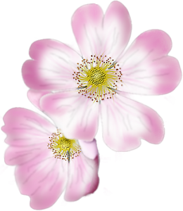
June 25, 2018 at 4:17 am #19653Everybody has been so busy and creating some good stuff. Love to see the different things being done. I too have been doing things . I have been practicing drawing and painting. I am no artist but can trace with the pen tool, love them nodes. Here is what I came up with, a Dog Rose.
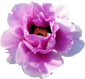
I also extracted a peonie and coloured in a rose from a line drawing, sorry don’t know whose drawing it was as I have had it on my PC for a very long time so I can’t credit the original artist. Anyway, thanks for looking. Sheila x
June 25, 2018 at 4:21 am #19654Michele, lovely card! The flower image is so cute and has a very nice texture… The kaleidoscope effect turned out great… And I love the bow, what a great script… The font fits perfect… Great work!
June 25, 2018 at 4:24 am #19655Sheila, they are beautiful!!
June 25, 2018 at 5:39 am #19657Hi Michele. Thanks so much for your kind comments my friend. As for the alpha, well … I found on the web a sample of an alpha that I liked. Copied it into psp, then copied the letters I wanted with the pen tool using a solid line setting size 1, putting each letter on a separate layer. The initial outline was plain the scratchy bits came later. After the initial outline I clicked inside the letter with the magic wand and then expanded by 5 or 10 (whatever suits you) and then, adding a new raster layer, flood filled with a floral pattern set to a percentage to suit the size of the letter (alpha). I then went back to the original solid thin outline and added the scratchy uneven bits again using the pen tool, solid line, size 1. I then merged the outline layer with the pattern layer, making sure the outline was on top. After that I simply placed each one in the correct order to form the title. I like using the pen tool in the mode Draw Point to Point – Bezier Curves just in case I need to add a curve or two. It was a bit fiddly but very rewarding. I hope this helps Michele, I’m no Cassel when it comes to tuts, LOL! Maybe Cassel can make sense of what I have been gabbling on about and create a tut for us!!! <3
June 25, 2018 at 5:46 am #19659Thanks for your lovely comment Cristina, much appreciated. Here is a copy of what I spelt out for Michele regards the title, hope you can make sense of it! (As for the alpha, well … I found on the web a sample of an alpha that I liked. Copied it into psp, then copied the letters I wanted with the pen tool using a solid line setting size 1, putting each letter on a separate layer. The initial outline was plain the scratchy bits came later. After the initial outline I clicked inside the letter with the magic wand and then expanded by 5 or 10 (whatever suits you) and then, adding a new raster layer, flood filled with a floral pattern set to a percentage to suit the size of the letter (alpha). I then went back to the original solid thin outline and added the scratchy uneven bits again using the pen tool, solid line, size 1. I then merged the outline layer with the pattern layer, making sure the outline was on top. After that I simply placed each one in the correct order to form the title. I like using the pen tool in the mode Draw Point to Point – Bezier Curves just in case I need to add a curve or two. It was a bit fiddly but very rewarding. I hope this helps Michele, I’m no Cassel when it comes to tuts, LOL! Maybe Cassel can make sense of what I have been gabbling on about and create a tut for us!!! <3)
June 25, 2018 at 6:07 am #19660Beautiful work Sheila, well done! <3
June 25, 2018 at 6:09 am #19661Very pretty card Michele, well put together my friend. <3
June 25, 2018 at 7:46 am #19662Thanks for all the encouraging words, ladies. <3
Sheila, those flowers are gorgeous. I’ve never seen a dog rose; it’s so pretty. Great job.
Wow, Annie. That sounds like it was a lot of work. I’m impressed with how you knew what you wanted and figured out how to get the result. If you don’t mind, may I save your pic with the directions you wrote? I would love to try something like that one day.
I always learn so much from the projects everyone posts.
~ Michele
June 25, 2018 at 8:38 am #19666Sheila those flowers are just beautiful !…. I especially love the rose you painted with the line drawing it looks so pretty… well done !
Dawn.
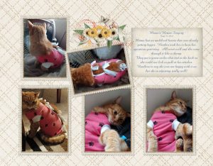
June 25, 2018 at 8:49 am #19670My daughter’s cat “Mama” had hernia surgery Friday. She is the love of the family and everyone was worried about her. She is a ginger tabby and she rides in cars like a dog. Go for a walk, she will walk with you. Does she need a leash, Nope! She is amazing! I did pages for her surgery day to go in my yearly photo book. They put pj’s on cats now instead of cones around their heads. It is adorable! She hates it, but she is adjusting and feeling better every day!
Hugs,
DeLoris
June 25, 2018 at 9:25 am #19675Aw, poor sweet baby. At least she doesn’t have to wear the cone of shame.
~ Michele
June 25, 2018 at 9:25 am #19676Thank you so much everybody for the lovely feedback. What a lovely group we have here, just the best.
S
heila x
-
AuthorPosts
- The forum ‘Showroom’ is closed to new topics and replies.


