Home of the Scrapbook Campus › Forums › Showroom › What are you working on (in July 2021)?
Tagged: what are you working on in July
- This topic has 101 replies, 13 voices, and was last updated 3 years, 4 months ago by
Annie Tobin.
-
AuthorPosts
-
July 30, 2021 at 1:35 am #61214
Sue that is an amazing flyer! Very informative … which I love. Beautiful photos … you really are very clever with your photography. Such a great way to learn about insect life, well done dear friend. ;D
July 30, 2021 at 1:58 am #61215Let me just say how lovely it has been to get on here and see all the beautiful pages you ladies have created. As I haven’t been on the ‘what are you working on in july’ showroom for ages there are just too many beautiful creations for me to comment on individually. Collectively … beautiful work and a total joy to peruse … well done dear friends. ;D
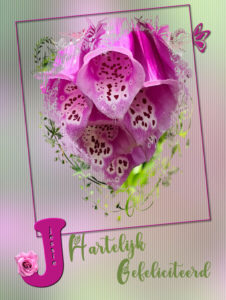
July 30, 2021 at 5:22 pm #61256July is almost to an end and I just made this birthday card for a friend. I cann’t post it on Facebook, because she will see it there before her birthday is due! Background is photo with a blur and texture; another photo of a flower (Digitalis) I took on a walk passing by a nice frontgarden. The mask is by Jessica Dunn and I use it often for cards. Simple frame with a butterfly and the text is Green Love and Growloves. I put her name inside the initial and decorated with a flower. I just started with the Diamond Membership and this are the first tutorials I did. I made one for myself too for future use. Furthermore I have browsed the contents and will work my way through, at first glance it is quite overwhelming!!! But I love it.
July 30, 2021 at 9:42 pm #61281Beautiful work Corrie and your friend is sure to be impressed. You will love the Diamond Membership and as Cassel keeps adding to it the joy of learning never ends. Welcome in my dear friend. <3 ;D
July 31, 2021 at 11:40 am #61282I agree with Annie, beautiful work. If I may make just one suggestion, and it’s just me and my love for insects. I know that it’s a butterfly. I recognize it. 🙂 I would move the butterfly to the right by a few pixels to reveal some antennae, and part of the abdomen, possibly tilt it by 1%. Only to make it more obvious. Sometimes it’s just those very fine details that makes the page even more phenomenal.
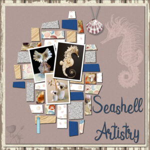
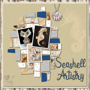
August 1, 2021 at 12:56 am #61284I finally got around to doing something for this forum. It is a mish mash of the freebie/scavenger/theme projects. It is ok … definitely not my best work and I think it could well and truly do without the threaded ribbon but … it is what it is. I would appreciate truthful comments about this piece and what you think of the threaded ribbon … yay or nay. Thanks for takin a peek my friends. 😉
August 1, 2021 at 9:47 am #61288Sue, I see what you mean and have adjusted accordingly, thanks and your comments are always appreciated; you are in this “game” so much longer then I’m! I love to learn from you.
Annie, I agree with you; no treaded ribbon although it was a requested element it doesn’t match well. I find your colorpalette so “not you” at all, if I may say so. This is really the first time that I have some minor critics. I should leave it and go on to a next new project/page, not everything can always be a 110%!
August 1, 2021 at 9:50 am #61289My dear friend Annie, your work is always superb, you always put so much time and thought into them. Even though I’m very much a minimalistic creator, I always love everyone’s work. I often wish I could add more, when I do, I don’t like it, and remove them. Yet when I see other pages I absolutely love them. No matter how hard I try, I just can’t fetch myself to fill my pages with elements. Your page is beautiful, you have a knack for matching colours too. You did a grand job on the threaded ribbon, much better than mine, I created mine to look flatter than yours, (or tried too) as your paper or card pieces appear thicker than mine. To give my threaded ribbon purpose for being in the page, I added a date to it, with a blend mode. Did you forget to add a shadow to the gem stone on the shell? You could have put a hole in the shell and threaded a ribbon through it. You have my honest thoughts on this page. I’m not one that gets easily offended. I also try not to offend anyone with my comments. I always appreciate honest constructive criticism. They always help me to look at my work in a different light, as we can all get in a bit of a rut.
August 1, 2021 at 10:06 am #61290Annie: I like your color palette on this design though I usually go for stronger colors. Since you asked for input, and after reading Sue’s comments, I have to chime in with my thoughts. I agree that the “gem” on the shell is invisible without a shadow; I didn’t even see it until Sue pointed it out! Also, a good idea to thread the ribbon through a hole in the top of the shell instead of the chain. My only other thought is the title looks a bit disjointed. I would push the word Artistry up closer to the word Seashell, but otherwise a rather pleasing design. If it were me, I’d be going back to fix things as I always want to “fiddle” with my designs. Good luck! 😉
August 1, 2021 at 9:50 pm #61297Ann, Corrie and Sue, my dear friends you are absolute gems. Thank you so much for your honest comments on this page. I have made some adjustments to accommodate your suggestions. I did put a shadow on the pearl by using the circle selection tool with a feather of 1. I had to do it that way because the original tube came with pearl and chain attached. I decided not to remove the chain … probably sheer laziness on my part … but there just wasn’t enough room for me to add a threaded ribbon to it, so chain it had to be. Also, it came with a shadow and removing a shadow from a chain was not enticing me to play by the rules, lol! Dear Corrie, I totally agree that the colour scheme is not me so I made a very minor colour change adjustment which I think is better but still not satisfying … hmmmm. Clever idea dear Sue to add a date to the threaded ribbon and again it was just laziness that made me delete instead of adding to it. I think by that stage I was wholeheartedly sick of the page and just wanted an end to it … bin job, lol! Dear Ann I went with your advice regards the title and moved the word Artistry up closer to the word Seashell and I do like the look of that better.
Thank you lovely friends for the constructive criticism … goes a long way to furthering my desire to improve my work. ;D
August 4, 2021 at 5:31 am #61358I have been away from the Forum for a long time… Not doing much and still working with the last challenge layout.
But all of you have been busy and created so many lovely and creative pages. Different styles and always a joy to look at. Congrats Everyone!
My dear friend Annie, my personal and honest opinion: I have great admiration for your work. I think you have a soul of an artist, and I see nothing off with your last layout… I even liked the color, lol!… Like Sue, sometimes I would like to add more elements, as you so perfectly do, but I also find myself deleting most of it. 😀
But I understand you, as sometimes, we can be our worst critics. : )
Best wishes, Scrapbook Campus Friends! <3
August 4, 2021 at 11:41 pm #61383You are so sweet Cristina. Thank you for your lovely comments dear friend. As you say, we are often our own worst critics. ;D
-
AuthorPosts
- The forum ‘Showroom’ is closed to new topics and replies.


