Home of the Scrapbook Campus › Forums › Showroom › What are you working on (in February)?
- This topic has 34 replies, 7 voices, and was last updated 5 years, 9 months ago by
Teri Cleaveland.
-
AuthorPosts
-
February 1, 2019 at 7:45 am #25429
It is a new month and new projects.
Show off what you are working on in February, be it a scrapbook page, a tutorial, or anything else you want.
We are curious and want to see, learn and get inspired.
These threads are quickly becoming a fantastic source of inspiration, support, and friendship. Keep them coming!
Show us greeting cards, or other holiday projects, while you are at it!
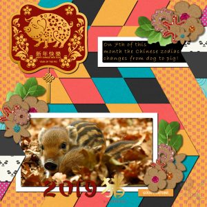
February 3, 2019 at 6:13 am #25463Hello Scrapbook Campers. I purchased a template by C Schneider from Sweet Shoppe Designs and have been itching to use it. The photo is from Unsplash by Gabor Vereb and is so sweet. Scrapkit used is by Marisa Lerin of Pixel Scrapper and is a real delight – Chinese New Year. I also used a couple of clipart elements that I had purchased from Corel. It was a lot of work but I am reasonably pleased with the end result.
February 3, 2019 at 7:00 am #25470Hi Annie,
What a cute layout and photo… I love the glittered elements. Nice work!
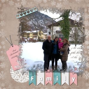
February 5, 2019 at 4:16 pm #25505This is the layout I made to practice the lessons from the Lab 9 Module 01 (Cutout Ribbon – Tied String – Cubic Pattern).
I used a free kit from DiHiller “Winter Fun Fan Freebie“… The mask I used on the photo was downloaded a looong time ago and the file didn’t have the name of the designer.
Font: Violeta
February 5, 2019 at 9:16 pm #25510Thanks for your lovely comment Cristina, much appreciated my friend. I do love your result for Lab9-M01, your choice of colour scheme is delightful. Well done! <3
February 7, 2019 at 8:38 am #25524Annie, thank you so much for commenting on my layout… I appreciate very much! <3
February 7, 2019 at 9:44 am #25525Annie, that must have taken you forever! I love how you melded all the different kits together. So nicely colorful…how appropriate for a celebration. And those baby pigs are just adorable.
Cristina, I love your layout. Everything came together beautifully. Your photo is really the star.
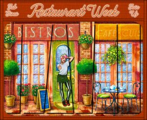
February 7, 2019 at 10:06 am #25527I’m a bit obsessed with Cassel’s Slashes and Colors template at the moment. For this, I layered the “slashed” pic over an unedited copy of the pic. On the slashed layer, I added a bevel and a drop shadow. For the background, I used a brick texture on a solid color layer. Then I tried something I don’t think I’ve done before. For the frame, I opened a new raster layer, used the selection tool to create a long rectangular shape, added a cutout, then repeated for the various edges. Since the cutouts are transparent, I erased the ends of a couple of them where they were overlapping so it would look like the vertical ones were laying on top of the horizontal ones. Does that make sense? I made use of the Setting Fires font Carol posted on the blog for this month’s Book theme.
Any constructive criticism is always welcome. I sometimes go the long way around to get a desired effect. 🙂
~ Michele
February 7, 2019 at 3:57 pm #25532Michele, thank you so much for commenting on my layout! I have to say that some layouts come easily and it doesn’t take long for me to finish… On the other hand, with others is a struggle and I am never really satisfied… So I post and move on to the next one 🙂
About your layout… I love everything about it! The image, the colors, the techniques you used… Looks amazing!
February 8, 2019 at 8:51 am #25534Thanks, Cristina <3
February 9, 2019 at 7:16 am #25538Michele your slashes and colors page turned out amazingly. Great work my friend. And thank you very much for your lovely comments on my work, much appreciated Hon. <3
February 9, 2019 at 7:29 am #25540Wow,, awesome work everyone. I do not feel confident enough to post anything. But I am trying out the classes. I am always in here looking at the pages you create.
February 9, 2019 at 7:35 am #25541@Helen, everyone has started as a beginner. And remember that we are always our own worst critic too. We never think it is good enough to show off, yet, when you do, someone will be inspired by your creation. Come on! Share something!
February 9, 2019 at 8:47 am #25544Thank you, Helen. Please remember that we were all brand new at some point.
~ Michele
February 9, 2019 at 3:46 pm #25555Hi Helen, we are all learning here! … Just some have found Cassel before others 🙂 … I can understand that in the beginning, we may feel intimidated but everybody here in the Campus is very supportive… I hope it doesn’t take long for you to feel confident and show your layouts.
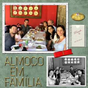
February 9, 2019 at 4:13 pm #25557This is the layout I made to practice the Lab 9 Module 02 (Ribbon Loop – Uneven Lines – Plastic Pocket)
The background paper is a freebie from DayDreams’nDesigns (May Blog Train). The alpha is a freebie from Kristin Aagard “Thrifty Gold Alpha“.
I made the notebook page … Cassel’s Creative Scrap > Tags and Journaling > Notebook page
I need to practice more the ribbon loop and working with the Mesh Warp Tool… I had to make a few before I had something that I liked…But it was fun!
Font: Edwardian Script ITC
February 9, 2019 at 5:38 pm #25561Dennis Davis
I am working on using the Selection tools and layouts. Using shadows in the layout adds to the effect.
This is our great grand daughter, Rose.
February 9, 2019 at 5:48 pm #25564The background is a photo posted by Cassel a few weeks ago.
February 9, 2019 at 6:56 pm #25566Dear Cristina, lovely work my friend … simple and very effective … photo takes centre stage. <3
February 9, 2019 at 6:58 pm #25567Hi Dennis, very nice work and Rose is definitely a little cutie, well done! <3
February 9, 2019 at 7:00 pm #25568Hi Dennis, have always loved this type of effect and the caption suits perfectly! 3
February 10, 2019 at 9:42 am #25581Cristina, using both color and B&W versions of the picture gives it a really interesting effect. Nice job.
Dennis, Rose is precious and makes a perfect valentine!
~ Michele
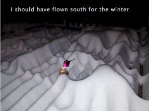
February 10, 2019 at 4:13 pm #25599Dennis, Rose is so cute! … And poor bird 🙂 … Nice layouts.
Hi, Annie e Michele, thank you so much for commenting on my layout! <3
Michele, the idea of using the same picture in color and B&W I got from a page I saw online about 3 years ago when I started learning scrapbooking here… Kind of scraplifting? 😀
February 24, 2019 at 3:33 am #26259I tried something new yesterday for my gaming group. I was inspired by a member of a PSP group I’m in. The photos are by Shannon Wild, an Australian wildlife photographer. I was lucky enough to have some extra time to work on this one so I could experiment. It was lots of fun. Hope you enjoy it.
~ Michele
February 24, 2019 at 8:00 pm #26287Dear Michele, this made for beautiful viewing. I love the layout, wonderful experimentation my friend! <3
February 25, 2019 at 10:44 am #26320Thanks so much, Annie. <3
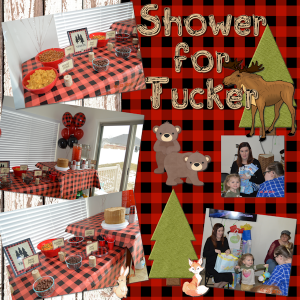
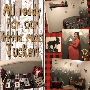
February 28, 2019 at 7:35 pm #26402Our little great grand son is arriving in 3 weeks. Mom is more than ready! They have his room all ready and just had his baby shower. I made the plaid “paper”, but the other things are elements I’ve picked up over time.
March 1, 2019 at 12:26 pm #26409Love them, Annie. What a great way to make a memory for the little guy before he even arrives!
~ Michele
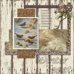
March 2, 2019 at 8:19 am #26412As I am not a photographer I have very few photos to display. I have decided to scrapbook pages on the art of some of my favourite artists. This one is a painting by Terence Jame Bond and he is a very keen bird watcher and artist. Thanks for takin a peek.
March 2, 2019 at 8:31 am #26413It’s really beautiful, Annie. You picked the perfect elements to showcase his work.
~ Michele
-
AuthorPosts
- The forum ‘Showroom’ is closed to new topics and replies.


