Home of the Scrapbook Campus › Forums › Showroom › What are you working on (in August)?
Tagged: August
- This topic has 45 replies, 7 voices, and was last updated 6 years, 3 months ago by
AprilDawn.
-
AuthorPosts
-
August 18, 2018 at 3:34 am #20741
Hi, dear Dawn 🙂 Thank you so much for commenting on my layout! <3… I posted the page yesterday and today I corrected the title and tweak a little bit, different font etc 😀 … Now, let’s see if I can come up with something for the Word challenge, and the for Travel Tale that starts tomorrow.
Best wishes
August 18, 2018 at 7:15 am #20742Lovely page, Cristina. Using the rope as frames fit the nautical theme perfectly. I also like how you mirrored the buttons from the top on the photos.
~ Michele
August 18, 2018 at 10:39 am #20744Michele, thank you! <3 … I like this tube very much… My initial idea was to write the title with it, but then changed my mind and framed the photos.
August 18, 2018 at 11:07 pm #20760Here’s a birthday card I made for one of my group members last night. I was inspired by a portion of Cassel’s No Scrap Kit class. However, I used a different method. I created a rectangle above the background. Then I created a layer of text. Using the magic wand, I selected the text, hid the text layer, activated the rectangle layer and hit delete so the background would show through. On new layers I added white cutout effects to lighten up the “text” edges. Finally, I selected and copied the blue flower from the background and moved it to the top. After a couple of hours of trying different methods to achieve what I wanted, I was pretty happy with the results.
I always end up making their cards on the day of so I have no time to plan. After reviewing their FB pages, I pick something I think they will like and try to get inspired. Wish I had more time, but every now and then I make one I’m particularly proud of. The original background really made the project pop.
~ Michele
August 19, 2018 at 6:45 am #20762Michele, a beautiful card… love the effect on the dark background and I am sure it will be well received.
Dawn.
August 19, 2018 at 7:46 am #20765Thanks so much, Dawn. She loved it. Would love to see more of your cards here when you feel up to it. Be well, my friend.
~ Michele
August 20, 2018 at 7:25 am #20786Michele, this card is just terrific! I love everything about it… the black background and the bright colors… And for sure you don’t need much time to create amazing layouts 🙂
Dear, Dawn, like Michele I would love to see your cards or any layout when you feel better. Take all the time you need, we will be here waiting for you. Be well. <3
August 20, 2018 at 8:09 am #20788Three Cheers Michele, a beautiful card my friend. <3
August 20, 2018 at 8:13 am #20789Thank you, ladies. <3
August 30, 2018 at 2:50 am #21025Having fun with clipart, shadows, highlights, etc. I did not do the backgrounds for the dance floors; I would never have the time to do that and still meet my deadline for the day. The font is a new one I got as a freebie from 1001Fonts, called Popular Cafe. It’s a nice fat font with some style. I was able to select the stroke color so I could apply an inner bevel to match the outlines around each pic. The little figures in the corners are from the game. Hope you enjoy.
~Michele
P.S. It’s GREAT to have the campus open again.
August 30, 2018 at 4:06 am #21026Hi, Michele, I like your layout very much and the inner bevel made all the difference… Like the font too 🙂 … Nice work!
P.S.: I agree, it is great to have the Campus up and running. Thanks, Cassel, for all your work!
August 30, 2018 at 6:04 am #21028Thanks so much, Cristina <3
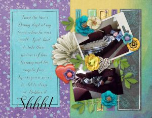
August 30, 2018 at 10:44 am #21049My grandson Danny spent the night with me Saturday night. Now that he is 11, there isn’t much chance of him doing it. He has his own room, but wanted to sleep on the couch. I took these pictures while he was sleeping. I made this page for my yearly book and used Kimeric Kreations “For The Love Of Summer” to make it. I don’t think you can purchase her kits any longer since the Digi Chick closed and she has passed away. I will miss her amazing talent!
Danny also left me a bug and I feel really bad. My throat and chest hurts. He didn’t go to school yesterday and his mom is sick too. Ya gotta love when school 1st starts!
August 30, 2018 at 10:58 am #21052Oh my… I knew of Kim’s passing, but didn’t know the store was closing! Sad news! again, we’ll have to search high and low to know where the designers will relocate!
August 31, 2018 at 4:20 am #21066Doris, nice layout to your yearly book. Get well soon!
Cassel, about the Digi Chicks site being closed, I only know that Palvinka now has her designs in two different stores: Pickeberrypop.com and Oscraps.com. I am not familiar with the other designers, names or where they are now.
September 3, 2018 at 9:00 pm #21163Michele and Deloris… very nice pages
Dawn.
-
AuthorPosts
- The forum ‘Showroom’ is closed to new topics and replies.


