Home of the Scrapbook Campus › Forums › Showroom › What are you working on (in August 2021)?
Tagged: Lab 10-7 negative effects
- This topic has 100 replies, 14 voices, and was last updated 3 years, 3 months ago by
Bonnie Ballentine.
-
AuthorPosts
-
August 16, 2021 at 11:49 am #61823
Annie, another example of your artistic work. Really beautiful.
I have almost finished the process of copying almost everything from one older laptop to a newer one. It is a lot of work, as some of you have also experienced not long ago.
I’ve noticed that the colors I see on one laptop are not the same I see on the other… The same color can look different, sometimes darker or lighter. Before, I never had the opportunity to have laptops side-by-side and compare the same layout.
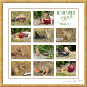
August 16, 2021 at 6:51 pm #61879I have many little friends, they join me for a bite to eat, and a beverage daily (elevenses). They are very unruly, and undisciplined. Very anti social, and extremely territorial to their own kind. I join them on the ground photographing them. They run over me, and occasionally give me little nip. Some will take a treat out of my hand, yet they are still very wild, and have their wits about them. They are some of the most entertaining creatures to observe. Now you know how I spend some of my time. I created a template some time ago, using masks. If anyone can think of a better title, let me know. If I was to print it off, I’d hang it in the kitchen overlooking the dining table.
August 16, 2021 at 9:25 pm #61885Dear Sue this is truly delightful! What gorgeous little critters and you take such beautiful photos of them. I agree, if you are ever able to print it off it would be perfect to hang in your kitchen. Well done my friend. ;D
August 16, 2021 at 11:06 pm #61886Annie, thank you ever so much my dearest kind friend. Carole commented on the page in the Facebook group. “Those are adorable” she wrote. Some of them have featured in previous pages. Richardson’s and 13 lined ground Squirrels.
August 17, 2021 at 4:13 am #61889As I said on the FB page, Sue, I love the little props you have for them. They almost look like they could fit in a dollhouse.
August 17, 2021 at 7:42 am #61892I was a bit late in finalising my Project #4. One difficulty I faced was when trying to do the serrated edge with the shift button held down I could only do one side. I tried several times without success. After the first page I had to cut out each triangle individually. I trust my effort is acceptable. George Watkinson
August 17, 2021 at 4:10 pm #61937I created a Birthday Card for a couple of chat friends on an Osprey live cam I chat on. The background is one I created so long ago, I have no idea how. The wreaths were from Creative Fabrica. I duplicated a couple of them and changed the color. The Cats were from https://clipart-library.com/. Hmmm, I got in a hurry at the end and just now realized I didn’t remove the white around two of the cats. Oh well Birthday girls probably didn’t even notice it.
-
This reply was modified 3 years, 4 months ago by
Anne Lamp.
August 17, 2021 at 9:12 pm #61955Really Sue you deserve the accolades. It is like a professional photo shoot with all the little props and the cuties posing … although I can only imagine the amount of time it took you to take the photos, lol! Kudos to you dear friend, you are most deserving. <3
August 17, 2021 at 9:19 pm #61957George and Anne, well done my friends. George, better late than never and Ann I am sure your friends will love the birthday card you have created for them. ;D
August 20, 2021 at 4:37 pm #62234Thank you Annie, you are always so kind, and I really do appreciate your comments. I’ve often said, that it takes longer to take the photos than it does to showcase them. I do enjoying shooting mother natures living gems, large and small. As you know I do have a particular passion for macro shooting insects. Each and every one are living jewels.
I created the cute ground squirrel collage, here is one of Bees and Butterflies. I saw a similar layout, and decided to copy it. I liked the polaroid effect. I used Carole’s polaroid script twice, and duplicated them. Of course so much detail of of the insects are lost due to resizing. Macro photography.
August 20, 2021 at 4:47 pm #62235Sue again a stunning page in every way! The photos are marvelous and the layout too. It’s a pity that you have to seize it down; we never get to see it in its full glory.
August 20, 2021 at 5:58 pm #62241Thank you so much Corrie. I’ve posted it on Facebook, even though I can post a much larger file on FB, Facebook compresses it down. So much fine details are lost.
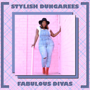
August 22, 2021 at 2:51 am #62341I fell in love with this picture I found on Google; it’s just so happy and colorful. I made the plaid background picking colors from the original pic. I decided to do a large, solid shadow with no blur so it looked like a solid paper; then repeated with negative offsets. Applied a soft drop shadow to the pic and the two solid drop shadows. I sometimes like adding a drop shadow to a drop shadow. By using different colors and/or different opacity and blur, you can get some very interesting effects.
The font is Gill Sans Ultra Bold. I used the magic wand to select the text, then moved down to the plaid layer & deleted to show the solid paper beneath. (Don’t forget to hide the original text layer.) Relying on guides, I used my eraser brush to create the framing. Finally, a drop shadow on the plaid layer.
If I had had more time, I would have placed the text a little more vertically centered so that it was equidistant from the framing and the blue layers below the main pic. I think I also would have placed the framing further away from the edges. Time gets away from me when working under a deadline. 🙂
August 22, 2021 at 6:07 am #62347Job well done Michele, I love it my friend. Your labour of love plaid out! LOL! ;D
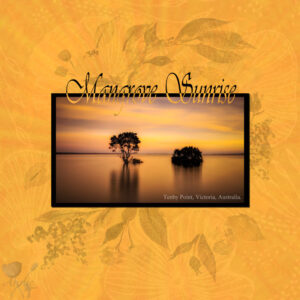
August 22, 2021 at 6:18 am #62349I found this beautiful photo of a mangrove sunrise so I decided to use it for a page and I didn’t want to overpower it with accents. I did a fair amount of work on the background using overlays with blurs, blend modes, opacities and this is the final result. Sometimes I can put together a page with loads of embellishments etcetera and it will only take an hour or two whereas this one seemingly so simple took quite a few hours … go figure! Thank for takin a peek my friends. ;D
August 22, 2021 at 8:46 am #62352Annie: Beautiful! I feel ya with the work for a simple layout; I had the same with my coppery wood duck. BTW: Love your new profile pix!
August 22, 2021 at 10:32 pm #62432Thanks dear Ann! I just had to put up a new profile pic because the other seemed all glasses and I just got a new pair which I prefer … still worrying about these things even at the age of 69! ;D
August 24, 2021 at 10:19 pm #62616I haven’t been here in a while and just thought I’d drop in and see if anyone had posted recently.
Annie that Mangrove Sunrise is simply stunning. What a wonderful way to showcase that picture.
Michelle, you always amaze me with your showcasing the pic of the day. I see that you have a dark blue paper under the plaid and that you must have “erased” the 2 side frames. How did you cut out the text?
August 25, 2021 at 1:19 pm #62628Michele and Annie what a beautiful pages you both did. They are so very different and I honestly can’t say which one I prefer!!!!
August 25, 2021 at 3:16 pm #62629Corrie – Love the cards you did in a hurry. Got me to thinking – I have a freebie mask template that Cassel gave recently and I thought I could use that as a basis for cards horizontal and vertical (since I use both sizes). So thanks for the inspiration.
Your cards are beautiful.
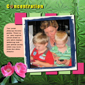
August 26, 2021 at 4:31 am #62657I have finished project #5 titled Concentration. It was a bit of a challenge. I have certainly learned a lot about layers. I did not have much to choose from as far as the frame was concerned. I enjoyed the challenge.
August 26, 2021 at 4:37 am #62658Thank you, Annie. Once I watched the plaid tutorials in the Campus Creative Scrap section, I realized that it wasn’t as difficult as I thought it would be. I usually have to refer back to the tutorials as I have a lousy memory. lol
Mary, thanks so much for your kind words. I used the magic wand to select the text, then clicked on the plaid layer and hit the delete button. Once I hid the original text vector layer, all you could see was the deleted text on the plaid layer with the blue layer showing through.
Corrie, you are so sweet. I’m glad this is not a competition. Annie’s layout is gorgeous. I love the subtlety of your background. I can see just how much work you did on it. It indeed made your pic stand out.
Wonderful page, George. The more you do, the more you learn. I can see that in your work.
August 26, 2021 at 5:33 am #62662Mary and Corrie, thank you very much for your lovely comments on my work. I grew up with a fishing dad, uncle and pop so I explored many mangroves and fell in love with them. ;D
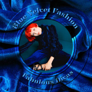
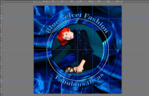
August 28, 2021 at 2:59 am #62737Fell in love with this photo; loved the contrast between the blues and the model’s bright red hair. I set up guides so I could use a circle selection and get it right in the middle. I used that method to erase the middle circle to frame her. I used that selection technique several more times, but promoted each one to their own layers. I applied inner bevels and little drop shadows on each to more clearly define them. I set up more guides so I could center a circular vector to create the text. I don’t know why PSP treats vectors and selections differently in terms of centering them, but I’m sure there’s a logical reason. The font is Elsie Swash Caps Black
August 30, 2021 at 3:56 am #62826Hi Cassel, Thank you for letting me in on your 8 secrets. I really appreciate receiving the booklet and there is a fair amount of information of which I was not aware previously. The enclosed photos show the difference made when straightening, cropping and one step photo fix are applied. Thank you so much. There is more to come. George.
August 30, 2021 at 3:56 am #62825Hi Cassel, Thank you for letting me in on your 8 secrets. I really appreciate receiving the booklet and there is a fair amount of information of which I was not aware previously. The enclosed photos show the difference made when straightening, cropping and one step photo fix are applied. Thank you so much. There is more to come. George.
August 30, 2021 at 7:22 am #62828Good morning, Campus friends! Beautiful creations!
I’m not sure I like this one but it was a fun evening…
August 30, 2021 at 11:55 am #62835Wow! what beautiful pages. What am I working on in very late August (better late than never), is techniques to help me get more comfortable navigating PSP. I chose Negative Effects from lab 10-7. Colors are pretty bold but I wanted to really see the contrast. Cassel, if you look on the “Wave” one it looks like a little white line followed the wave (which I did with the freehand selection set to freehand – just to try it, it was hard controlling it). Also, a few times I had problems with the text, it wouldn’t let me resize it with the handles. Not sure why or even how I managed to resize it eventually. The fonts all came from Creative Fabrica.
August 30, 2021 at 6:03 pm #62878Annie T … can’t help but laugh at your reason for new glasses. I am OLDER than you … so that must be the reason I have about 25 pairs of glasses! Just teasing you, truly. I have glasses of just about every color and shape but I don’t think I honestly worry about much of anything other tha I guess I just like having a glasses collection. Good thing my prescription rarely changes!!!
Lovely things to took at everyone. I like seeing what everyone is doing. It’s very inspiring!
August 30, 2021 at 11:14 pm #62885Bonnie – I like it! I always like fireworks – didn’t get to see any this year. So, I’ll enjoy your LO!!!!!
-
This reply was modified 3 years, 4 months ago by
-
AuthorPosts
- The forum ‘Showroom’ is closed to new topics and replies.


