Home of the Scrapbook Campus › Forums › Showroom › What are you working on (in August 2021)?
Tagged: Lab 10-7 negative effects
- This topic has 100 replies, 14 voices, and was last updated 3 years, 3 months ago by
Bonnie Ballentine.
-
AuthorPosts
-
August 1, 2021 at 7:26 am #60254
It is a new month and new projects.
Show off what you are working on in August, be it a scrapbook page, a collage, a tutorial, or anything else you want.
We are curious and want to see, learn, and get inspired.
These threads are quickly becoming a fantastic source of inspiration, support, and friendship. Keep them coming!
Remember to size down your image to about 600×600 pixels before posting it.
Here are a few guidelines for everyone:
- when you post a project, give as much information on your sources or techniques used. It will help others who are curious and would like to do the same.
- if someone uses something that you like on their page, ask where they got it. Sometimes, you can go get it too and it will be better quality than trying to extract it (as it would have been resized to post in the forum anyways).
- if it is something that they did from scratch, ask how they did it. It would be so helpful to everyone!
- if you like a photo and would like to “play with it”, ALWAYS ask permission. Sometimes, there are some limitations and the person is not allowed to let others use it. Don’t get them in trouble. Usually, people are happy to say yes (if they can) when you ask politely. And if you get permission, you might get better quality than on a resized image anyways.
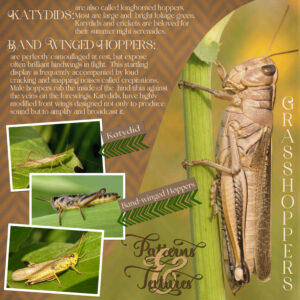
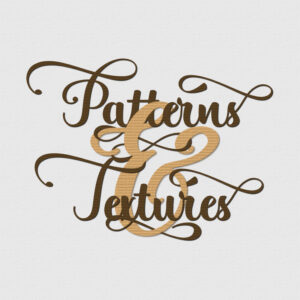
August 1, 2021 at 9:38 pm #61295Dare I post my first page in August 2021? I absolutely love these creatures, with their external skeletons, rich in textures and patterns. There is so much I could write about them. They emerge as mini versions of themselves, as they grow they have to molt, shedding their external armour, to make way for a bigger one. I saw an advert on the telly recently, and I just had to copy it. Where the & was intertwined with the other words. I can’t even remember what the ad was for. I thought it was kind of cool, and different. All my own work, and photos (macro).
August 1, 2021 at 10:35 pm #61299Here is a intertwined text, for better viewing.
August 2, 2021 at 7:09 pm #61313A beautiful job dear Sue and I really love that intertwined text … I must have a go at it myself. Very informative as well which I am sure you know that I love. Well done my friend. ;D
August 2, 2021 at 9:26 pm #61317Thank you so much Annie, I thought to myself when I was posting, that you would appreciate the little info about the grasshoppers. I will certainly be using this intertwined effect in many of my wordart projects. It was my first attempt.
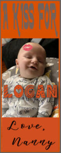
August 3, 2021 at 6:39 am #61320Trying out Cassel’s Word Frame 2 script. Logan is turning six months old on Aug 6. The script generated the orange frame at the top and I added the matching one at the bottom. The “kiss” is a tube, the top font is Farmhouse, his name is in Dingo Nursery and the sig is Emelyne.
Edit: I changed the last line; I knew something wasn’t right! 😉
-
This reply was modified 3 years, 4 months ago by
Ann Seeber.
-
This reply was modified 3 years, 4 months ago by
Ann Seeber.
-
This reply was modified 3 years, 4 months ago by
Ann Seeber.
August 3, 2021 at 10:21 am #61323Playing with signature tags.
August 3, 2021 at 2:00 pm #61326Ann, that looks like an interesting script. Nicely done.
Helen, very nicely done, signature and motivational tags are fun to make. May I make a suggestion? Place the text beneath the flowers, for a more realistic look. Or place the left flower.in the top left corner and tilt the text. Place the bottom right flower flush with the corner.
August 3, 2021 at 3:22 pm #61329Re-done, thank you for the help. This looks like it is cracked or scratched in the text just a bit.
August 3, 2021 at 3:32 pm #61332August 3, 2021 at 5:20 pm #61337Helen, that is so much better, it really is lovely. Well done. Check your text settings, perhaps you used a texture on it.
August 3, 2021 at 7:13 pm #61342Ok, thank you for all the great suggestions.. hugs to all
August 3, 2021 at 10:31 pm #61350Awww, Logan is so sweet Ann, you must be very proud. Nice work my friend, enjoyed perusing it. ;D
August 3, 2021 at 10:44 pm #61353Nice work on all projects Helen and Sue’s suggestion worked really well once you put it into action … You Go Girl!
August 5, 2021 at 9:50 am #61387Again playing in PSP 2022 making signatures. This one is not much work to it.
August 5, 2021 at 12:23 pm #61388Helen: I like your little signature strips. I see you’re using PSP2022. Have you noticed any differences from PSP2021?
August 5, 2021 at 6:24 pm #61389Lovely little signature strips Helen. Like yourself I am playing with PSP 2022 and so far I am happy. There is a webinar on Saturday 21st August and, unfortunately for me, it is being held AEST 2am – 3am … I have registered and will definitely have to set an alarm, lol! You can register via the Discovery Centre. ;D
August 6, 2021 at 4:34 am #61410Annie: The email I got from the Discovery Center had that webinar and also had about four separate videos to pursue re: PSP2022. I feel like they’ve explained all the new features so I’ll skip the webinar. Hopefully, you still have their email or can access their website.
August 7, 2021 at 1:30 am #61430Thanks Ann, I will do that. I really don’t fancy getting up at 2am for a webinar … don’t think the old brain would take in too much, lol! ;D
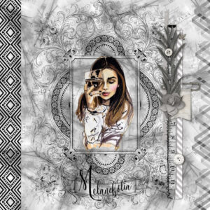
August 7, 2021 at 2:01 am #61432This is one I have played around with for the last couple of days. I love black and white shades with a touch of colour. The intricate frame is a tube from pngegg, the cluster is by Kate Pertiet, the border left is my own using the font Haus Ethnik Dingbats, the right border is from pngegg (greyscaled), background paper is my own, the font used for the title is Ossellany Script and the melancholy lassie is a tube I have had for quite a while. Thanks for takin a peek my friends. ;D
August 7, 2021 at 5:09 am #61433WOW, that is beautiful.
August 7, 2021 at 10:12 pm #61439Thanks Helen, really thrilled you liked it my friend. ;D
August 8, 2021 at 5:16 am #61443I really love using the text cutter tool and adding shadows. I think the result is subtle and allows the subject to shine. The font is Hawaiian Punk and the original illustration is by Bella Pilar.
August 8, 2021 at 5:35 am #61446I love it Michele, very well done and oh so summery … bit chilly here, lol! 😉
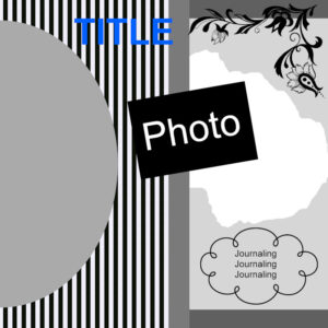
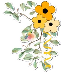
August 8, 2021 at 5:44 am #61449I created 2 things today … a layout template and a corner cluster sticker. I am off to bed and will be setting the alarm to make sure I don’t miss Cassel’s webinar on shadows … still a bit of a bugbear for me. Thanks for takin a peek my friends. 😉
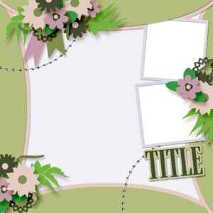
August 8, 2021 at 5:44 am #61450I used a template by Jodi Watson from A Love For Layout Templates blog train from March. As usual, I put my own spin on it. Carole has told us, a template is simply a guide and a starting point.
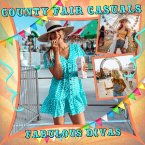
The font is Carnival Rimmed and the pics are from google (there was no info so I could give credit).
August 8, 2021 at 10:40 am #61453Michele lovely and a good use of that template to make it yours!
Annie hope to “see” you later today at the masterclass! Your melancholia is stunning.
August 9, 2021 at 8:38 am #61478Sue, beautiful work with the intertwined text! You not only create great layouts but also fill them with lots of information. 🙂
Ann, beautiful picture of Logan; he is adorable!
Helen, nice tags! I still have to install my PSP2022. Right now, I am in the process of changing laptops, and it takes time until I have everything the way it should. My older one is giving me signs that time is up. 😀
Annie, I love everything about the Melancholia layout. The corner cluster is so cute.
Michele, beautiful and colorful pages. I do love both.
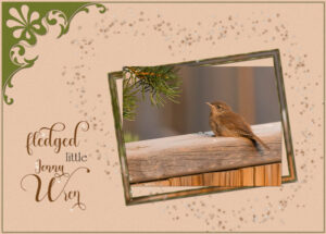
August 9, 2021 at 9:47 am #61481August 9, 2021 at 11:31 am #61483An ecard I made for a dear friend. Her name is Jenny, and I always make birthday cards for her using a Wren photo. In the UK, we refer to the Wren as Jenny Wren, a term of endearment. I omitted the private Birthday greeting. This is a North American fledged House Wren, the same as what we get in the UK. A simple fine frame, Cassel corner punch. Using the brush variance palette, I created the stars.
-
AuthorPosts
- The forum ‘Showroom’ is closed to new topics and replies.


