Home of the Scrapbook Campus › Forums › Showroom › What are you working on (in April 2021)?
- This topic has 276 replies, 19 voices, and was last updated 3 years, 7 months ago by
Diana Craft.
-
AuthorPosts
-
April 14, 2021 at 3:17 pm #56488
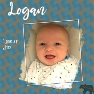
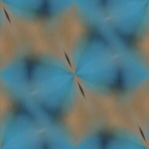
I’m back to playing with masks, and using kaleidoscope to make background patterns from photos. Logan, born 2/6, is starting to smile and giggle. I just revised one I did for Magic but with new background and details. The bear is his protector ever since his gender reveal party. 😉
Here’s the design plus the background pattern.
-
This reply was modified 3 years, 8 months ago by
Ann Seeber.
-
This reply was modified 3 years, 8 months ago by
Ann Seeber.
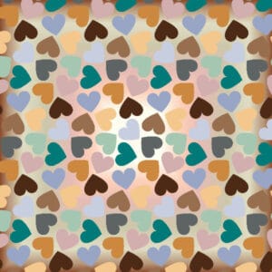
April 14, 2021 at 4:25 pm #56499Thanks to Cassel and Annie, the problem is solved! I don’t think I’ll ever forget to check that match mode on the floodfill tool, a lesson well learned!!!
This are the 2 papers I made from templates. It were both layered ones from Marissa Lerin at Pixelscrapper. I used one of the links for colorpalettes, but I think if I use this method to make a paper from a template then I will pick the colors from my photo.
April 14, 2021 at 8:11 pm #56505Thanks for your compliment Mary, always appreciated my friend. Yes, I always create a colour palette from my picture. I like to have a five colour palette and in that way can make sure the colours blend in with and do not overtake the main feature. Sometimes I use more and sometimes less but I start out with the five. 😀
April 14, 2021 at 8:20 pm #56506You are a champion Carole, thank you. Hopefully it will be the same issue for Corrie! Problem solved! 😀
April 14, 2021 at 8:22 pm #56507Yay Corrie! Lovely papers are the end result. You Go Girl! 😀
April 15, 2021 at 4:58 am #56510Oh, Ann, Logan is simply too cute!
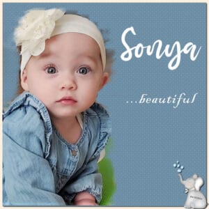
April 15, 2021 at 1:22 pm #56525Here’s Sonya. I hear she’s standing and starting to toddle. Time to baby-proof the house! 🙂
This layout is based on one I did with a mask for a sleeping Magic but I created a new kaleidoscope background pattern based on Sonya’s photo and added her elephant.
April 15, 2021 at 3:03 pm #56527Ann, That is a wonderful page and Sonya IS beautiful. Hope you are planning to frame this one.
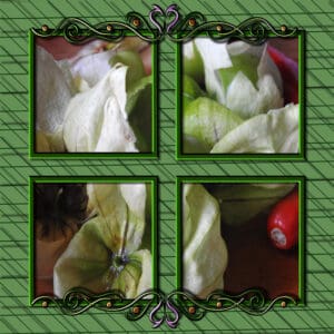
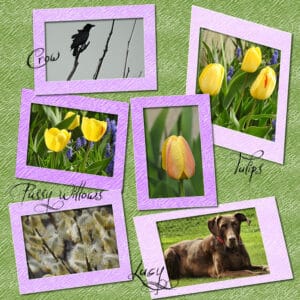
April 15, 2021 at 5:03 pm #56533I was out in my backyard mowing the lawn, spraying the weeds and taking photos so I thought I’d share them.
I used Carole’s frame mask script but discovered it uses multiple frames but only one photo so I filled the frame areas with black and promoted them to their own layer then used the clip to it script. So the tulips etc are the promoted layers and the tomatillos are one photo in four frames which is how the script is meant to be used.
-
This reply was modified 3 years, 8 months ago by
Lynda DiGregor.
April 15, 2021 at 5:20 pm #56535Ann,
Geeze, how many beautiful grand-babies do you have….I’m jealous! Maybe I’ll get some greats, not to soon though!
April 15, 2021 at 9:01 pm #56539Fiona, I love the brights you used to colorize the template, well done. 😀
Sue, your Autumn page is gorgeous, beautiful colours displayed brilliantly, well done my friend. 😀
Lynda – what can I say, you have overwhelmed me with all that you have been up to. Bumble Bee is a delight and very clever, Template coloured perfectly, ribbons are divine, tomatillos and spring are beautifully portrayed. And, thank you so much for the links to colour palettes, much appreciated. You Go Girl! 😀
Shirley, I am afraid that I have no answer for your photo. A blurred image to that extent is beyond me. Perhaps Cassel would know how to ‘fix’ it. Good luck my friend. 😀
Ann – Logan and Sonya are gorgeous babies. Sonya is going to be a killer with those peepers! Terrific work my friend. 😀April 16, 2021 at 1:03 am #56557Well I have been obsessing over textures and in the past couple of days I have created 34 of them but I haven’t finished playing with them yet, LOL! Sometimes a nicely textured solid colour is all you need for a terrific paper. These are just 6 of the ones I have created … resized of course! Thanks for takin a peek my friends. 😀
April 16, 2021 at 6:18 am #56563Ann, Sonya is gorgeous! Your family makes beautiful babies!
Lovely pages, Lynda. I giggled when I saw that you labeled Lucy along with the flowers.
Great textured papers, Annie. I agree…sometimes a texture on a subtle solid color is perfect. Beautifies the project while not overpowering the subject matter.
April 16, 2021 at 9:05 am #56565Annie, thank you ever so much for your kind words, even if I say so myself I was delighted how the page turned out.
Not being a huge fan of patterned papers, I use textures a lot, they give a subtle effect, often using a little noise and or blur. Well done, I love the texture papers you have created.
Everyone has been so busy creating, wonderful pages. I’m slowing down, as the weather keeps improving, I spend more and more time outside.
April 16, 2021 at 9:55 am #56569Lovely posts from everyone and great ideas, too. I agree, Annie, patterned papers have their place, but not everywhere. It’s great though to use them to practice what we are learning here. I made a few template “transfusions” as well, and I am glad to have learned it – especially some of the pitfalls you folks all ironed out for us. Your textures are lovely … as they always are! You are very very good at that! I hear you, too, Sue … outside is calling in a big way. I hope it isn’t going to limit your sends too much! As it gets hotter and hotter in Florida I find myself out doing more and more watering! I feel sorry for the bees when it gets really hot out. I saw an article where you could help them along by placing a bowl of water out and have the bowl FULL of marbles -even the dollar store floral ones, so they can land and not drown. Cool idea. Just thought I would mention, too, one of the things I found in template transitioning … that’s what I am calling it … be aware of the colors used. If you are going to resize the project at the end, which I did, it totally changed the look of the small lines in the transitioned bg. It went from a bright and bold yellow to looking more coral/pink after resizing, which was not the look I was after and did not match my accents. I think it might be a prudent to see what your resized paper might look like resized before putting a great deal of time into it. Yes, I know, you can always change it left in the right format, but just as a time saver, might be quicker to just take a peek at it first. Thanks for sharing your experiences as it helps US as well, but isn’t it awesome when Carole can chime in and solve it in a snap. LOL I love that.
April 16, 2021 at 10:07 am #56570Annie, solid papers are great when you add texture. Other things you can do (if you want more variety) are:
- adding a slightly grungy edge
- adding random dots of blurred black all over and blur it a lot to make it ALMOST even, then change the opacity and play with the Blend mode
- making a SLIGHT gradient with similar colors and choose the rectangular or sunburst mode
Those are simple ways to vary a solid too, adding even more possibilities.
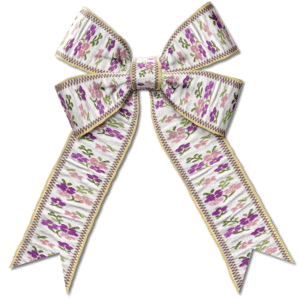
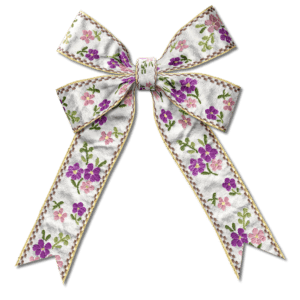
April 16, 2021 at 10:13 am #56571Lynda, when you made the Big Bow, did you use a script? I wonder if you should have resized the ribbon yourself to be thicker. It looks like the script assumed you were using a thick ribbon and might have mis-resized it as the pattern (that you worked so hard for) is distorted.
April 16, 2021 at 10:20 am #56572Shirley, unfortunately, there is nothing to do with that type of blurred photo. With a motion blur, it is harder to fix, and the Unsharp Mask does work only with “overall” blurriness.
April 16, 2021 at 2:16 pm #56578Here is my flop play with template transitioning. I deliberately picked a very busy bg to see if I could get the little lines and it surely did. All of the items used including the frames were grayed out templates. In making it, they are exactly the same color as the bright yellow. But as you can see when resized it made them different. Maybe I did something wrong, too? Going to try again … but not today. On to something else today. It was fun though.
April 16, 2021 at 8:20 pm #56584Thanks Michele, always appreciated Hon. 😀
April 16, 2021 at 8:24 pm #56588Thanks very much Carole. I will give it a go, your creative bent knows no bounds. The webinar has gotten under my skin and I am obsessing with backgrounds and overlays now, LOL! It was a fantastic one, thanks so very much. 😀
April 16, 2021 at 8:31 pm #56589I do so agree Minka. I have had the background change colour when sized down and I think it does all have to do with the type of texture used. Some of the textures look terrific but need a ‘lift’ to make them of some use in a project. Still playin, LOL! Enjoy the outdoors my friend. It is Autumn here and the weather is truly beautiful, I would like to think it would keep on keeping on but Mother Nature may have different ideas! 😀
April 16, 2021 at 8:51 pm #56591Thanks dear Sue, much appreciated my friend. Don’t slow down too much, it is always a delight to peruse your work. 😀
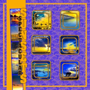
April 16, 2021 at 8:54 pm #56592I can see what you mean Minka but it is still an eye catching result … gorgeous colours. And, they sure are spectacular sunsets. Well done my friend. 😀
April 16, 2021 at 10:35 pm #56595Carole,
I did use the big bow script but the ribbon was really small so I resized it to what was needed for the script to work. It became distorted at that point but I ran the script anyway. The floppy bow worked out better. I just figured the big bow looked more wrinkled. I was just messing around to see what would come out.
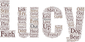
I would like to try the the cloud text again but I can’t remember how to do it. I just read your reply to my e-mail. Here is an illustration.
Lynda
-
This reply was modified 3 years, 8 months ago by
Lynda DiGregor. Reason: add image
April 16, 2021 at 10:42 pm #56596Lynda, when you resized the ribbon, was it resized proportionally? For the Cloud text, are you referring to “word cloud” like the tools from this blog post?
April 16, 2021 at 10:48 pm #56599Carole,
Yes, I guess that is the cloud thing. Thanks.
No, the ribbon was not proportional. I don’t know how that would work. Can you give me some insight?
April 16, 2021 at 10:59 pm #56600Lynda, typically, when you resize, the checkbox for Lock aspect ratio is checked by default. If you size UP using PSP2021, it will use the AI-powered mode but then, it does not show the Lock aspect ratio. So, to check it, change the AI-powered setting to something else (like Bicubic), so you could see whether that box is checked or not. Once it is checked, you can go back to the AI-powered option, and select the thickness you want for the ribbon (then the length would automatically adjust).
April 17, 2021 at 8:13 am #56603Thanks Carole, I will do that with the ribbon and thanks for the link to word clouds
April 17, 2021 at 9:26 am #56606OK Carole, Here is the big bow with AI resampling and for comparison, the original. It did work out better . Thanks for the tip, Ill remember that in the future.
-
This reply was modified 3 years, 8 months ago by
-
AuthorPosts
- The forum ‘Showroom’ is closed to new topics and replies.


