Home of the Scrapbook Campus › Forums › Showroom › What are you working on (February 2022)?
- This topic has 100 replies, 17 voices, and was last updated 2 years, 9 months ago by
Shirley.
-
AuthorPosts
-
January 31, 2022 at 11:45 pm #70772
It is a new month and new projects.
Show off what you are working on in February, be it a scrapbook page, a collage, a tutorial, or anything else you want.
We are curious and want to see, learn, and get inspired.
These threads are quickly becoming a fantastic source of inspiration, support, and friendship. Keep them coming!
Remember to size down your image to about 600×600 pixels and save in jpg format before posting it.
Here are a few guidelines for everyone:
- when you post a project, give as much information on your sources or techniques used. It will help others who are curious and would like to do the same.
- if someone uses something that you like on their page, ask where they got it. Sometimes, you can go get it too and it will be better quality than trying to extract it (as it would have been resized to post in the forum anyways).
- if it is something that they did from scratch, ask how they did it. It would be so helpful to everyone!
- if you like a photo and would like to “play with it”, ALWAYS ask permission. Sometimes, there are some limitations and the person is not allowed to let others use it. Don’t get them in trouble. Usually, people are happy to say yes (if they can) when you ask politely. And if you get permission, you might get a better quality image than the resized image anyways.
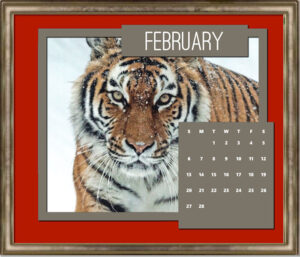
February 1, 2022 at 5:46 am #70780February 2, 2022 at 6:14 am #70836I’ll start February off with my desktop calendar, using a Campus template and photos from a calendar I got for Christmas but which proved to be too small for my office wall, so I pulled it apart and used the photos in the 2022 template. This month worked well for celebrating the Chinese New Year – Year of the Tiger!
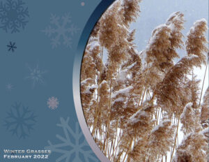
February 2, 2022 at 7:31 am #70838CONTINUING my work with templates — I happened to have a photo that fit nicely with this wintery frame template. I brightened the photo, added a shadow to the curved frame and added a little text. I also resized the template to fit my desktop printer, so it came out 11 x 8.5 inches using landscape format or 3300 x 2550 in pixels.
February 2, 2022 at 9:26 am #70839Ann, these are beautiful. When you print, do you print slightly lighter since the ink on paper usually results in a darker image?
February 2, 2022 at 11:04 am #70842Susan: The only time I have to print lighter is if I have skin tones in my design. Otherwise, I don’t see a problem. I had to fiddle with this one to get the skin tones looking normal.
February 2, 2022 at 1:19 pm #70845Thanks Ann. I never thought about skin tones. I’m going to start printing pages this year and wondered if I need to do anything different than what I’d normal do when printing photo’s. Currently, I outsource the printing (and they print slightly dark), but hoping to get the printer I want ($$$) this year.
February 2, 2022 at 1:29 pm #70847Love the wintery scene Ann and an unusual composition. I want to share with you an edible cake topper I have had made from my design for my godson’s 21st birthday. I made the cake and added the topper. He is studying Japanese and he said the translation was correct. (Thank you Mr.Google). I cropped the photo and in PSP applied Instant Effects/Retro Pop . To fade out the edges, I then used Cassel’s freebie template with a mask ‘Watercolour Page’. (Thank you Carole).
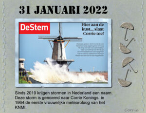
February 3, 2022 at 7:00 pm #70881A couple of days ago we had the first storm of 2022 in the Netherlands. The next day this photo of a mill in a coastal town was in the newspaper. Since 2019 storms get a name over here, at least as they generate a code oranje or red. The Netherlands, Great Britain and Ireland together make up a list of names each year. This year one of those names is Corrie, my name, but the name is in honnor of the first Dutch woman meteorologist in 1964. It was funny to see and hear my name all over the news, so I decided to do a quick layout about it. I made a frame with the worn frame tut from the new Lab for this month. The raindrops and umbrellas where in my stash, the title font is Stencil. The corner in red on the photo is the name of the newspaper.
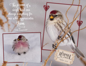
February 4, 2022 at 7:34 pm #70897I have been preoccupied of late. Saying that I make time to shoot nature. There isn’t much during the long cold winter months. I do have, and in excess of 200 of them, the very tiny arctic, Redpoll Finch, they fly from their summer home way up north in the tundra, to spend winter further south, where it’s supposedly a tad warmer. They get quite impatient, when I fill their 9 feeders, landing on me, by the dozen. The one on the snow all fluffed, as it was -30c that day is a male, (as I flatly refuse to take photos through a window) only the males have the pinky chest. The other is a female.
February 4, 2022 at 10:10 pm #70902Anonymous
- 335

- Enthusiast
Sue: oh, they are so cute -thank you for the info on these little ones 🙂 your page is made in a delicate style – great
February 5, 2022 at 12:11 am #70903Pirkko, thank you for your kind words, I really appreciate.
February 5, 2022 at 11:36 am #70909February 5, 2022 at 11:47 am #70910Doing good Liz. If I could offer one suggestion it would be to look at the elements you used and ask yourself if they are realistic or drawn. If they are realistic, I would be picky on the shadowing and such. If they are drawn, they might be considered a paper element instead and require a different type of shadowing.
February 6, 2022 at 7:50 am #70923Anonymous
- 335

- Enthusiast
We have a lot of snow …
photos from Southern Finland (Sammatti) in early February. The cluster from Pixel Scrapper
oops… wrong year…. just a moment please… now it is right 🙂
what a… let it be… the photos taken this year 😉
February 6, 2022 at 7:57 am #70927Pirkko: Your layouts are very beautiful! I study them for design tips. It must be my Finnish grandfather’s genes that are stimulated! 😀
February 6, 2022 at 8:00 am #70929Anonymous
- 335

- Enthusiast
Ann… you are almost finnish 🙂
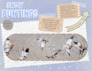
February 6, 2022 at 8:28 am #70933February 6, 2022 at 9:17 pm #70940I am a lucky girl, I won the circular slats script. It certainly does create a unique effect to any layout. I had several attempts before I was satisfied that all of the birds faces were almost visible, at least their eyes. All my own work, cellotape. I used the pen tool to create the inverted corners on the labels, pen tool for the arrow, with text on a path. Scalloped edges, layered text for the heading. I used effects for the background layer, and a texture for the scalloped paper. Custom brad script for the date. 4k burst for the photo. (30 frames per second). For the photographers out there.
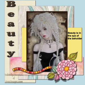
February 6, 2022 at 10:17 pm #70950Borrowed. Carol’s picture from today’s webinar and added elements from stock
February 6, 2022 at 10:47 pm #70959Trish, how did you find the process? Did you have some elements that you had a hard time to place or elements that simply didn’t fit?
February 7, 2022 at 4:00 am #70982February 7, 2022 at 12:46 pm #70987February 7, 2022 at 12:58 pm #70989Liz, text wrapped inside a selection will behave oddly when resizing. The vector format will possibly “disappear” which is why it is a good idea that you make a duplicate to convert to a raster before resizing. Also, if you use the wrong compatibility mode, your text will actually disappear when you save the file. When you open it the next time, it will be gone. HERE is an article that mentions those oddities.
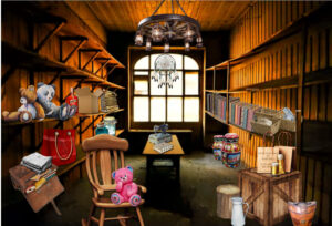
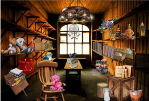
February 7, 2022 at 1:25 pm #70993See revised picture … Boxes are a nightmare, Carole, getting the angle right, I think it required a made-to-measure one for this picture or the box should be at ground level or straight on. I wanted to get some things higher up, puts some bottles on the self where I put the booze I have numerous bottles or jars but all looked as though they were falling off the shelf, also candles, they just leaned, I couldn’t get things that required sitting parallel to the wall surface while sitting up straight, it didn’t help with the distortion of the shelf, although it got better when I realized the shelf was more straight and it was the shadow making it look worse, the picture looked like it was taken with a bulls-eye lens I think that’s what its called I am not a photographer. I screenshot your picture as I knew it would have been a problem and it lived up to it x
February 7, 2022 at 2:14 pm #70996Carole, I thought the Webinar was mix and match, where different types of elements were merged , this one I used a backdrop photo which I reduced (see image), all the elements where from different souces, cartoon, kit, png site, textures came from another png site as did the road, greenery from another as did the sky
February 7, 2022 at 2:21 pm #70998This one was from a song challenge, the backdrop was a picture of a railway carriage, everything else almost were picked up from various png sites and from Kennys web page, all reduce to size, effects added , smoke ect. train from a kit
February 7, 2022 at 3:03 pm #71000Trish, the idea was to “mix elements that match”. I wanted to point out various details that made elements match or mismatch if you want something realistic. Of course, if one wants some other style, things won’t have to match!
February 7, 2022 at 3:17 pm #71001Sorry I think we are on cross purpurses, I try to make elements from differnt and miss matched sourses and blend them together,to look like they match, ( you cant always find one that is the same sort,) so they all look like they belong
February 7, 2022 at 5:36 pm #71003Anonymous
- 335

- Enthusiast
I participated in another challenge. Its tutorial was pretty old, as were the effects but I got the idea – this one 🙂
-
AuthorPosts
- The forum ‘Showroom’ is closed to new topics and replies.


