Home of the Scrapbook Campus › Forums › Showroom › Up-to-Date Challenge 2021
Tagged: Up-to-Date Challenge 2021
- This topic has 200 replies, 26 voices, and was last updated 4 years ago by
Carol Anne Wall.
-
AuthorPosts
-
October 20, 2020 at 12:34 pm #48216
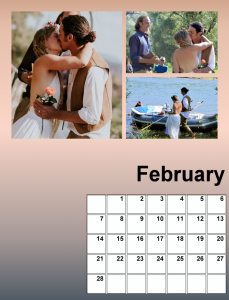
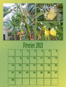
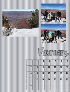
I notice that the background on my Feb 2021 layout there a distinct beak, from the gradient, I think it’s because I had to compress to 600pixcels from over 4 MB. It’s ok on the page to be printed.
October 20, 2020 at 12:52 pm #48218Dear Sue, I am glad to say that after 3 weeks of treatment for an eye infection, they are ok now… I have never had anything like that, and it was a bit stressful dealing with it. Thanks for asking. <3
Another great layout and I love the font!
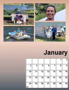
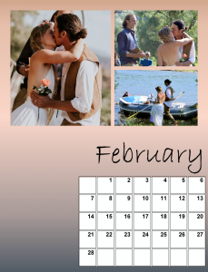
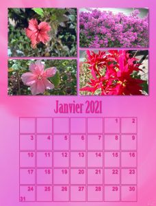
October 20, 2020 at 12:54 pm #48220Did the background for Jan and Feb with a gradient called Rising. And I selected the area of the calendar and filled it with white. I changed one of my photos; in Feb I added a photo of the happy couple boarding their raft to leave for the reception.
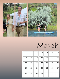
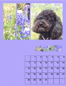
I did fill the background on March and April but I got confused with the photos for March. The layers had lots of PHOTO HERE directions so I thought I’d wait for Carole/Cassel to explain.
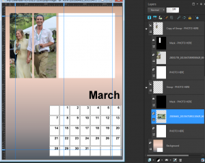
Carole/Cassel: I did try adding photos to March and something isn’t working right. I used 2 photos: one for the right area and one that I placed twice for the 2 left areas. The left areas worked out fine but the photo for the right will NOT show up, for some reason. I’m attaching a screenshot to show what I’m dealing with. Help!
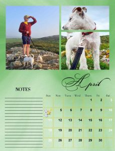
October 20, 2020 at 1:18 pm #48221Cristina, I’m pleased to hear you have made a full recovery. The font is called Bickham Script fancy. I haven’t checked to see if there are any other glyphs in character map, as it’s pretty fancy as it is.
October 20, 2020 at 2:57 pm #48225Here is April, I chose these two photos, as there was yellow in them. Son in law Tom has Smudge and Bramble on leads, their mother Tinks is the one in the other photo. They are Parson terriers.
October 20, 2020 at 3:09 pm #48229Ooops! forgot to attach page.
October 20, 2020 at 3:42 pm #48232Very nice work Ann, I’m looking forward to seeing your finished pages.
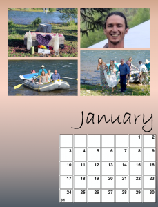
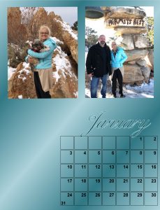
October 20, 2020 at 3:47 pm #48236Ok, here’s what I have so far for Jan, Feb and March. April onward will be baby Magic. These wedding photos are for the ages with all the chanting and rafting back upriver after the ceremony. The reception was held out in the woods in Colorado with lots of tents and mosquitoes. That tall handsome groom is my grandson. 😉
I changed the font on the month name to Bradley Hand. The gradient background is Rising rotated 180 degrees. I think that split screen effect came out pretty good, a first time for me.
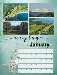
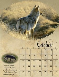
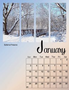
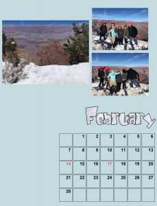
October 20, 2020 at 3:48 pm #48237I’m not going to have a theme to my calendar. Just each month will be something different to look at. :o) Jan I chose where I live. And for February I chose space … because I like it. Would have gone to the moon myself if I could have.
October 20, 2020 at 4:35 pm #48243I know there are many modifications yet to come, but I enjoy looking at all of your pictures, so it’s only fair that I post my own progress so far. These are all my own photos.
October 21, 2020 at 6:41 am #48245MoniqueN, don’t worry, you will catch up.
Cristina, looking forward to your projects.
Sue, combining more than one masks is a great idea. And it can work well with some specific photos. And yes, when resizing, the gradients or shadings can sometimes give an odd look. At least, it is fine on the original.
Ann S, as I have mentioned on the FB group, there was an error for the March template. It will be great to end up with a whole calendar showcasing those wedding photos: a year to remember. As for the font used, you MIGHT want to try another one, later (you’ll see what I mean)
Minka, did you use a font for the “unplug” or was it a premade word?
Alicia, you are correct; until the end, everything will be a work in progress.
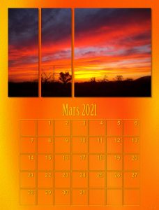
October 21, 2020 at 7:43 am #48248Hello, here I am with my first two months.
What I have seen so far is very beautiful. Congratulations to everybody!Désolée Carole, je n’ai pas pu passer avant pour aviser de ma participation
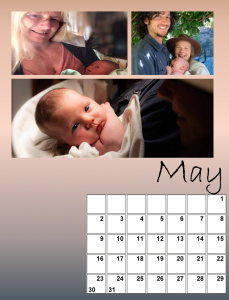
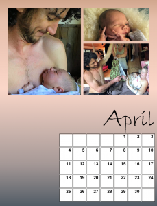
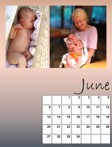
October 21, 2020 at 11:00 am #48253Hi everyone. Here are April, May and June. Now we’re into Baby Magic, three years after the wedding. The other person in these photos is Nana Deb. She is Magic’s grandmother, Will’s mom and my daughter! Now the setting is Comptche, Northern California, just in from the Mendocino coast, about 3+ hours north of San Francisco. So far the fires haven’t touched them. It’s really damp there from the ocean though the air quality has suffered.
So far I’m sticking with the same gradient background and keeping the Bradley Hand font, though I did increase the size of the first letter of each of the months.
October 21, 2020 at 5:16 pm #48263A busy day today, for now here is June’s page. After seeing Jnet’s pages I opted for putting a slight shadow on the photos. Thinking back I can remember trying the drop shadow, but undid the shadows, simply because I have never seen a calendar with shadows before. Now that doesn’t mean that shadows are not accepted as the norm for calendars, as these calendars we create are very unique and personal, to the creator and the persons receiving them. OI created a background paper using the brown in the photos. Used the photo of Tinks, and placed her inside the date boxes. Overlay, and opacity. I may go back and dispense with the note section, and place a masked photo, fitting for each month, as I have loads of photos. At least I have plenty of time to fine tune the months, before printing and posting it.
October 21, 2020 at 5:33 pm #48269Many of the family and friends that receive one of my calendars, don’t like to write on them. They have them hung up on display than use them as a functional calendar, so this layout works well, I think I will go back and take the note section out and replace it with something similar to what I did in the page.
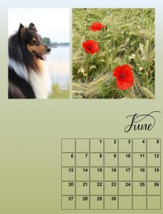
October 21, 2020 at 6:16 pm #48271October 21, 2020 at 6:26 pm #48280hello everyone, this is what I’ve made of it so far.
October 21, 2020 at 7:16 pm #48286Marie Claire, Beautiful calendars and that is one beautiful dog. Does he/she have a name? 🙂 Great photography too!
October 21, 2020 at 7:18 pm #48287I am blown away…everyone is doing a spectacular job with these calendars. They will all make great gifts. 🙂
October 21, 2020 at 7:34 pm #48289I whole heartedly endorse Lynda’s last comment! The West Wales coastline is renowned for it’s outstanding beauty and wildlife, not only in the UK, but throughout the world. For this page I created a background paper using as many colours that I could pick out of the photos, even the purple from the Thrift flowers in the top right photo.
October 21, 2020 at 10:44 pm #48290Jnet, it is ok to start a bit late. Your flowers are beautiful!
Ann S, using the same background is often a way to keep a consistent look through the multiple pages, however, you MIGHT also change your mind, who knows?
Sue, shadows or no shadows is mostly a matter of what you want to achieve as an effect. You might want to make the images as if they were photos glued on the page, or pages framed and behind the page. And both are ok too.
Lynda, that is a great way to display one photo through 4 spots. What font did you use for the month? It looks quite interesting.
Marie-Claire, what font did you use? It looks cool.
October 22, 2020 at 7:12 am #48300Thank you Carole for your comment
I’m moving, I’m running out of time … and moreover I have to cross over to my daughter’s house at 2 houses to have WiFi in order to download the files and also to post once the work is done. My WiFi problem should be fixed today.
Once again I am amazed to see everything that has been done since my layout submission, well done everyone.
Sue, I found that my dates and boxes did not stand out, from there a little bit of shadow 😉
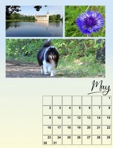
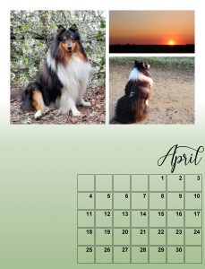
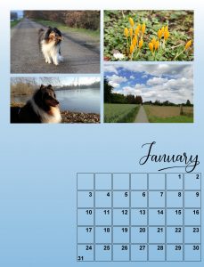
October 22, 2020 at 7:58 am #48301Lynda, Thank you!! The name of my dog is PONCHO :-), and it is a male
Carole, Thank you for the comments. The font is a free font from fontbundles.com and it comes with extra glyphs
https://fontbundles.net/free-fonts/script-fonts/nostalgia-scriptOctober 22, 2020 at 8:42 am #48302Thanks Carole,
The font is Caneletter Script and it doesn’t have the extra things in the character map that you were showing us in the
video. I think the font is pretty common, actually I thought it came with the program but I really don’t know for sure.October 22, 2020 at 10:27 am #48306Whole yesterday evening I spend trying to get the extra characters. The first problem was: I have PSP in English and my Windows and Word are in Dutch. So it took me some time to figure out where this charactermap with the unicode subrange was located. The second problem was to find a font that had those fancy letters. Most didn’t or had only a couple. So in the end I decided to use a fancy font I have and then I could change the names of the month to Dutch, because if I really make a gift of this calender it has to be in Dutch. Besides that I wanted to change a photo I wasn’t happy with and select more photos for the next month, because I like to see where I can put the photos. I am just like Shirley! At that point PSP frooze for a couple of times. This evening I’ll continue. I only have saves my pages in PSP formate and not have not saves them in JPG. Later this day I hope I can show something. Now it’s almost time to cook dinner. See you later.
October 22, 2020 at 11:47 am #48309Opps! I posted my results yesterday I thought, but it does not show, so trying again. (Also, I could not find this thread on the forum list. Only by the email you sent.
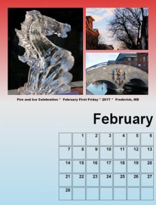
I will try it one at a time.
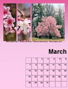
October 22, 2020 at 11:51 am #48311Here is lesson 2
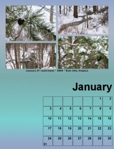
October 22, 2020 at 11:52 am #48313And 3 for me.
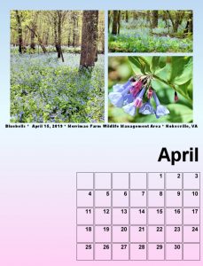
October 22, 2020 at 11:53 am #48315I redid Lesson 2 and saved it as 4, but I will do another April later
October 22, 2020 at 2:09 pm #48316<p style=”text-align: left;”>Thank you for the comment Carole. I’m enjoying the new layouts. I agree, it depends on what effect the creator is looking for, I must admit I like shadows, they give perspective, and not a flat page, again it’s down to personal preference, either is OK.</p>
-
AuthorPosts
- The forum ‘Showroom’ is closed to new topics and replies.


