Home of the Scrapbook Campus › Forums › Showroom › The BIG 10 Showoff
Tagged: Big 10
- This topic has 440 replies, 37 voices, and was last updated 3 years, 3 months ago by
cindy harris.
-
AuthorPosts
-
September 9, 2021 at 7:57 pm #63890
Anita, lovely photo. May I suggest that you delete the photo, and re-add it. As you don’t need to use the magic wand to select the area to place the photo in. The quick page is a png, which means that the checkered board showing is your psp work surface. (it’s blank) When you copy and paste the photo into the quick page, move it below the quick page in the layers palette, then you can resize, or even rotate it.
September 9, 2021 at 10:56 pm #63896More entries of the day:
Euka, there is so much one can do with the text wrapping despite its limitations.
Marie-Claire, there are many ways to add pizzazz to titles, and you are showing that in your projects.
Fiona Cook, that is such a great way to use that out-of-bound technique.
MoniqueN., that red glitter is a perfect match.
Susan Ewart, thank you for the information about Sublimation (which was mentioned during the FB live video this morning). That two-tone text is very effective.
Sheila Hogg, a great way to use that overflowing technique.
Nadine, using overlays and blend modes can add such interesting textures and backgrounds.
Sue Thomas (3), yes, you inspired me to explore that overflowing approach and that led to a full class. Those overlapping frames are one of those techniques that can only be done digitally! Can you imagine trying that with printed paper photos?
Diane Co., on its own, it might not look like much but it would make a fantastic background.
Mary Solaas, great monochrome page full of techniques.
Wanda (Sue) McGuire, another great result from that Love Story challenge.
Ann Seeber, isn’t it nice to learn that someone is currently displaying your work? As for another similar challenge, that is a possibility.
Sandra Jones, that lifted shadow makes quite an impression!
Bonnie Ballentine, I didn’t remember reading that story (or I forgot it!).
Corrie Kinkel, one page to summarize almost all the tutorials of the challenge.
Anita Wyatt, yes, a quick-page can be a great introduction to digital scrapbooking since it can be done so… quickly.
I hope we will see some newcomers also post in the next few days. There are lots of tutorials available all the time on the blog and this weekend, you will have even more tutorials to try!
September 9, 2021 at 11:02 pm #63898Thank you for the helpful tip Sue. I used it and like the results a lot. It is also much easier and as you mentioned, one can resize and rotate, etc. I am very happy I found the Campus where everyone helps each other and shares their knowledge of PSP. I posted results below.
September 9, 2021 at 11:43 pm #63900Carole, yes I am getting more confident, but only on some techniques. It still can take hours to decide on papers and elements. I’m not likely to be taking it on for a living but if I charged by the hour now that would be very lucrative!! lol
September 9, 2021 at 11:49 pm #63902For today I have used Carole’s Slats script
September 10, 2021 at 3:06 am #63905I made this for the Boot Camp a few years ago. I think I used the decorative border tutorial to create the background.
September 10, 2021 at 5:47 am #63908I would just like to say, what a sterling job everyone has done with their fabulous creations of work. I think we have all come a long way with our ideas and practicalities with using PSP. We have so much to be grateful for to Carole, who has given us so much tuition, time and inspiration. A big Thank you and Congratulations to her and may this fabulous forum continue for many years to come. Well done everyone.
September 10, 2021 at 6:13 am #63907I really enjoyed working on this magazine project, although I haven’t really finished (but i will) here i use dingbats fonts
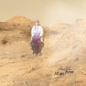
September 10, 2021 at 6:19 am #63911Yesterday I saw a picture I wanted to use as background. I took it from NASA. It’s a picture by Perserverance.
Skills I used in this fun picture
I isolated me from a vacation pic with my hubby a few years ago. When I put me in the photo I used a modify selection to be able to put a blur around my figure so it feathered better into the background. I learned how to do this from one of the classes here. Then I put a shadow on a separate layer and played with it using the pick tool in ‘perspective ‘. That’s a shadow trick I learned in a recent shadows master class. I wanted to make sure the shadow looked the same as the other visible shadows in the background. Then I put a hazy overlay over the top to make it look like dust in the air.
I remembered that Carole had a travel class /challenge about creating a date stamp but didn’t have time to look it up or study how to do text on a path again so I went with a fancy font and thought about the Paintshop Pro Maniacs Facebook group where I learn so much from other members about how to make my pictures look better. One person there suggested using a couple of different fonts when creating word art.
I am having fun with PSP again!
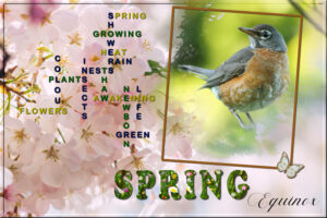
September 10, 2021 at 8:47 am #63913Maasterclass: word art with PSP 2 create a crossword effect on a theme.
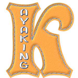
September 10, 2021 at 8:52 am #63917Creative scrap: stitched element.
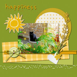
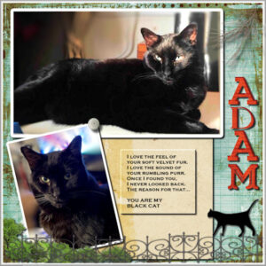
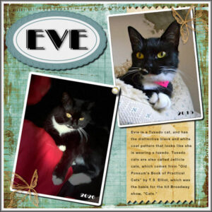
September 10, 2021 at 8:54 am #63918When I was first here last year I did a pair of matching layouts featuring my fur kids, Adam & Eve. I used what techniques I had learned in Bootcamp and the Basic Scrap Course plus stuff from the other challenges. These celebrate their adoption from two different animal shelters. Adam was first in 2010 when he was 2 and Eve was next in 2015 when she was almost a year and had been picked up as a pregnant stray. She had her 2 kittens and they were adopted before we adopted her. So, here is my Hauspanther and my Tuxie.
September 10, 2021 at 10:53 am #63927I, for one, thank you, Carole, for this 10 day opportunity to show what we have learned with you over the past years (for me probably only 1-1/2 yrs.). You are a great teacher – able to bring even complicated techniques down to the beginner level. Your students, also, take the time to share techniques. I’ll share one I learned this past week with the Effects>Reflection effects>Rotating Mirror. When you make a new image from a photo, do the Effects right away – don’t do anything else to that new image – or it won’t work. I reinstalled my PSP at least once trying to make it work on an image I had opened and closed several times before discovering what the problem was. Live and learn.
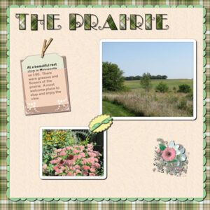
This LO is created from Lab 6 Module 3: multiple scallops as an edging; create translucent envelope and make a card to go in it; scalloped elipse shape. I did the experiment 2 – make a paper clip and experiment 4 creating circular shapes and brads (which was fun). This LO: Title is Annie Tobin’s alpha which she so generously shared with us, filled it with the plaid paper I created using the prairie picture. The cluster I made for the 2021 Travel Challenge. The cream paper is my own, used masks for the 2 pictures which I took at the rest stop. The small green bow was made from Bow2 Cass script; the bow at top of card is from Gina Jones – Pretty Bird kid.
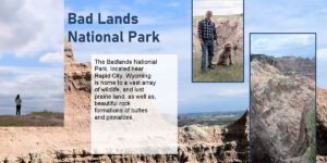
September 10, 2021 at 11:04 am #63929The recent Magazine Challenge was another interesting challenge for me and a great learning experience with templates. Learning how to edit them and how to create one from scratch. Finally templates started to make sense!
The challenge also included text wrapping and text overlapping a photo. I am still tweaking my pages for this and adding extras.
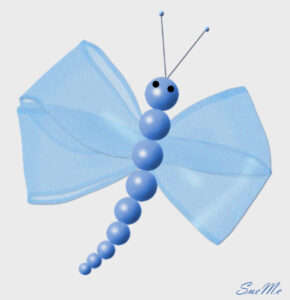
September 10, 2021 at 12:37 pm #63931Dragon fly made from Carole’s Script. I have puchased so many of her scripts and love them all!
September 10, 2021 at 1:00 pm #63938I can’t believe it! Pay no attention to what I said about the Effects>Reflection Effects>Rotating Mirror. It is not working again. Can’t understand it. I am using PSP 2021 Ultimate on a Windows 10 (latest upgrade) PC. Restarting my computer doesn’t help and I am NOT going to reinstall PSP again. The result from using this effect makes the best plaid. Does anyone else have this problem?
September 10, 2021 at 1:25 pm #63939Mary: I had some problems with Effects also. I discovered if I saved the image after each effect but before applying another it worked pretty well. Something about PSP saving temp files that won’t let go until you save it, I think.
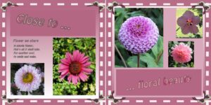
September 10, 2021 at 2:43 pm #63941This is one of my pages from the Magazine Challenge. Carole provided the template for the left side of the page. I decided to enlarge my canvas, keeping the original template to create a double page. I used masks to slide my photos in to and then I added borders to the Masked images.
I love the challenges because it is awesome to see everyone’s take on the same subject or format. Plus Carole always teaches us something new!
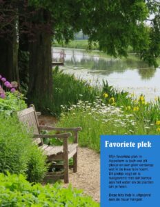
September 10, 2021 at 3:08 pm #63944Of course I have to add my favourite garden in Appeltern during the magazine challenge 2021 🙂
Great work everyone, would love to comment on every single one,but there are so many……..:D
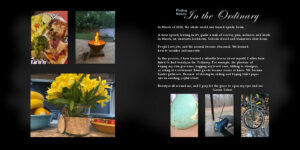
September 10, 2021 at 3:09 pm #63945Last Year, I really struggled emotionally because of Covid. For the Double Page Challenge, I decided to use the theme Finding Beauty. My theme helped me to look beyond the awfulness of the Covid Pandemic, and to see that beauty, even in the midst of a pandemic, surrounds us everywhere.
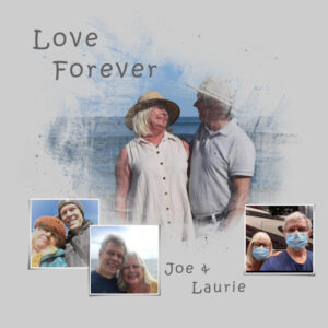
September 10, 2021 at 3:22 pm #63947The Love Challenge was my very first real experience with PSP, and it was my first time participating in the Campus. It was the hardest Challenge for me because my knowledge of PSP was so minimal, But, having said that, it was my favorite Challenge because I learned the most from it. I followed up the Challenge with the Basic Scrap Course. The Basic Scrap Course was awesome!
PS- This was my very first Scrapbook page!
September 10, 2021 at 3:44 pm #63948Ann – I tried that in PSP 2021 and it still wouldn’t work. Went back to PSP 2020 and it works fine (today anyway). It has been very off and on again, but I am not going to reinstall again.
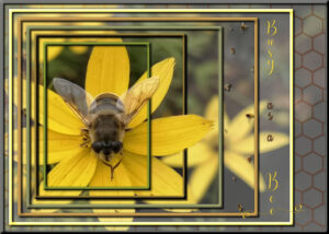
September 10, 2021 at 4:57 pm #63951The overlays masterclass is very populair (with me too), so I wanted to show you something with OVERLAYS in it. These nested frames were a freebie from Carole and we were asked what we could come up with using the different layers. I had this photo of a flower with a fly (Sue thanks for pointing that out to me) and arranged it on different layers each with a different opacity. The honeycomb on the base layer is an overlay on the background photo and if you look closely you will see some little bees scattered around another layer; they are an overlay too. I gave the frames a different color and an innerbevel. All colors are taken from the photo. Then OUT-OF-BOUNDS for a petal and a wing.
September 10, 2021 at 5:52 pm #63955Here is the project I worked on during Bootcamp Day 9 Project 4. I loved the pinking shear effect and I learned more about selection borders for photos. I also enjoyed learning about changing colors and finding out new fun tips about fonts.
September 10, 2021 at 6:16 pm #63958Carole, I used a link in my last post and it is likely in SPAM-world now.
September 10, 2021 at 6:48 pm #63957This is a test page from the Photo Gallery script that I won from the FB group and purchasable through Creation Cassel store https://creationcassel.com/store/index.php?main_page=index&language=en I have much to test out in this, but it makes a beautiful page. Once I free up some time I will do some in depth tests with number and orientation of photo’s etc. These photos are mine from various years on the front of my Christmas cards. I will do several layouts as I have many Christmas card photo’s I want showcase.
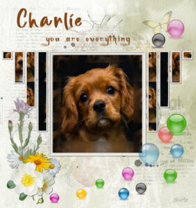
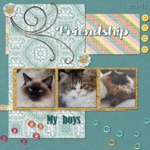
September 10, 2021 at 7:24 pm #63965Today I have chosen from one of my early bootcamps featuring my beautiful boys. George Pete and Charli. I can see plenty of room for improvement in this one but as I say it was one of my early challenges.
September 10, 2021 at 8:35 pm #63972Double Take Challenge, September 2019
September 10, 2021 at 9:43 pm #63984September 10, 2021 at 11:23 pm #63986They are handsome boys, Shirley. Love the layout.
Anita
-
AuthorPosts
- The forum ‘Showroom’ is closed to new topics and replies.


