Home of the Scrapbook Campus › Forums › Showroom › Template Workshop 2022
Tagged: Template Workshop 2
- This topic has 406 replies, 43 voices, and was last updated 1 year, 7 months ago by
Cassel.
-
AuthorPosts
-
March 27, 2022 at 12:34 am #74305
Joyce, to answer your question, HERE is a tutorial on how to do it, and HERE is a script that will do it for you. The main reason why digital scrapbook templates are mostly in 3600×3600 is to imitate the traditional paper scrapbooking, and 12×12 simply gave more space to work than the 8.5×11 papers. But you are not the only one who prefers a smaller rectangular format over the large square one.
March 27, 2022 at 12:47 am #74307Carole, you are so right. No shadows on the 1st one. I was really bleary last night and will have to go back and redo that one. I think I have put all the shadows on the one I’m posting tonight (almost morning again!).
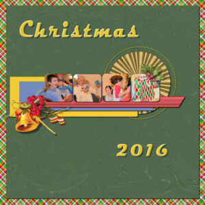
I used the teaching you did in the Quick Page Workshop on this one. It helped me to find something to put in those “little squares”. The cluster with the bell is one I created with one from PS. The hollys at the top right are also from PS. The papers I created and that ribbon under the cluster is one I created from one of the labs. fantastic that teaching on how to colorize stitching. Sure enjoy the Clip to it. Trust I won’t forget how to create a mask!!!March 27, 2022 at 2:43 am #74308Thank you, Carol. I’ve downloaded both the Resizer Script and the Clip To It Script. Can’t wait to play with them!!
Joyce
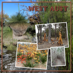
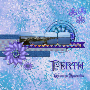
March 27, 2022 at 4:17 am #74310Template 4 – the main photo not very well displayed here (Xanthorrhoea australis), most often called the grass tree/austral grasstree or blackboy. All photos are mine taken in Western australia.
I am enjoying the various images, template adaptions and stories being presented here, so thankyou.
March 27, 2022 at 5:05 am #74312I love what Everyone has posted… Fun, creative, lovely, and touching layouts. What a great group!
Late as usual, here is my Day 2 page… I used the “Template 2 – Diamond” and tweaked it slightly… For the PaintSplash, I’ve just changed the Brightness.
Usually, when I use the same photo, one is Black and White, but this time I thought it was not coming out the way I wanted… So, I had one layer with the Black and White photo, added the original photo on top of this layer, and lowered the opacity… Maybe, I could have done the same by lowering the photo saturation.
I used “marisaL-prettythings-glitter-brown2” tile and created the polkadot paper (Cassel’s tutorial).
Fonts: Beauty and Love and Great Vibes
March 27, 2022 at 5:37 am #74316Lesson 6
I notice Mary is up at 2am and I am trying to catch up having in the UK lost an hour due to the clocks going forward, just when we have loads to do.
I loved Ann’s cheetah and it reminded me of a visit to a cheetah rescue park we visited in Cape Town for a birthday treat I stroked a cheetah. So silky.
Sue, loved the delicate lacey border and wondered how you did it with a brush.
Lesson 6
I decided to keep the template daisy designs, selected sample colours from the photos and colourised by locking the transparency, floodfilling and Adjust-Add Noise. Then adding a reverse shadow helped.
A question: for the template Paper layer that had the texture, could you use it as a mask or clip to it at that stage?
March 27, 2022 at 5:40 am #74317Template – Day 5.
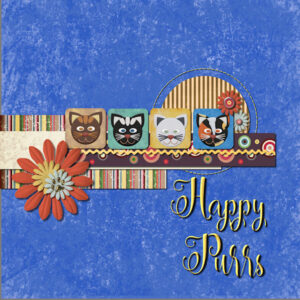
This took me a while but it was a lot of fun and so many new things to learn. I looked at the small Photo boxes then I had an idea. Some time ago, I had download some cat faces from Melisa Riddle at Digital Scrapbooking and I decided to place them on some of the background papers from Marissa Lerin’s kit. The hardest part is always finding pictures for a project. The yellow RicRac is from Janet Scott at Digital Scrapbooking.The gold paw-print on one of the flowers is one of my graphics. Font is Carolina Script.
March 27, 2022 at 6:44 am #74318Carole-That is the same font that I used on the previous page, day 2 I think. I tried a shadow, but with the cut-outs in the letters, it just didn’t look right. Your suggestion was a smaller shadow, which I used on day 3. But I am really thinking that font, which is called ‘Flora Garden’ just can’t have a shadow. Or, I suppose, with the shadow on its own layer, the parts inside the cut-outs could be erased? I’m only thinking of that now because it is morning and my brain is in gear! 😉 I don’t have time to try it now, because I need to get some breakfast and get in the shower.
March 27, 2022 at 7:00 am #74320Hi Carole the paper from my previous project is from a kit called Sweet Violets – it was in the march blog train and can be downloaded at https://themagnoliapatch.blogspot.com/
So, below is my day six project. I’ve mainly used elements from Janet Kemps Snow and Snuggles kit.
March 27, 2022 at 7:05 am #74321Carole – thanks for helpful suggestion.
“Lois (#74289) it looks like your title is floating. It has a similar shadow as the flower while it should have something more similar to the photos/papers.”
I wondered about that when I was finished but I saved the page without the title so I could amend that.
So is this better? I think it is. We learn something new every day.
-
This reply was modified 3 years, 4 months ago by
Lois Duckworth.
March 27, 2022 at 7:09 am #74323Day 5 – slowly catching up. Everything on here is mine and just using one photo.
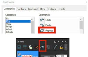
March 27, 2022 at 7:27 am #74325For repeating the previous action I use a button from the edit menu and have it placed on my layers palette for easy access. I find it an easy way to repeat an action especially when adding shadows and on the layers palette it is very handy. I only use a mouse and I have to use 2 hands for Ctrl Y .. this way I don’t have to leave the mouse.
If you want to add it to your task bar or layers palette, go to view, customize and under commands select edit (on left under categories heading) and on the right under Commands it should be 3rd icon down, then simply drag the icon to your task bar or the layers palette.
I have several of my most used icons added to the task bar in this way.
Hope this is ok to post Carole.
March 27, 2022 at 7:34 am #74327Anonymous
- 335

- Enthusiast
My result for Cass-Template Day 6
I hope I can grow a new houseplant for myself 🙂
March 27, 2022 at 9:30 am #74333I’m like Euka. I use my mouse and not the keyboard (except for text). However, I have set up a custom tool bar that has all the icons I use the most. Over 30 of them right at the top of my screen. Just click on it and it either activates the tool or brings up the box to make adjustments.
Yes, the tools are on the left of the screen but for say the pick tool, if that isn’t the one selected in that grouping, you have to change it. With the pick tool being on my custom tool bar, I click on it and have the pick tool. The icons for items from the menus really saves time, especially something like drop shadow that is used a lot.
This is just something that I have done through many versions of PSP. In fact, I have a written list so that I can set it up when I get a new version (since most of the time that doesn’t transfer from a previous version).
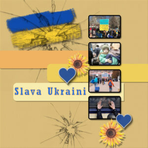
March 27, 2022 at 9:31 am #74335Lesson 5, using alternative template. As Lynda pointed out with her layout of Ukraine, it is much on my mind too. But mine is not celebratory in nature.
March 27, 2022 at 9:39 am #74336Thanks Sue and Carole for the tip. I haven’t quite worked it out yet to create my own “quick” border but I think I will be able to.
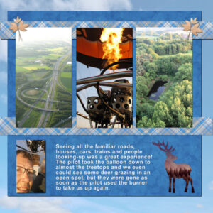
March 27, 2022 at 9:40 am #74337Minka sorry for my late reply. In Breda the city next to where I live their is a balloon company that offers this experiences. The owner is a price winning pilot, not only in the Netherlands but internationally and has been to many balloon festivals, including some in the Alps. That would have been fantastic to see, but just here and seeing up close my own region from the air was great!
Carole my husband didn’t come along on the ride, he prefers to be on “terra firma” bt took the photos of the lift-off and some on the moment I had to pay attention to the instructions etc. The bulk of the photos are mine.
March 27, 2022 at 10:08 am #74339So, after a very hard week at my job I finally created my first template.
I used a stockfree photo. The Background is marisal gl20 feb solid paper and was a bit darkened. The rectangle is DadyDCS aix KP d’hiver_Pap2 and the raster paper is ps_sharon-dewi-stolp_314151star light-paper-stars-blu_pu.
The font called Palatino Linotyp at 500.
It was hard work but I finally got it. It’s Template Day 1.
-
This reply was modified 3 years, 4 months ago by
Christiane.
March 27, 2022 at 10:37 am #74342Fiona, (#74316) Carole has a nice selection of crotchet lace picture tubes in the store. I also have a varied selection of lace brushes, including some nice Xmas ones. Which ever you use the technique will be the same to create a frame, round, square or rectangle. The picture tubes can be used to create round or oval frames using the vector tube script, even rounded cornered rectangles or squares. The same will apply for some brushes, using the vector brush script. To create the frame I used in the frame, I used Carole’s mitered corner script, which is very quick and easy. There is also the circular script. If you don’t have them, check out these two tutorials in the creative scrap, in the campus. Ribbon frame and wood frame. I find it’s always a good idea to learn how to do these things myself. Even though I have the scripts, as more often than not a technique will be demonstrated, which can be used in other ways, for different projects.
March 27, 2022 at 11:47 am #74344Carole #74302
1.
SCRIPT PROBLEM SOLUTION FOUND
Carole, Regarding the problem with the Script, I found a solution.
Somebody had posted on the Corel Forum with the same problem.
It turns out that the Script Recorder added a Path line to the LayerArrange part of the code. Following the instruction from the Forum (and the example that was supplied), I was able to remove the offending line and get my Script to Run exactly as I wanted.
In case anyone is interested (or someone can reach out to Corel to have this bug addressed), here is the link https://forum.corel.com/viewtopic.php?t=68584
2.
Carole, as always, thank you for your valuable input.
-
This reply was modified 3 years, 4 months ago by
Randy.
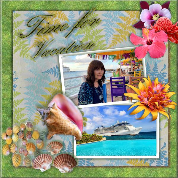
March 27, 2022 at 12:20 pm #74345For my Day 6 project, I started to long for a warm vacation, so Vacation Time.
-
This reply was modified 3 years, 4 months ago by
Hank Sobah.
March 27, 2022 at 12:23 pm #74348Thank you Carole for putting this workshop together – I’ve learnt a lot and have loved seeing what everyone else creates. Below is my Day 7 project.
March 27, 2022 at 1:45 pm #74352My day 6 with kit – PSPTK _ Avril 2017 et day 7 with PSBT Cozy Kitchen Septembre 2018
Thank you Carole for this great week of patterns, I enjoyed the little tricks shown and it made me think of things I knew but didn’t use (like shift D) because I use the keyboard a lot
Bravo to all the participants who have stopped by so far. There are some lovely creations with a nice variety of photos, kits.
March 27, 2022 at 1:50 pm #74353For my Day 7 Templates project, I couldn’t help thinking of home and some Detroit iconic institutions. And I sort of strayed off the script a little, but mostly followed along.
 March 27, 2022 at 1:52 pm #74355
My final Big Cat is the Bengal Tiger. I used the Diamond Template from Day 6. I’m still working up a cover page using Day 5 with the small photos, but I wanted to finish the tiger first.
March 27, 2022 at 2:01 pm #74357Hi Cassel
This is not my dog. I have malts. You’re right, the photos are the same. refills and it got much better. Thank you for your attention..March 27, 2022 at 2:02 pm #74359Lesson 4 – template 4
The background is from Marisa Lerin on digitalScrapbook.com, and de font is Monabelia from Creative Fabrica
Carole, thank you for your comments in your reply #74302. I hope I keep doing well with the drop shadows 🙂
-
This reply was modified 3 years, 4 months ago by
Marie-Claire.
March 27, 2022 at 3:57 pm #74374Template 4 Diamond
The background paper is from Janet Kemp at digitalScrapbook.com
The font is Classic AltCaps from fonts101.comMarch 27, 2022 at 4:07 pm #74376Anonymous
- 335

- Enthusiast
my work for Cass-Template 6 Diamond
March 27, 2022 at 4:23 pm #74379It takes me “hours” to scroll true all the lovely layouts for this workshop!!!!
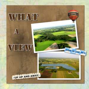
This are both templates for day 6. On the What a view page I used a map as background and the word strips are from the balloon kit I use mainly for this theme. The balloon I extracted from a photo; the font is Stencil. On the other page I used the space for an element to put an extra photo. It has no title only some journaling. The plaids I made another time but the colors match, so I re-used it. The background is a photo of the sky with the opacity lowered. I have several sky photos and they are great as backgrounds., just as maps.
-
This reply was modified 3 years, 4 months ago by
-
AuthorPosts
- The forum ‘Showroom’ is closed to new topics and replies.


