Home of the Scrapbook Campus › Forums › Showroom › Template Workshop 2022
Tagged: Template Workshop 2
- This topic has 406 replies, 43 voices, and was last updated 11 months, 1 week ago by
Cassel.
-
AuthorPosts
-
March 26, 2022 at 4:51 am #74212
Thanks Sue and Trish I’ll take your ideas into consideration as I’m struggling with day 5. The template doesn’t match with my idea and need for my story and I want to stick to it. I’ll have to think some more and try a different approach, so back to the drawingboard….
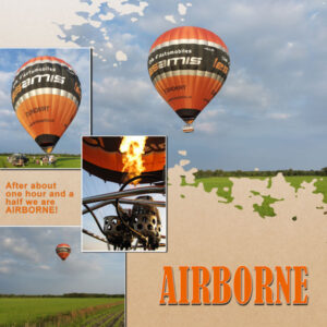
Here is my take on Diamond Template 4 and after all the preparations the balloon and its 12 passengers + pilot is finally airborne. My husband took those photos of the balloon taking to the sky, because I was taking the ride. To be continued.
March 26, 2022 at 5:54 am #74214Day 5
I have learnt from doing these templates the long way as a few of us seem to have done but I think I should get the ClipToIt script for the future. The mask of the circle didn’t work for me even after repeating the process a few times so it may be a case in point for the script. The solution as suggested was to add a flat element for that layer so I placed a doily. One of the ribbons is deliberately a gauze effect and the pink one is from cass-RibbonFactoryC-Spring.
March 26, 2022 at 9:44 am #74215In response to #72404 Susan.
A question for Rene. When you said you changed the shadows because as you go up the layers the papers would be farther from the base. Do you base the shadowing on it’s relative nearness to the paper directly below it or to the very bottom layer (further away). I was wondering because a paper layered on another paper (even several layers up) would be the same distance to the paper right below it as the first paper up from the base would be to the base. Does this makes sense. I like to hear about how people tackle shadows and make note of their techniques.
It depends. A lot of the templates I use do not have the papers stacked right on top of each other but offset somewhat. For those that are stacked right on top of another layer with no offset then yes, I do use the same shadowing. But if any part of the right/bottom side of the paper is offset then I might change the shadow because that paper would be farther from the background. It also depends on how it looks which is why I shadow from the bottom up. Also, the difference in the shadow is actually small. My normal paper shadow preset is 10-10-70-20. I might change it to 12-12-70-20. So a minimal change that most people wouldn’t even notice.
It is really the elements that have more depth to them that might have more change in the depth of the shadows since when layering those elements in clusters, some are right on the background and others aren’t and if any part of that element higher in the cluster appears to be on the background, it needs to have a deeper shadow. Again especially if it is on the bottom/right side of the cluster (since that is where the shadows are).
I actually paper scrapped over 20 years ago and lot of these techniques were taught to me then. I just had to learn how to convert to digital. I’ve seen some digital layouts done by people much more creative than me that have so much depth to them, I would think they were done with paper if I didn’t know better. I strive to be more like them!
March 26, 2022 at 9:58 am #74216Rene. Thank you! what a great amount of information for me. I come from a photographic background and I’m always thinking about the “inverse square law”, specifically, the light source to subject distance and subject to background distance. In scrapbooking and photography it’s all about the shadows isn’t it. thank you again for taking time to tell me about your methods and sharing your many years of experience.
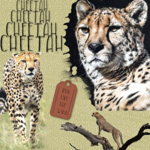
March 26, 2022 at 10:44 am #74218Finally finishing up my Day 4-Diamond Template. Here’s CHEETAH. The font is called “Children Funny.” I had to use the Raster-to-Mask script for the bottom photo. The Clip-to-It did not work; it kept tossing the photo and mask into the previous group. Now on to Day 5 as I have yet to watch that video!
March 26, 2022 at 11:20 am #74220Carole , this my try to correct the schadows of Template 2
March 26, 2022 at 11:21 am #74222Day 2, extra template
March 26, 2022 at 11:26 am #74224finally my day 3 temlate done i have covid and been doing nothing for a few days
March 26, 2022 at 11:30 am #74226Am really loving seeing what everyone is creating – it is inspiring to see the different slants we have on how we do things and the photos are also great. Don’t know why but I struggled with this one to the point of having to start from scratch three times! Anyway got there in the end. I have taken bits from different kits and reused my photos from day 4.
March 26, 2022 at 12:36 pm #74234Day 2 project
March 26, 2022 at 2:34 pm #74237As usual everyone is doing a bang up job. Really beautiful layouts, photos, colors and technique.
Here are a couple for lesson 2. A bit behind, maybe I can catch up.
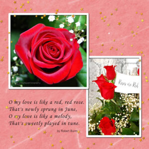
I made two. The roses for practice and the Ukraine layout using Carole’s template because the people of the Ukraine have been on my mind as I imagine is with all of us. I used just stuff on my computer for the roses and my photos. For the Ukraine I used “Reach for the Sun” elements by Jessica Dunn. It seemed to me that those elements were appropriate under the circumstances. The photos are acknowledged on the layout.
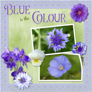
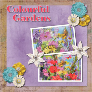
March 26, 2022 at 2:48 pm #74239Day 6. The lace border was created using a brush, and Carole’s mitred corner script. The elements are my own flowers extracted from photos. Larkspur, cornflowers, flax, pansy and geranium, with tri coloured bumbles and a hover fly on three of them. The extractions were done a very long time ago, so was the lace border, all I had to do with that was to change the colour.
March 26, 2022 at 4:12 pm #74241Lesson 3, template 3
hopefully the drop shadows are ok, I always struggle with that a bit
March 26, 2022 at 4:44 pm #74243Lesson 3- Today and Tomorrow elements, my photo. Was trying to change the stitching to a gold chain..
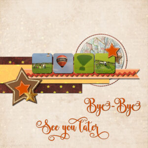
March 26, 2022 at 5:05 pm #74246I finally solved the problem how to use those tiny squares in this layout for day 5. I used a light colored paper with some with some texture and an overlay of stars and I hope it is visible in this resized version. For the squares I cropped square parts of my photos and searched matching papers/ribbons from my stash. Flowers for the elements wouldn’t work so I used stars. The font is Wingcharm. I almost wanted I stayed with my favourite subject flowers’it would have been simpler, but not a challenge….
-
This reply was modified 2 years, 9 months ago by
Corrie Kinkel.
March 26, 2022 at 5:21 pm #74250Corrie, I love the photo of the balloon shadow. Great touch.
Day 6 layout.
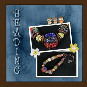
Font is Mystery Quest (CF), photo’s mine, bead art, Megan Parks. I promised I’d do a lighter layout and here I am dark, dark, dark. wish I’d noticed the blue paper off centre before I did stuff with it. For some reason the magic wand wouldn’t work as it did before. don’t know what I was doing wrong. I had to click it twice then invert the selection then go up to the paper and hit the delete key. Hopefully I will get to the second layout. I must go “adult” now and get groceries and do errands. It’s a beautiful spring day….if I ignore the 2 inches of snow I woke up to ?. papers and elements are Digital Scrapbook. I tried adding more elements but I couldn’t settle on anything that made sense to me. I need to alter my ideas of it not needing to make sense, such as the flowers that really have nothing to do with beading, but they are cute. So I added owls, cause who doesnt like owls. I added an inner bevel to try and make them more plump and played with the shadow, not sure if I got it. There was too much shadow at the toes and I played till the shadow was smaller.
-
This reply was modified 2 years, 9 months ago by
Susan Ewart.
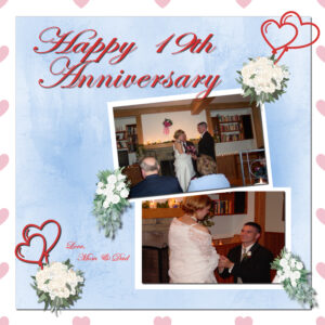
March 26, 2022 at 5:30 pm #74253I get so confused with the big and small squares in the Materials Palette! I used the Text Tool to type my first word in the title and then couldn’t get the color of red and the stroke color I wanted. I found out if I make any changes, I have to select the Text by click and drag and not just have the rectangle selection around it. Yet I still couldn’t get the squares figured out as to which ones to use. Also, in doing a drop shadow, I don’t have the two windows to look at to compare how to make the settings. Mine (2022) just shows it on the photo or item on the page so I have to undo to change the settings if they are too strong or weak. I also had trouble when to close the group and merge it. Apparently, I did it too soon and then I couldn’t do one set of flowers and balloons. I had to go back to the video to watch you get the paper background to be outside the rest of it. I struggled but learned a lot! I even was able to install and use the two scripts you used. They were a time saver! So I made mine with wedding bouquets to send as an anniversary card.
March 26, 2022 at 6:04 pm #74257Template 3 Diamond
March 26, 2022 at 6:25 pm #74260Anonymous
- 335

- Enthusiast
here is my result for Cass-Template Lesson 5
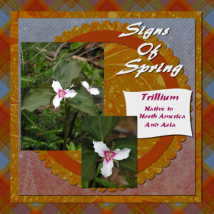
March 26, 2022 at 6:25 pm #74261These pictures are from a previous year, but I am awaiting the arrival of Trillium this year! It is usually a sign that Spring is here to stay….. Fun lesson, thanks Carole!
March 26, 2022 at 7:11 pm #74263I’ve discovered that the most time-consuming part of scrapbooking is making up my mind! Here’s Day 6 #1 project.
March 26, 2022 at 7:32 pm #74266MASK with irregular shape – After trying to work with it, I could not get what I wanted so removed it.
Pictures in the frames – I think I asked this in another workshop – the pictures were duller so adding in frame seemed to cause this – what should I do?
Frame showing lightly inside other frame – this may be related to my problem with Pictures in the frames – what should I do so that the frame does not show within another frame?
Frame – picture inside not wide enough. I chose to just try to center it and it is probably okay. I never thought until now that maybe I could have resized the sides of the frame to the picture.
THE BORDER (FRAME) – I wanted to keep the elements where they were and also to keep the border but did not want it intersecting some of my elements, so I moved it just above the background, behind all the other layers.
Script Question – creating my own CLIP TO IT – I thought it would be nice to try myself as I try to understand SCRIPTS – I thought I would use the script recorder to capture the steps to create the mask and a script was created – but when I run it, I get an error when it tries to move a layer down (happened when I tried to move the Floating layer down) and (happened when I tried to move the picture below the mask).
The error says – The arrange command is not valid in the current program state.
If you have any suggestion as to what to do, I would appreciate knowing.
NOTE: I created a second script that begins immediately after I manually moved the Floating Layer. The second script executed fine until it reached the part where the picture is moved below the mask … where it failed.
I am learning and trying to challenge myself.
Thank you for these interesting videos.
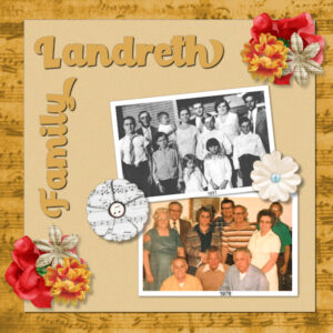
March 26, 2022 at 8:18 pm #74274I had forgotten about these pictures. The BW picture is my dad’s family – mother, Henry Retta (yes, that’s how she spelled it), father Alford Landreth, and their ten children. My dad is in front wearing the gray shirt next to Aunt Kate who was picking her nose.
The second photo was taken 45 years later and was probably the last time the siblings were all together. My dad is in the back in the center. Aunt Kate is on the right. She outgrew the nose-picking.
The music motif honors the role that music played in the family. Any gathering was a reason to make music.
March 26, 2022 at 8:34 pm #74280I agree with Joyce–sometimes the most time-consuming part is making up my mind.
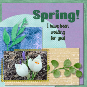
Day 3- I began this last night. Hard to make up my mind on papers, not sure I like what I picked, even if it was the third or fourth one. Each layout seems to take me 2 days. I used a smaller shadow on the title text, as Carole suggested. I’m not sure it works….but I have decided I am finished for tonight. The crocus photo I took yesterday! Tomorrow we will be taking our daughter back to school, so not sure when I will get to begin day 4.
March 26, 2022 at 9:00 pm #74287Lesson 6 Diamond extra. I found out my problem with the magic wand. The “all layers” was “magically” (read: something dumb I did somewhere along the way) checked. I unchecked it and all was right with the universe again.
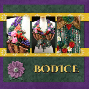
This layout is a beaded and foldformed (copper part) bodice made by Megan Parks for an exhibition about breast cancer awareness I believe. I cant even comprehend the amount of work in this piece. I used the kit (Digital Scrapbook) for the papers and the elements except the yellow strips that I took a selection from to get the flowers centered. the font is Cinzel Decorative (CF). I liked the part in the videos about changing the paper color, which I did with the dark Magenta-blue (purple) paper and the Green I used a blend mode, but I forget which one. I had not used blend modes until this class.
March 26, 2022 at 9:03 pm #74289Lovely results ladies. I enjoy viewing all the different styles.
My result for Day 6 using the template provided and items from scrap kit bundle called All The Princesses by Janet Kemp at DigitalScrapbook. This is a fabulous large bundle and I especially loved the pack of flower elements.
Font used for title is called Elephant.-
This reply was modified 2 years, 9 months ago by
Lois Duckworth.
March 26, 2022 at 9:38 pm #74297Post 74287 – Susan.
I found out my problem with the magic wand. The “all layers” was “magically” (read: something dumb I did somewhere along the way) checked. I unchecked it and all was right with the universe again.
I hate when that happens! I can’t remember exactly what I do to cause it to happen and can’t open PSP to check if what I think is right. I’m thinking it has to do with linking layers (I do that a lot). The magic wand “all layers” usually checked after I do that. But don’t quote me on that.
March 26, 2022 at 11:34 pm #74302Mary (#74203) did you forget to add (or to unhide) shadows on the photos? (#74208) You remembered the shadows on this one. 🙂
Susan (#74204) those two pages are beautiful and work well together. It is interesting how you tweaked those templates. (#74250) Those owls are so cute. I saw further that you figured out the issue with the Magic Wand. So many settings exist for most tools that it is very easy to miss one.
Anita (#74206) as you figured out, whenever you use the Text tool (or a vector tool), it will create OBJECTS that are parts of a vector “group” so to speak. That means that you can end up with several objects for a single vector layer.
Pirkko (#74209) yes, that works so well that I thought it was part of the photo itself. (#74260) That feathered edge on the title is very interesting!
Corrie (#74212) did your husband end up taking flight too or was he the “designated photographer”? (#74246) One tip I can share: sometimes, small photos can be used when photos are bad quality (which is not your case) or when you might want to show smaller details of a larger photo (like the ball in a baseball photo).
Fiona (#74214) although the circle could be used for a photo spot, I didn’t use it for that. I used a paper instead. However, your doily is also a great element to use there.
Ann S (#74218) the Clip to it script will work under some specific conditions: you have to have the photo/paper just above the shape you want it clipped to, and the photo/paper layer should be active when you run the script. If you want to test it, give this a try.
Marie-Claire (#74220) those shadows definitely look more realistic. And I love how you created the FB header! Great colors. (#74241) The shadows are also correct on this one! You are getting there. (#74257) It is great to see that even though you changed the position of the greeneries, the shadows were correctly adjusted.
Liz (#74224) you layered the various elements very well. The title shows the shadow of the greenery, which is a nice touch. Well done.
Sharla (#74226) I love that background paper you used. Can you remember where you got it from? Although you said it was challenging, the result is very eye-pleasing.
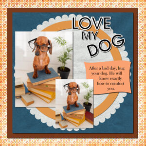
Cristina (#74234) is that your dog? It is interesting to see the same photo used twice on a single layout. It is not common but it works.
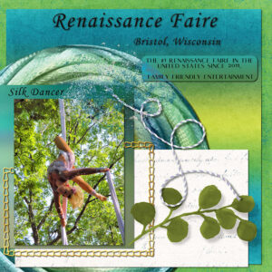
Lynda (#74237) the layout for Ukraine works perfectly well with that kit! And the base shapes really look like a sunflower! (#74243) I had to look twice at the photo to realize that it was an upside-down dancer!
Sue (#74239) that lace frame is so delicate and elegant!
Gramie (#74253) in the Materials palette, the tiny swatches are mostly meant for the gradient, like the Foreground/Background, where you can change those solid colors. For the Text, it will use what is in the larger swatches at the time you click on the project to start adding the Text. If you want to change something to a text that is already applied on the project, you have to highlight it and then you can change some settings (like the colors, the size, the font, etc.) For the two windows for the Drop Shadow, look on the top of that window for the word Preview. There is a tiny triangle on the left. Click on it and it will drop down those windows (just like the little triangle you would get to the left of a group in the Layers palette).
Nancy (#74261) hopefully you will get a spring soon! I see one missing shadow on the top photo. Am I seeing right? Also, on the text on the tag, I think a shadow is there but is just not needed since ink has no thickness.
Joyce (#74263) the second most time-consuming task is choosing the components (photos and supplies)! Who is that cutie in the photos?
Randy (#74266) (1) for the dull photos, I doubt adding a frame would affect the photo however, if you rotate a photo, it will often blur it a little bit. If you rotate multiple times before getting to the correct placement, the blur adds up. Could that be the explanation? (2) Rearranging the elements is also a good idea. (3) For the script, it might depend on how it was recorded; rearranging layers would require similar layers on both. A few members have taken the scripting course and commented that sometimes, there is more to edit than just the recording part. If you were to record the same steps, with the same layers, on the same image, there are more chances that it will work. If you use a different image, you might have different layer arrangement and the script won’t know the difference, and will fail. 🙁
Gerry (#74274) those are great photos! And I like how you added the year, which is something that is very appropriate when displaying this kind of photos!
Linda (#74280) considering that you have a larger text and a smaller one, I would likely switch the shadows: a bit larger for the larger text and smaller for the sub-title.
Lois (#74289) it looks like your title is floating. It has a similar shadow as the flower while it should have something more similar to the photos/papers.
Tomorrow is the last lesson of this workshop. I hope you are getting more comfortable now. And for those who are following the workshop and have not posted (I know there are some of you) it is not too late!
March 26, 2022 at 11:53 pm #74303Carol ~ That’s my oldest granddaughter, Payton, who is also in the first project this week, “Howdy, Folks!”. She will be 21 next month and still a photographer’s dream!
March 27, 2022 at 12:29 am #74304I have a question about converting a 3600 x 3600 (12×12) template canvas to a 3300 x 2550 (11×8.5) canvas. Is that possible? Or would it just be easier to recreate from scratch? I started my family album photo books in the 11 x 8.5 – because they fit nicely on a standard bookshelf! But many templates are for the 12 x 12 format. Are there good pros for using the 12 x 12 format over 11 x 8.5? Or is that a carry-over from a hard-copy photo album?
-
This reply was modified 2 years, 9 months ago by
-
AuthorPosts
- The forum ‘Showroom’ is closed to new topics and replies.


