Home of the Scrapbook Campus › Forums › Showroom › Template Workshop 2022
Tagged: Template Workshop 2
- This topic has 406 replies, 43 voices, and was last updated 11 months, 1 week ago by
Cassel.
-
AuthorPosts
-
March 24, 2022 at 2:33 pm #74040
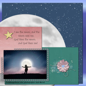
OK, here is my Day 3 layout. Photo is from Freerangestock.com, photographer is Jack Moreh. The poetry is an old English nursery rhyme (part of it I remembered from the dim, dark past, and the last line to the rhyme was found on the web). Fonts: poetry is Curlz MT, the acknowledgment for the photo is Arial Rounded MT Bold. The background is a blue gradient; the starry sky paper is an overlay (ps-marisa lerin) on a flood fill; the green and pink papers are from the Today kit (cpjess-today) and colorized. Elements: the gold glitter star is mine; the flower cluster is made from elements in the cpjess-today kit.
Oh, yeah – the moon paper is a copy of the moon from the picture tube that I isolated and made a png from for a Halloween layout. This worked fine to display as a paper for this layout!-
This reply was modified 2 years, 9 months ago by
Mary Solaas.
March 24, 2022 at 2:54 pm #74043Anonymous
- 335

- Enthusiast
here is my result for Template Workshop Lesson 3
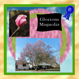
March 24, 2022 at 3:01 pm #74045I finally finished day 2. The pictures are from a few days ago. It was a beautiful day and we had rain coming in so I hurried down to get these photos. If is wasn’t for the rain the tree would have been even fuller in a few days.
March 24, 2022 at 3:29 pm #74056Carole – thanks for your encouragement for lesson 3. In reply to your question “Lois (#73985) beautiful. Are you feeling a bit more comfortable with the steps yet?” I am getting more comfortable but still need to work on things. I am so used to doing things the hard way that I am having trouble with some of your shortcuts. Getting there though.
Lois
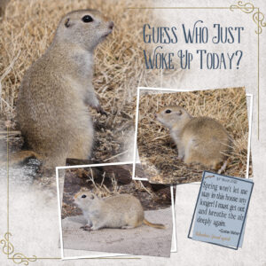
March 24, 2022 at 4:10 pm #74058Day 4. A lovely template to work with. I had other plans for today’s template. That is until I spotted the ground squirrel while I was outside having my elevenses, a cup of tea and a welsh cake or two. I grabbed the camera, and started shooting. This chap hibernated under the tack room. Truly a sign that Spring can’t be that far away. Fingers crossed!
Carole, your comment, about having to look twice at my pages……. made me smile. Thank you ever so much for your comment. I genuinely appreciate your words. As you know I’m not a fussy, frilly creator. I am a stickler for fine detail though. I feel just one small detail can make a page pop.
I used Carole’s lifted photo script. Replaced one photo with a tag with journaling. Lifted corners of the photos over their frames, tilted the frames. Added a corner font to two of the corners, to balance the page, instead of using the frame provided. Background paper: took a neutral colour from the photo, added an overlay, and a hint of texture. This template was meant for this little beauty!
March 24, 2022 at 4:11 pm #74060MASK DAY 2
March 24, 2022 at 4:23 pm #74063Hard work over the last few days beginning to pay off. Don’t need to maximise the video so often from the tool bar to find ou where I went wrong or to find out how to do the next step.
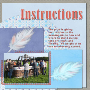
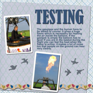
March 24, 2022 at 4:33 pm #74066I wasn’t happy with my day 3 layout and it hadn’t any journaling, so here is it again together with day 3 Diamond tamplate. Both layout belong more or less together in my story and again I didn’t use the greenery from the template. Because the instructions page had feathers in it, I put birdsilhouttes on the other one nd made a ricrac ribbob out of the straight one that is in the balloon kit that I used on day 1.
On to day 4 now and I enjoy all the great pages shown here, too much to comment on individually.
March 24, 2022 at 5:09 pm #74068Day 4 first project. Second one still to do.
March 24, 2022 at 5:58 pm #74078Woorkshop Mask Day 3
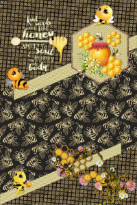
March 24, 2022 at 6:37 pm #74083Sue, thank you for your comments about the page with the bees
Carole, the word Honey was an element in the kit. So I don’t know which font. I thought it suited the whole thing so well that I used it instead of looking for a font myself.Day 2 – Diamond template
March 24, 2022 at 6:48 pm #74084Second try, I forgot to change my journaling into a raster layer, so it didn’t show up here. This it Template Workshop 4 and the story continues, we are almost in the air. The Diamond Template will show that, but it has to wait till tomorrow, it’s almost midnight again. I changed the template to suits my photo and there isn’t a 4th photo, because I needed some place for the journaling. The background is a paper I have in my stash (Boo by DigitalScrapbook) and I choose it because their is some orange in it which matches with the balloon. I did only a part of the frame with an edge punch from Carole.
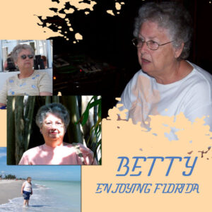
March 24, 2022 at 6:51 pm #74086March, 2006…trip to Sanibel Island.
March 24, 2022 at 6:54 pm #74089March, 2006…traveled to Ft. Myer, FL with Betty…we spent one day on Sanibel Island. Betty will soon be 92 years old. Can’t wait to celebrate with her.
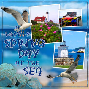
March 24, 2022 at 7:00 pm #74090I’m on a calendar countdown until the day I can go home. As usual, I’m longing for spring in Maine, but everyone is telling me it’s still pretty cold and not to hurry. So I’m making do with just using pictures from home. I rotated the template for my purposes (pics) and I did add the splat but I blurred it considerably. I used Filter Forge on the thin little outline to make kind of a variegated effect with some sparkle. A fun template, Carole. Again, a lot of wonderful works to look at … and I am enjoying your balloon adventure Corrie! I can’t wait to see how far you went in it and how high? Loads of places around here give balloon “rides” they call them … but they aren’t really rides because the balloon is tethered. That would be good enough for me!
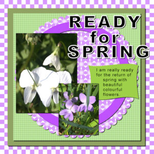
March 24, 2022 at 7:18 pm #74092I decided to try something that Carole had shown in another workshop to use a pattern (which I created using colours from the pictures) to fill to create my papers.
I know that Spring has officially arrived but I am looking forward to warmer days and the appearance of the spring flowers.
March 24, 2022 at 7:21 pm #74093Carole, #73905
Thank you for the information on what is the correct way to do it.
March 24, 2022 at 7:23 pm #74096I stuck with the open layer script and was impressed – saved time along with the CTRL Y that I’d forgotten about!!!
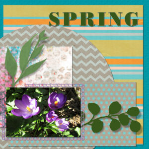
I had a spot of trouble with getting my photo to ‘fit’ on the shape. I did the magic wand to make it only go on the shape but at first the photo had a large chunk missing, as if it was within another mask/shape… I kept at it and finally it went right, but to be honest, I have no idea if I had done anything different but it seemed to have just worked!
Here is my Day 3 page – I used various papers from Digital Scrapbook – Gina Jones February Kit. The photo is of crocuses that are in Mums garden.
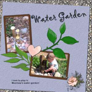
March 24, 2022 at 7:43 pm #74100I love what everyone has been inspired to do. So many different takes on a simple template. Does the template inspire us or do we take it as a chance to showcase pictures we have been anxious to use. I know that this one is displaying pictures I took of my great grandson years ago – I was fascinated with his fascination with his grandmother’s little water garden. Now I have a chance to display them.
The font is Gigi for the title – inner beveled and shadowed. The background is filled from my gravel pattern. The blue paper was colored from the pic and texturized. The pink heart is from cpjess Cherish kit. The cluster is mine. Bought and used the ClipToIt script for the 1st time. Thanks, Carole – it really is a big time saver!March 24, 2022 at 8:32 pm #74103My result for Day 4 using the template provided and a background from a Kit by Di Hiller called Garden Bliss from the scraptrain for March at DigitalScrapBook. I just love this mini kit.
Font used for title – Bodoni MT Black
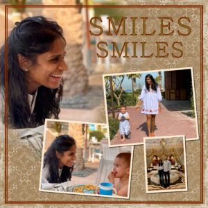
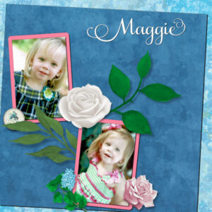
March 24, 2022 at 8:36 pm #74104My oldest great-niece, Maggie, is named after my mother. She turns 13 in a couple of months. Although I’m not in favor of it, my great-nephews keep reminding me that I don’t get a vote in the matter.
At least I have these pictures to remind me of that precocious little girl.
March 24, 2022 at 9:18 pm #74108Lesson 3 plus extra. Clip-To-It is so fast. I had previously bought it but didn’t know how to use it, time goes on and I forgot I had it. It was like getting a surprise gift when I looked and saw it.
Geometric: PMC clay beads by Melanie Rowe, photo by me. Font is Christmas Glee (from CF) papers from Digital Scrapbook. I used the doge and burn blend modes on the elements and reduced the opacity to look like a watercolor wash.
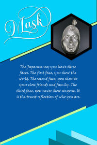
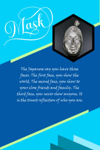
Mask: PMC Mask by Melanie Rowe, photo by me. I should mention the metal clay and glass masks Melanie first carves a wax mold and then uses a refractory mold mix (mold mix 6) and brushes on many small layers (letting it dry in between) of this mold mix over the wax (I’ve done it, it’s painstaking). Then burns out the wax and the mold is ready for hot glass or metal clay to be pressed into. I have two mask layouts, one shadowed and one not. No shadow it’s as if it was a poster. The fonts are Ernestone Script (“Mask” with glyphs-M&L) and quote is Viner Hand. I used flood fill for the colors, was playing around and keeping it simple.
March 24, 2022 at 9:20 pm #74110Day 2 posting for me…really having trouble keeping up. So many steps. I watch the video thru first, then open PSP and the template and chose my photos, then I begin.
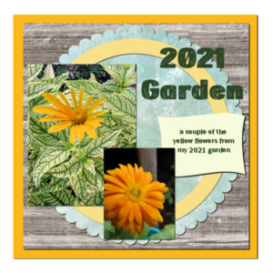
I used some garden photos from last year. But today I saw my crocus are blooming, finally! I have been waiting for spring! I didn’t use a drop shadow on the title text. It just didn’t look good with the cut outs in the text.
March 24, 2022 at 9:52 pm #74112Day 4 Project 2 🙂 I had made frames for my mask templates, but I hadn’t thought about just using a frame without the promoting to a mask layer! I also want to use the script writing tutorial so I can speed up the part about touching up multiple old photos. So much to learn!! Thanks for you help, Carol, and your comments and suggestions.
March 24, 2022 at 9:55 pm #74114Made this for a friend today.
March 24, 2022 at 10:32 pm #74116You are all doing so great. Keep it up!
Anita (#73992) I am glad the script now makes sense to you. It will surely become a favorite. On your page, did you miss the shadow on the first word of the title?
Matsugirl (#73995) did you get the explanation for the vanishing text? It has to do with the Wrapped Text. It is explained at the end of this post.
Susan (#74000) I am glad you enjoy your membership. Let’s hope it will encourage others who might still be on the fence. (#74108) I am glad that you showcased the poster template with and without shadows. It illustrates very well that different purposes will require different approaches: a poster is typically meant to look flat, while a scrapbook page will be expected to look realistic and dimensional.
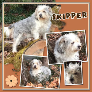
Joyce (#74002) it is interesting how you changed the colors of the greeneries to something else than green. It goes well with the colors of the layout. (#74068) Beautiful display of photos for that good-looking dog! (#74112) So many interesting ideas to explore, right? (#74114) Is this a duplicate post?
Pirkko (#74005) although I see that you angle your shadows differently than I do, I have to say that they still look good because they are very realistic and consistent. (#74043) Reducing the opacity of the papers to show the ones underneath is a very clever way to tweak your page. And the additional flower is a nice touch too!
Ann S (#74007) adding that branch really gives the impression that the animal is hiding, ready to pounce. Great addition. (#74031) I had not noticed that the shadow was on top of the title; I thought you just used a dark pattern. We might not have noticed if you had not said anything, since we didn’t know what the pattern was supposed to look like!
Theresa (#74009) those colors give a really warm feel and obviously, it is all well coordinated. (#74096) Although I cannot be certain (as I didn’t see the issue you explained), one possible explanation is that the Magic Wand was used on the wrong layer OR with a wrong “mode”. But I am glad you found a way to solve your issue.
Sharla (#74014) you have rotated the leaves from the bottom right, and in doing so, the shadow is now going upward, as if it was lit from the bottom, which is now inconsistent with the other shadows on the page, including the one on the left side. If you need to rotate a shadowed element, you have to either adjust the shadow accordingly or recreate it to stay consistent. I am also wondering if the shadow layer has been added above the leaves? (#74035) I am glad that you tried that script and you find it useful. Scripts are such useful tools (usually).
Julie (#74015) using the wrong workspace is a very common issue simply because PSP will default to the Essential workspace if you reinstall or reset it. And since it looks similar to what you are used to, it is easy not to realize it.
Euka (#74020) although you likely didn’t use a blend mode to show the texture of the greenery, the effect is still very interesting as if it was a cutout paper.
Trish (#74022) I hope your son is doing ok. Remember that if he needs more time from you, PSP will stay around. (#74024) Are those water drops made from an overlay or a patterned paper? (#74060) You can probably use the same settings for all your paper elements. I think the large green paper has a shadow that would be expected, while the others seem a little thin. (#74078) Be careful about adding “thick” elements (the greeneries on the right) when your photo does not seem to have any shadow as it would likely be lifted from all those stems.
Jnet (#74026) if the script works with a name change, it likely is because you had another copy in the Restricted scripts folder, and that is the first folder PSP will reach in. You created a very nice blending between the photo and the paper.
Fiona (#74029) be careful with the shadows on the title. If you look closely, the bottom left corner of the letters (the H for example), you can see an obvious gap between the letter and the shadow, which means that the light goes under the letters. The only way it can happen is if the letter is off the paper, and the light seeps underneath. If that is the case, it means it is floating. 🙂 (#74038) Having a border as part of a photo is something that is also very common and could have been done on purpose, so we can’t tell it was a “mistake” at all!
Gerry (#74033) do you share all those pages with your family? I hope they love seeing how you showcase those photos so beautifully. (#74104) Those photos are so great. No wonder you want to showcase them!
Mary (#74040) that choice of the moon instead of a paper, is very good, creative and perfectly appropriate for the layout. (#74100) I hope you will continue to use those scripts. I know I use them all the time when using templates (and even when working from scratch).
Ann L (#74045) did you forget the shadow on the bottom photo?
Lois (#74056) yes, you will need practice but with comfort comes assurance (knowing that nothing will blow up!) (#74103) I also love that font for titles as it is so easy to read.
Sue (#74058) it is so fun to see how you tweak the “basic” elements with just little details that make your pages “next-level”. That little corner element and the overlapping photos/frames give elegance.
Alan (#74063) if it is starting to pay off after four days, imagine after seven days! It is nice to see how you used the same photo twice on a layout. It is not common but can give great results!
Corrie (#74066) be careful about adding writing over two separate surfaces. Check this post for more details. (#74084) Great way to tweak the starting templates to suit your needs (you are ahead of the lessons, hehe)
Marie-Claire (#74083) Can you try to reduce the opacity and increase the blur a bit for your shadows? Just a tad to make them less “obvious”.
Bonnie (#74086) it is so fun to meet all your friends and travel with you!
Minka (#74090) it is interesting how you seem to have used two photos blended together instead of a photo and a paper.
Randy (#74092) it is so encouraging for me to see that something from a previous tutorial/lesson/class is now carried over to this workshop. That means that all those techniques are getting more use in more projects.
Linda (#74110) have you considered making it only a faint shadow on the title? Sometimes, it is not just a matter of adding one or not, but also just a matter of how obvious or discrete it is. Maybe you tried and still chose not to have any.
March 24, 2022 at 10:57 pm #74120Anonymous
- 335

- Enthusiast
Here is my result for Day4-Template Workshop
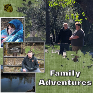
March 25, 2022 at 4:54 am #74134Day 4 – Shadows on to group photo with a white border. The sense of having the Clip To It script is apparent with some of the problems I have been having with the intricacies of a mask template. I did however manage in the end to merge the group photo with its border by being able to merge down from the border to the photo group. Not sure why I wasn’t permitted on my PSP page to do that with my original attempts. Perseverance, the name of the game.
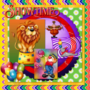
March 25, 2022 at 7:30 am #74136Day 2 – Not what I started for day 2 but this is a kit I was going to try and use for the swap kit challenge by turning a circus kit into a birthday party. Circus kit is by KizzedbyKelz. Everything is from the kit, and it is a bit too busy for me.
March 25, 2022 at 9:37 am #74139Day 3 extra Mask
Carole u asked about the water, when is an element a overlay, this came in the form of an element overlay, there was 3 on that mask
You say the light green paper was light, to get the colour that matched there kitchen cabinets, that was from the palett and then a texture put on it. The Leather dark green layer was a paper from creative, that was quite dense and didnt work trying to lower the occupancy. -
This reply was modified 2 years, 9 months ago by
-
AuthorPosts
- The forum ‘Showroom’ is closed to new topics and replies.

