Home of the Scrapbook Campus › Forums › Showroom › Template Workshop 2022
Tagged: Template Workshop 2
- This topic has 406 replies, 43 voices, and was last updated 11 months, 1 week ago by
Cassel.
-
AuthorPosts
-
March 23, 2022 at 5:57 pm #73971
Minka, I can so feel your message. What a sad state of affairs when nature is being pushed away. Love your project!
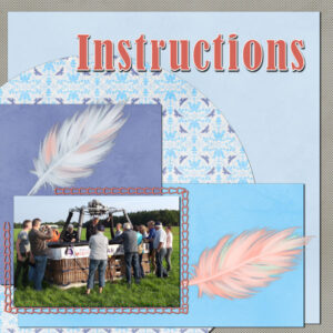
March 23, 2022 at 6:52 pm #73974Template 3 and it’s about the pilot giving instructions to the passengers. I used papers from a kit called Kiss by digital scrapbook and because the greenerie from the template does not fit my theme I used some feathers. The rest of the story for today will be on the Diamond template but time has run out and I’ll continue that tomorrow.
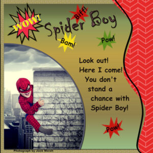
March 23, 2022 at 7:14 pm #73976I haven’t gotten to day 3 yet! Just finished the Diamond template for Day 2. Finally got something I could use – I think my mojo has gone on vacation! Found a new site: FreeRangestock.com which has photos like Unsplash for free. So this photo is of a cute kid playing superhero and the photograper has him climbing a chimney in a busy city setting! So I have finally gotten to use splashes and the Wow! splash I made in one of the earlier labs (I think it was Lab 6 but I’m not sure of the module – it was one which stumped me and I didn’t make a layout for it. The papers are mine. The bursts are a brush I made in that lab. The title font is Chiller and the narrative font is Comic Sans MS. The photographer is Jack Moreh.
March 23, 2022 at 7:16 pm #73981I’m behind but my son did build me a fantastic computer. Been trying to put everything back together. It’s a work in progress.
This is Day 1. I used a kit from Pixel Scrapper call Wanderlust, it’s a collaboration of the ladies there, and the template provided by Carole.
March 23, 2022 at 8:03 pm #73983The Winnie the Pooh in me ( a bear of little brain ), made fewer mistakes today.
March 23, 2022 at 8:29 pm #73985I love looking at everyone’s results. Awesome.
Carole, thank you for your helpful comments on my templates for days 1 & 2. Really learning quite a few tricks.
Attached is my result for Day 3 using the template provided and papers from Jessica Dunn at DigitalScrapBook called Homestead.
Font used for title – Impact
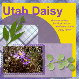
March 23, 2022 at 10:31 pm #73987Day 3 Daisy photo from 2006 taken during a trip to Utah.
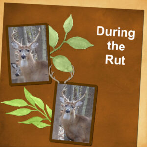
March 23, 2022 at 10:32 pm #73989Deer photos from 2019. The rut is mating season and the males bulk up tremendously. This fellow is unusually large.
March 23, 2022 at 10:58 pm #73990Great projects posted so far. If you have not started, it is not too late!
Susan (#73907), it is a good thing that you are going to have long time access to those lessons; if time is limited now, you will be able to catch up. (#73949) Very good reasoning about not adding shadows to the title. Although SOME titles can be made of cutout papers, the font you chose was definitely more of a “painted” effect. If you want to add some details, you can create an edge where it overlaps two surfaces. You can read about it HERE.
Matsugirl (#73909) that is such a neat photo to showcase. Eventually, you should find a way to add stories and memories to this page or even make a second page with text. It could become a double-page full of conversation starters!
Anita (#73911) yes, an outline will work well, but only with bold fonts. Using it with fine or ornate fonts would be much different. Glad that those tips were helpful.
Fiona (#73918) let me answer your questions. For the transparency, since the layer has the icon, it means that only that layer will have it locked. It will replace every non-transparent pixel by another color of your choice while retaining the transparency. That means that faint blue pixels can be turned to faint red pixels, which is not possible otherwise. In older versions of PSP, you could click anywhere on the layer and every non-transparent pixel will be replaced. In more recent versions, you need to Select all (Ctrl-A) to get the same result. As for the text that disappears, you probably resized the layout while the text was still in vector format; this is an oddity of the Text Wrapping (you can read about it HERE). So you didn’t do anything wrong; you just need to make a duplicate copy of the text and convert it to raster. That one will resize and stay visible. (#73939) Those scripts are optional, and you surely can do all the steps manually.
Ann (#73920) those are beautiful images very well showcased.
Cristina M (#73922) this kit fits the photo perfectly. This is a great start for your workshop.
Hank (#73923) that Buttonize effect can be quite effective. I would suggest you reduce a bit your shadows: on the stitching, it should not be blurred as the thread is expected to be close against the paper, and then, you are using the reverse shadow, but a bit too large and too dark; that “reverse” shadow should be barely visible.
Marie-Claire (#73925) will you change your FB header with this one? (#73944) Was that a font you used or an alpha, for your HONEY title?
Cristina (#73927) using a blend mode is another great way to change colors, especially if you want an “overall” shade like in your project. Thanks for sharing that tip.
Ann S (#73931) for the text size issue, are you highlighting the text when you change the size? Are you using Points or Pixels for a size?
Theresa (#73936) it is a good idea to have a light area under the text when the paper is patterned. It makes that text stand out.
Christiane (#73940) looking forward to even just a handful of projects you can post.
Sue (#73947) I always need to look at the projects twice and think about it. You customize those templates in a way that makes your project completely unique.
Anne L (#73952) those butterflies are perfect for that flower!
Julie (#73955) no more trauma!!! You can now use templates without nightmares! For the greeneries on your page, did you play with the opacity of the top layers? It looks like we see the shadows THROUGH the leaves. Because you used a well-defined font for the title, you can probably add a shadow to it. (#73958) If you don’t see the same options it is likely that you are working with the Essential workspace. Go to File > Workspace > Complete. That will give you access to all the commands, including those that are “hidden” in the Essential workspace.
Gerry (#73956) this is a fantastic photo. Do you have the name of all the people in the picture? You can consider making a second page to make it double, so you can use that space for the names, and maybe the story of the oak too.
Marvin (#73960) keep sharing photos of that cutie!! This second project looks great. Is that you in the picture?
Minka (#73964) no wonder you worked hard on that layout. There are so many details!!
Jnet (#73966) the script has to be put in the Trusted folder. If you still have that error, it could be that you have a copy of it in the Restricted scripts folder. To make sure, edit the name by adding a suffix (like “-B) to the one in the Trusted scripts folder. You will then see if another one with the original name still appears in the drop-down list.
Corrie (#73974) we are following that adventure very closely. It was a good idea to replace the leaves with feathers.
Mary (#73976) thanks for the mention of that site. Something we can look into. I love those photo compositions for super-heros. That is something I would love to do for a class.
Lynda (#73981) getting a new computer is both exciting and frustrating when you have to reinstall everything. Hopefully, it will make you happy in the long run!
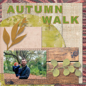
Alan (#73983) the choice of papers is perfect for the photo and the theme! I probably would have expected several wood patterns to be overwhelming, but you proved me wrong!
Lois (#73985) beautiful. Are you feeling a bit more comfortable with the steps yet?
Bonnie (#73987) will you remember that date in 10 years? You should find a way to add it in the layout, even if only as a note. I have to admit that I don’t always add dates either and I should. I am getting at that age where I do wonder when a photo was taken if I don’t have a reference point. (#73989) Are those photos from the trail cam?
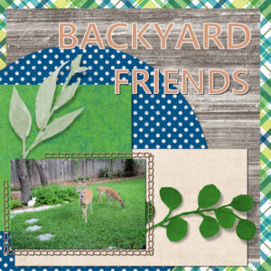
March 23, 2022 at 11:03 pm #73992Here is my Template for Day 3. I love both scripts, one can save so much time by using them. I had bought the ClipIt script and downloaded the free open as Layer scripts a while ago and today with your helpful video tutorial I used them both and placed a star for the Open As Layer script in my toolbar. The ClipIt will go there also. Thank you Carole for showing us how easy it is to use them. The photograph shows some of the deer that visit our backyard, because they know I always have a treat for them. The Font is Segoe UI Semibold. I also played with the blending modes and that was fun too.
March 23, 2022 at 11:23 pm #73993No, the photos are not from the trail camera…I need to retrieve the memory card and see what’s new…maybe tomorrow. I usually place the date in the title of my page…that way my computer sorts my pages by date and I will remember the date from the title. I don’t know why I don’t usually place a date on the page…I should consider that!
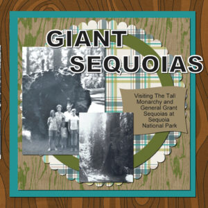
March 24, 2022 at 12:11 am #73995Hello! My layout is a continuation of my first layout posted here, of the camping trip. Sequoia Trees, the largest trees in the world in volume–they have huge trunks!
Thank you for another great video Cassel.
Ignore the first submission. I noticed that the journaling was missing on the first one I uploaded. Thank goodness I saved the pspimage layout and was able to save another jpg. Have no idea how that text disappeared. :/ Time for me to get some zzz’s.
March 24, 2022 at 1:33 am #74000Day 2 Diamond template.
Background papers: Digital Scrapbook
Fonts: De Artloy and Madira Braciela from Creative Fabrica
Photography: me
Glass Art: Melanie Rowe
I really enjoy the video tutorials. Everyone has fabulous layouts. Thank you Carole I will check out that tutorial (after a good nights sleep). Becoming a Diamond member was the best thing I’ve done for myself in the last couple years. I’m off work the rest of the week so I hope to catch up.
March 24, 2022 at 2:42 am #74002Day 3. Two oldest grandsons. Looking forward to Day 4, too!
March 24, 2022 at 4:42 am #74003Carole:- Thank you for your kind words of encouragement. The rainbow paper I used on template 1 was from the Raindrops and Rainbows bundle by Janet Scott.
March 24, 2022 at 4:46 am #74005Anonymous
- 335

- Enthusiast
here is my result for Template Workshop – Lesson 2
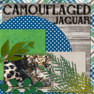
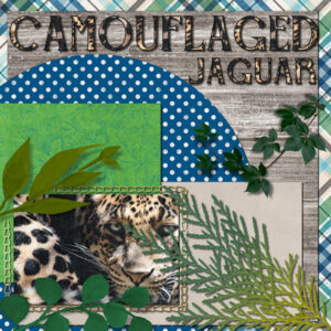
March 24, 2022 at 5:30 am #74007Here’s my BIG CAT for day 3 – CAMOUFLAGED JAGUAR – The title font is Belisha that I filled with two different jaguar fur patterns from the photo and used a black stroke. I used all the elements from the template and added an extra bit of greenery for the camouflage. Carole, this workshop is outstanding!
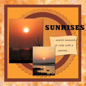
March 24, 2022 at 6:13 am #74009Hello everyone,
Here’s my Template 2 page.
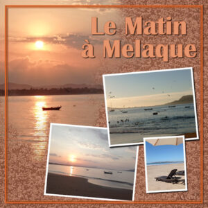
I’m a huge fan of sunrises and the serenity they bring, and after a few beautiful mornings here in the UK, I’ve been blessed by some stunning sunrises, which boosted my inspiration for this.
Had to do a few rewinds on the tutorial regarding the magic wand and which layers to highlight as it wasn’t doing what Carole was doing – took a few tries but got there in the end!
The papers I used were from Gina Jones February kit from Digital Scrapbook. And the colour dropper colours for the outer circle, the square frame and the journal shape were from the two pictures. I adjusted the colour slightly on the journal shape, and slightly adjusted one of the papers.
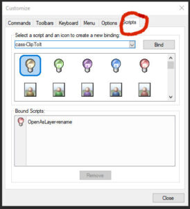
March 24, 2022 at 6:16 am #74011Julie – When I click on VIEW/CUSTOMIZE, I get this dialogue box. The Scripts are on the top right.
Oops, I see Carole had the answer. You’re in the wrong workspace. Go to Complete for the total package.
-
This reply was modified 2 years, 9 months ago by
Ann Seeber.
March 24, 2022 at 9:32 am #74014I love the Open as Layer script – thank you Carole. Here’s my day 3 project.
March 24, 2022 at 9:33 am #74015Thanks Carole and Ann! I knew it would be some small thing that I was overlooking! (adding icons)
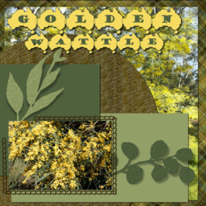
March 24, 2022 at 10:13 am #74020Day 3 – I am always behind and I have still to post day 2. Photos and papers are mine and the font is Australia Fair, green and gold are the national colours of Australia.
Acacia Pycnantha aka Golden Wattle is the floral emblem of Australia and only became official in 1988, but a Wattle Day has been observed since way back in 1899, before the nation was even federated. Wattle Day falls on September 1, the first day of spring, which reinforces the flower’s status as a symbol of new growth, renewal and fresh beginnings.
March 24, 2022 at 10:17 am #74022bit behind owing to my son being gin hospital so have some catching up to do day 1 extra
March 24, 2022 at 10:18 am #74024Day 1
March 24, 2022 at 11:56 am #74026March 24, 2022 at 12:17 pm #74029Day 2 – re-saved
Thank you Carole for the explanations and the tip about saving the text vector layer as a raster layer before resizing has got me out of a pickle. The article you linked to as well is very useful. Thank you.
Here is my Lesson 2 in its completed state. On to do Day 4 now.
I like your version for the Ukraine, Trish.
March 24, 2022 at 1:04 pm #74031I looked closely at my CAMOUFLAGED JAGUAR again and realized I inadvertently had the shadow on top of the font. No wonder it looks so dark! I also added a little more greenery and put some noise on the title, so it looks more furry.
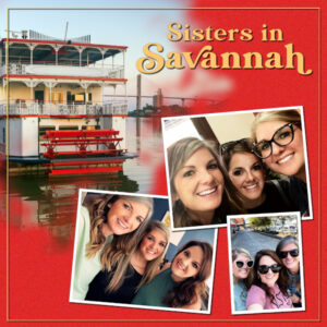
March 24, 2022 at 1:57 pm #74033Every year, my nieces get together for a “sisters’ trip.” Last year’s destination was Savannah, Georgia.
The steamboat picture is from Freepik.com and the font is Rachel Brown Display Font.
Carole: RE: the family picture, I believe one of my cousins has the name of everyone in the picture. One of my uncles was an authority on the Landreth family, tracing our generation back to Scotland in the 1500s. Before that, written records were scarce or nonexistent so he spent time with distant cousins to gather stories for an oral history.
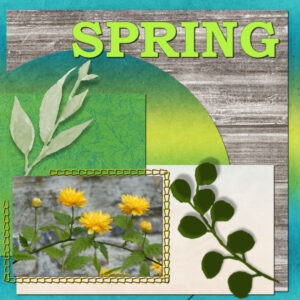
March 24, 2022 at 1:59 pm #74035Took the plunge with another script – clip to it – and love that as well. I continued with the spring theme using some photos taken in the garden yesterday – there’s not much colour yet but it is definitely emerging.
March 24, 2022 at 2:14 pm #74038Lesson 4
On my Mask Brush layer (which appears white to show through the photo) I brushed out some of the distracting flare from the mask effect by using a white brush set at low hardness of 20.
Somehow I hadn’t noticed that my Photo borders were on top of each Group Photo so I had the wrong corresponding frame border when I merged down. Ha! (Should have gone to Spec Savers!). Having grouped the photos I then couldn’t merge down from the photo border layer. So I have decided to leave off the drop shadows on the photos.
Anyway, thank you for another interesting lesson Carole.
-
AuthorPosts
- The forum ‘Showroom’ is closed to new topics and replies.
