Home of the Scrapbook Campus › Forums › Showroom › Template Workshop 2022
Tagged: Template Workshop 2
- This topic has 406 replies, 43 voices, and was last updated 1 year, 7 months ago by
Cassel.
-
AuthorPosts
-
March 22, 2022 at 10:55 pm #73904
Linda, did you choose the correct photo layer in the mask group. Try merging the mask, and then using the eraser. Hide the mask, to make sure you have chosen the correct layer/layers. When you have the correct layer hidden, the excess photo will also disappear.
I think it’s a simple case of selecting the correct layer.March 22, 2022 at 11:30 pm #73905Euka (#73808), yes, that is very pink, but also very well coordinated.
Pirkko (#73812), I love how you added that string to the cat. It is a sort of out-of-bound creation with a twist.
Joyce (#73814) that cutout of the figures gives a very interesting effect. I had to look twice thinking first that it was just an out-of-bound effect, but seeing other shadows in the middle, I realized it was a cutout. (#73854) that layout where you used the wood as a paper gives such an interesting effect. Your variations show how versatile a single template can be!
Anita (#73816) that is a very delicate project and you mixed the patterns without overpowering anything.
Marvin (#73820) who is that cutie in the photo? (#73880) That is a very colorful page. It makes me smile just looking at it.
Julie (#73822) you can always replace the image with a new one if you edit it. 🙂 (#73878) Templates are meant to be tools and starting points. Sometimes, we have a clear idea what we want our layout to look like. That is when we don’t need templates. But if we are lacking inspiration OR we want to just go faster, then templates will be a life-saver! I hope you were not traumatized by the mask? I think you might have forgotten a couple of shadows.
Jnet (#73825) the shadows definitely add some volume. However, I would suggest that you adjust the shadows a little: they are wide and blurred, suggesting that the elements are floating a bit. Reduce the offset and the blur, and see how it looks. (#73859) Did you use an overlay over all the papers or were all the papers textured the same way?
Kathy (#73829) thanks for the heads up.
Hank (#73833) when a post does not appear, refresh your page. If it is still missing, drop me an email. Sometimes, some posts are caught in the spam filter (for some unknown reason). That was the case with your post. Your layout shows a lot of volume. I would suggest to avoid shadows on the “written text”, as it should not have any thickness. All the other shadows are very consistent. Buttonizing can give a very interesting effect!
Susan (#73843) the papers you used look like they have glitters. Perfect for the theme!
Randy (#73845) to answer your question, you can only set a size for a font that will allow the height of the characters. Each font has its own proportions, so if you set the height, you don’t control the width: some fonts are narrow, some fonts are wide. So if you want/need a different proportion, you will have to stretch or squish as needed. At least, it is still in vector format, so you won’t lose quality.
Liz (#73850) great result. Your shadows are very consistent. (#73861) Are you going to use that FB header?
Sharla (#73863), great layout. I think you can consider adding a reverse shadow to this layout. That will be explained in Lesson 6, so keep this layout available as you might want to review it.
Marie-Claire (#73865) you used a fun effect with the two-color title on the two different surfaces. Well done.
Corrie (#73867) this is so interesting to follow that adventure!
Sue (#73871) your projects are always delightful and give so many ideas to beginners and veterans too.
Alan (#73872) your layouts are wonderful. Where did you get the supplies for the first template? I LOVE that rainbow paper!
Theresa (#73874) yes, sometimes, part of the photo (or paper) will hide outside of the paper. Holding the SHIFT key while moving that layer can give you access to that section, which you can then select and delete, or use the Eraser tool. Sue also has another way to trim those outside sections, as long as they don’t show on the image itself.
Gerry (#73876) those letters are so much fun!!!
Lois (#73882) great layout. That is a very cute font!
Mary (#73888) I am sure you will now be using those adjustment tools to make any supplies fit better with your photos.
Bonnie (#73894) did you forget the title?
Linda (#73897) when you move a layer, the shadow normally moves too as it is linked by default, but that is only when you use the Move tool. If you use the Pick tool, it overrides the linking and the grouping. Were you using the Pick tool by any chance?
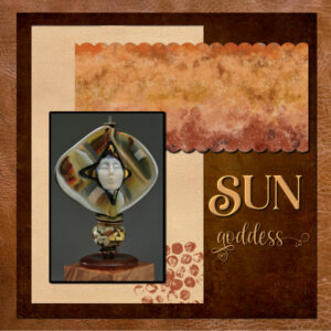
March 23, 2022 at 12:15 am #73907I’m a little behind (tough work week), here is my extra Diamond member template. Sticking with the goddess theme. Glass art by Melanie Rowe, photo by me (wood stand is even by me). Papers from Digital Scrapbook. Fonts are from Creative Fabrica, Rachel Brown (“sun”) and Peaceful Heart (“goddess”).
What creative and inspiring creations from everyone. So enjoyable to come home from work and be able to look at them all.
March 23, 2022 at 3:15 am #73909My mom and dad bought a tent trailer when I was in my early teens. They took my sisters, brothers and myself to various places in California. This picture is when we spent time at Kings Canyon, CA. Wonderful memories! 🙂
Thank you Cassel for the wonderful tutorial. Enjoyed myself!
I used Winter Woodland kit by Wendy P, for my layout.
March 23, 2022 at 4:11 am #73911Here is my project for Templates Day 2. I used Jessica Dunn’s mini-kit from the lesson and changed some of the colors a bit to blend with my photos. I love using the white outline, it makes the text pop. I also found it quite helpful to merge the group which saved a lot of time with the drop shadows. Thank you Carol for another great lesson.
March 23, 2022 at 5:54 am #73912Hi Cassel
Do you know of any tutorials on how to use filters unlimited and import filters into it
Thanx
Liz
FOUND IT!!!
-
This reply was modified 3 years, 4 months ago by
Liz Kershaw.
March 23, 2022 at 7:01 am #73913Oh, no, Carole, I did…!!!
Fixed it…
-
This reply was modified 3 years, 4 months ago by
Bonnie Ballentine.
March 23, 2022 at 8:41 am #73918Lesson 2
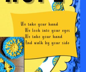
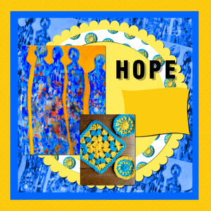
Recently my eye caught a post card which had been offered to share to open hearts to the people of the Ukraine. The painting ‘Hope’ is by Pamela Allsop and extracted words from the poem on the back of the card ‘We take your hand’ by Christine Allison. I created some crochet mats and combined for the picture for my lesson 2. I know the sentiment does very little but together sometimes people can make a difference.
On the technical side, does ‘locking the transparency’ confine the fill to the particular layer? Without doing so does the fill go across the whole page?
For some reason my poem text does not appear on the resized file that was saved as a jpg. What can I be doing wrong?
There have been some lovely images produced and the tips keep rolling in! Thank you.
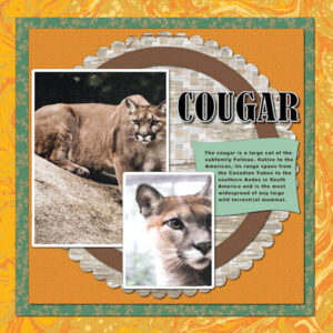
March 23, 2022 at 8:42 am #73920TEMPLATES-DAY 2 – COUGAR – Photos from my Big Cat Calendar that Laurey gave me for Christmas. It was too small for my wall, so I pulled it apart and scanned the photos for digital use. The title font is Bernard MT. Learning useful techniques in this class. Thanks, Carole!
March 23, 2022 at 11:26 am #73922Hey
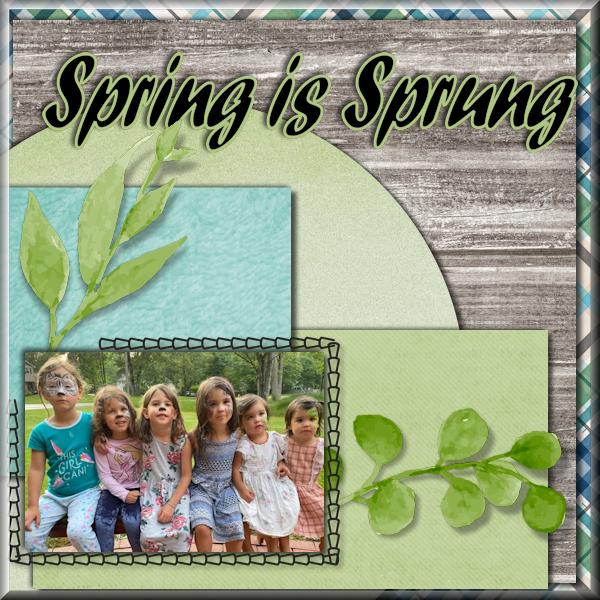
A little late, but here’s my first templateMarch 23, 2022 at 11:27 am #73923For my day 3 project, I chose spring – as the flowers and colors Cassie chose reminded me of spring – and the grandbabies, Spring is Sprung. Somehow I’ve also become enamored with “buttonize.”
.
 March 23, 2022 at 11:29 am #73925
Day 1 – Facebook Template
Carole, thank you for your comments on my two templates of day 1
March 23, 2022 at 12:15 pm #73927Here is Template 1 – Lesson 1
The papers I used are from a kit by Marisa Lerin (DSF June 2012). For two of them, to change the color and keep the pattern, I added a layer with a solid color, then on top of this layer, the patterned paper and changed the Blend Mode of the latter.
Font: Candy Round BTN
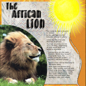
March 23, 2022 at 12:24 pm #73931DAY 2-DIAMOND TEMPLATE – THE AFRICAN LION The title font is Baby Olivia. For some reason my PSP is being strange with my font sizes. The reading text in this is down to font size 02! I did various re-starts and temp deletes but no help. It all wants to be HUGE! This is more from my Big Cat Calendar.
March 23, 2022 at 1:38 pm #73936Sue and Carole – Thank you for your help. Managed to erase the bottom of the pic that was showing.
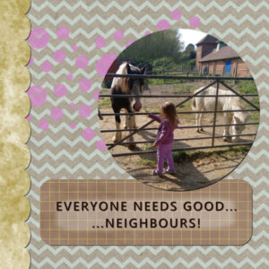
Here is my template 1 – When my granddaughter comes to stay she always asks to go and see the horses, mule and donkey that have been rescued, and live not too far away from us.
The papers I used were from Digital Scrapbook and were from the February kit. I used the hue, lightness and saturation to change the colour of the spots to compliment Isabel’s clothing.
March 23, 2022 at 2:26 pm #73939Day/Lesson 3
I didn’t have the Clip To It script but that is a good thing for me at this stage as I had to practice my masks long hand. I chose to keep the gauze effect mask layers and decided the drop shadows didn’t work with them so I omitted them. I thought the template had a natural gap in the stitching border to added a flower element.
March 23, 2022 at 2:30 pm #73940I’m so sorry.
I have a very busy week, so it’s impossible to attend her. Try to learn and try to do a few templates at the weekend. See you around.
March 23, 2022 at 2:33 pm #73941#73912 Liz, a very good idea. Maybe a topic for an upcoming workshop?
March 23, 2022 at 3:11 pm #73942Ann – I’ve got to say it! Love your lion layout! I couldn’t imagine what in the world to use for a photo let alone the rest of the layout, but you have done great! Lions are one of my favorite cats – Aslan is a lion (I think C.S. Lewis was thinking of the title “Lion of Judah”). Disney did a great job with “The Lion, The Witch, and the Wardrobe”. All the Narnia books are wonderful reads.
March 23, 2022 at 3:18 pm #73944March 23, 2022 at 3:39 pm #73945Theresa, I’m pleased I could be of some help.
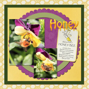
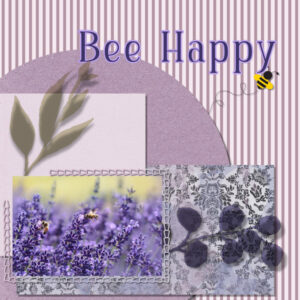
Marie-Claire, what an outstanding page. Call me bias, but your bees are the stars of the page.
Everyone has submitted exceptionally creative page. It is a pleasure to scroll through pages. You should all be very proud of yourselves.
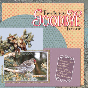
March 23, 2022 at 3:47 pm #73947Day 3. Carole, thank you for your kind comments. I omitted the elements, replacing them with my own. Conifer tree branch extracted from a photo. I could have done a better job, had time permitted. As it is a tedious time consuming task to do it properly. Lifted some of the cones above the photo and lace. The lace is another one of Carole’s fonts. I used Carole’s mitred corner script. The background paper is a photo I took of frost on the stable window. I wanted something in red, to match the Redpoll’s cap, so I created a polka dot paper. The leafy paper is a paper template, which I coloured. The frame is created using font dividers.
This winter I have had in excess of 200 Redpoll Finches. The most I have ever had. During their time here, I have taken thousands of photos of them. It has been such a joy having them.
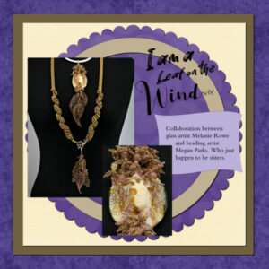
March 23, 2022 at 3:58 pm #73949Day two template. Background, scallop element and yellow paper from Digital Scrapbook, others I used flood fill. Fonts are Better Brush (I am a leaf on the), Hello Safana (Wind) and the journaling is Bembo all from Creative Fabrica. This was the first time doing the mask without my instructions nearby. I’m sure tomorrow I will forget again, but pretty happy I remembered today. I am getting better at remembering to “lock the transparency” when i want to flood fill a layer.
I didnt put a shadow on the title as it was supposed to be painted on. and I think I forgot the shadow on the little journaling paper.
-
This reply was modified 3 years, 4 months ago by
Susan Ewart. Reason: forgot something
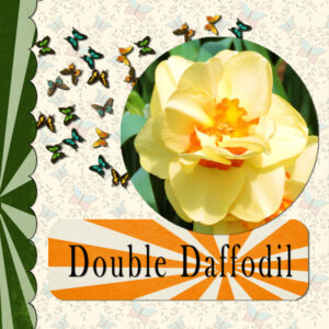
March 23, 2022 at 4:27 pm #73952Project day 1. The paper for the starburst started out from PS_JanetScott_Unwind_Snbrst. The backgroud paper is ps_jessica-dunn_196453_frenchy-butterfly-paper_pu The butterflies are a picture tube. The flower is a pic I took several years ago, I hope I am wright about what it is.
March 23, 2022 at 4:50 pm #73955Day 3 Template. Love those two scripts to speed up the process. The ClipToIt is a lifesaver b/c it creates a mask and I don’t need to be “traumatized” by making my own to fit a photo into!!! Brilliant. Now I have to get them on the toolbar as icons.
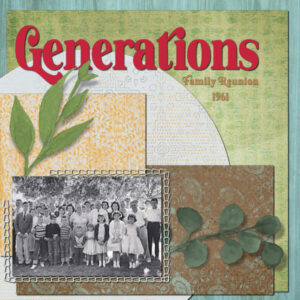
March 23, 2022 at 4:52 pm #73956This is a picture of three generations of my family. My dad was one of ten siblings and not all were in attendance that day. The oak tree behind us offers a poetic background. It was a favorite of all the kids.
The papers are Yesteryear Distressed by Marisa Lerin (DigitalScrapbook.com). The font is Vintage Culture from Creative Fabrica.
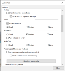
March 23, 2022 at 5:03 pm #73958General question please: When I click View>Customize I do NOT get an option to choose the Scripts tab. There isn’t one! This is all I see. What am I not doing?
March 23, 2022 at 5:04 pm #73960Carole, the cutie in my photo (*73820) is my granddaughter who lives in Arlington, Texas.
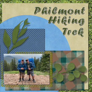
My day 3 project is attached. It is a photo of my grandson (the brother of the cutie in #73820) with his father on their Boy Scout troop hike at the Philmont Scout Ranch in New Mexico last summer.
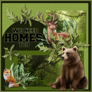
March 23, 2022 at 5:17 pm #73964I made this template about ten times before I got one I liked. I guess there just wasn’t enough cookies around me for inspiration! I took great liberties with the template … such is life. While I downloaded a ton of the kits, I didn’t end up using any of them. I found one Free Wallpaper of a forest and split it in half and then made the papers with just what is given in PSP. I feel for all the animals around me. I know people have to live, too, but this area is just pushing them out with the building boom and I’m not sure where people expect them to go? I wish there could be some sort of program for more land dedicated to animals. I know it will never happen, but it’s a good/happy thought. The animals, I purchased online. The font is a favorite of mine when big letters are needed called Freshman. I am absolutely thrilled to see so MANY entries and so many new names! And the works are ALL FABULOUS! A joy to look at and experience a small portion of your talents. 🙂 Thank you.
March 23, 2022 at 5:18 pm #73966You can see a lot of beautiful things here, with their small differences depending on the photos chosen
Thanks Carole for your comment, I retouched the shadows of my lesson 2 (they are textured papers) and I followed the tutorial (which works no. 1 today) for lesson 3. I liked the open as layer script – but I had a problem, it works but terminates leaving me the chosen paper open and I get this error message:
It was in my regulated scripts, I put it in my secure scripts and I get the same message
-
This reply was modified 3 years, 4 months ago by
-
AuthorPosts
- The forum ‘Showroom’ is closed to new topics and replies.


