Home of the Scrapbook Campus › Forums › Showroom › Template Workshop 2022
Tagged: Template Workshop 2
- This topic has 406 replies, 43 voices, and was last updated 11 months, 1 week ago by
Cassel.
-
AuthorPosts
-
March 22, 2022 at 9:40 am #73829
FYI to All: There are currently 3 free digital scrapbook templates for the daily freebies on Go Digital Scrapbooking site through March 23. You can download them from this page: https://www.godigitalscrapbooking.com/store/vendor/arizona-girl/
March 22, 2022 at 10:34 am #73830Yes, the only place I think they are should be with the membership. Is that right?
March 22, 2022 at 11:02 am #73832Jnet, not exactly. Everyone can access the basic supplies and the tutorials, for this week and a couple of weeks after. Then, it will ONLY be available for the DIAMOND members, just like the extra supplies included.
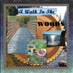
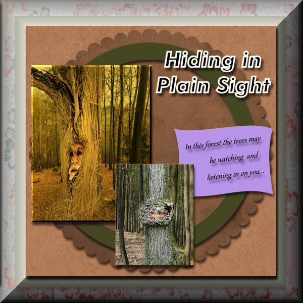
March 22, 2022 at 11:03 am #73833Day 2 Templates Workshop – for some reason my last upload didn’t work so here it is again. For this workshop I chose some doctored up pictures taken at my local state park – of course, minus the faces. Interesting effect when I buttonized on 2 different layers. Both attached.

-
This reply was modified 2 years, 9 months ago by
Hank Sobah.
-
This reply was modified 2 years, 9 months ago by
Cassel.
March 22, 2022 at 11:04 am #73831Day 2 Templates Workshop Project, I chose the forest and some doctored up pictures from my local state park, and used 3D effect Buttonize. Interesting effect when I buttonized on 2 different layers, second photo attached.

 March 22, 2022 at 11:06 am #73837
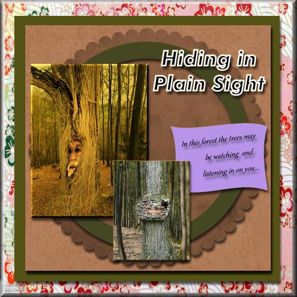
Hmm, having trouble when I attempt to load two different JPGs, so I’ll do one at a time. This is my Day 2 Template Workshop project. I chose pictures taken in my local state park – minus the faces of course 🙂
 March 22, 2022 at 11:06 am #73838
Day 2 I also buttonized on two different layers, and thought this effect was pretty interesting…
 March 22, 2022 at 11:08 am #73839
It looks like my uploads did work, just didn’t post right away – sorry for all of the repeats. I don’t see a DELETE option or I’d delete the excess images 🙁
-
This reply was modified 2 years, 9 months ago by
Hank Sobah.
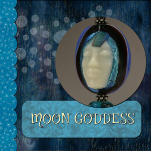
March 22, 2022 at 11:51 am #73843Lesson 1. I’ve never used templates so this was a wonderful lesson. Glass art by Melanie Rowe, photography by me. papers from DigitalScrapbook and Creative Fabrica. Font is Mystery Quest (Creative Fabrica). Reduced opacity on the dots, they are moons. Was glad we learned how to change the papers, I need some more practice to get the right hue and saturation I was after.
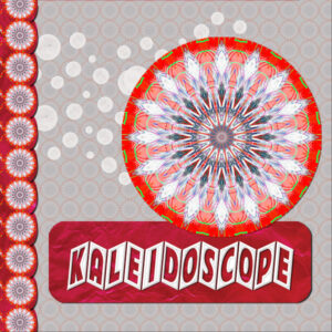
March 22, 2022 at 2:37 pm #73845THE PICTURE — I used a picture I developed using PaintShop Pro. I actually started with something that I set up in Corel Particle Shop and brought it back into PaintShop Pro. There I used it as a seed to play around with and come up with interesting things using Kaleidoscope. – used also for the background and the bar on the left by selecting as a pattern (I actually took the cropped picture and pasted as new image to be able to get from the pattern – without the surrounding part that I did not want, allowing for a transparent part between each occurrence).
THE FONT — Cinerama – The Up and Down effect was accomplished by using lower and upper case alternatively – one has up hill and one has down hill. I really liked what the bevel did to this but I decided to reduce depth to 15 from Carole’s setting as I liked that better. It was nice that the number of letters allowed me to have an even number of letters to have the first and last letter in opposite orientation.
THE PAPER — from DigitalScrapbook.com – used as background for the text and for the bar on the left.
OTHER THOUGHTS – I was thinking that it might be nice to work with each of the while circles with this picture also but maybe that would be too busy.
THE SIDE BAR NOTE – I decided to keep adjusting the setting for the pattern until it fit with the border. If I had been doing this without the template, I probably would have worked a circle to set the pattern in, or made it part of the pattern.
LEARNING GOES ON – As noted by others, these workshops have the benefit of teaching new things and reinforcing what we have learned in the past.
CTRL+Y (Redo) – in one of the things I tried, I wanted to add Gaussian Blur and tried multiple times to get it more and more blurry. I wondered if there was a way to get a Gaussian Blur with attitude so that I did not have to apply so many times.
QUESTION – With the Font, I had to stretch using the pick tool to get to fit to the height and width I wanted. Are there settings on the TEXT tool that I could have used to make this fit without using the pick tool?
Thank you, Carole for your instruction.
Thank you to everyone who has posted. Really great works of art have been presented.
March 22, 2022 at 3:49 pm #73850Day 2 Changed the colours to match my tubes TUBES from PIXABAY —KIT from DIGITALSCRAPBOOK.COM
-
This reply was modified 2 years, 9 months ago by
Liz Kershaw.
March 22, 2022 at 3:59 pm #73854Two variations for today.
March 22, 2022 at 4:00 pm #73857And two more from yesterday’s class.
March 22, 2022 at 4:33 pm #73859Very nice everything that has been added since yesterday!
My day 2
I used PS Mars 2022 – Cozy Blues by Desert Digi-Scrap and Photo perso
March 22, 2022 at 5:09 pm #73861My Facebook Template —
tubes where from PIXBAY and my kit was from DIGITALSCRAPBOOKING.COM
March 22, 2022 at 5:26 pm #73863Am enjoying learning about templates. Have used the same papers as Carole.
March 22, 2022 at 5:48 pm #73865The diamond template of day 1
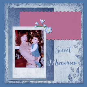
This is a picture of myself with my daughter in 1979
kit : themagnoliapatch.blogspot.com
font : RhapsodyScript
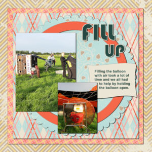
March 22, 2022 at 6:17 pm #73867Day 2 and my story about the Hot Air Ballon continues. The kit I used for day 1 didn’t go well with my photos for today so I used another minikit by Marisa Lerin (digitalsscrapbook.com) juni 2012. The fonts are Bauhaus and Arial. The Diamond template 2 has a lot of space for journaling and I’ll use it later in my series because I want to have the opportunity to tell more at the end of this project, not in the beginning.
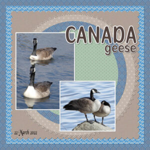
March 22, 2022 at 6:33 pm #73871Day 2 I’m afraid I didn’t stick to the template, I modified it. I am notorious for doing that. I didn’t use a kit either. I used paper templates, colouring them to match the photos. Saying that I did create the paper with the 4 dots. If I’m not anything else, I am consistent and predictable. Carole’s fancy edge fonts, which I absolutely love and use a lot. The snow is melting fast now, bodies of water everywhere I look, with geese arriving in their thousands every day. Took these shots this morning.
March 22, 2022 at 6:37 pm #73872Steep learning curve for me but been inspired by the quality and range of subjects of the day 1 templates.
March 22, 2022 at 6:41 pm #73874Hi all,
WOW, so many lovely creations 🙂
Really enjoyed Template Lesson 1, until right at the end where I’ve hit a problem. I have the bottom edge of my photo showing on the base of the page. I tried moving it up and down like Carole said near the end of the tutorial, but whichever way I move it, either the pic shows at the top or bottom of the page.
As usual, it’s probably something simple that I’m not grasping.
Thanking you in advance.
March 22, 2022 at 6:50 pm #73876The kit is Summer Lovin’, also by Jessica Dunn from DigitalScrapbook.com.
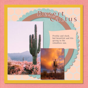
March 22, 2022 at 7:13 pm #73878Hi all, love all the projects and the colours and creativity. Having fun with learning about templates. I think, perhaps, they may be more work than making my own layouts….? When I got to the part in the video where Carole says “masks”, I almost shut down the computer and ran! But that wouldn’t be helpful to me. So I carried on. I watched the video once and then tackled the project, seeing how much I could do from memory.
I didn’t have a kit (mine are also dispersed into separate folders), so I just pulled in this and that and got kinda close to what I wanted (southwest USA vibe). Images from Pixabay or Unsplash. I’m sure I’ve forgotten to do something, but I was just relieved it didn’t all blow up on me!
March 22, 2022 at 7:21 pm #73880My day 2 project.
March 22, 2022 at 7:36 pm #73882Wow everyone is doing so well. Keep up the good work.
Here is my result for Day 2 using images from Pixabay and the kit I used is from Digital Scrapbook called Homestead Life: Spring by Jessica Dunn. Font used is called Butterfly.
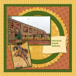
March 22, 2022 at 8:19 pm #73888Love all the layouts shown! spent the day on this one and have learned new things. Thanks, Carole. Didn’t know about the way to get around a part of the rectangle hiding by using the ctrl key. Also, had never used the hue, saturation, lightness tool. So, 2 new things learned. I have spent the day playing with that. Changed up this layout several times, but this is my final take on it. I did use the suggested Jessica Dunn freebie (I like using her stuff). We always stop at the Corn Palace when we go to South Dakota, so the pics are from 2 different trips, but they go together with the theme of the main picture.
March 22, 2022 at 8:29 pm #73894Day 2
Forgot the title. Added it, added a fake drop shadow, added a gap for overlapping text. Fixed, I think.
-
This reply was modified 2 years, 9 months ago by
Bonnie Ballentine.
March 22, 2022 at 8:54 pm #73897Unfortunately, there are no more hours in Tuesday than there are in Monday!
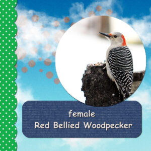
Day 1 – I changed the blend mode on the dots, I think to Color. I liked how they echoed the red on the bird. I also had a bit of the photo left at the top. When I tried to move the photo up, just the photo moved and not the shadow, even tho it showed the linked symbol on the right. I tried a couple of times, tried a couple of different ways, but ended up making a selection box and deleting. Or maybe I selected both layers and shifted them? I can’t remember now 🙁
I have not used templates before, so I know I learned a few things tonight.
March 22, 2022 at 9:55 pm #73900I have read that some of you are having problems removing parts of a photo, which is outside the original size of your project. There are other ways to remove the excess, but I always select the crop tool, select original proportions and click OK. That will also remove elements and parts of background papers that are to big for your project. Sometimes after using the selection tool to remove part of a photo you may be left with a strip that got missed, to remove it, make sure you select the correct layer, and use the eraser tool to remove it. Again, there is always more than one way to do anything in PSP.
March 22, 2022 at 10:39 pm #73903Sue – The eraser tool was one of the ways I tried. I was on the photo layer, I checked when it wasn’t working. Maybe my settings were wrong from the previous use, I don’t know? But you are correct, there is always more than one way to do something in PSP. Just have to think about it at times.
-
This reply was modified 2 years, 9 months ago by
-
AuthorPosts
- The forum ‘Showroom’ is closed to new topics and replies.


