Home of the Scrapbook Campus › Forums › Showroom › Template Workshop 2022
Tagged: Template Workshop 2
- This topic has 406 replies, 43 voices, and was last updated 11 months, 1 week ago by
Cassel.
-
AuthorPosts
-
March 29, 2022 at 5:40 am #74524
Carole – I just went back onto the pspimage of my template 5, and again ran through the tutorial. I don’t know if it is a glitch on my PSP2022, but doing the select all when the layer of the stitching is highlighted doesn’t flood fill the stitching with a colour – at first it didn’t change colour, nothing happened, and then a 2nd time it flood filled the background of the stitching layer. I locked the transparency on it, and did each action as was on the tutorial. but to no avail.
I then went back onto it, highlighted the stitching layer in layers, locked the transparency, picked a colour, clicked the flood fill, and then clicked the area inside the stitching, and voila…. the colour changed 🙂 All I did differently was not do the ‘CTRL A’ to select all.
I have found that sometimes taking a step back from a project for whatever reason is quite beneficial when something is not going quite right – gives you time to find a solution, question whether the actions were done properly or not, or run through things with a clearer head.
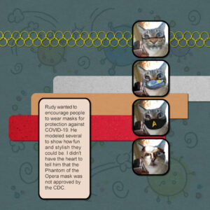
March 29, 2022 at 7:20 am #74526March 29, 2022 at 9:08 am #74528As a follow-up to The Faces of River from Day 5, Rudy is featured in this layout. He takes his modeling work very seriously.
March 29, 2022 at 9:32 am #74529Ha ha, Gerry! That’s really amusing, especially the Phantom mask. 😀 Really nice design, too. Did you create that background? It’s right on point with the topic.
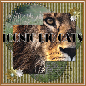
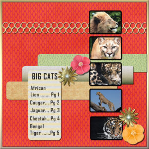
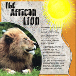
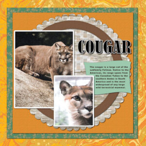
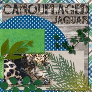
March 29, 2022 at 9:43 am #74537So, I finished the Cover for my Big Cat album so here’s the whole series, 7 designs so far. I may have to do a “back cover” to end up with an even number for the album… The cover font is Broadway. The template is #7-Diamond that had 2 photos which I joined into one and then even joined the two groups so I could add some shadowing. I’m getting better at this stuff! LOL The striped paper was one of Marisa Lerin’s freebies yesterday.
March 29, 2022 at 11:49 am #74538Ann,
You have gone full bore with your “Iconic Big Cats” album. It is beautiful, Kudos to you! When you have it printed please post some photos of it.
Lynda
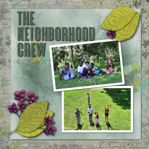
March 29, 2022 at 11:52 am #74540Lesson 6
I used some photos of the neighborhood kids playing croquet in my backyard. Unfortunately they all moved out of the area so I only see them when they visit the neighborhood. Miss having them around. They were a fun bunch.
I used Janet Kemps “Elegant Autumn” elements and just followed Carole’s lesson.
March 29, 2022 at 12:07 pm #74541Liz, Love your angels…beautiful
March 29, 2022 at 12:51 pm #74544Been away for a long weekend in London so catching up. Here are my efforts for templates 5 and 6.
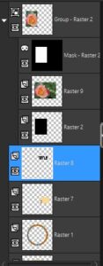
March 29, 2022 at 1:11 pm #74546Oh, Carole. I’m so sorry I absolutely misunderstood you.
It’s raster 8.
See Screenshot below.
March 29, 2022 at 1:18 pm #74550Ann, your album is superb! Great job!
Nice work for the new layout added since my last visit
The extras
March 29, 2022 at 2:37 pm #74552Ann – Love your Big Cat pages, WOW 🙂
Here is my Lesson 6 Page. Really enjoyed this, and I loved working with the textured paper. The elements and papers I used were from Gina Jones ‘February’ Kit. I removed one or 2 of the placeholders. The hue/saturation/lightness, plus brightness and contrast were used to adjust the colours of the elements.
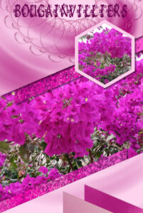
March 29, 2022 at 3:23 pm #74554Carole thank you for your comments, the colourful one AFRICA, was actually cut out on the layer above, exposing the layer below, I put an inner bevel on it, but didn’t think it showed up very well.
The flower on the next one, yes I did try, but there were problems, the flower that is to the back and looks like it drops down is actually on the background paper so couldn’t use a shadow although I did think of cutting it out and using it as a layer, which I normally do in cases like that. The large pink one to the front, the shadow stood out to the dark, looked like the flower had been framed and reducing the occupancy was just as bad, which governed the other flowers, and the sketched ones looked odd with any degree of shadow past 1, although the feathery one to the left does have 3 layers of shadow that surprised me, it just thickened it from the feathery look it had. The dog hasn’t a shadow as it looked like a cut-out as it was. For the triangles masks, I gave each a shadow that also didn’t look right, but I think that was a matter of the layers needing to be re-aranged. It was good practice.
March 29, 2022 at 3:47 pm #74555#74508 Carole, it looks like a 17 to 18 hour drive between us…doable if we have plenty of time…and, of course, when Covid is over and travel restrictions are lifted.
March 29, 2022 at 3:48 pm #74557I kinda got lost on lesson 6 when the little lesson on resizing templates to paper size got me. I resized the lesson 6 template and made this. My photos, the Circle tour sign from the internet and I put a URL in case anyone was interested in this “Iconic Road Trip”
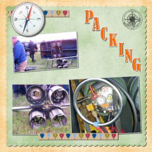
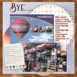
March 29, 2022 at 5:25 pm #74576And this are the 2 templates of day 7 and that is the end of my story about the Balloon! Bon both pages I altered the template to what I needed for my story /photos. On the “packing” page I wanted to use the compass, but that couldn’t go under a photo, so for the round element I put it on top. The last page I rotated the template because my photos were landscape format and I didn’t want to alter the certificate I got for going on a balloonride. I know only have to do a coverpage and I have my story complete.
Carole thank you so much for this excellent workshop! I enjoyed all the work that was done by everybody!
March 29, 2022 at 6:07 pm #74578Carole – Thank you for this workshop. Have learnt lots of new things – hopefully they’ll stay in my head even though I have written notes for certain things.
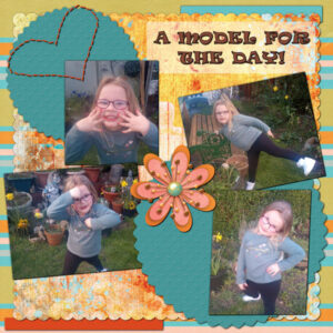
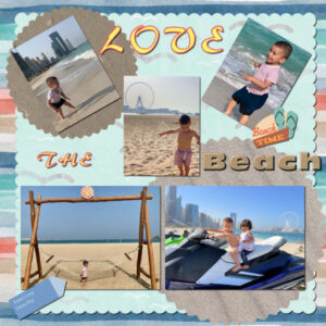
Here is my Template 7 – The other day my granddaughter and I were taking a look at the flowers in my Mum’s garden. She wanted to take some pictures of them and then decided that posing for photo’s was more fun than taking the pictures…. She will be 5 in May and is growing up so fast!!!
The elements and papers are from Gina Jones ‘February’ Kit. I removed the flower placement holders, 2 of the long thin ones too. I locked the transparency on the 2 remaining placeholders and flood filled them with colours from the papers. Added 2 new ‘rectangle selections’ for extra photos and resized them. Adjusted the colour of the heart stitching with no problem this time around 🙂
An informative workshop, thank you.
And thank you to all that have displayed their marvellous creations and those that have given their time to share tips and advice.
March 29, 2022 at 9:31 pm #74585Happy Days from a kit in MM
March 29, 2022 at 11:12 pm #74594Mary (#74511) a little trick I would like to share about drop shadows: when you have an element that goes to the very edge on the left of a page, if you apply a horizontal offset, it will show a tiny gap on that edge (same thing for a vertical offset if the element is on the top edge). In those cases, it is a good idea to set an offset of 0 for the horizontal (for the left side). I forgot to mention that during any of the tutorials, so I am adding this here, for anyone who might be using this template in particular. Once you see it, you cannot un-see it!
Anita (#74516) that little bookworm is the perfect addition to this page.
Euka (#74521) you should have received something from me by email about the master class. I am glad this workshop appealed to you.
Liz (#74523) whenever you need to resize a photo, it is important to always set the mode to Scale AND use only a corner handle to do so, never a side one. (#74526) Yes, the reverse shadow is something that we don’t usually notice, but it still makes a difference.
Theresa (#74524) the older versions of PSP didn’t require the Select all to work on all non-transparent pixels, but in recent versions, that is what it usually requires. If you click directly on the area you want to change color, it will work on all adjacent pixels. It means that if you wanted to color a word including five letters, you would have to click five times. That is still not too bad. I am still puzzled why the Select all didn’t do what it is supposed to do. At least, you have a workaround. (#74552) I would probably add an obvious shadow on the title because the font itself seems to be in 3D.
Gerry (#74528) my guess is that you edited the photos to add those cute masks, right? If so, that is a great job. If not, you have a very immobile cat!
Ann S (#74537) I love how you have those photos with the big cats off-center as if they are sneaking up on you! I would be careful with journaling that is on two separate surfaces AND on a patterned paper as it makes it harder to read.
Lynda (#74540) those are really fun photos. You have a paint spatter on the edge of one paper. You can use the technique of writing on separate surfaces to give it that 3D effect. It works just as well with paint spatters. (#74557) Those semi-transparent ribbons are really interesting!
Alan (#74544) you are a natural at scrapbooking! You seem to be in your element!
Christiane (#74546) what happens when you just hide that layer? Does it still “show up” on your project?
Jnet (#74550) those are fun extra projects. Maybe you can use those FB headers!
Trish (#74554) I thought the flowers were really completely separate. I guess sometimes, it won’t work if it is not well defined on its own layer.
Bonnie (#74555) it would be a long drive, but I still have in mind, the idea of organizing a live event, sometimes in the future. Although COVID didn’t help, I could never have considered it while I was still working. Now, I’ll start re-warming the idea.
Corrie (#74576) this was such a fun adventure. You carried us with you (but we don’t get the certificate!)
March 30, 2022 at 12:14 am #74595Ann, I’m blown away by your Big Cat Album. Jerry, I love your cats. Do they have the same sense of humour as you? Who ever said cats are aloof has never spend time in the company of cats. It’s really nice to come home from work and get to see everyone’s layouts. They are so beautiful and creative.
March 30, 2022 at 1:12 am #74596I think I’m registered for the Dynamic Frames class, but I haven’t seen an email response.
March 30, 2022 at 4:03 am #74597More inspiring and great layouts were posted in the last few days. This thread is really a hit. Great job, everyone!
Corrie, it was great to go along with you on this balloon ride! I would love to do this as well… probably in another life! 🙂
March 30, 2022 at 4:05 am #74598Hi Joyce, I had the same issue… I’d suggest you send Carole an email, and she will send the link.
March 30, 2022 at 4:19 am #74600Here is Day 3 – Template 3 Diamond
This time I tweaked a little bit more… added one more paper and one more photo.
I used some elements and papers from the “DiHiller_PS 2021Jul Nature Walk” free kit (DigitalScrapbook.com).
From Cassel: LiftedPhoto script and WordFrame (Lab8-Module02).
Again, I changed the colors of the greeneries, adding a solid color underneath them and changing the blend mode to Overlay.
Fonts: Candy Round BTN and Label Creator; this one was a treat from my good friend, Sue Thomas. Thank you, Sue!
March 30, 2022 at 5:14 am #74601Yes Carol u thought right they are all on seperatye layers except the one that drops down which is part of the pattern on the backfround layer xx
March 30, 2022 at 8:42 am #74605Susan,
Thanks for the information about the glass work. I will take a look at Leslie’s Facebook page. Don’t know if I’ll ever make it to the places you referred to but if I do I’ll know where to go.
The only thing I ever used a kiln for was ceramics. I really enjoyed that but like you ,when I moved the kiln did not go with me.
Again Thanks,
Lynda
March 30, 2022 at 8:49 am #74606Susan,
I just did a search for your friend. Wow, It will take me some time to get through it all. Fantastic…I saw one thing there that reminded me of something my son made many years ago. I still have it and cherish it as he is no longer with us besides the fact that it is beautiful.
Thanks again for the lead.,
Lynda
March 30, 2022 at 9:00 am #74607Thanks Carole, the one of the first day is already on FB
Sue, the work on the photo of the birds is superb
March 30, 2022 at 9:12 am #74609Hi Carole, Thanks for such an informtave course. Personally I’ve learnt so much and it has satisfied my wish to produce more interesting items for my grandson’s early years on video studio. Here’s my attempt for Template 7.
March 30, 2022 at 10:34 am #74611Carole – Thank you. I can’t remember what font I used but the wording has a black outline with a brownish fill. I probably got carried away with the ‘CTRL Y’s’ when drop shadowing everything and probably should have changed the settings for the title. All good stuff to learn.
Once again, thank you for a great workshop. Really enjoyed it.
-
AuthorPosts
- The forum ‘Showroom’ is closed to new topics and replies.


