Home of the Scrapbook Campus › Forums › Showroom › Template Workshop 2022
Tagged: Template Workshop 2
- This topic has 406 replies, 43 voices, and was last updated 11 months, 1 week ago by
Cassel.
-
AuthorPosts
-
March 28, 2022 at 8:16 am #74450
I delete the layer.
I try the other way and delete the fonts itself. Hopefully, it works.
March 28, 2022 at 8:23 am #74451I tried both ways, Carole but it didn’t work.
I always saw a grey backgrounded part of some letters. ? ?
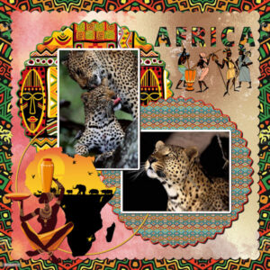
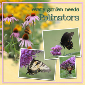
March 28, 2022 at 8:26 am #74453March 28, 2022 at 9:03 am #74456AFRICAN ART AND LEOPARDS – DAY 7 TEMPLATE
March 28, 2022 at 9:14 am #74458Thank you Sue for the info on brushes and to Carole for the answer to my question about the texture layer.
Lesson 7: I tried making a mask for one of the circular paper elements layers (without changing the brightness setting in order to make it opaque). It resulted in a translucent image therefore the background layers showed through. I am now assuming that the template layers are presented as tonal greys sometimes in order to differentiate them from each other especially if overlapping in a design. From your previous answer Carole I guess ClipToIt always treats the tonal template layers as if they are opaque black ones and knows what to do?
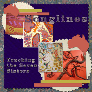
For the ribbons I went for plain colours as my overall images are so busy. Coincidentally I have chosen an Australian theme (having never been there though). I added a white border to a couple of the images to bring them out a bit and I used the Selection Expand technique from a previous lesson to do so.
I have found these lessons extremely useful and there is a wealth of creativity and techniques that is being shared. Need the time to read it all again. Thank you everyone especially to Carole.
March 28, 2022 at 9:18 am #74459Christiane, can you share a screenshot of your layers palette?
March 28, 2022 at 9:25 am #74461Lesson 6. A bit behind but enjoying all the tricks and tips. Used alternative template. My own pix. I thought I posted this yesterday….? Sorry if it’s a dupe.
March 28, 2022 at 11:05 am #74465Hi Carole,
maybe you find it. But in case you don’t, here it is: #74453.
March 28, 2022 at 11:46 am #74466Christiane, I meant the LAYERS palette. I wonder if there is something in the layers that was maybe merged with another one, or such.
March 28, 2022 at 12:44 pm #74468Carole…there is a pickleball shirt that says “I play pickleball because I like it, not because I’m good at it.”…That’s me.
We’ll have to get together someday…don’t wait too long…I’m old! When we get together, I’ll teach you how to play…you would enjoy it.
-
This reply was modified 2 years, 9 months ago by
Bonnie Ballentine.
March 28, 2022 at 1:14 pm #74471Another extra template
March 28, 2022 at 1:22 pm #74472Wow Trish!
March 28, 2022 at 1:23 pm #74474Day 7
I used the chisel effect on the words, but didn’t know if I had to add shadows?
March 28, 2022 at 1:32 pm #74476Lesson 5
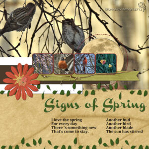
I used Marisa Lerin’s elements, cass-leaves text for the leaves, joyfullearningblogspot on Pinterest for the poem, and my photos.
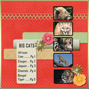
March 28, 2022 at 2:43 pm #74478FINALLY finished the Index for my Big Cats Album. This is the Diamond Template #5. It just gave me more room for the extra photos. Now on to Day 7, hopefully, the cover. I didn’t even unzip the templates or watch the video yet!
EDIT: After contemplating my “finished” design I decided to try changing one of the photos that I had already “merged to group.” I put the new photo on a layer just above the group and tried the “clip-to-it” with the group as the base. It worked! So, all I had to do was maneuver the photo to my liking and Merge to Group again.
-
This reply was modified 2 years, 9 months ago by
Ann Seeber. Reason: Replaced photo
March 28, 2022 at 2:59 pm #74479Ann,
Nice job, that is going to be a great Album
Lynda
March 28, 2022 at 3:21 pm #74480Lynda, thank you! Now I’m re-thinking this a bit and see that page more as in index rather than cover. So, on to the next creation, the REAL cover. 😀
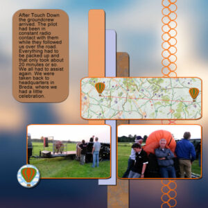
March 28, 2022 at 3:39 pm #74482Just like Ann I didn’t do my templates in the given order to suit my story. This is the Diamond template 5 and I changed it considerably (but they are just a starting point as Carole says). It has no title because the journaling speaks for itself. The background is a blurred skyphoto and instead of 4 little photos I made 2 larger ones, some papers and again a flairbutton that I made from the supplies in the balloon kit.
Now I have to look into day 7 of the workshop to conclude my story.
March 28, 2022 at 5:37 pm #74493Susan, I love the wood carved stands and the beautiful , I’m assuming, blown glass. So jealous…guess I have to get my a** in gear and take advantage of the classes my city parks provide. Love it!
Lynda
March 28, 2022 at 5:39 pm #74494Ann,
You might have a point. The index on most books are on the inside but you can be a maverick and do it your way.
Lynda
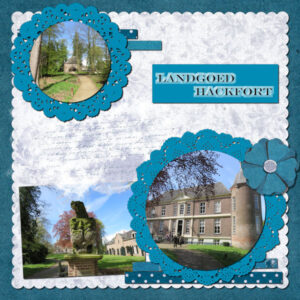
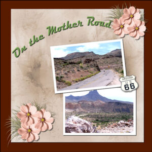
March 28, 2022 at 9:03 pm #74499Finlly on Day 6. 1st one done. The papers and the route 66 element are from my stash. The cluster is made from flower and grass in PSBT-July 21-Nature-DBMagnolia. The font is Magneto. The pictures are from our 2008 Route 66 trip and are of the road as it winds its way to Oatman, AZ.
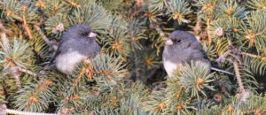
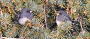
March 28, 2022 at 9:10 pm #74500This little beauty returned today. Dark eyed Junco. I thought I would post these pages. For those that were introduced to masks for the first time in this template challenge. Masking, is a powerful tool, once you become comfortable using them. I often create pages like these, many of them I have posted in projects. Same bird, two photos, one final image. Using a mask, the selection tool, and a gradient. Then the brush to touch it up. After doing the first one, I noticed that the feather was present twice in the image, so I redid it. Creating the second page. I will use these images in a project. The images have been greatly degraded, as the originals are 4,000 pixels x 2,800 pixels, reduced to 600 pixels.
Carole, I do talk to all the animals, even the smallest’s of insects. lol
March 28, 2022 at 9:25 pm #74504Anonymous
- 335

- Enthusiast
my result for Cass-Template 7
I made papers myself from original photo (in the lower right corner of the page) I used Effect Kaleidoscope and the second paper I did the plaid according to Carole’s instructions. Thank you Carole so much for good guidance
the text from the Bible
March 28, 2022 at 9:46 pm #74507Great scripture Pirkko!
Day 4 – I lost track of how many times I watched the video, and how many times I stopped the video….but I got day 4 done! I’m not sure how many days I am behind, but I will try to keep plugging on even tho I have a full week ahead.
March 28, 2022 at 10:42 pm #74508Euka (#74441) glad to see those corners used, and yes, it is just a matter of rotation to use them in all four corners.
Liz (#74444) did you happen to “resize” the larger image sideways? It might be the original format, but it seems squished.
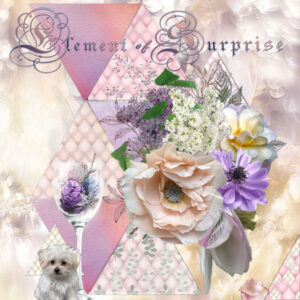
Trish (#74456) very colorful. I like how you used the same pattern for the title as for the background paper. Perfect match! (#74471) Because of the thickness of the flowers, a large shadow would likely make them stand out from the background. Did you try?
Fiona (#74458) you are correct: the script considers the opacity and not the darkness.
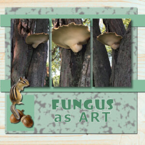
Julie (#74461) who would have considered fungus as art pieces? But you did!
Bonnie (#74468) too bad we live so far from each other. I don’t know if there is much pickleball around here.
Monique (#74471) a bevel can be a great addition to create depth. I might go a little narrower for the size of the text, but you still need to add a shadow to be consistent with the thickness of the element. It is interesting how that rectangular photos became round. On the bottom left photo, it might use some reverse shadow to make a sort of separation from the background paper which is similar in color/tone.
Lynda (#74476) another great appearance of the moon!
Ann S (#74478) yes, once you have merged a group, you can always re-run the clip-to-it script to replace any photo. I have done that often too!
Corrie (#74482) using a very blurred version of your photo is a great way to create a background that perfectly matches the rest of the layout.
Mary (#74499) the clusters work well because you didn’t rotate them much. If you pay attention to the shadows already on the clusters, it would look odd if you had rotated them more. Good job. Nice to see you add text on a path.
Sue (#74500) those photos could easily become a nice FB header!
Pirkko (#74504) great layout with a monochrome look focussing on the verse.
Linda (#74507) was there something in particular that was unclear? Were you stuck on a particular tool or step?
March 28, 2022 at 10:44 pm #74509Thank you Lynda for your comments on the wood/glass pieces (#74493). I believe these glass face beads were likely fused in the kiln. they are beads, Melanie would first carve a face in wax then used a refractory mold mix to paint over the wax, (many thin layers) then burn out the wax and the mold would be left and can be use with hot glass in the flame (Lampworking) and pressed into the mold or fused in a kiln with layers of glass with a mandrel (stainless steel rod coated in a bead release) in the middle, more glass on top and put in the kiln to melt the (fuse) the glass together. Melanie and her twin sister (Leslie Rowe-Israelson) are well known glass artists in the world of fused/cast glass. They were selected by the Czech govt to come and teach their techniques (in the 70’s or 80’s). They have taught at Pilchuck (Dale chihuly’s school), had residency’s at Corning Glass amount many other accomplishments. I was blessed to know Melanie. They do life size heads too. The wood is left over pieces when I worked for my brother who made custom Japanese shoji doors and furniture. I loved the knots in the wood and thought they looked like little museum plinths (stands). And the collaboration was born. You can find Leslie on FB or see her glass art if you ever find yourself in Jasper or Banff, Alberta. I sold all my glass supplies and kiln when I moved to Alberta (from BC), but I still love glass.
March 28, 2022 at 11:04 pm #74511Here is the extra for day 6. The font is Matura MT Script Capitals, inner bevel and shadowed; the papers are my stash; the ribbons were simply colorized and texturized; leaf for the cluster is from PS Elif Sahin; the flowers are from my stash (created in a Lab).
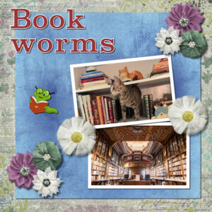
March 28, 2022 at 11:12 pm #74516Templates – Day 6: I used some of the papers and elements from the Janet Scott Mini-Kit Elegant Autum. One of the photographs is mine showing our Bella. She loves to jump up to the bookcase looking for a good “Read” preferably one about cats. The other one I found on Canva under Library images. The font is Shenandoah Clarendon Bold which is a bit like the Clarendon Blk Carole used. I could not resist to add a bookworm from my graphics file. I added Hue and Saturation to it for better blending. Currently, I am in a book club called “Bookworms” so this lesson was just perfect. Thank you Carole for another great Workshop during which I enjoyed learning many new PSP skills and shortcuts. I will be working on my final Day-7 tomorrow.
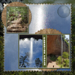
March 29, 2022 at 2:13 am #74521Final template – Paradise Falls – (very small falls) with quite a steep and uneven descent but worth the views. I am not sure which was the hardest – the going down or going up.
Everything on the page is mine the ‘papers” are photos and the circle I made is a sine sphere. The font Aachen vertical.
Thank you Carole for another interesting and educational workshop, one with a large participation showcasing amazing creativity and willingness to share knowledge and ideas.
A big thank you also to everyone who posted for the pages have been a delight to view and follow along the adventures taken and meeting friends, family and furry family members past and present, all honoured beautifully.
Carole, I have tried to register for the Dynamic Frames, but although a message appears at the top saying I have been sent a link so far no link has arrived, and it sends me back to the log in page. I also sent an email (replied to) the Cassel email, I am probably drifting around in cyber space dodging satellites!.
March 29, 2022 at 4:43 am #74523 -
This reply was modified 2 years, 9 months ago by
-
AuthorPosts
- The forum ‘Showroom’ is closed to new topics and replies.


