Home of the Scrapbook Campus › Forums › Showroom › Template Workshop 2022
Tagged: Template Workshop 2
- This topic has 406 replies, 43 voices, and was last updated 11 months, 1 week ago by
Cassel.
-
AuthorPosts
-
March 27, 2022 at 4:31 pm #74386
Can someone have to many hobbies? Yes, you can! 😀
I had to finish another project (not PSP) before starting this template workshop, but here are the first 6:
The one for lesson 3 could of used more texture/patterned papers…….I didn’t remember the kit I used, so left it this way…….
March 27, 2022 at 4:40 pm #74387I just had a look at all the wonderful projects in this thread. Didn’t see them yet…… With every class I’m so surprised that with one template so many different projects are made. Well done everyone! 🙂
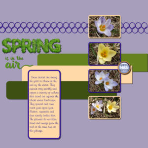
March 27, 2022 at 4:47 pm #74389Day 5…snow crocus volunteering in my lawn.
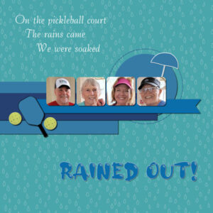
March 27, 2022 at 4:48 pm #74391Day 5…we were on the pickleball court when the skies opened up. We were soaked by the time we reached shelter.
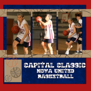
March 27, 2022 at 4:49 pm #74393Day 6…photos from 2008…basketball playday with my basketball orgainization. Tons of fun!
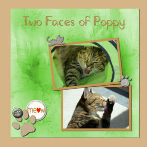
March 27, 2022 at 4:50 pm #74395Day 6…my cat, Poppy. I really struggle with adding elements…usually, I don’t like them.
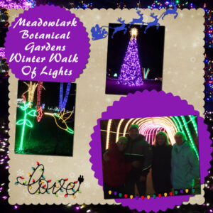
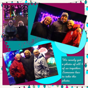
March 27, 2022 at 4:53 pm #74397Day 7 We attended a festival of lights last December. It was cold! We tried the hot chocolate…best I ever had…no pictures tho, could have been another page.
March 27, 2022 at 4:54 pm #74399Day 7 More of the festival of lights.
March 27, 2022 at 5:49 pm #74402Holy Bonnie, you are really productive. 6 layouts in the time it took me to do one ?.
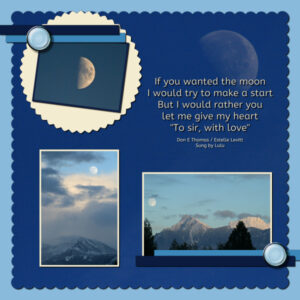
Here is my first one for day 7. I broke from my artisan theme. On the way to get groceries the radio was playing old 60-70’s songs that were in movies. To Sir, With Love came on and it’s been an earworm (albeit a good one) in my head all day. What’s a girl to do…well, do a layout of course. It’s the first time I used a photo in the background (okay, almost the background), enlarged a lot, already grainy from high ISO, but looked cool to me. Rest of the photo’s was my view from my living room (good thing for removeable screens) when living in Chilliwack, BC (CAN). I flood filled actual background layer, the yellow and the strips. I made good use of the Hue/Saturation/Lightness to change the buttons from white to a Cyan tint and for the yellow circle to slightly change the saturation and lightness. At first I was intimidated on what I would do to change the template but once I got started it came together. I am not a moon photographer by an means, my lenses aren’t long enough, but I take the shot anyway. Good practice.
March 27, 2022 at 6:01 pm #74404Here is my page for Template 4 – Birds from the Garden…
One of my ‘favourite waste of times’ is to just sit in the garden and watch the birds flit about between the trees and shrubs. I could literally sit there all day if time allowed.
In the pictures we have a Robin, a Blue Tit, a very fluffy baby Sparrow/Dunnock (I always get the two confused!) and a baby Blackbird.
I think I’m finally understanding masks and am making them quicker than I was a couple of days ago. I love the brush effect one, and I am assuming that was made by the paintbrush, and that all I’d need to do is create my own ‘design’ using the paintbrush options and then create a mask from it??? Is that right??
I used an embossed paper from Gina Jones February kit from Digital Scrapbook and I adjusted the colour, brightness and contrast. The colour of the border and the text colour are colour dropped from the Sparrow’s head.
I’m loving seeing the levels of creativity that are being displayed in the forum. Thank you all for sharing them.
March 27, 2022 at 6:07 pm #74405Day 7
Thank you Carole for this brand new workshop. Without any doubt the newbies will have learnt a great deal. As for the likes of myself, it’s great to refresh the memory, as there are so many tools available to us, that remembering them all, all of the time is quite impossible.
The papers were created using overlays and textures. The corner element is a brush. I created the labels. Text on a curve. I will mention for those who are not familiar with my work, I only ever use my own photos, and create the majority of my own elements.
March 27, 2022 at 6:11 pm #74406Thank you, to all who have participated, and posted their outstanding, creative, unique pages. Each one has been a pleasure to view, and have been a great source of inspiration to all.
March 27, 2022 at 6:14 pm #74407Hank, love the Detroit layout! Grew up going there often as child and teenager. Lived not far from Windsor. Now living back in the area and looking forward to being able to go back sometime soon. I remember “old Detroit” really well. Just not the same anymore.
March 27, 2022 at 6:22 pm #74418Susan, I love taking moon shots. I don’t use lenses, yet the details I can capture of the moon, are quite incredible. Using the right settings. One of my favourite songs from my teenage years. To sir, with love. I often wish I could relive those school days.
March 27, 2022 at 6:24 pm #74419Susan, I didn’t create them all at once (#74402). 2 per day…I got lazy posting them because my computer was acting up. Posted them all today…created them over time.
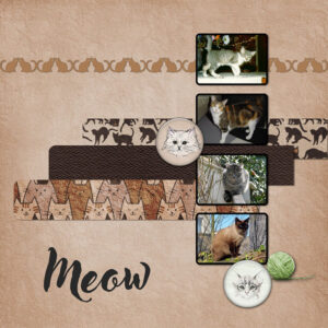
March 27, 2022 at 6:35 pm #74421Lesson 5 – Template 5 Diamond
Kit : themagnoliapatch.blogspot.com – Oct 21-Cats RuleMarch 27, 2022 at 7:01 pm #74423Day 6, delayed owing to Mothers day hope ever one enjoyed there days xx
March 27, 2022 at 7:41 pm #74425I’ve really enjoyed this workshop also. There were so many things to learn – from Carole always – but also from each of you – I have learned something new – it might be in the way you display your photos, it might be the shortcuts you have developed over time, it might be your take in using the particular template. Great stuff!!!
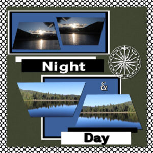
This is my Day 5 Extra. The font is Medieval Sharp. The elements and background paper (which was darkened) are from PBST-June 21-Summertime-DBMagnolia. The 3 template elements under the photos I simply colorized and texturized.March 27, 2022 at 7:57 pm #74427Day 7 – Just for fun. I want to learn and do more with the perspective options. So that’s what this is. Only two actual pictures, just flipped horizontally for effect.
I agree with so many others, that this has been a fun series and I not only learned many new things, I actually got kinda comfortable using them. Thank you, Carole!
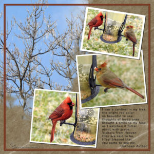
March 27, 2022 at 8:47 pm #74429We have Cardinals daily at our bird feeder now. Our weather can’t make up it’s mind. One day ice crystals shining on the trees, the next Cardinals at the feeder.
I changed the mask layers a bit as I wanted a larger space for the photo with two birds. I didn’t use any kits except Carole’s template. Photos are mine. I really like the frame idea and procedure and thanks for reminding me how to put the script buttons on the toolbar. Time saver.
March 27, 2022 at 9:10 pm #74431Thanks to Carole for another great workshop. Like others, I learned new things and drew on things I learned in other workshops. I always enjoy seeing other interpretations of the same template and learning from the ideas that are shared.
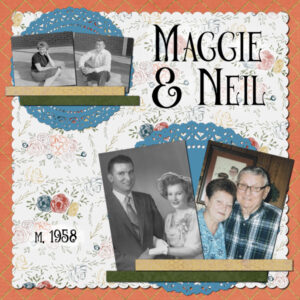
Today, I learned (again!) that “greyscale” affects everything, not just one layer. I also learned that once you save the file, you can’t undo it, meaning any color pictures added later are greyscaled. Hopefully, it will be a while before I have to learn that again.
My parents married in 1958 and were married 52 years when my dad passed away in 2010.
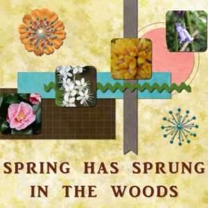
March 27, 2022 at 9:26 pm #74433After seeing a few other wonderful creations and becoming inspired, and a bit brave I have to say, I altered my original page and moved elements around and used align and distribute to move the photos. I don’t have any rick rack in my limited supplies, so I locked transparency on it and flood filled with a colour.
I did have a problem with the ‘select all’ on the stitching to change the colour of it in one hit – I just couldn’t get that to work even though I watched that part of the tutorial half a dozen times or more… In the end I zoomed in and used the adjust – hue, saturation and lightness to change the colour.
I had a lovely woodland walk yesterday which inspired my page. The spring flowers were beautiful as they were dotted about the ground and in the hedgerow. In the photos, we have Camelia, black hawthorn, gorse and bluebells.
March 27, 2022 at 9:45 pm #74436Lovely results ladies. I enjoy viewing all the different styles.
Thank you Carole for the workshop. I learned something new each day.
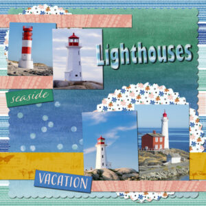
Here is my result for Day 7 using the template provided and items from scrap kit called Coastal Summer by Jessica Dunn at DigitalScrapbook.
Font used for title is called Gill Sans Ultra Bold Condensed.March 27, 2022 at 9:48 pm #74437Thank you Carole! What a fabulous and comprehensive workshop. Having 3 great workshops back-to-back was just the immersion I needed. What a huge undertaking for you, and I truly appreciate all of your work and guidance.
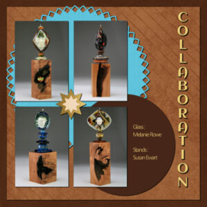
This is my final layout. Photo’s and wood stands are mine, glass is the incredibly talented Melanie Rowe. the two background papers are Digital Scrapbook and font is Aclonica, not sure if it’s windows or Creative Fabrica (CF I think).
I have learned so much this past year and dare I say, I might be getting a wee bit better at it. I took my first workshop (Bootcamp) in May 2021. My pace is slow, but I’m coming along thanks to the Scrapbook Campus, Carole and all the students and members.
Now I get to grab a tea and look at the amazing creativity of all the students.
March 27, 2022 at 10:08 pm #74438Carole is that Dynamic Frames class only for Diamond Members or
can anyone register?March 27, 2022 at 11:41 pm #74439Mary (#74307) missing a shadow is such a common “mistake”. Sometimes, we forget to add it, sometimes, we hid it and forget to unhide it. And often, after looking at a project for too long, we just don’t see anything! (#74425) Sometimes, simply colorizing and adding a texture is enough. We don’t always need to have a busy paper or a pattern. After all, the focus should be on the photo and the story instead of overpowering the page with lots of bells and whistles.
Euka (#74310) I have never been to Australia and all those photos make me feel like I have! I love that font you used for the title. (#74323) That is a beautiful kit you used. Great way to showcase that “panoramic” photo. (#74325) Yes, I also have added that icon on my Layers palette, but not in my 2022, so I would not confuse anyone in the tutorials!
Cristina (#74312) better late than never! It is an interesting take on using the same photo twice, and mirroring them make so much sense with the peek-a-boo.
Fiona (#74316) to answer your question, if you use the clip-to-it (or a mask for that matter) it won’t work. Trust me, I tried! Since the texture is actually the same opacity all over and not variations, you would end up with a solid square mask and lose the texture. That is why I had to show a different way to use it than what we used in previous lessons.
Anita (#74316) those cat faces are so cute!
Linda (#74318) adding a shadow to letters and removing it from the inside would probably look odd. It is a matter of finding the correct settings. From the top of my head, I would suggest you try something like 10-10-70-10 for the big title and maybe 5-5-70-5 for the sub-title. That would be a starting point and you can always adjust the opacity afterward, if the shadow is on its own layer.
Sharla (#74320) I see that you used a flat shadow (like paper) for the flowers. That is very accurate since those flowers are drawn as if on paper, unlike the flowers that I was using! Good thinking. (#74348) You know, when you use scatters like you did, you CAN place some on top of the photos, as long as they are not covering anything important. It is ok under the photos, but you have that option too.
Lois (#74321) that version makes more sense, don’t you think? It is like that what flower with a larger shadow: we can see a gap between the tip of the petal and the shadow, but that makes sense as the petal can very well be off the paper, unlike the title! (#74436) Where are those lighthouses from? It would be fun to have their location indicated on the photos (or around the photos).
Pirkko (#74327) you colorized the placeholders correctly. You can also replace those placeholders by other elements from a kit or your stash. (#74376) You did a fantastic job with the shadow of the flowers!
Rene (#74333) there are so many ways to customize one’s workspace, and with all the possible shortcuts available, everyone should find what suits them.
Julie (#74335) yes that is something on everyone’s mind, wherever they are in the world.
Christiane (#74339) you might have forgotten the shadow on the round photo. Especially since it is on top of the rectangular paper, it should have some. And yes, it can be hard work when you start to learn about a new technique or a new tool (or several).
Randy (#74344) yes, that extra path is a bug. I had addressed it in the scripting course, but I didn’t want to go into such details in the forum since I didn’t know how familiar you were with editing scripts. I had never experienced that bug myself because I always use PSP9 for scripting, but when doing the video tutorials for the scripting course, someone using PSP2022 pointed out that issue.
Hank (#74345) just as a comparative exercise, have you considered using the exact same elements you have on your page, but using the shadow settings I am using (offset, opacity, blur, color)?
Jnet (#74352) those cooking/baking elements are great addition to replace those “boring” rectangular placeholders!
Ann S (#74355) that off-center photo gives such character to the page! I probably would not have thought of it, but I LOVE it!
Cristina M (#74357) awe, I wish those were pictures of your dog!
Marie-Claire (#74359) and Poncho is supervising everything 🙂 (#74374) Where is that church? It is very intriguing (hopefully it is not too windy there). (#74421) Are those your cats too?
Corrie (#74379) it is so fun to have been able to follow your adventure. You now have a whole album about it!
Monique (#74386) the beauty of keeping a layered version of the project is that you can always replace papers or elements later on. Sometimes, looking at our work after a day or two, we suddenly see something we would want to change or tweak. Don’t hesitate!
Bonnie (#74386) I smiled at the “volunteering” of your crocus! I would so love to go see you play. You always seem to have so much fun!
Susan (#74402) I love how you tweaked the template to suit your photos. That is the whole point. (#74437) I am happy that you are getting more and more comfortable with all those tools and techniques.
Theresa (#74404) yes, you are getting a good understanding of the masks: you can create one yourself with the Brush too, although you can also use Selection tool. (#74433) What do you mean when you say that the Select All didn’t work?
Sue (#74405) your layouts always make me smile. I can just imagine you like Snow White, talking to all the animal in the forest surrounding you.
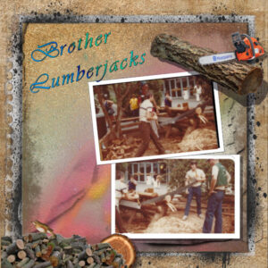
Trish (#74423) those are very interesting paint spatters and they go well with the idea of saw dust all over!
Lynda (#74429) those are beautiful pictures of colorful birds.
Gerry (#74431) yes, the Greyscale command will affect all the layers because it is applied to the IMAGE. If you want to turn only one layer into shades of grey, you should use the Hue/Saturation and set the Saturation to 0.
And to answer Lois’ question, the Dynamic Frames master class is open to all, members, non-members and newcomers too.
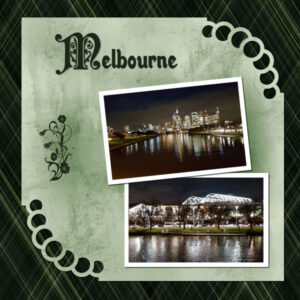
March 28, 2022 at 1:05 am #74441Day 6- Melbourne by night a view looking up the Yarra river to the city and across the river to the Tennis Centre.
Photos and plaid paper both mine and the corner cutout is a brush script from Carole – I haven’t really used them as I couldn’t get them to work in each corner … duh light bulb moment – read the instructions “rotation”! The M font is Preciosa and the rest Walrus Gumbo. The flower doodad is a brush.
-
This reply was modified 2 years, 9 months ago by
Euka.
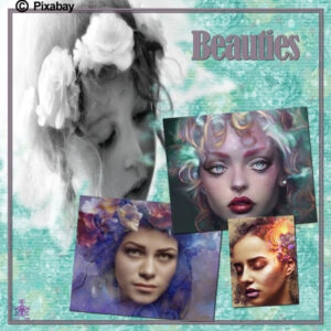
March 28, 2022 at 1:10 am #74444Using inspiring photos from pixabay for this workshop though these four went together well . Thankyou for the script Cassel it comes in very handy
March 28, 2022 at 6:32 am #74446Today I try Template Nr. 2.
All the steps are fine by me. But when it comes to delete the TITLE I have difficulties to delete it. As Carole says I delete the raster 8 (the Title) but after that I see part of the Title (in a very light way) inside my inner circel. What do I do wrong? I have no idea.
Can you help me, please?
-
This reply was modified 2 years, 9 months ago by
Christiane.
March 28, 2022 at 7:18 am #74449Christiane, how did you delete the TITLE? Did you delete the layer itself or did you hit the DELETE key?
-
This reply was modified 2 years, 9 months ago by
-
AuthorPosts
- The forum ‘Showroom’ is closed to new topics and replies.
