Home of the Scrapbook Campus › Forums › Challenges › September Tut/Tech Challenge – Double-exposure
- This topic has 13 replies, 7 voices, and was last updated 6 years, 2 months ago by
Michele.
-
AuthorPosts
-
September 15, 2018 at 5:28 pm #21338

The Campus is the perfect place to learn more about photo editing, various techniques, or PSP in general.
This challenge will give you an opportunity to practice some of those techniques or use some tools.
This month’s Tut/Tech Challenge is the Double-Exposure effect using PSP. Although the technique is quite simple, it might be more challenging to find the “right” photos!
HERE is a tutorial to help you out (that is one tutorial I did for Corel).
No need to create a whole layout or project. Just show us the end result. If you want to create a whole project around it, that is great, but show us the effect first.
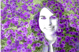
September 18, 2018 at 11:06 pm #21392I’m not very original, but I am enthusiastic. I chose a random pic of a young lady and flowers. I like how she ended up with Elizabeth Taylor eyes (violet).
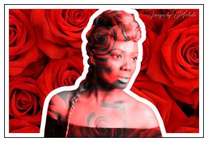
September 19, 2018 at 10:11 am #21395Found a wonderful picture on Unsplash. I made this for a color challenge in a FB group and realized it also works for this double exposure challenge. Hope you enjoy.
September 19, 2018 at 10:15 am #21396Susan, I just love the color and you’re right; it does look like Liz’s eyes!
~ Michele
September 19, 2018 at 1:22 pm #21397Great images ladies!
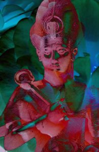
September 19, 2018 at 1:24 pm #21399My try at Double exposure. The colours didn’t work well with Lighten so kept clicking and kind of like this one with Difference. Maybe because Hallowe’en is coming!
September 19, 2018 at 3:26 pm #21400Michelle – I like the white border you put around the lady. It makes her stand out while at the same time you have the double exposure. Snazzy.
Anne – Quite interesting. Certainly looks Halloweenish 🙂
September 19, 2018 at 11:33 pm #21405I used a double exposure technique for my group’s pic last night. I started with a black silhouette of a woman doing yoga. I made two pics with different color background layers at different opacity above the white background. There are so many different ways you can apply this technique. I learned it quite a while ago, but I haven’t used it since then. I don’t have the best memory lol. Then again, the more I learn, the easier things get. (Best seen in full view.)
Susan, thank you for the kind words.
Anne, thanks for your appreciation. Glad to see that you played with the Blend Mode to get the look that you wanted. It’s a very interesting effect.
~ Michele
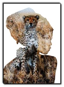
September 23, 2018 at 7:01 am #21458Lovely work everyone on the double exposure challenge, absolutely loved seeing the different results. This is my result which I have called Safari. Both pictures were freebies on the web. The woman I used the freehand selection tool – point to point – with a feather of 2. Much longer but cleaner results which I prefer. To get a better overlay effect I used hard light, duplicated then used overlay otherwise it was too wasted. Thanks for takin a peek.
September 23, 2018 at 7:42 am #21459Love it, Annie, and that’s a perfect name!
September 23, 2018 at 6:36 pm #21464Thanks dear Michele, much appreciated. It sure was fun to do and I think I will be doing a lot more practice with this tut. <3
September 24, 2018 at 9:45 am #21467Susan, Michele, Anne, and Annie, what beautiful layouts. Really great work!
September 27, 2018 at 1:11 am #21531Michele, Susan, Anne and Annie…. you have all created wonderful examples for this challenge… well done!
best wishes,
Dawn.
September 27, 2018 at 2:58 am #21536Thanks, Dawn <3
-
AuthorPosts
- The forum ‘Challenges’ is closed to new topics and replies.


