Home of the Scrapbook Campus › Forums › Challenges › August Tut/Tech Challenge – Andy Warhol-inspired pop art
- This topic has 31 replies, 7 voices, and was last updated 5 years, 3 months ago by
trish williams.
-
AuthorPosts
-
August 24, 2019 at 8:43 am #33502

The Campus is the perfect place to learn more about photo editing, various techniques, or PSP in general.
This challenge will give you an opportunity to practice some of those techniques or use some tools.
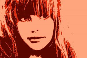
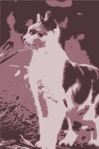
This month’s Tut/Tech Challenge is to create the Andy Warhol-inspired pop art effect using PSP. Although the technique is quite simple, it might be more challenging to find the “right” photos!
HERE is a tutorial to help you out (that is one tutorial I did for Corel).
It will be fun to see which photos you will choose!
August 24, 2019 at 10:48 am #33531Another fantastatic idea, thank you Carole!
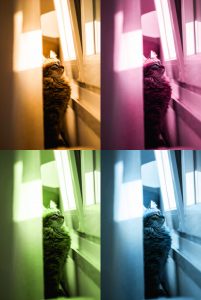
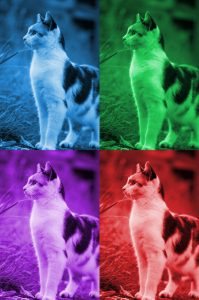
You are certainly right saying the right photo will be the challenge :-).August 24, 2019 at 6:18 pm #33548I tried the tutorial of the first link “Make your own pop art”. The thing I noticed I had a little problem to position properly with the move tool.
August 24, 2019 at 6:19 pm #33550That was the first one.
August 24, 2019 at 6:20 pm #33551Libera, try to add guides in the middle, horizontally and vertically. That should help.
August 24, 2019 at 6:23 pm #33552Ah OK, thanks Carole, I didn’t add in the middle, only horizontally and vertically! So a new test 🙂
August 24, 2019 at 7:15 pm #33559August 24, 2019 at 7:53 pm #33560Those could make great posters!
August 24, 2019 at 9:12 pm #33567Merci Carole!
I went on and exercised the second link “Turn a photo into Pop Art”, this is a lot of fun.
August 24, 2019 at 9:14 pm #33570August 25, 2019 at 8:49 am #33579I think you’re addicted to this now, Libera, but you’re not alone. When I first did the 2nd tutorial, I couldn’t stop changing everything into Pop Art.
~ Michele
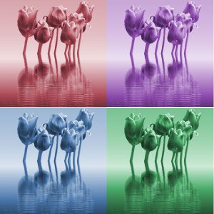
August 25, 2019 at 9:33 am #33612Here’s one from me. I found the original pic on Unsplash a while back; I fell in love with it so I’m happy to finally use it for something. The way I lined them up was to use the object align and distribute commands. I find that to be fairly straightforward if I don’t have too many objects on my page and they’re all the same size. When it gets more complicated, I definitely have to use the snap-to guides. They’re like magic!
~ Michele
August 25, 2019 at 7:04 pm #33627Libera and Michele… you both have chosen great photos for this technique … well done!
best wishes to you both,
Dawn.
August 26, 2019 at 3:26 am #33634Great pop art Libera, well done!
August 26, 2019 at 3:28 am #33635Lovely job on the pop art Michele, cool colors!
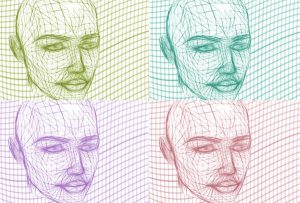
August 26, 2019 at 3:31 am #33638Hello Scrapbook Campers. Here is my play with the pop art tut tech. Photo is from Unsplash. Thanks for takin a peek.
August 26, 2019 at 6:17 am #33639Wow, Libera, Michele, and Annie, you all made great layouts with this technique! Lovely work!
August 26, 2019 at 7:30 am #33644Yes Michele, it is not difficult to get addicted, because it is rather simple to do thanks to Carole’s good instruction and great fun. I forgot, I took my photos from Pixabay.
I like too the choice of your colors, that makes it! It is really surprising what effects you get choosing colors you would not necessarily choose for other works.
The same for you Annie!
Thanks for all your comments 🙂
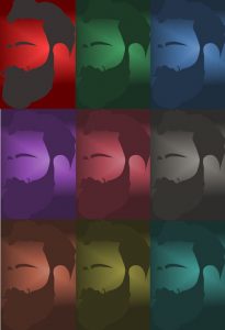
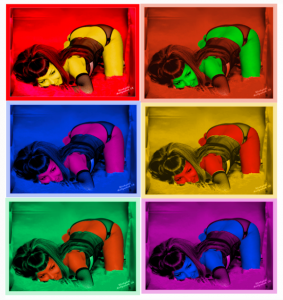
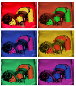
August 28, 2019 at 3:20 pm #33817Well done all, some great ideas, so here is my take on it. Ive had this pic for years, thought Id never use it, but just kept hanging on to it, it seemed just perfect for this, although when I started changing the colours it reminded me of that jeff goldbloom film where 3 furry coloured aliens came from outer space, and landed in the beauty parlour.
I had trouble lining it up, everytime I sized it together, they moved and the sizes changed.
Have a nice evening x
August 29, 2019 at 9:20 am #33841Annie, I love that kitty! Nice work on both your images.
Trish, you did a great job. The colors are awesome and I like that you framed each one. You cracked me up with your reference to Earth Girls Are Easy.
In terms of the alignment issues you had, Trish, since Carole’s tutorial was for four images, you would have to add more guides to accommodate all six of yours. It’s important that you use the same original to produce of your color pics so they are all the same size. I don’t always have luck resizing them once they’re on the same image.
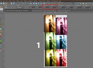
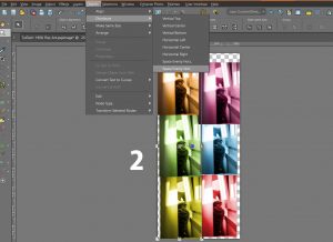
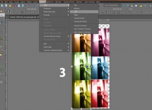
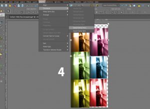
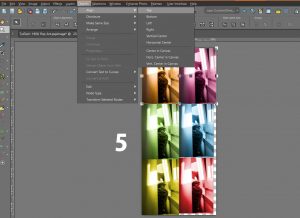
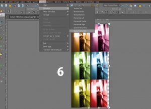
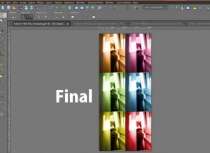
This is an alternate way to do it. Once you determine the size of your original, use Shift D to duplicate it as a new image. Then do your magic. Go back to the original and repeat Shift D and then magic. Repeat until you have all your images. Once you have all of your images done, create a new image the width and length that will work for your project. In your case, you would want to double the width and triple the length of the original pic. What I would do now is copy and past all of your images onto the new blank image. Move them to roughly the position you want. Now comes the aligning. 1) Using the Pick Tool, select the top left image and change both position X and Y to zero. That lines it up exactly to the top and left edges. 2) Now, using the Pick Tool, select the other images on the left. With all three selected choose Objects: Distribute: Space Evenly Vert. 3) With those same images selected choose Objects: Align: Left. 4) Now select the top left image and the top right image and choose Objects: Distribute: Space Evenly Horiz. 5) Then choose Objects: Align: Top. 6) Now select the top right image, then the other images on the right. Choose Objects: Distribute: Space Evenly Vert. 7) Choose Objects: Align: Right. I put together some screen shots that I hope will illustrate what I did since it sounds pretty confusing when reading the steps. Once you’ve done it a few times, you’ll be more comfortable with this method.
Carole, I think this is my first attempt at a tutorial so please look it over and see if I made any mistakes. Thanks so much.
~ Michele
EDIT: I deleted the small pic and added the pics for the individual steps. I hope they’re more visible.
August 29, 2019 at 8:12 pm #33882Thank you Micfin, I will try it again using 2019 as I seem to have a sliping problem on 2020 at the point of saving. I did take each one from the original, which I removed from the final picture and did a selection , again from the original on all the fleshy body parts, then working from the original colour a copy and then colour a copy of the body bits. then laying the 2 together they fitted perfectly to what ever picture I matched it to. Hope I am not confusing you, I confuse myself enough. so I landed up with 6 copies of the original and 6 copies first copy of the of the parts , I thought they couldnt go wrong that way, but at the last minute they seemed to move and the sizes didnt match so had to juggle. will try it again your way tomorrow. I didnt see a tutorial on it, I ,must of missed it, 4 would have been easier. Thank you x
August 29, 2019 at 8:28 pm #33883Micfin, I think your tutorial is great. Unfortunately, the image is too small on my monitor to really be able to see the details, but my guess is that it is very detailed.
Another tip (which was mentioned in the initial tutorial) is to add guides on the edges of the larger image so all the corner photos would snap into place. For a 6 image project, you would only have two to align “manually”.
August 29, 2019 at 9:35 pm #33891Carol is the tut the one mentioned in here at top of page, was there supposed to be instructions with the tut like you are saying. I have looked at the a few time, but dont get no words or writing just 4 pictures that move t supper fast speed, I dont know if anyone else is getting that. x
August 29, 2019 at 9:39 pm #33893Second try
August 29, 2019 at 10:13 pm #33894Yes Trish. The written tutorial is below the “gif”. Just scroll down a little and you’ll see it.
August 30, 2019 at 6:40 am #33906Thank you Carol, silly of me. but thought that was it. anyway as u can see, I have redone it, I should have left the edges coloured, and the white blends in to much .
August 30, 2019 at 7:58 am #33928Carole, thanks for taking a look at my tutorial. I thought the pic was a bit small, but I didn’t know if I could load the separate pics. I edited my original post to delete the small pic and add the pics for the individual steps. I hope they’re more visible.
Trish, your second one looks perfectly aligned; it’s awesome. I think the white borders look good, too. It’s just a different style.
~ Michele
September 2, 2019 at 12:22 am #34033Did this one for my gaming group today. I thought it worked well with the name of my group. I hope RuPaul doesn’t mind. 🙂
~ Michele
September 2, 2019 at 7:23 pm #34068Wow Michele, great work on this one my friend, a real show piece! <3
September 2, 2019 at 7:47 pm #34070Trish I really like your remake and I prefer the white borders, tends to make the colours stand out more…… of course Andy Warhol may not agree, lol!
-
AuthorPosts
- The forum ‘Challenges’ is closed to new topics and replies.


