Home of the Scrapbook Campus › Forums › Challenges › September SKETCH Challenge
- This topic has 11 replies, 8 voices, and was last updated 4 years, 2 months ago by
Cassel.
-
AuthorPosts
-
September 12, 2020 at 10:46 am #47077

Learning scrapbooking is often done with practice, looking around for inspiration and trying to recreate projects we admire. Sometimes, we can be inspired by finished projects, but sometimes, we also have to use our imagination to interpret something.
This challenge will give you an opportunity to envision something from a “boring” base, and you will have to imagine the end result differently. The sketch is only a written idea, and you can fly with it, modify it, and customize it to fit your vision, your photos, your supplies.
Here is the sketch you will want to start with.
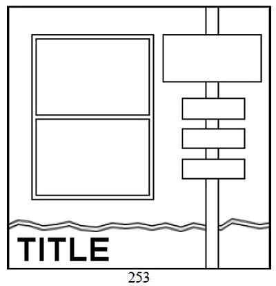
And if you want more information on using sketches, check out this article.
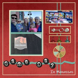
September 18, 2020 at 6:25 pm #47363Sketch challenge in the Campus. Crossroads Tabletop Tavern offers all sorts of games to be played while you are eating. Lots of children’s games too. A Sunday midday was the perfect time to bring the kids. Elements from Family Game Night at Pixel Scrapper.
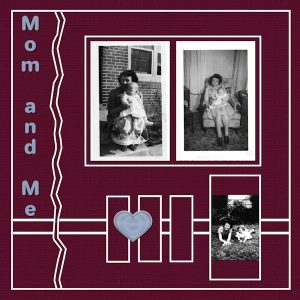
September 18, 2020 at 6:32 pm #47365Rotated the sketch.
The scanned photos are not the best…now I want to scan more and at better quality.
September 19, 2020 at 4:59 am #47378Nicely done, Bonnie.
September 19, 2020 at 5:31 am #47379Bonnie, the layouts are very nice. Good idea to rotate the sketch; I like the result very much and inspired me. I didn’t start yet, kind of stuck not knowing what I want to do. 🙂
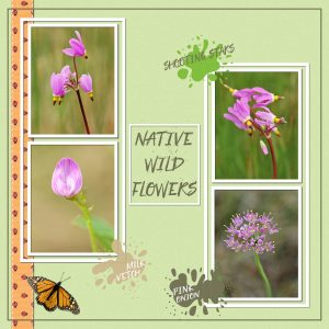
September 19, 2020 at 3:07 pm #47395I’m afraid my layout, doesn’t look anything like the sketch by the time I finished with it. The Monarch butterfly is one I extracted from a photo of mine some time ago. Went with the ink splatter effect. There’s a technique for ink spillage over a frame, photo or paper, I can’t remember in which masterclass, but I know how to do it.
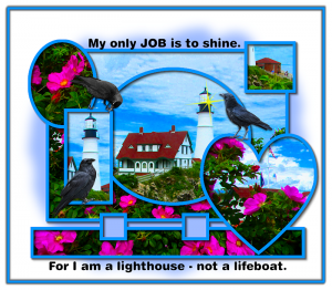
September 19, 2020 at 8:12 pm #47411I did the given one … so trying again with one I made. I took the pictures used – Portland HeadLight in Cape Elizabeth, ME. It seems like all our pretty birds have left for the winter season … and mostly what we have left are crows – which I love -seagulls, blue jays and a ton of birds of prey. I used crows. I guess I don’t mind crows and them being so rowdy and noisy because I am up anyway. They are very smart! Probably someone wanting to sleep in would not be so enthusiastic over them. LOL
September 19, 2020 at 9:02 pm #47415Hi @all, Bonnie, Sue, Minka, beautiful works to see here and all over the other challenges!
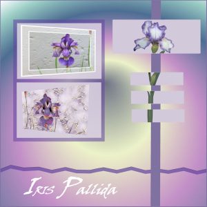
I didn’t find the sketch above, so I tried to do it by myself. It “almost” looks like it :). I love iris flowers too and I found photos again I took a few years ago. For the second on the left side I used pictopainting. On the right side I cut the flower trying to adjust it in the little layers. The gradient is holographic-sunburst. I forgot to write down which font I used …
September 24, 2020 at 12:00 pm #47589Bonnie, Sue, Minka and Libera: Great Layouts! I really enjoyed looking at them and seeing how you all made them different. They all gave me ideas on how to do Sketches.
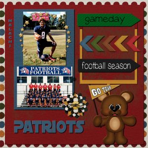
This sketch was a little hard for me to work with, but I think I got it. I am new to using sketches and I really enjoyed working with it. I used a kit called “Football Fever” by Sweet Pea Designs.
September 29, 2020 at 7:58 am #47735Nice to see everyone‘s take on this challenge. I enjoyed seeing each and every work. Good job!
September 29, 2020 at 8:26 am #47737Here is my contribution to this challenge.
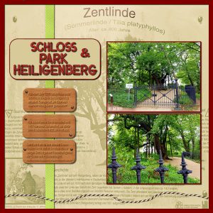
I mirrored the sketch because I wanted the text underneath to be more visible.
The background paper is a photo I took from the sign (first photo). Then Photo Effects>Sepia – Blend Mode=Screen over a layer filled with a green color. I tried different blend modes and colors before choosing this one.
From Cassel: Ribbon (Ribbon Factory Script) / String Tube / Screwheads Tube / Construction Alpha
I changed the color of the Alpha with Adjust>Hue/Saturation/Lightness
September 30, 2020 at 6:20 pm #47764Bonnie, it is so interesting to see how your layouts were very different even if starting with the same sketch inspiration. And rotating a sketch is a super simple way to expand the possibilities of a single sketch.
Sue, a sketch is a starting point, but it can often differ after we put our hands to it. We change it, tweak it to suit our photos, our text, our preferences.
Minka, it is very interesting how you added some blue in the background. It looks like watercolors, which is perfectly suitable for the theme of the page.
Libera, a sketch is only a flat image and it was on the first post. That is the difference between a sketch and a template. You can read more about it here.
Sandra, even though the project is fairly different from the sketch, that is a sign of creativity: you make it your own, and it is 100% allowed (even encouraged).
Cristina, that is a good example of how your needs will determine how you will tweak the sketch.
Remember that whether you start with a sketch or a template unless the challenge is to COPY it exactly, you are always encouraged to customize it to your own needs and preferences.
-
AuthorPosts
- The forum ‘Challenges’ is closed to new topics and replies.


