Home of the Scrapbook Campus › Forums › Challenges › September Number Challenge
Tagged: Number Challenge
- This topic has 39 replies, 11 voices, and was last updated 6 years, 3 months ago by
Annie Tobin.
-
AuthorPosts
-
September 8, 2018 at 11:01 am #21236
Let’s make this a bit challenging. This time, I will provide you with a number, and you have to find a way to include that number of SIMILAR elements in your project. It could be X number of photos, X number of flowers, X number of buttons, etc.
In September, the number is 20. Can you incorporate 20 similar elements on your project?
Post your result, and tell us what element has been used X times (in case we don’t see it!). You can also share about the ideas you had, the struggles you faced, and the solutions you found. Everyone gets inspired by that shared information.
Are you up to the challenge? Post your projects in this thread or, if you want, our PSP Scrapbook Showcase pinboard on Pinterest is always there to showcase what is being shared in the Campus (if you need an invite, let me know). Or you can post it in our Facebook group.
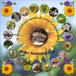
September 8, 2018 at 10:52 pm #21245The element I used was the Flair button, I don’t have the script if there is one. I made them all myself. I found some photos were better suited for the Flair button than others. The flowers in the corners were my own, which I extracted from photos. The only problem I had, if you can call it an issue, was spacing the buttons evenly apart from each other.
September 9, 2018 at 4:20 am #21248Sue, your photos are amazing and you had a good idea of using the flair buttons. Well done!
September 9, 2018 at 9:27 am #21249Thank you Christine. Sometimes I feel it would be nice to have diagonal guide lines. 🙂
September 10, 2018 at 5:43 am #21293What a beautiful job, Sue. I love everything about it.
~ Michele
September 10, 2018 at 9:35 am #21294Well done Sue! Clever use of the flair buttons and overall very pretty. <3
September 11, 2018 at 8:42 pm #21297Sue – how unique and pretty! Great Job!
Hugs,
DeLoris
September 11, 2018 at 9:09 pm #21300Sue – Very nice. I admire your curved text.
September 11, 2018 at 9:10 pm #21301Beautiful work. I can just imagine the problems with spacing the buttons.
September 12, 2018 at 11:59 am #21304Thank you all for your very kind comments. Once I had decided on an element to use multiple times, the rest fell into place, right down to choosing which background photo to use and text layout. Quite often I find it easier to start with one thing, and build around it. A tip I taught myself last night, (which I will share with you) as I wanted to replace the birds with all insects, as I’m a member of a macro photo club. I saved all of the buttons in PSP format. Rather than make the buttons from scratch. Using the same sizes, I added a new selected photo to one, placing the new photo above the original photo and below the coutouts. Marvelous, I didn’t have to recreate the cutouts all over again. I hope I’ve motived some of you to take part in the challenge.
September 12, 2018 at 2:20 pm #21306Hi Sue, this is really a good tip and saves lots of time! I will remember it next time.
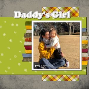
September 12, 2018 at 2:43 pm #21308This is my contribution to this challenge. I added 20 adhesive tapes, which I made using Cassel’s Adhesive Tape Script.
In order to have different papers, I watched a few of Cassel’s tutorials…
Plaid Pattern; Denim Texture; Grungy Texture and Textured Overlay.
I also used some papers from Sherwood “Season Change” freebies.
The title was done using Cassel’s StitchEdges2 Script.
Today I learned a lot 🙂
September 12, 2018 at 8:06 pm #21316Sue… a great effect with the flair buttons…
Cristina .. a creative idea to use adhesive tapes for this challenge .. a very sweet page.
best wishes to you both,
Dawn.
September 13, 2018 at 12:27 am #21317Christina – What a sweet picture! The plaid is awesome looking too. Nice job!
September 13, 2018 at 3:49 am #21318Dear Dawn, thank you so much for your kind comment! 🙂
Best wishes to you! <3 <3
September 13, 2018 at 3:56 am #21320Susan, thank you for commenting on my page!
I made the plaid pattern following Cassel’s tutorial… First I chose the colors, created a file and named color palette… From it, I made the plaid paper… Some of the colors I took from the photo and others from the internet (autumn colors).
Here is the color palette image
September 13, 2018 at 6:46 am #21321Lovely page, Cristina. Your color palette was perfect for that Autumny look.
September 13, 2018 at 9:18 am #21322Hi Michele, thank you so much for your kind comment! <3
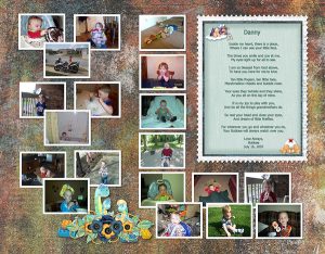
September 13, 2018 at 1:02 pm #21324Christina, I love what you did adding all the papers. Thank you for the color code! I made mine with a bunch of pictures of my grandson Danny. As you know, he is 11 now and not into having his picture taken. But, I miss the little man he was. Of course, I can’t tell him that. I don’t want him to feel bad about growing up. He is growing into an awesome young man. Very polite and thoughtful. The poem in my page I wrote for him when he was around 2 months old. I was rocking him and it just came to me and I had to write it down. I hope you enjoy it. This was a tough challenge for me especially since I only see out of one eye. I use the guides and do the best I can to get them even. I made one photo the size I needed. Then I selected it, added a layer and pasted the next picture into the selection. I de-selected and moved the top picture to where I wanted it and repeated the process till I got all my pictures loaded. I then used Cassel’s script to add borders to each one. I gave them all a double drop shadow so they would show up better on the dark paper. I’ll add the bigger picture to Facebook so you can see it better.
Hugs,
DeLoris
September 13, 2018 at 1:04 pm #21325Very sweet, DeLoris. I look forward to seeing it better on FB.
~Michele
September 13, 2018 at 2:06 pm #21326DeLoris, thank you for your kind comment! <3
Your page is just lovely! It was a lot of work but all worth it…And we can feel with how much love the poem was written… Great job!
September 13, 2018 at 5:30 pm #21327Thank you Christina! I’m pleased you liked the poem.
Hugs,
DeLoris
September 13, 2018 at 6:17 pm #21330Hi everyone! I had just finished lab 5- mod 12 about gears. Then I saw the 20 Challenge and thought 20 gears and from that thought steampunk. The photos are from CCFlickr under the attribution license, so there is no copyright issue. I made the gears, the eyelets (from another lab- lab5 mod9?), the two papers from lab6-mod1 Cathedral Window Pattern, and the fonts were Eagle Lake and Penguin Attack.
There are 3 gears in the upper left hand corner, but they are very hard to see. They did look good until I started fiddling around with other things and by the time I noticed, I had already merged several layers etc, etc, etc. It is what it is. I remembered to start out at 3600 and reduce to 600 for posting. I did forget to leave any space on the left hand side for printing. No harm this time, as this is my first attempt at this and I’m not going to print it, hehehehe. When I use my own photos (got to remember to take a camera with me when I leave the house) I’ll get down to journaling my pages. Thanks for looking.
September 14, 2018 at 12:47 am #21331I love this, Susan. Great job.
~ Michele
September 14, 2018 at 1:34 am #21332Susan, great layout. Well done!
September 15, 2018 at 4:52 pm #21337Oh my goodness such lovely work is being displayed here. I enjoy looking at the pages, reading the stories and getting ideas!
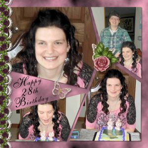
I over did it I ended up with 22 roses. I started with a pink background then added some layers and added some black brushes, some more transparent then others, by adjusting the layer blend and using blurs. I used a template for the shapes of the pictures and used my favorite script Cass Clip to it to place the pictures in the shapes. Added a couple of butterflies, lace and added drop shadows per Cassel’s guidelines.
September 15, 2018 at 7:50 pm #21340DeLoris, Susan and Royanne ….. your pages look great!….. well done to each of you!
best wishes,
Dawn.
September 16, 2018 at 7:22 am #21345Royanne, your page is absolutely lovely. I don’t think two extra roses disqualify you. LOL
~ Michele
September 16, 2018 at 7:23 am #21346Lovely work on here.
Sheila x
September 16, 2018 at 10:12 am #21351Royanne, great layout. Well done.
-
AuthorPosts
- The forum ‘Challenges’ is closed to new topics and replies.


