Home of the Scrapbook Campus › Forums › Showroom › Scrap Bootcamp – October 2022
Tagged: scrap bootcamp
- This topic has 113 replies, 15 voices, and was last updated 2 years, 1 month ago by
cindy harris.
-
AuthorPosts
-
October 12, 2022 at 3:07 pm #84396
Hi All, thank you for your art work ect
Linda did you get it now? I have to rewatch videos a few times I have learning disabilites, so when I can get it
I am so proud of myself, and 6 ft tall. 🙂 Hang in there You can do it, plus your good at explaining yourself thats a Win
October 12, 2022 at 3:36 pm #84398This is my submission for lesson one. Here are also the settings and how I work mostly. I made recently a wallpaper with the sizes 1920×1089 PX with the subject of autumn.
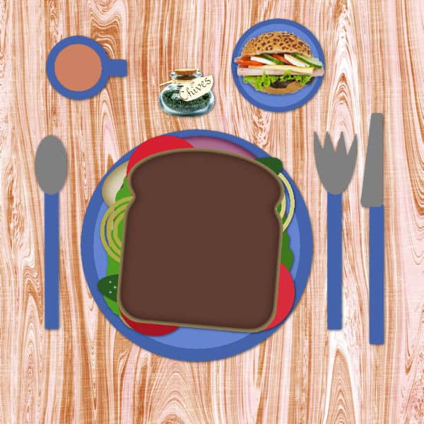
October 12, 2022 at 3:44 pm #84399This is my submission for lesson two. I was very hungry after working in the garden all day long, so I ordered an extra roll. We here can get extra dark bread. First, the wheat grains are roasted and ground after that it’s processed into bread. Some people like some do not. It’s not more nutritious as whole flour bread.
-
This reply was modified 2 years, 2 months ago by
Jannette Nieuwboer.
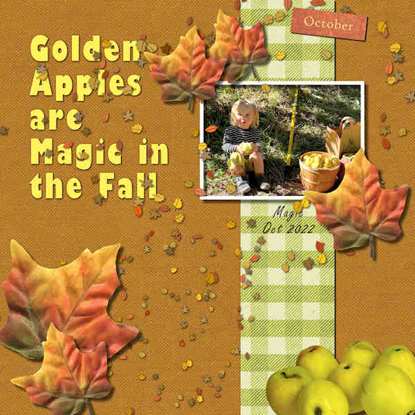
October 12, 2022 at 3:48 pm #84403Day 3 – My great-granddaughter Magic and her golden apples. I used the mini kit from the lesson and Carole’s scatters. The leaves are from a mini kit from MarisaL called Autumn. The apples are from a site called pngfind. The title font is Gill Sans Ultra Bold and the text under the photo is Freestyle Script.
Edit: I realized the sun was from the wrong side on the photo so I mirrored it horizontally.
-
This reply was modified 2 years, 2 months ago by
Ann Seeber.
October 12, 2022 at 4:04 pm #84407brand new tq all of this – first try
October 12, 2022 at 5:15 pm #84410seems my post disapears when I try to link to the gallery…
So I post again: Project 1
My son Dennis and my grandson Jonas (son of my daughter)Credits:
Jessica Dunn: My Tribe
Sahin Designs: Digital Day
font: Go Panda
photo: personal
-
This reply was modified 2 years, 2 months ago by
Cassel.
-
This reply was modified 2 years, 2 months ago by
Patricia Felix.
-
This reply was modified 2 years, 2 months ago by
October 12, 2022 at 7:23 pm #84413Here is my best shot.
 October 12, 2022 at 8:16 pm #84423
I downloaded a mini kit from Curiousity Pantry called Golden Hour, some sea shells and some confetti from Pixelscrapper. The font is Annabel 1 and I applied a PSP layer style.
October 12, 2022 at 11:25 pm #84441Patricia (#84378), what browser didn’t work? I am using Chrome and never had issues. In the future, if any post does not seem to show up, click on the yellow tab on the right of the page and let me know. Checking in the backend, that is what happened. You have a delicious sandwich. (#84410) Great use of the shadows. I have one question though: did you happen to squeeze the photo to fit it in the frame? I have a suspicion that it was either stretched sideways a bit or squished vertically to fit. If you need to fit an image into a specific frame, check this article.
Donna (#84387), I find that Layer Styles in PSP are underwhelming as they use familiar “tools” with unfamiliar “settings”. I think it is sad because that feature has a lot of potential! (#84423) You are using shadows a bit inconsistently. Notice that the shadow is upward on the confetti, but downward for the title. Consistency is important to give a cohesive feeling.
Susan (#84391), it makes sense for you to use that “new” materials palette then! For me, those settings are mostly of no use, which is why the “old” one is better for me. Let us know how your lunch goes down, after you have your tea.
Jannette (#84398), I see you still have tabbed windows. At one point, if you like to see more of the elements you work on, just remember to untab those. (#84399) That bun has extra meat too!
Ann (#84403), that is a great observation about the sun on the photo. Although that is not technically an error in shadows, it is worth considering. Beware, however, that mirroring a photo of a person will actually change their facial features, mostly for those who know them.
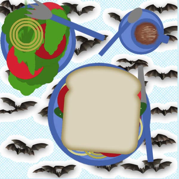
John (#84407), welcome to the Campus and the Bootcamp. That seems like a fun Halloween lunch!
James (#84413), that is a wonderful shot! Definitely worth showing off!
If you have not finished your first project, don’t worry, the next project is only going to be posted on Friday so you still have a full day.
October 13, 2022 at 2:55 am #84451Cassel, yes my photo got squeezed a bit, I chose ‘make image the same size’, since I had another picture first, but I had cropped the first one.. I only noticed after I uploaded.
It took some try and error to come to grips with the shadowing in PSP, but I learned a lot…
Thank you for your nice comments and your help.
-
This reply was modified 2 years, 2 months ago by
October 13, 2022 at 10:51 am #84473Hello All Love you all s Work Art Projects, your all so good.
I have fun doing this it was the best I felt about one of my uploads. 🙂 I used the kit Carole gave a link to
what nice people she knows, Sharing
-
This reply was modified 2 years, 2 months ago by
October 13, 2022 at 6:02 pm #84478I’ve changed some of my settings Carole. Dragging is going well now. See here the result.
October 13, 2022 at 7:39 pm #84480Day 3 My great great niece was fishing for the first time at my Sister’s pond and caught this nice fish. (it was released back into the pond) I know I used a lot of scatter, but decided to keep all of it because it made the page look more girly.
October 13, 2022 at 8:06 pm #84481Project One done. Photo is from my summer photo project that keeps on going (taken October 10th, when it should have snowed already but was over 20 degrees celcius!). Papers and hearts from Digital Scrapbook.com. Font is El Capistrano Serif from Creative Fabrica. I used pictures tubes from PSP as my scatter as I couldn’t find scatter that I like. Carole did you make these picture tubes (in PSP in just says “flower – and then a number). They came in very handy. I put an outline on the title so it would show up a bit more, I wanted it subtle so I didn’t make the yellow vibrant.
Good work from everyone, enjoyed the layouts I’ve seen so far.

-
This reply was modified 2 years, 2 months ago by
Susan Ewart.
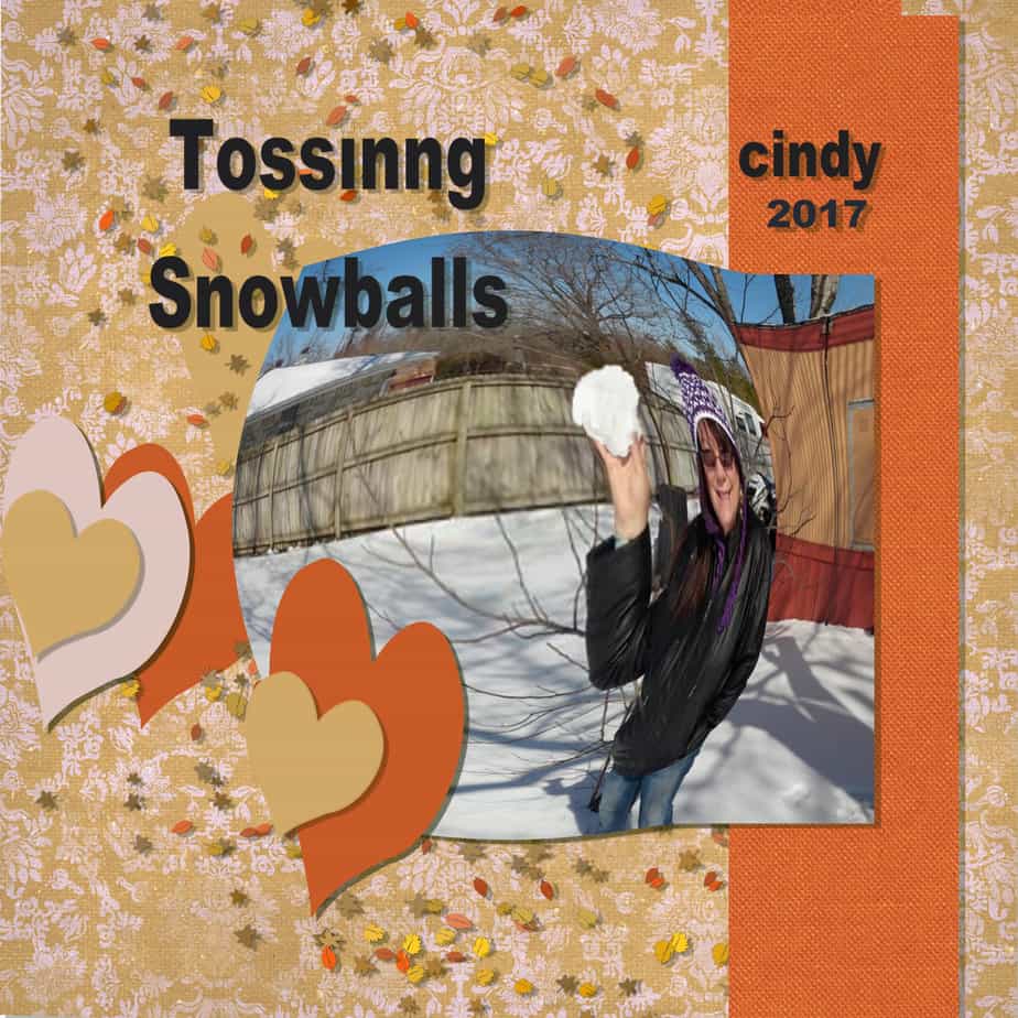
October 13, 2022 at 10:24 pm #84490Cindy (#84473), it is a fun effect you used with the Warp Brush to associate with a snowball!
Jannette (#84478), one trick I found was to have the source image to the left, and the target on the right so when I drag from the layers palette onto the image, I don’t have to worry about accidentally dropping it in the wrong image!
Anne (#84480), those are cute fish and very nicely fitting the theme and the photo.
Susan (#84481), those picture tubes are very old, but always useful! You are right to choose a not-so-bright yellow; it is well-coordinated.
Tomorrow, you should get the second project to do.
October 14, 2022 at 10:26 am #84497Day 5 – Adventure Park – My title is Magic has Wheels! Her first bicycle (though her parents pointed out there are no pedals, so it’s under “foot power,” which is appropriate for a 2-year-old toddler.) Carole, I tried to use the bird from the second kit but it doesn’t have a transparent background. The title font is called Heavy Boxing Script.

-
This reply was modified 2 years, 2 months ago by
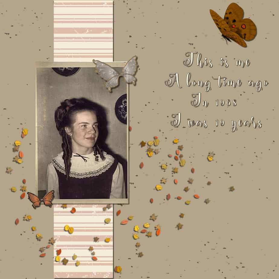
October 14, 2022 at 3:39 pm #84501This is lesson 3. An old photo of myself. I did not fix the photo and kept it like it is now. I used some material I had in stock. I made the shadows 10, 10, 60, and 10. As suggested. Except for the white butterflies, those got a bit more, 15, 15, 60, and 15. As I thought the butterfly is a bit bigger and has more depth.
October 14, 2022 at 9:04 pm #84513This is my granddaughter and her imaginary trip to Africa. I used paper from Pixel Scrapper and images from Pixabay.
 October 15, 2022 at 12:44 am #84551
Ann (#84497), my grandson also got wheels with no pedals. Apparently, it is a new thing as it is easier for them to learn their balance before adding pedals.
Jannette (#84501), the size of the shadow seems correct, however, it seems like they are in the wrong direction in the scattered leaves. They look like they are on the left instead of the right.
James (#84513), that is a very interesting composition. Did you build that top photo or are there that many animals in one place?
October 15, 2022 at 1:08 am #84552Project 2 – Adventure Park….well Adventure at the Water Park in this case. I oriented the photo on the left side because the birdy action was drawing my eye to the right. Papers, flower and two birds (the spitting image of the real blue jays that come to my yard ?) come from Digital Scrapbook, the fonts are all windows, Gill Sans Ultra bold, Gill Sans MT and arial for the writing on the side of the photo. I love Gill Sans Ultra Bold. I stretched it up a bit to make it taller. The photo is mine. There was a furry of LBJs (little brown jobs – what we call little birds) to one of my 3 baths. I didnt get to my camera fast enough, at one time there was about 7-8 in the bath at once.
 October 15, 2022 at 4:09 am #84554
Indeed. you are right. The scatters were in my text so I decided to move the photo etc. to the left en flipped the scatters. I forgot the shadow was already on it. I have to pay attention to that in the future. as long as it’s in PSP everything seems ok. You can only see the result when it’s on the forum. So next time I will make the outside line of the text heavier a 3 or 4 when I use filled text. Now was it a 2. That scatters were yours. ?
October 15, 2022 at 6:44 am #84555My grandson Jonas, 30 minutes young. I was at my daughter’s side and saw him being born. Awesome!
Credits:
jessicaDunn: Baby Shower
fonts: Bremen Bd BT & Lemon Tuesday
photo: personal
-
This reply was modified 2 years, 2 months ago by
-
This reply was modified 2 years, 2 months ago by
-
This reply was modified 2 years, 2 months ago by
October 15, 2022 at 8:41 am #84556Patricia Felix: Very nice introduction to your grandson. I like the font you used for the title: Welkom Jonas. Can you tell me the name of the font? Thank you!
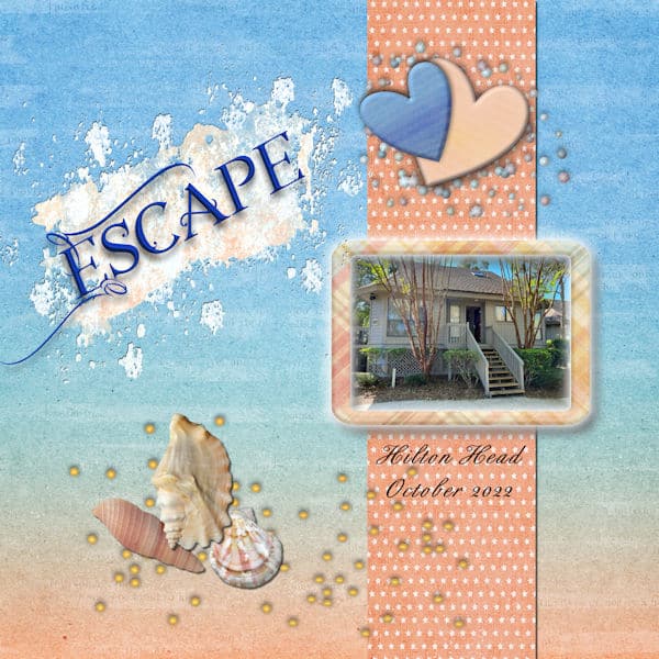
October 15, 2022 at 12:22 pm #84560I thought that I submitted this yesterday, but now can’t find it. Once again I used the cpjess-minikit golden hour with some additional downloads. The font is Broadway Bold, and the photo is a self taken at the beach in Hilton Head.
Carole, I tried very hard to follow your instructions on shadows for everything except the title which I had to reduce to 5.
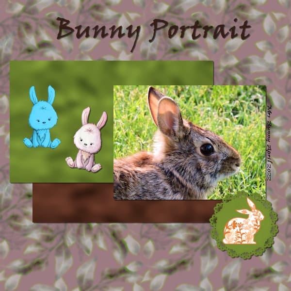
October 15, 2022 at 1:03 pm #84562Day 5– I was looking at my photos form this year and found a nice clear close up of a rabbit in my yard this spring. The title is Viner Hand ITC.
October 15, 2022 at 4:56 pm #84573Hello
Love you all’s work Many redos but finally got it
Thank you for the kit and instruction.
-
This reply was modified 2 years, 2 months ago by
October 16, 2022 at 8:14 am #84623Ann Seeber: I always put the credits in the gallery!
It is Bremen Bd BT, it is a free font. Just google ‘Bremen font’. You can find it at different font sites.
-
This reply was modified 2 years, 2 months ago by
October 16, 2022 at 9:16 am #84626Cindy – Adventure is beautiful. Colors appeal to me – they are soft – go well with the photo; and your frame is beautiful.
October 16, 2022 at 11:10 am #84635Project 3:
Magical Scraps Galore: Boys Rule
Day Dreams ‘n Designs: Scraps N Pieces BT 01-2016 (glitter)
fonts: Landliebe & KBA Stitch in Time
photos: personal
-
This reply was modified 2 years, 2 months ago by
-
This reply was modified 2 years, 2 months ago by
October 16, 2022 at 11:12 am #84637Susan (#84552), that is still an impressive photo! You are also right about placing a photo to the left or right. Typically, you want to draw the viewer’s gaze toward the center of your project. The same goes for painting and photography in general.
Jannette (#84554), that is what I suspected: a rotation after the shadow was added. It is such a common detail we forget!
Patricia (#84555), did you happen to change or move the image in the gallery? It does not show in the forum anymore. (#84635) This one shows fine, and he is a cutie! Good work.
Donna (#84560), that does have a really “beach-y” feel with that kit! Your shadows are good. With practice, you will see that some elements, like the seashells and the flowers can accommodate even larger shadows as long as the blur is also increased and the opacity slightly lower. It does take practice.
Anne (#84562), that was a cutie of a bunny!
Cindy (#84573), you are getting better and better! I think that your page could use a different title. You don’t have to use the same one as in the lesson since you don’t have the same photos I use. What would you title that page?
-
This reply was modified 2 years, 2 months ago by
-
AuthorPosts


- The forum ‘Showroom’ is closed to new topics and replies.


