Home of the Scrapbook Campus › Forums › Showroom › Scrap Bootcamp – July 2019
Tagged: Day 7
- This topic has 135 replies, 18 voices, and was last updated 5 years, 4 months ago by
Cassel.
-
AuthorPosts
-
July 28, 2019 at 12:26 pm #32652
Edie, Thanks for the tips on getting my computer to work with the program better. I”ll give it a try on next assignment for sure. : )
July 28, 2019 at 1:52 pm #32667July 28, 2019 at 3:41 pm #32691Here is my lunch for today.
July 28, 2019 at 5:10 pm #32696I have no idea if I am posting this in the correct spot. Hope so.
I thought the flag in picture deserved an American theme.
July 28, 2019 at 6:03 pm #32697Rhonda, Often with older computers reducing the size and resolution makes a big difference,
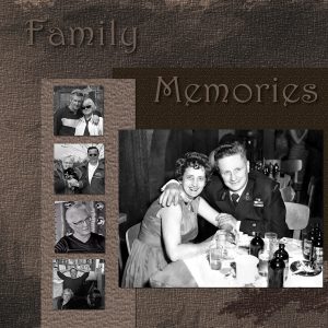
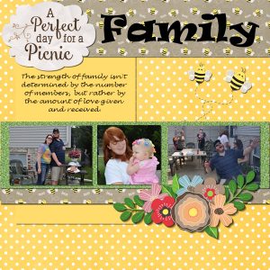
July 28, 2019 at 6:06 pm #32699I created this one for my Husband’s family his sister and her daughter are big time scrapers, her daughter has a room set aside to do it.
July 28, 2019 at 6:34 pm #32701July 28, 2019 at 8:11 pm #32710Jerri, Nicely done!
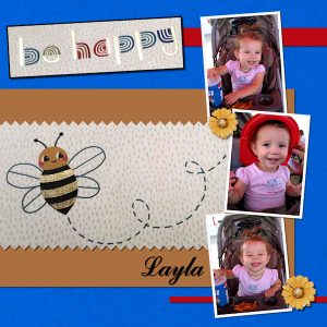
July 28, 2019 at 9:25 pm #32731Day 6. I snapped a photo of the little bee from a book my friend had. I had intended to remove the background and just use the bee graphic but I did not have the patience to do that today. I still struggle with trying to use someone’s layout and am trying to force myself to get use to doing it. So far I have not succeeded. My style is to take a photo and get my inspiration from it and create things on my own. I do know that the layouts are only a guide and I do not have to use them but I just need to learn to do it for myself and have the outcome be something I like. It is kind of a ME challenge. LOL
July 28, 2019 at 9:27 pm #32732I learned something new for PSP today and that doesn’t happy very often anymore. I had never copied text from Notepad++ into a selection. This worked very well until I resized my image to 600 X 600. The text disappeared! I located it way below the image. When I moved it back over my image, it was still at the original size. I tried resizing just that layer and it would not resize the text. Couldn’t resize with the pick tool either. I converted the text to raster and that did work.
Thanks for the bootcamp, Cassel. It has been a busy, but fun, week. Here’s my last project.
July 28, 2019 at 9:40 pm #32733Linda, this behavior is a sort of an “annoyance” (not really a bug, even if it can be bugging us). It happens because your text is inside a selection and when you resize a canvas, a selection would not resize along with it if you had it, so this text is kind of behaving the same way as it is stuck at the location of the initial selection which is kept in the memory of the image. Converting to a raster will do the trick, but make sure you keep a vector copy at full size anyways, just in case you need to come back to it for any change in the future.
July 28, 2019 at 9:49 pm #32734Wanda, as it is an “exercise”, the idea is mostly to use the different techniques. If you use them while you re-arrange the elements on your page, it is ok. As long as you practice the same thing, everything is fine. On the other hand, if you want to CHALLENGE yourself to do something that is different or uncomfortable for you, it is fine too! There are many ways to learn.
July 28, 2019 at 9:51 pm #32735Edie, aren’t you smiling when you can do as much scrapbooking as you want without the need for a whole room in the house to store supplies and work!? 🙂
July 28, 2019 at 10:05 pm #32736Jerri, you are catching up nicely! On your America layout, if you want to keep realism intact, you might want to consider placing the curly ribbon on top of the photo instead of underneath.
Rhonda, the disappearing text is something known (and annoying) and happens only when you use the Text wrapping. In order to avoid it, you can either duplicate the text layer and convert it to a raster before resizing OR you can make a duplicate of your image, flatten it and then resize (leaving the original intact). As for the shadows, don’t worry; it seems to be a learning curve for everyone so you are in good company. And as far as making basic pages, that is totally fine. Simple layouts can be just as effective as complicated one and it is easier to apply new skills to something simple than getting lost in a ton of stuff on a page.
Linda J, of course, we always learn by mistake. At least we remember more once we make a mistake once (or more than once!). Did you end up getting the video to play all the way through?
Susan, I don’t find your outdoor layout “too busy”. In fact, I find it suits perfectly the outdoors as there will be lots of things outside, trees, paths, rivers, etc.
Linda, when creating a layout, choosing photos is usually taking half the time of the whole project!
July 28, 2019 at 10:40 pm #32737Wanda, I’m with you using others templates and stuff don’t work for me either unless it is a crash job for someone else. LOL
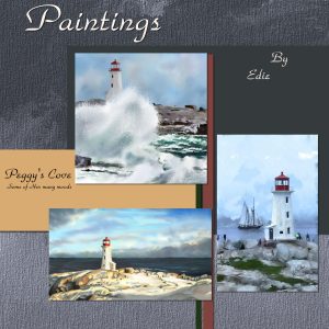
July 28, 2019 at 10:44 pm #32738Yep! That is also why I now paint digitally it take up less space and no mess!
July 28, 2019 at 11:10 pm #32741Yes I do like to challenge myself. That is why I keep doing these projects over and over. I believe this might be my 3rd bootcamp. Not sure though. May be 2nd
July 29, 2019 at 8:29 am #32749My flowers this year.
July 29, 2019 at 10:31 am #32767Here is my Day 7. I used the same kit “Seaside Holiday” by Kim Broedelet. Font: Black Butter.
I really enjoyed participating in the challenge. It is always an opportunity to learn and practice the tutorials.
Thanks, Carole!
July 29, 2019 at 12:21 pm #32771I am way behind! My son called 2 am Friday morning saying they were coming to visit. Was not prepared for the surprise! Anyway, here is my second project!
patti
July 29, 2019 at 2:05 pm #32773Here is project 3. It is so much easier putting a page together when someone (Carole) is guiding you!
July 29, 2019 at 3:40 pm #32785Fourth Project.
July 29, 2019 at 4:08 pm #32787This challenge took me a while. It was fun to do though.
July 29, 2019 at 4:11 pm #32788Thanks you Edie. I am not sure I am posting in the correct area.
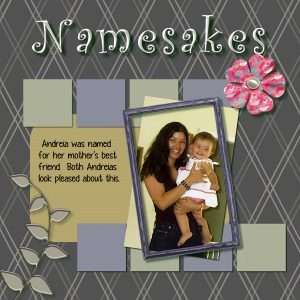
July 29, 2019 at 5:06 pm #32789Linda, in your layout Namesakes, have a peek at the leaves on the bottom left. Notice the edges of the leaves: the dark edges are facing up while the light edges are facing down. This is inconsistent with the shadows you added everywhere else on your layout. That particular element would probably need to be flipped upside down, if you can find a way to incorporate it in the existing arrangement.
Edie, you have very nice flowers!
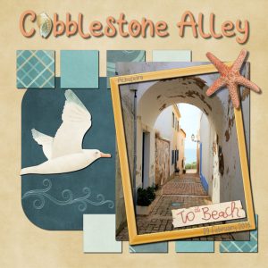
Cristina, do I see that the shadow on the starfish is a bit large than the one on the frame? That is a great little detail to think of.
Patti, you really caught up very well with those three layouts.
Jerri, it looks like you might have squished someone on your photos. You have to be very careful when resizing an image to NEVER resize up/down or left/right, but always with a corner handle while the Pick tool is set to Scale. If needed, you have to crop the photo but never try to fit it in. And yes, you are posting in the right place.
July 29, 2019 at 7:09 pm #32793Day 7
July 29, 2019 at 9:56 pm #32821Wow, wow, wow! So much to learn in this lesson too!!! Lots of tricks!
I got busy with life yesterday and today too.
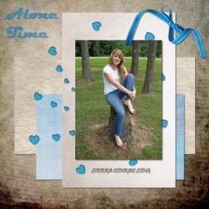
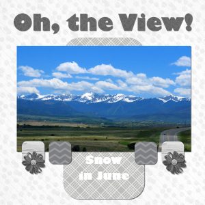
I wanted to use monochromatic papers so the photo would star. But I need to practice more. Not sure I am completely happy with this one, but here it is.
July 30, 2019 at 10:39 am #32831Carole, yes, the starfish shadow is larger than the frame one. Everything I know about shadows I’ve learned from you in the last few years, and I still have a lot more to learn. I added shadow presets to the PSP based on your tutorials, like paper shadow, reverse, flower, button, and so on.
July 30, 2019 at 11:21 am #32833Last Layout finally done!
July 30, 2019 at 12:24 pm #32839Bravo pour les belles pages ajoutées!
-
AuthorPosts
- The topic ‘Scrap Bootcamp – July 2019’ is closed to new replies.


