Home of the Scrapbook Campus › Forums › Showroom › Scrap Bootcamp – July 2019
Tagged: Day 7
- This topic has 135 replies, 18 voices, and was last updated 5 years, 4 months ago by
Cassel.
-
AuthorPosts
-
July 23, 2019 at 11:00 pm #32110
Glad that you learned something new, Rhonda!
July 24, 2019 at 9:34 am #32161Are we going to get more sandwiches? It seems like many participants will go hungry this time around!
Have fun with it and show us your lunch! You will need energy before starting the “real work” today!
July 24, 2019 at 10:51 am #32166Having trouble uploading here. Probably because I am too tired (it is nearly 1.00 am). Hope to have better luck later in the morning.
July 24, 2019 at 10:56 am #32168DAY 3: Picnic at the Beach
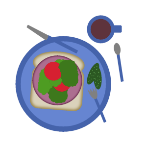
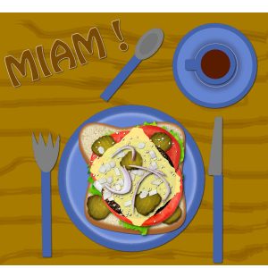
July 24, 2019 at 11:03 am #32170my open-faced sandwich with a cup of coffee
July 24, 2019 at 11:19 am #32171Eileen, are you getting an error when you upload? Points to consider;
- you cannot upload a .pspimage file. If you want to show your work, you have to save it in a .jpg format
- you need to resize the image; if you try to upload a very large image, it won’t like it. Resize it to 600 pixels for better results
- are you cliking the Upload images button at the bottom of the box when you write your post?
Rhonda, are you placing the shadows on the bottom left on purpose? Just a curiosity question. Your shadows are all consistent, which is what is required. It is just less common to have it on the bottom left, as we tend to use the bottom right. But as long as you are consistent, it would be great. May I suggest that you either resize or arrange your title so it does not go on top of the paper? The paper has a shadow (perfect) but then, the title does not and if it is “printed” on the paper, it could not go on top of that paper. Just a little detail.
Patti, I guess you don’t need a saucer if it is a cup of coffee! 🙂
July 24, 2019 at 11:52 am #32172Yes, I put the shadows off to the left because my photo shows the sun coming from the right. I wanted it to look kind of like the shadows were falling from the direction of the sun. I did have a shadow under my title for awhile but then you mentioned not needing shadows under text so I removed it. LOL I can certainly put it back as I really did like it better with the shadow. I can play with moving it as well so that it doesn’t cover the band, I just thought it looked more balanced…however it did take away from the last few letters being as noticeable.
July 24, 2019 at 12:06 pm #32174Rhonda, I am glad to hear that it was all thought out. Shadowing is often challenging since it is the kind of details we normally don’t notice until we have to add it. You typically don’t need the montage shadow to match the one IN a picture because the picture will always be perceived as a “printed version” in a paper format. Otherwise, you migt get stuck if you ever have 2 photos with different shadows.
As for the text, if it is considered to be cut out from paper, then it will have a thickness, therefore a shadow. If it is printed, then no shadow is needed.
July 24, 2019 at 12:27 pm #32192First project!
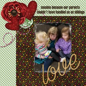
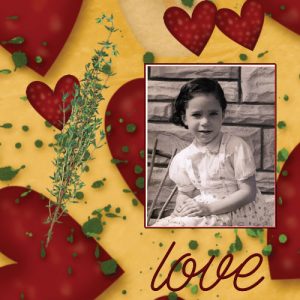
July 24, 2019 at 12:32 pm #32193Patti, that is such a fun title!!! May I suggest one tweak on your layout? One heart (which is supposed to be thin) is overlapping the flower (which is supposed to be thick). It would not make much sense if you had those in tangible format, so if you would move the heart from the overlapping position to a different location (or stuck under the flower) it would look more consistent. 🙂
Great work!
July 24, 2019 at 3:09 pm #32224It is my third time participating in this challenge, and every time I learn a little bit more.
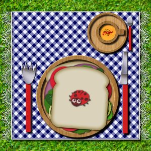
Background: PSP realistic grass tube. I made the placemat following Cassel’s tutorial – Creative Scrap>Paper>Gingham pattern. I added a lace edge to the placemat (Cassel’s tutorial Creative Scrap>Edge>Lace Edge) and also added Cassel’s bead art ladybug freebie (Beads Art Script).
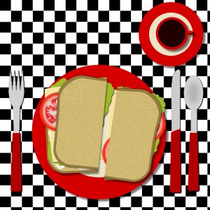
July 24, 2019 at 4:18 pm #32226My Day 2. I have done this one so many times I decided to just make my own dishes and sandwich stuff to have a bit of change.
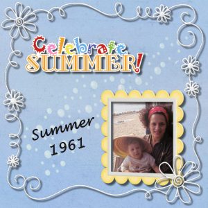
July 24, 2019 at 6:42 pm #32230My Mom and me….
July 24, 2019 at 8:58 pm #32233It’s almost as exciting as Christmas – I’ve completed my very first scrapbooking page!
July 24, 2019 at 9:14 pm #32234Cristina, I guess a ladybug is better than ants!!!
Wanda, the red dishes and silverware really stand out well on that checkerboard placemat!
Susan, is that you in the picture? If the child is you, we are pretty much the same age! If you look at the shadows, they seem to be a little wide, which makes the elements (and mostly the string) look like they are off the page, like they are floating. Don’t worry, those darn shadows are always challenging!
Linda, congratulation on your first scrapbook page! How does it feel? 🙂
July 24, 2019 at 11:19 pm #322361st layout assignment!
I learned a few things!
Do we have to upload the day of the assignment?
You can’t drag an element from one window onto the page?
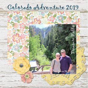
A month ago, the 5 of us took a trip across the country for our daughter’s wedding….I have a few photos!
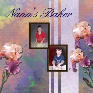
July 25, 2019 at 12:23 am #32241My little Baker at 3 and 5 he is now 11. I created my own Papers in Painter 2020, and used my iris Tube.
July 25, 2019 at 1:32 am #32243Yes Carole, I am the baby in this picture. I was born in Feb of 1961, but I should have put summer of 62, since I think I was already walking in that picture.
July 25, 2019 at 5:24 am #32245Carole, I agree! I was inspired by Linda’s comment about ants. I didn’t have any, but I remembered I had these cute “Bead- Art-Critters” freebie.
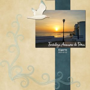
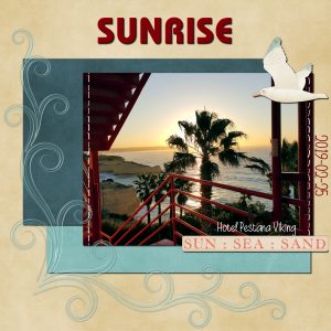
July 25, 2019 at 10:21 am #32269Here is my Day 3. I used the “Seaside Holiday” free mini kit from Kim Broedelet. Font: Beauty And Love Script
July 25, 2019 at 12:34 pm #32291July 25, 2019 at 2:02 pm #32307Hi everybody
Here my day 2. The sandwich was made with Hamburger and Bread 2 scripts. Toppings with Burger Toppings PSP Tubes. Sliced onions (picture tube) from the Pizza script. Processed cheese is a simple deformed rectangle.
July 25, 2019 at 3:57 pm #32331Hi Everyone
Here is Day 4. I used the same kit “Seaside Holiday” from Kim Broedelet, and added “running stitches” by Sheila Reid.
Fonts: Bauhaus C Medium and Beauty and Love Script
July 25, 2019 at 5:45 pm #32339July 25, 2019 at 9:31 pm #32365I’m not really happy with this one as some of the elements I made didn’t work out, and it is a bit sparce.
July 25, 2019 at 9:42 pm #32366Edie I like your page. Not too happy with mine but have felt kind of blah today
July 25, 2019 at 9:47 pm #32368Carole I am attempting to send Day 3’s picture. I hope it gets there this time.
July 25, 2019 at 9:58 pm #32369Sara, it worked!
July 25, 2019 at 10:05 pm #32370Wanda, we all have days like that, your page is fine!
July 25, 2019 at 10:42 pm #32372Had trouble with the text. It would show up in the layers as a ‘floating selection’? And when I tried to move it, I couldn’t. I had to trash a few layers a few times before I got it to work.
Kit is Cottontail & Co. Add On by Melissa Bennett
-
AuthorPosts
- The topic ‘Scrap Bootcamp – July 2019’ is closed to new replies.


