Home of the Scrapbook Campus › Forums › Showroom › Scrap Bootcamp – April 2022
Tagged: Still on Friendship
- This topic has 146 replies, 21 voices, and was last updated 2 years, 7 months ago by
Sharla.
-
AuthorPosts
-
April 13, 2022 at 4:10 pm #75218
I agree with Mary, Nel (#75198) and Susanne (#75213) have beautiful layouts.
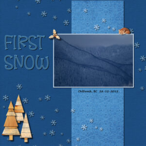
Here is mine. Papers, trees and snowflake scatter are from Digital Scrapbook. Little fox from Creative Fabrica. Photo is mine. Fonts are Loving Austin (from Creative Fabrica) and Segoe Print (windows font).
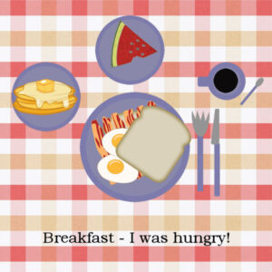
Ann, I love you plate, I’m going to have to learn how to cut my sandwich…I am supposed to be civilized after all ?.
I added the fox cause he is cute and the right color and why not? I hope I got the shadowing right on him, didn’t make sense to have it below him as he’s supposed to be laying on the frame.
April 13, 2022 at 7:22 pm #75227Hi everybody, Here’s my effort for Project 1.
April 13, 2022 at 9:09 pm #75235Yes Susan, I need to learn how to cut my sandwich too!
Carole, I got the bacon at https://www.digitalscrapbook.com/
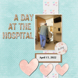
Project 1–I spent today at the hospital with my husband, for a procedure he had scheduled. The font is Jt Distressed, which I think probably describes my husband today/tonight. We got up at 4 am, to be at the hospital at 5:30 am. Long day. It is my prayer that he sleeps well at the hospital tonight.
April 13, 2022 at 10:45 pm #75242Sandy (#75180) glad that you are getting answers to your questions. Everyone has been a beginner and your questions are certainly helping others.
Nel (#75198) glad to see your first project. If I can offer a suggestion, for the confetti, make the shadows smaller and less blurred because they are small and flat on the paper.
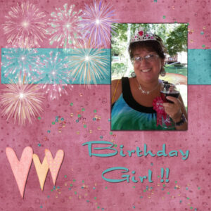
Suzanne (#75213) yes, the sandwich exercise is just an exercise, but it is always fun to share and read the stories that everyone is posting. Your birthday girl project is lovely. You are very consistent with the shadows too. Good job.
Susan (#75218) although the fox is a bit small on this resized version of the layout, it looks like the shadow is correct. What is important is that you actually questioned it instead of just applying a “standard” shadow. By asking yourself the question, it shows that you understand the principle.
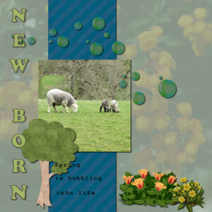
Alan (#75227) that is an interesting way to put the title. Not many people use the vertical text! May I suggest that you move the text a little so it would not overlap two different surfaces?
Linda (#75235) I never expected that we would get a “live” event in our projects of the day! 🙂 It is great that you added a piece of solid color for the text. It makes is always easier to read.
I know that this is coming toward the Easter weekend and some might be away from the computer. I will still be around if you have questions. And keep your projects coming!
April 13, 2022 at 10:47 pm #75244Anonymous
- 335

- Enthusiast
Here is my result for Scrap Bootcamp – April 2022 Day 3
I used my previous work as a template – I’m getting really lazy…
but why reinvent the wheel – huh
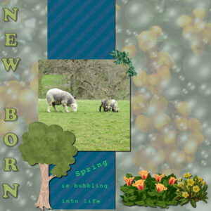
the image dawn is from cellphone 🙂April 14, 2022 at 12:09 am #75245Alan what sweet picture, baby lambs, it doesnt get much cuter than that.
Linda, I hope everything is going well and your hubby is well rested (as one can be after a procedure – I’ve had back surgery so I get it about not sleeping in the hospital). I’m blown away you could make a layout while being there.
Pirkko, Wowzers! that’s are beautiful sunrise and layout. I love how the sun is shining through your yellow strip. Very cool.
April 14, 2022 at 9:16 am #75251Yeah… my second bootcamp.
I was inspired by the sandwiches made by Pirkko, Alan, Ann, and Linda and just had to have a go at doing it differently. Additional images are from digitalscrapbook.com
Carole – the sandwich exercise is a great way of teaching and showing how layers work in paintshop pro. Thank you
April 14, 2022 at 1:31 pm #75253Wow. There is so many great layouts in here. Here is my try with the sandwich.
April 14, 2022 at 2:03 pm #75254Susan – He is home and sleeping now….but last night at 11 pm they had to take him back into the OR because of bleeding. I didn’t do the page while I was at the hospital, but in the evening when I was home….and before I had to run back to the hospital for the ‘back to the OR’ emergency. Time for both of us to get some rest.
I see some creative meals!
Yes, we are heading into Easter weekend. I will be cooking. We no longer have little kids, and no grandkids, and given the past few days, it is going to be pretty low-key and scaled back here, as we celebrate the Resurrection. I will be watching for new posts.
April 14, 2022 at 2:17 pm #75256my sanswich for this round i resized my knife and my sandwich and added a background
April 14, 2022 at 3:01 pm #75268Hi everybody, Tweaked my first layout for project 1. Its more pleasing to my eyes.
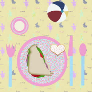
April 14, 2022 at 6:45 pm #75304Here is my table and sandwich. I decided to make it a half sandwich and use a child’s theme for the whole thing. The tablecloth, cookie, and ball were all downloads from Digitalscrapbook. The center of the plates I filled with a pattern I created from the Spring Palette colors.
April 14, 2022 at 7:07 pm #75305OK. Lots of more questions. Once I have finished setting the table with the sandwich minus tablecloth ( haven’t found a way to put that on the table yet), how do I save my work so I won’t have to start from scratch next time. I noticed that when I click ‘save’ it will only save one highlighted picture, so when I get back next day, being as slow as I am, I have to restart all over again…good practice, but it’s like one step forward and one backward! Still on lesson 2 ?
And…when I have the table setting as I want it, how do I get it to ‘merge’ in one image rather than a collection of layers?
-
This reply was modified 2 years, 8 months ago by
Sandy Stevens.
April 14, 2022 at 7:26 pm #75309Sandy, if you save your work with Save as… and choose the .pspimage format, it will keep all your layers intact so you can continue your work later, or revisit it if you change your mind.
If you want to merge it, you can simply save it as .jpg and it will automatically merge all the layers into a single one, which you can then post (but you will also have to resize it to 600 pixels and save a copy with -600 in the filename so it won’t overwrite the “good” version).
April 14, 2022 at 9:17 pm #75312Hi everyone,
I finally have time to play catch-up and am going through all the emails and tutorials. I’m using 2021 Ultimate and my workspace is set to dark grey and background is med grey. I don’t really do scrapbook pages, I just edit photos but have been wanting to learn more about layers and layouts. I used to print out photos all the time then when I went to a DSLR I didn’t have film to print anylonger and now they all sit in my computer. The picture I used is my sister, I made her wear the crown, fairy wings, and the birthday girl button for her birthday a few years ago. She was a sport and humored me!
April 14, 2022 at 9:39 pm #75313Sandy – the ‘table’ is just a layer under all the other layers. And, if you have more than one file open, when you ‘save’, it is saving the one that the title bar is active on. If you click on the title bar of what you want to save, and save as a PSP image, all the layers will be there the next time you open it. I hope that makes sense. Carole Cassel is very good teaching and walking you thru the steps!
April 14, 2022 at 10:22 pm #75317She is…just amazing! And just what I needed…
April 14, 2022 at 11:55 pm #75318Pirkko (#75244) I LOVE how your page turned out!!! That is stunning!
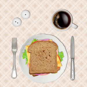
Sharla (#75251) I am glad you like this exercise. That is exactly why I created it because layers are so important. I guess I will go get myself some bacon, as it is making me hungry!
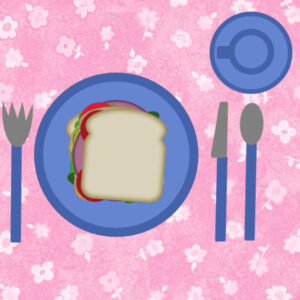
Suzanne (#75253) I see some different cheese in there too! I also gather that your silverware is probably easier to handle than my “blocky” ones!
Linda (#75254) I hope he feels better and everything will settle for him.
Liz (#75256) what will you drink? You might be like me. When I was growing up, my mom always said we could drink AFTER the meal, not during.
Alan (#75268) yes the difference is notable. Isn’t it amazing how some small changes can make a project so much more eye-pleasing?
Anne (#75304) I guess kids have a smaller appetite so a half sandwich is enough for them!
Sandy (#75305) looking forward to your lunch!
Megan (#75312) welcome to the Campus and the Bootcamp. Even as a non-scrapbooker, going through the exercises will give you some practice with the various tools, and you might get some ideas to showcase your photos too (we have several other non-scrapbookers in the Campus).
Tomorrow, you should get the second project tutorial. If you have not completed the first one, don’t worry, you will still have plenty of time to catch up.
April 15, 2022 at 11:22 am #75322Leuke opgave. Ga het gebruiken voor het fotoboek dat ik van mijn reis in Gambia gemaakt heb.
groetjes,
Nel
April 15, 2022 at 12:09 pm #75325Boot camp day 3 The photo is mine, everything else was downloaded from various sights. I have started saving where I download from now, but I did not have that info on these.
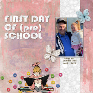
April 15, 2022 at 3:15 pm #75336Finally got to do Project #1 – this is First Day of (Pre) School featuring my son-in-law, Ernie and my great-grand, Sonya. This just happened last week. Sonya will be two at the end of June. The title font is Bauhaus and the rest is from various unlabeled kits. I know the girl reading the books is from a kit called 1-2-Buckle-My-Shoe. The background paper is from Marisa Lerin Good Life May 21.
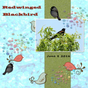
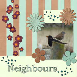
April 15, 2022 at 4:14 pm #75342Okay, project 1 with a cute blackbird and sparrow.
I used 2 kits both from digitalscrapbook.com – gina-jones scatter elements and Mint & Brown Mini. The photo is one of mine.
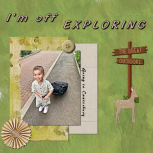
April 15, 2022 at 4:47 pm #75345Hi Everybody, Here’s my effort for Project 2. Getting good ideas from looking at other peoples’ layouts.
April 15, 2022 at 5:08 pm #75348Hi All, Checking my effort for Project 2, I noticed the doe had no drop shadow.
April 15, 2022 at 7:19 pm #75354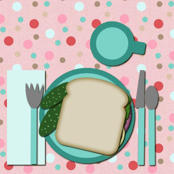
I am jumping in a bit late. I have been using PSP since 2009, but the last year has been pretty rough and then Tuesday the 12th, I had a total replacement on my right knee. Still in a fair bit of pain but wanted to get started and refresh my brain!
April 15, 2022 at 8:18 pm #75358Another lesson, my newest Great Grand. I have my 4th due in September!
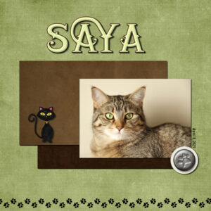
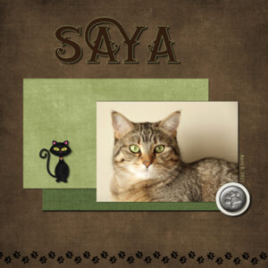
April 15, 2022 at 8:20 pm #75359Here is my page for Day 5 Project 2. I did two colors as I am trying to use lighter/brighter colors and I always go dark. This is one of my cat girlz Saya, pronounced Si-ah. The papers and elements are from Digital Scrapbook. The drop shadow on the black cat has a reduced opacity so it would show up. I used a drop shadow on the paw print as if it was a thick paper as it looks like a button on a cover weight paper and would cast a shadow accordingly. the paw print came with it’s own shadow. The title font is Nomaden (Creative Fabrica), and green one has an inner bevel and a bit more of a drop shadow as it looks like it’s a thicker puffy letter. I didn’t shadow the paw prints on the bottom border because it’s meant to be ink, a nod to my other cat girl Sumi who seems to appear from nowhere when we paint, resulting in a painted black cat. I am leaning toward the green background. I will have to go back and fix the end ‘A’ as there is a spacing issue that I meant to fix and forgot.
Really nice pages from everyone. Inspirational and motivating for me. ?
April 15, 2022 at 9:24 pm #75362Anonymous
- 335

- Enthusiast
here is Riio – isn’t it stylish 😉 and
a little different… – the lake is same
April 15, 2022 at 10:35 pm #75366Well…I made it this far even if I didn’t manage to get a tablecloth on my table. However it’s a major achievement after years trying to understand how layers work! Yeppeee….
April 15, 2022 at 10:49 pm #75367Nel (#75322) I would suggest you make your shadows with less blur so they will be more defined. A blurred shadow makes the title a bit harder to read, and we really want to read it! 🙂
Anne (#75325) I love how you put those birds all over the place, behind, on top, etc.
Ann (#75336) although those multicolored elements are “supposed” to be tiny beads, on your layout, they look like Fruit Loops (maybe you can add some noise to them to give them that cereal texture?)
Sharla (#75342) are those birds in your backyard?
Alan (#75348) good catch about the shadow on the doe. You are getting a keener eye now!
Teri (#75354) I hope you are doing ok after the surgery. How did it go? I assume it is a pretty big surgery. Hopefully, this sandwich is going to give you more strength! (#75358) That baby looks so awake!
Susan (#75359) that is a great explanation of all your reasoning for the various decisions you made regarding shadows, bevels and such. I am sure everyone is learning from those.
Pirkko (#75362) I love those two takes on the lesson. That thin uneven frame is delicate and adds a great touch on the page.
Sandy (#75366) that is a good start. Maybe the tablecloth is just in the laundry and you might add it later (if you keep a pspimage format)
-
AuthorPosts
- The topic ‘Scrap Bootcamp – April 2022’ is closed to new replies.


