Home of the Scrapbook Campus › Forums › Showroom › Publish It Challenge – 2019
Tagged: Publish it Day 7
- This topic has 239 replies, 32 voices, and was last updated 5 years, 5 months ago by
Cristina.
-
AuthorPosts
-
July 4, 2019 at 4:36 pm #31002
I went back and changed all my pages so they would have the same background. I was quite happy with it at that point. Then I realized that I have the wrong date on all of them. We did have flooding in 2017, but the photos I used were from 2009. Oops! I’ll have to fix that.
Is there a way to set these as some kind of slideshow presentation that can be uploaded? I’m dumber than a box of rocks when it comes to anything to do with web presentations. I come from a printing background so I’m a newbie at advanced graphics.
July 4, 2019 at 4:56 pm #31004Sharon, I have not found a way to upload any kind of video file in the forum. You could use PowerPoint to create a slideshow and you can use one of these video recorders. I didn’t check them all, and I don’t have a free one to suggest from personal experience (I am using Camtasia to record and it is not free). Then, you could post it in the Facebook group where you can upload video files.
July 5, 2019 at 7:27 am #31017To Carole and Sharon,
if Sharon wants to create a slideshow, may be she coud try it with the free version of IrfanView. It will create an .exe-file and that is pretty easy. But the question now is, is it possible to upload this format on Facebook or must it be converted?
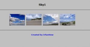
P.S. I just discovered a way to create a html-file with images in IrfanView ….
July 5, 2019 at 4:21 pm #31025Libera, maybe you can try to post that html file in the forum to see if it works.
July 5, 2019 at 7:03 pm #31026I did some checking around about the slideshow presentation. Evidently I should be able to create one with Google Slides. It said I could then post it to Facebook. I just have to figure out how to work with their templates. I’ll explore it some more when I can chisel out some time to learn how to do it.
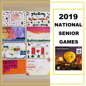
July 5, 2019 at 8:10 pm #31033Day 1: Posters by school children welcoming senior athletes to Albuquerque. 5 Nations in addition to all 50 states were competing.
July 5, 2019 at 8:11 pm #31035Day 2
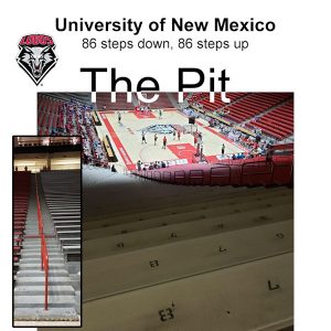
July 5, 2019 at 8:12 pm #31037Day 3 Basketball was played at the University of New Mexico…The Pit is where they play their home games. 86 steps are a challenge. We also played in their practice gym but I did not include that in my pages.
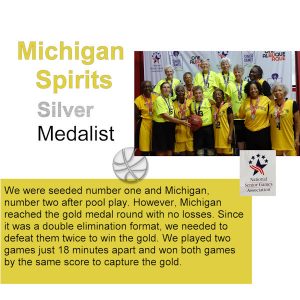
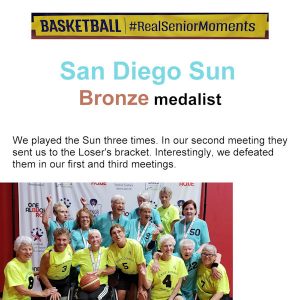
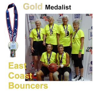
July 5, 2019 at 8:14 pm #31040July 5, 2019 at 8:14 pm #31042Day 5: Gold Medalists
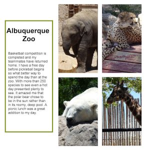
July 5, 2019 at 8:15 pm #31044Day 6: Albuquerque Zoo
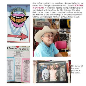
July 5, 2019 at 8:17 pm #31046Day 7: Unexpected adventure in an ice cream shop. I need to do more pages as we visited the UNM campus, The Frontier Restaurant, and Old Town Albuquerque plus I competed in pickleball also. Plus, I have other pictures of my team and other friends.
July 5, 2019 at 8:24 pm #31048Bonnie, if you add more pages, photos and stories about this event, it will surely be worth getting a printed version afterward. Imagine the conversation starter when sharing that with others (including your teammates)!
July 6, 2019 at 7:01 am #31065Carole, I tried last night to create the html-file with IrfanView. It looks like this: file:///C:/Users/Public/Pictures/Test.html
It works on the own pc, I can see the pics in the browser and that’s it … So other steps would be necessary to transfer to another website.
Another P.S.: it looks like in the uploaded image. All photos can be saved in 1 html-file and each photo can be saved as an htm-file, you can have both and even do a html-slideshow.
July 6, 2019 at 7:03 am #31066I’ll have to think about that, Carole. I rarely print my pages but this trip was filled with memories.
July 9, 2019 at 8:45 am #31188Congratulations again Bonnie for your successful basketball adventure and thanks that you share it with us through the exciting steps in your layouts!!
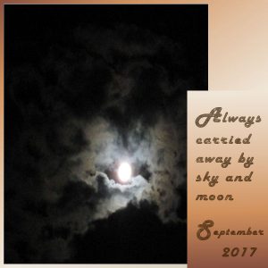
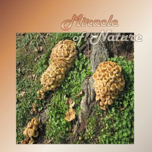
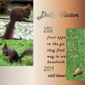
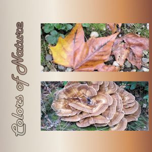
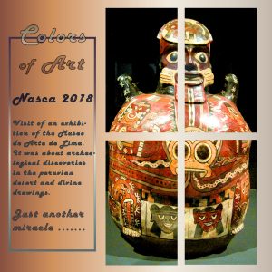
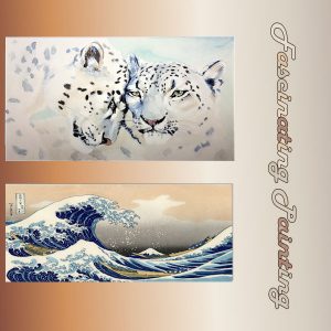
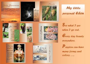
July 9, 2019 at 9:12 am #31192I decided to show the current results of my making of :-). So many ideas, so many pics and so on ….. But it has to come to an end somehow. The font all over is “Buggy” with the gradients “goldent time” and “forest tones”, I like it but it is not really appropriate when you want to insert a bit more text. Background color the “golden time” gradient too. Little changes for day 1 and 3. For day 4a I used the log digits Carole sent us a few days ago to write 2016 and 2019 and colored in green. Not much story. I wanted more to let the photos speak. I had an unexpected problem with the size of day 7 after saving the psp.format in jpg. Don’t know what did I wrong and hope it will not be awfully big after the upload.
First Day1-3
July 9, 2019 at 9:16 am #31195July 9, 2019 at 9:18 am #31198July 9, 2019 at 9:19 am #31200July 9, 2019 at 9:23 am #31202I tried to compose all the pics with a little text on 1 side. Just a simple test.
July 9, 2019 at 5:29 pm #31217Beautiful result for all Libera, well done my friend. <3
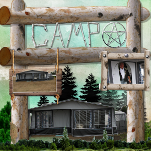
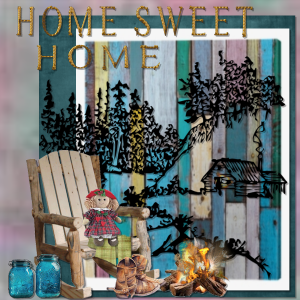
July 9, 2019 at 7:02 pm #31221internet crashed again, its like losing a limb , so pleanty of time to play around with logs and twigs
July 9, 2019 at 7:04 pm #31223logs and things
July 10, 2019 at 6:28 am #31249Boonie, great achievement.
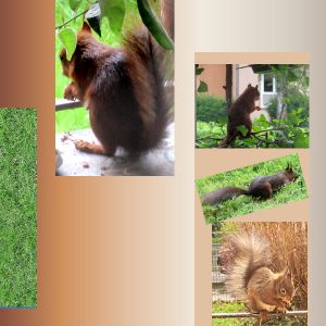
Libera, you achieved very nice results with your magazine. I am still working on mine. Your regular visitors are so cute!
Trish, your layouts are very nice. I love the colors of the Home Sweet Home page.
July 11, 2019 at 9:07 am #31274Thanks for your “likes”!
July 11, 2019 at 10:17 am #31281Figured it out! Thanks. Yes it was the checked item. I needed to reset my presets beforehand. Been out of commission. Will try to get to the last lesson soon. Barb
July 15, 2019 at 4:06 pm #31445Thank you, Libera and Cristina. It was a fun trip. I have hoped to win a gold since 2005.
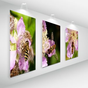
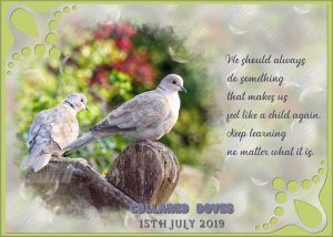
July 17, 2019 at 1:18 am #31473I was working on the Collard Dove project when the ‘Painting on the wall’ appeared on the blog. Cassel’s corner punches are one of my many favourites to use in projects. I created the background paper, using the masked doves I made. I created a seamless tile from it and flood filled the paper. Using two other light colours from the photo, placing those layers above the tiled paper, played with their opacity, dropping them to about 20%. Texture. Used the stitched 2 tutorial on the text.
July 20, 2019 at 12:05 pm #31756Hi Sue, I love both layouts. The “Painting on the wall” (perspective) is a great technique, and I have to try it… I also like very much how you create background papers; they give a subtle effect. The corner punches are also my favorite brushes, but I still have to use them in a bigger size, which I love.
-
AuthorPosts
- The forum ‘Showroom’ is closed to new topics and replies.


