Home of the Scrapbook Campus › Forums › Showroom › Publish It Challenge – 2019
Tagged: Publish it Day 7
- This topic has 239 replies, 32 voices, and was last updated 5 years, 5 months ago by
Cristina.
-
AuthorPosts
-
July 1, 2019 at 4:31 pm #30868
I am using the pic tool, but I cannot select the photo. I clicked on the large gray square under the 4-square mask and add my photo. But I can never select it to resize! Ugh I am obviously doing something wrong.
July 1, 2019 at 4:51 pm #30869Patti, when you want to select a photo that is in a group, you would have to select the layer itself in the Layers palette as otherwise, clicking on the “photo” on your project will activate the top layer, which will be the mask itself. So check the Layers palette, and scroll until you get to the layer where your photo is. Then, with the Pick tool active, it should allow you to move/resize it.
July 1, 2019 at 6:49 pm #30872Wondering if Patti was not putting the photo under the mask layer although without the pick tool she still would not be able to move it anyway.
July 1, 2019 at 6:50 pm #30880Day 8. Hi Scrapbook Campers. I decided to stick with white for the background of my magazine article as it provided a stark contrast for the photos I have used. I loved this challenge, the simplicity of it for such effective results, as you would expect for a quality magazine. If I could improve anything it would be my own journaling but, for now, I shall let the pictures tell the story! Thanks for takin a peek.
July 1, 2019 at 8:08 pm #30919Finally, Day 6! Good lesson!
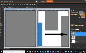
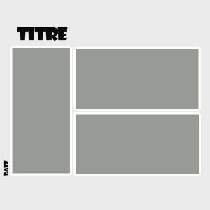
July 1, 2019 at 8:38 pm #30921Need help with day 7. I have my first mask layer created with no problems. When I add a raster layer and flood fill it with grey, it is not filling in the area where there is a window in the mask group below. I have attached a screen shot below. I have tried it twice. Thanks.
July 1, 2019 at 9:26 pm #30922Barb, if you click on the little tiny arrow on the left of the second layer, that is where you will see the mask group. From your screenshot, it looks like the mask group is not “open” to display the layers inside.
July 1, 2019 at 9:35 pm #30923That is not the problem, I am referring to the new raster layer. The mask layer looks perfect.
July 1, 2019 at 9:56 pm #30926Day 7 page 8 finally complete. Thank you. It has been a good learning experience.
July 1, 2019 at 10:05 pm #30927Barb, although the screenshot is tiny, I think that you have one box checked in the Fill toolbar for “use all layers”. Uncheck that and it should work as intended.
July 1, 2019 at 11:13 pm #30929Une page faite avec un template que j’ai fait à partir de la leçon 7
Maintenant que je sais comment faire, je vais pouvoir m’amuser – Merci Carole
July 2, 2019 at 7:56 am #30936I am just gobsmacked at all the wonderful work everyone has posted. Pat yourselves on the back!
~Michele
July 2, 2019 at 8:27 am #30939I changed Day 3, same background as in Day 2, changed the position of the title, the font color, then “more options” stroke width and space between the lines. Thanks Carole, I used the values from your screenshot, miter limit and leading (2,00 and -0,300).
I would have used the background of Day 1. Unfortunately I didn’t save the gradient. I am still unable to find the values again. When I open the file I can’t see the gradient in the material palette …. May be someone knows to find values again?
July 2, 2019 at 8:43 am #30940I had one long post with feedback on most projects that I posted a couple of days ago, but I cannot find it, so I apologize for being seemingly absent. I had responded to everyone. I still look at EVERY post. Let’s see if I can repeat my previous post plus add for the more posts uploaded afterward.
Shutterpixi, even if you started later, it is fine. It is not a contest or a speed test. The text with the hanging Y does make the title really part of the overall page. I like that.
Jean, those birds are great. Did you take those photos? That double page looks great. Imagine that on a double page spread on a printed version of the magazine!
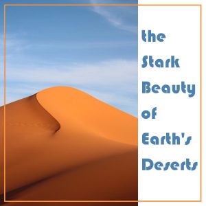
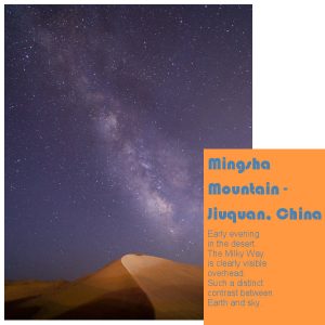
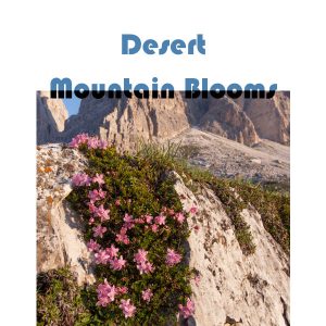
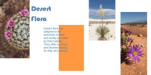
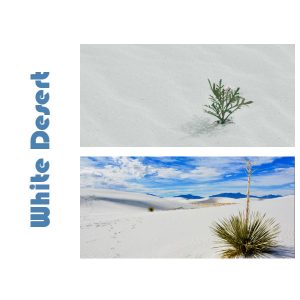
Annie, you just pick suh beautiful photos (although let’s admit it, those photos at Unsplash are usually fantastic!). That one photo of flowers in the desert is quite impressive.
Lynda, I feel like going RVing with you!
Trish, the frame around the title of the cover page really does fit very well. Using a map for a background paper is just brilliant for your theme. The collage is absolutely ok. It is your magazine! And no, there is no single winner. If there were, it would have to be randomly picked as everyone has posted something unique.
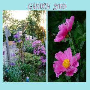
Sue, are those your gardens? That collage you did looked familiar 🙂 Glad to see that the techniques from one class is reused in another project.
Barb, if you had not put that mention (somebody is watching) I probably would not have looked as closely. Why not put something intriguing like that in the title or even as some text?
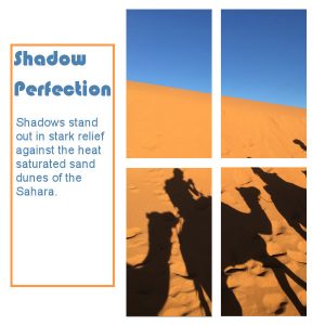
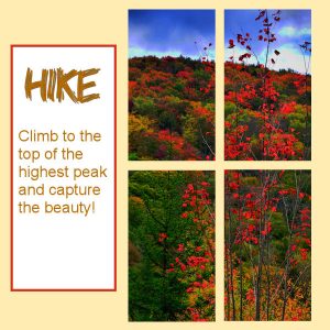
Wanda, those vertical slots are definitely more challenging but I find that you managed very well. Also, with such a creative cropping of the photos, they tend to attract attention. If you were really stuck and had only horizontal images, you could have rotated the templates too.
Mireille, bonne utilisation du texte en deux couleurs. Pour le vectoriel, le texte est toujours en vectoriel, donc aussitôt que tu utilises cet outil, un nouveau calque vectoriel sera créé. Tu n’as pas le choix.
Kim, what are those big red “boxes”?
Lyn, will you end up with a magazine about buildings? You can always go back and change the cover if you want.
Alicia, that yellow background really reminds me of the National Geographics. Interestingly, I have one copy on my desk and yes, I see that yellow! For the Flood Fill (or any other tool), there are often so many settings that I don’t think of listing them all as typically, I would use the default, yet, occasionally one setting could be accidentally changed and cause headaches like yours. I think I might have enoug examples to write a blog post about such unexpected settings that mess up tools!
Sharon C., the important part is what it looks like to YOU, on YOUR computer. We certainly cannot have such big pages in the forum as it would take so much time to load the pages! We have a great overview nevertheless. Your garden looks wonderful. How long did it take you to build it all?
Marisia, if you want to showcase your tags without turning our heads, you can rotate the templates.
Sharon W. just like I mentioned to Wanda, creatively cropped photos vertically is visually more intriguing and adds interest to a page.
Patti, I like the background papers you used. It matchs the theme very well.
Marlene, we got to visit that place with you. I didn’t even know it existed.
Cristina, using Pic-to-Painting makes for a fantastic cover page.
Barbara, I love your creativity in using those staples! great idea.
Bonnie, even if the email series is over, the thread will stay open and you can post your projects. How did your team do at the games?
Libera, nature is an unending source of inspiration when we take the time to look at it. For the gradient, if you used it recently, you should be able to retrieve it by right-clicking on the “larger” swatches, unless you were using the Foreground-background gradient, in which case, it would not keep the actual colors.
July 2, 2019 at 9:17 am #30944Thank you Carole. The gardens are photos I’ve taken in the past week in the local village, not far from where I was raised. The flower collage, are flowers I’ve taken in the past week too, I used the template I created from the no kt 3 masterclass. I’ve done insects, animals and now Roses. Really enjoyed the challenged, I don’t know what I was expecting, but to focus on masks was a good choice on your part. Thank you all the time and effort that went into the challenge.
July 2, 2019 at 10:30 am #30947Thanks Carole for the infos, I did this gradient for the first time creating Day 1 on sunday. I tried the way you described it, but apparently no way to retrieve the infos about it.
I tried now something else to get the gradient and use it again. I opened the file Day 1, clicked on the pick tool, then on the background layer with the gradient, made control + c, opened a new empty file, control + v and saved it as new pspimage. Now I will try to save it as a preset ….
I take the time every day to look at nature and around me, that is why I called the magazine “daily discoveries” :-)!
July 2, 2019 at 12:10 pm #30951Hi, sorry, I am late.
July 2, 2019 at 1:45 pm #30954Carole comment je fais pour enlever mon texte en vectoriel – je voudrais le remettre à flottant car j’ai moins de problème ainsi
Même si l’outil est à flottant, en cliquant sur ma page avec l’outil texte, j’ai un calque vectoriel
Je te mets aussi ma barre de configuration outil Texte
J’ai fait mon template de la leçon 7 avec mes fleurs sauvages
July 2, 2019 at 1:46 pm #30957July 2, 2019 at 1:56 pm #30958Jnet, le “calque” vectoriel devrait disparaître une fois que tu auras appliqué le texte et il deviendra flottant. As-tu essayé ça? Par contre, tu sais que ton texte ne sera plus éditable s’il n’est pas vectoriel!
July 2, 2019 at 3:56 pm #30959Est-ce qu’on a toujours eu le mot vectoriel quand on faisait un clic avec l’outil texte? si oui, c’est drôle c’est la 1iere fois que je remarque (ah! la mémoire). Et tu as raison, il n’est plus éditable une fois flottant, je viens de faire des tests – Merci je vais le garder en vectoriel
July 2, 2019 at 5:21 pm #30960It has been a sheer pleasure to log in here daily and view the delightfully diverse results of Scrapbook Campers for this challenge. Thank you one and all … and, a huge thank you to Cassel for this great challenge which was a wonderful learning process throughout!
July 2, 2019 at 7:08 pm #30963last page sorry bit late, computer crisis, total crash
July 2, 2019 at 7:10 pm #30965the whole thing, my first publication lol x so small be surprised if its readable.
July 3, 2019 at 3:08 am #30970Carol I tried to put it in a book form/ video with fast flick but couldnt find a format, it only did mpeg4 wmv or avi, is there one that makes a book or video to go on here.
Dont know if this is relevant, guess its probably solved be now, but Patti’s picture problem, I get confused with where the pic is, so I turn off the layer till the one I am looking for disappears.Thank you carol for a great project and all the help especially the video. xx
July 3, 2019 at 5:03 am #30973Hi ! Day 7. Thank you.
July 3, 2019 at 6:25 am #30976Trish, I searched and didn’t find how you can upload a video file. The only thing I know is that if you have it uploaded on YouTube for example, then you can post the link. Otherwise, I don’t know. If you are in the FB group though, that should be easy to upload there.
July 3, 2019 at 2:19 pm #30984New image
July 3, 2019 at 3:44 pm #30986Thank you for the “wrap up” email. I was able to get to the lesson for Day 7, which had been a problem for me. I used the opportunity to make a sort of back cover, a page without any text.
This challenge was good for me, as it reminded me that I don’t need to spend so much time and energy on choosing or creating embellishments. After all, for some scrapbooks, I just want to focus on the photographs, and let them tell the story. An introductory page of clean text in journalistic style would make a nice addition.
July 3, 2019 at 5:59 pm #30988I enjoyed your magazine article Trish, well done! <3
-
AuthorPosts
- The forum ‘Showroom’ is closed to new topics and replies.


