Home of the Scrapbook Campus › Forums › Challenges › October BINGO Challenge
Tagged: Bingo
- This topic has 23 replies, 8 voices, and was last updated 5 years, 2 months ago by
Annie Tobin.
-
AuthorPosts
-
October 11, 2019 at 8:01 pm #35149
This month, I will offer you something new: a BINGO Game.
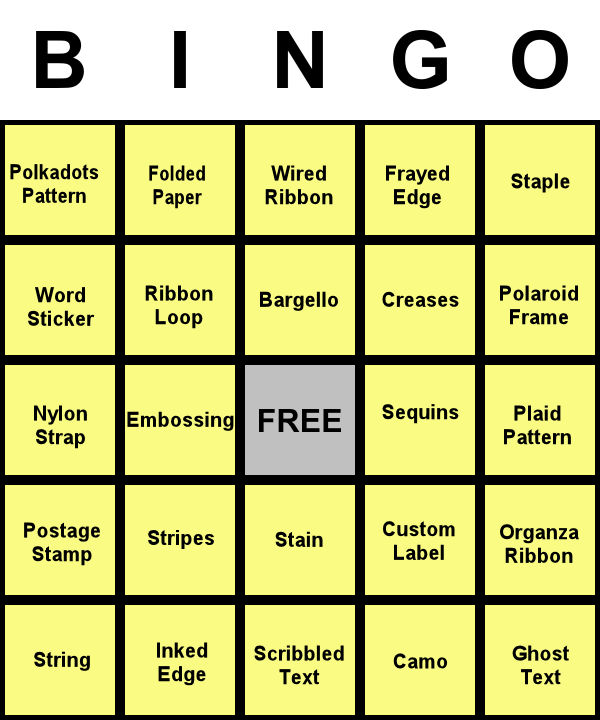
I am providing you a card with 24 elements that can be included in a layout. You can make a bingo by using any element in a straight line that would make a bingo, whether it is a horizontal line, a vertical line or a diagonal line. That means that you have to include 5 (or only 4 if you use the FREE in the center) elements in your layout. Of course, you can have more than one bingo if you want to create more than one layout.
Once you post your layout, tell us what 4-5 elements from the Bingo card you are using (it is just easier for everyone to check on you! 😉 )
So, here is your card, for October 2019.
If you are a DIAMOND member and want to create those elements, you are more than welcome. If you are not, or if you don’t want to do anything from scratch, you can also use ready-made elements. There is no rule for or against that.
The only rule: have fun and be creative!
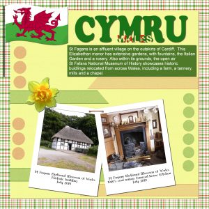
October 12, 2019 at 11:23 am #35176I used the far right vertical line. The elements used, and created from scratch are: Polaroid frame, staple, plaid pattern, organza ribbon, and ghost text. I didn’t use a shadow on the ribbons, or the organza circles which I created by using the selection tool, and promoted to a new layer, and duplicate them, as the shadow changed the colour to much. I also created the flag.
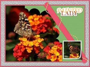
October 13, 2019 at 1:38 pm #35232Painted lady butterfly. In this project I used the elements on the left , horizontal. Polkadots, word sticker, nylon strap, postage stamp, and string. I could have used two scripts, but I opted to created everything myself from scratch. All good practice, and a refresher, so I don’t forget.
October 13, 2019 at 6:25 pm #35238great results for the bingo challenge on both projects Sue !…. i must say i especially love your butterfly one it is really lovely and also the corner punch adds a wonderful effect to the photo .
best wishes,
Dawn.
October 13, 2019 at 11:12 pm #35240Thank you very much Dawn, thses pages were fun to do and came together quite easily. The photos lead the way.
October 14, 2019 at 9:50 am #35242I am sitting here laughing, Sue. I saw your wonderful pages on Facebook and I had no clue what you were talking about because I hadn’t read the Cass’s newsletter yet. I was looking for the far vertical line and your left horizontal elements on your layouts. It all makes so much more sense now. LMAO
October 14, 2019 at 11:00 am #35243Oh Michele, there are times when you crack me up!!!! Thank you for your lovely comment. I’m smiling to myself here, I can just see you searching for elements, on the horizontal and vertical that weren’t there, you were probably thinking to yourself that I was as mad as a hatter. Just as well we can laugh at ourselves. Have a good day! x
October 14, 2019 at 12:31 pm #35247Sue, what can I say? As always, you created wonderful layouts!
October 14, 2019 at 11:08 pm #35252Love the bright colours and lay out in the second post Sue.
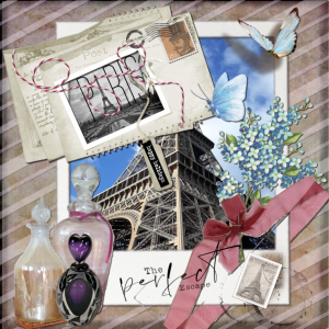
This one inc. postage stamp stripes- stain – label- organza ribbon -inked edge- scribble text.
I did’nt know what half the things were on the board, need a reference where to find them.
what is a nylon strap .
October 15, 2019 at 4:57 am #35253Trish, very nice layout. I like the background paper, the colors… Great work.
October 16, 2019 at 7:50 pm #35271Great work on both Sue, your refresher was well and truly worth it! <3
Trish, your page is a delight and I should well imagine that Paris would be the perfect escape! <3October 17, 2019 at 1:23 am #35276hello Trish, a very nice page …
best wishes,
Dawn.
October 17, 2019 at 6:00 am #35279Lovely page, Trish.
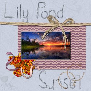
October 19, 2019 at 2:39 am #35313Hello Scrapbook Campers. I used the middle column for this one – wired ribbon, bargello, stain, and scribble text. Photo from Unsplash. Thanks for takin a peek! <3
October 19, 2019 at 3:08 am #35314Great work Annie.
October 19, 2019 at 7:09 pm #35324hello Annie … lovely work!. love the effect the wired ribbon gives to your layout.
best of wishes,
Dawn.
October 19, 2019 at 7:21 pm #35327Thanks very much Sue and Dawn, always appreciated my friends. <3
October 19, 2019 at 9:45 pm #35335Wow, Everyone…great pages. I have never done a BINGO project. This is my first attempt. I used the middle horizontal row…plaid paper, nylon strap, embossing, sequins…and free space. The plaid paper was a part of the quick page and the sequins are from kits. I did the embossing and nylon strap following Carole’s tutorials in Creative Scraps. I also created the recipe.
October 20, 2019 at 2:32 am #35352Hello again Scrapbook Campers. This time I went for column 5. The artwork is a personal computer wallpaper I found on the web. I loved refreshing the brain cells with the tutorials for this page. I always end up confused with shadows, they are my biggest bug bear with digital scrap-booking. The owl looked ridiculous with a 3D shadow and the organza ribbon looked ghastly. I ended up erasing the bottom section of shadow from the owl and I used a very low opacity in a light gray for the ribbon. I did add a very small shadow to the text but I think it looked better without. If anyone has any tips I sure would appreciate it! Thanks for takin a peek! <3
October 20, 2019 at 1:08 pm #35362Annie, you are bringing up some real “shadow challenges” and that might mean a possible class in the future, but in the meantime, here are some pointers:
– shadows are how light is blocked by something of different opacity and in the case of an organza ribbon, it is not opaque to start with, so it would not stop the light much = very faint shadow. In that case, you might want to make that shadow with a very low opacity and a very high blur at the same time.
– 3D shadows are completely different than “regular” shadows as the regular ones assume that the element is flat on the surface behind it while the 3D shadow assumes that the element is typically standing up on a horizontal surface, and require manual addition of the shadow.
If you have other “shadow challenges”, let me know so I could add that to a future class!
October 20, 2019 at 7:39 pm #35383Cass, thanks so much for your response/tips. I recognized the problem with the organza ribbon immediately as it looked terrible with the “regular” shadow application. I would so appreciate a tutorial addressing these issues. I am a visual so if something doesn’t look right I muck around with it until it does! If I come across any more shadow issues I will let you know. I have watched your existing shadow tutorials and they were very informative but as is usual there is always something that will crop up that just doesn’t fit the bill! <3
October 21, 2019 at 5:42 am #35391I am right there with you, Annie. Shadows confuse the heck out of me. Sometimes I end up spending more time on figuring them out than putting together all of my elements. I think my main issue is visualizing how much to put on each layer.
I, for one, would LOVE a detailed class, Carole. I will, however, review your existing tutorials. Maybe I just need a refresher.
October 23, 2019 at 12:57 pm #35459Annie, very nice layouts. I think everybody has difficulties with shadows. Whenever possible I try to practice different types of shadow but I am not always successful. 🙂 I will keep trying. 😀
Bonnie, this a fun and lovely layouts. I love the idea of writing a recipe for it.
October 23, 2019 at 8:14 pm #35470Michele, I hear you my sweet. Time consumed on working out shadows has me tearing my hair out, lol!
Cristina, thanks for your comment my friend. It would appear that we are all shadow ignorant! Ribbons get me in a real knot … they may be a small addition to the page but if the shadow is incorrect it can make the page frightful. Do you also have a problem with ferns or live critters in a cluster? If I use a cluster that is put together by a designer then I tend to leave it alone but it becomes an issue if the designers shadowing does not fit in with my page. if I am putting the cluster together myself it becomes a constant battle. Should I shadow as I am going along or once it is merged (which seems silly as items in the cluster are overlapping and will cast a shadow on the items behind). Yes Cassel, I think we need help with these “Shadow Horrors”, LOL! -
AuthorPosts
- The forum ‘Challenges’ is closed to new topics and replies.


