Home of the Scrapbook Campus › Forums › Challenges › November TUT/TECH Challenge (2022)
- This topic has 13 replies, 7 voices, and was last updated 2 years ago by
MoniqueN..
-
AuthorPosts
-
November 25, 2022 at 7:51 am #87433

The Campus is the perfect place to learn more about photo editing, various techniques, or PSP in general.
This challenge will give you an opportunity to practice some of those techniques or use some tools.
This time, the Tut/Tech Challenge will be to blend in two (or more) images following the lessons in the master class “Blending Pictures” that you can watch HERE. It will be a great way to practice this technique. Tell us what you used: did you use masking or the eraser too? The Blend modes or just played with the opacity?
Show us what you learned.
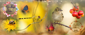
November 25, 2022 at 9:28 am #87437I’ll start the ball rolling with a blast from the past. I don’t normally repost any of my pages. I created this back in the Autumn of 2014. I used the brush tool within several masks. I don’t use several layers within a single mask, as Carole demonstrated, instead I create new masks. Which has always been my preference.
I will create a new page, to post later on.
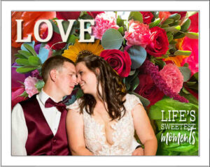
November 25, 2022 at 10:01 am #87440After learning from the Master Class, I created this blended layout from my granddaughter’s wedding photos. I think I only used the smart selection brush and the eraser tool. I need more practice with the multiple masks. This was the happy couple and a photo of the flowers on the head table at the reception. I had the word art in a wedding kit.
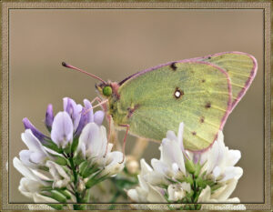
November 25, 2022 at 8:05 pm #87462I added the butterfly to the photo of the Alf alfa flowers. Extracted the butterfly using 2 masks. I had to then extract, and promote to a new layer some of the petals in order for the butterfly leg to be placed behind the petal. I then used masks to be very precise with the extractions of the petals Also other petals, to be placed in front of the butterfly to make it look realistic.
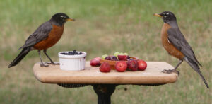
November 25, 2022 at 8:18 pm #87464Here I used 2 photos, two of many I took during a photo session. They were hand held photos. I had to perfectly align the table in the photos, straighten and resize. I then used a mask, and gradient to blend them together.
November 26, 2022 at 1:50 am #87467Sue, if you didnt say this was two merged photo’s I would never have guessed it. It’s really well done. Especially how you handled the butterfly.
November 26, 2022 at 7:06 am #87478Sue Thomas: Wow, they’re both great! I’m especially admiring your butterfly and would like to know the technique for the border, especially at the bottom. It gives a look of transparency that is very nice.
November 26, 2022 at 12:07 pm #87486Wow, Sue, outstanding work, as always. Lovely and so precise.
November 26, 2022 at 4:29 pm #87495Sue I love your butterfly and your extraction is so very precise (as always)!
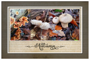
November 28, 2022 at 4:30 pm #87518I used 3 photos of mushrooms and blended them together, placed that on a background and made a frame around them. I almost never use the frames that come with PSP, so I thought let me give that a try. The fonts are Salmon Queen and Salmon Queen Extras, a freebie by CF with many swashes and little elements.
November 28, 2022 at 4:36 pm #87521I forgot to tell that I used the masking technique and a lowered the opacity of one of the photos. When the composition was to my liking I merged all and copied it to a new layout with the background.
November 28, 2022 at 8:41 pm #87532Very nicely done Corrie. It certainly would pass for an unedited single photo. Had you not told us otherwise. I have to admit, I have never used the frames that come with PSP.
November 28, 2022 at 8:45 pm #87533Thank you ladies, for your very kind words on the two pages I submitted.
December 1, 2022 at 5:12 pm #87699
This is the first project I made after the blending class. Love this technique!
-
AuthorPosts
- The forum ‘Challenges’ is closed to new topics and replies.


